

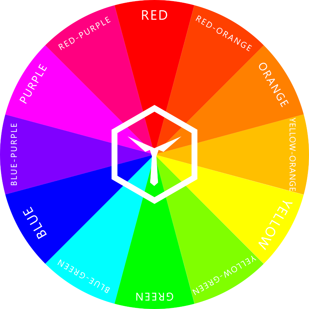
Color Psychology: The Secret Weapon of Marketing and Advertising
Colors hold a surprising amount of power, influencing our emotions, memories, and even our decisions. Marketers are using color psychology as a secret weapon to craft impactful campaigns that resonate with their target audience. Here’s how the world of marketing and advertising uses color psychology to influence you.

Have you ever walked into a store and felt strangely drawn to a particular product, only to realize later it was the vibrant red packaging that caught your eye?
Or perhaps a calming blue website put you at ease while browsing for financial services? Believe it or not, these experiences are no coincidence. Marketers are wielding a powerful tool – color psychology – to influence your behavior and perception.
Colors hold a surprising amount of power. They can trigger emotions, evoke memories, and even influence our decisions.
Understanding how colors affect us can be a game-changer for marketers who want to create impactful campaigns that resonate with their target audience.
What is the Best Color For Marketing and Advertising?
There's no single "best" color for marketing! The most effective color depends entirely on the message you want to convey and your target audience.
Here's why:
Color psychology: Different colors evoke different emotions. Red conveys urgency and excitement, while blue suggests trust and security. Green is linked to health and nature, while yellow brings happiness and optimism.

Red is exciting and fun, blue implies trustworthiness. This is the power of color psychology.
Target audience: A company targeting young children might use bright and playful colors, while a luxury brand might lean towards sophisticated black or deep purple.
Industry: Certain colors are commonly associated with specific industries. Green is popular for eco-friendly brands, while blue dominates finance.
Here's a tip: Consider these factors when choosing a color palette for your marketing:
Brand identity: What emotions and values does your brand represent? Choose colors that align with those.
Target audience: Who are you trying to reach? What colors resonate with them?
Goals: Do you want to create a sense of urgency or trust? Choose colors that achieve that specific goal.
By understanding color psychology and your target audience, you can choose colors that strategically influence your audience and enhance your marketing message.
Let’s delve into the world of color psychology a bit more, shall we?
The Emotional Spectrum of Color:
Let's explore how different hues can speak volumes to your customers:

Red: Bold red grabs attention like a stop sign. It's associated with excitement, passion, and urgency. Think clearance sales, fast-food chains (think McDonald's!), and anything that needs a quick purchase decision.
Did you know? Red is actually linked to increased appetite – that's why it's so commonly used in the food industry!

Blue: Cool and calming blue exudes trust, security, and professionalism. It's the perfect choice for banks, financial institutions, and tech companies (like IBM) that want to portray reliability and stability.

Green: Nature's color, green, is synonymous with growth, health, and harmony. Eco-friendly brands and those in the wellness space (think health drinks!) use green to create a sense of freshness and environmental consciousness.

Yellow: Sunshine yellow brings a burst of happiness and optimism. It's ideal for attracting attention and creating a cheerful atmosphere. Brands like IKEA use yellow to make their stores feel bright and welcoming.

Orange: Energetic orange is all about enthusiasm, creativity, and fun. It stimulates the senses and grabs attention, making it popular in the food and beverage industry (think Fanta!) and brands targeting a younger audience.

Purple: Associated with luxury, wisdom, and mystery, purple adds a touch of sophistication and elegance. Beauty brands (like Chanel) and high-end products often use purple to create a sense of exclusivity and prestige.
Pink for Femininity, Brown for Comfort:
Pink is a natural choice for brands targeting women or products related to love and beauty. It evokes feelings of warmth, compassion, and romance (think Victoria's Secret!).
Brown, on the other hand, brings a sense of stability, comfort, and earthiness. Food and beverage brands (think chocolate bars!) and outdoor companies (like The North Face) often use brown to create a sense of tradition and reliability.

Pink is feminine and soft, brown looks comfortable and reliable. Both are colors often found in the makeup industry.
Black and White: The Power of Extremes
Don't underestimate the impact of black and white. Black oozes sophistication, power, and luxury. Think of luxury car brands (like Mercedes-Benz) that use black to convey a sense of timeless elegance.
White, on the other hand, signifies purity, simplicity, and cleanliness. It's a popular choice for healthcare and tech brands (like Apple) that want to portray a sense of reliability and cutting-edge innovation.
Light vs Dark: A World of Difference
The choice between a dark and light shade can dramatically alter the message you convey.
Dark colors like navy blue and dark gray exude sophistication, authority, and power. They're ideal for creating a sense of luxury and exclusivity (think high-end menswear stores).
Light colors, on the other hand, feel more approachable and youthful. Think pastel tones used in summer collections or light blues on websites targeting a young audience.
Light pastel tints make you look younger, did you know? The same goes for your brand.
By understanding the psychology behind light and dark shades, marketers can create a visual identity that resonates with their target audience and evokes the desired emotions.
We have a dedicated article just for the topic of dark versus light colors. Check it out by clicking the link.
What Are Calm Colors for Marketing Purposes?
In marketing, several colors can evoke a sense of calmness and tranquility, perfect for promoting relaxation, security, or trust. Here are some top choices and how they can be used:
Blue: The king of calm colors, blue is widely associated with peace, trust, and reliability. It's a natural fit for financial institutions, healthcare providers, and tech companies seeking to project stability and security. Think calming ocean blues, soft sky blues, or muted lavenders.
Green: Nature's color promotes harmony, balance, and growth. It's ideal for eco-friendly brands, wellness products, or companies promoting relaxation and rejuvenation. Opt for calming sage greens, spa-like mint greens, or refreshing seafoam greens.
Light Purple: Associated with royalty and wisdom, light purple adds a touch of sophistication and calmness, yet more youthful than darker shades of purple. It can be a great choice for beauty brands or luxury products seeking to create a sense of serenity and elegance. Think calming lavender hues or soft lilac tones.
Here are some additional tips for using calm colors in marketing:
Combine with white: Pairing calming colors with white can enhance their tranquility. Imagine a serene blue paired with crisp white for a spa brand or a soothing green alongside white for a meditation app.
Avoid harsh contrasts: Stick to softer shades and avoid harsh contrasts with bold colors, as this can disrupt the calming effect.
Consider gradients: Gradients, smooth transitions between colors, can create a sense of peacefulness. For example, a gradient from soft blue to white can evoke a calming ocean scene.
By strategically using these calm colors, you can create marketing materials that promote relaxation, trust, and a sense of well-being. This will ultimately connect you with your target audience on a deeper level.
Which Colors are Most Likely to Attract Customers?
Here are some attention-grabbing colors for you:
Red: The boldest attention grabber, red is associated with excitement, urgency, and passion. It's ideal for clearance sales, impulse purchases, or anything needing a quick response. Think fast-food chains or discount signs.
Orange: Energetic orange exudes enthusiasm and grabs attention. It's popular in the food and beverage industry (think Fanta!) and targets younger audiences with its playful and fun vibe.
Yellow: Sunshine yellow is another champion of attracting attention. It injects happiness and optimism, making it perfect for summer collections or cheerful branding.
Consider combining colors strategically. For instance, red and yellow together can create a sense of urgency and excitement, perfect for a sale!
Also, try darker shades paired with lighter tints to mix things up a bit.
The Takeaway for Marketers and Advertisers:
Color psychology is a fascinating field with immense potential in the marketing world. By harnessing the power of color, marketers can create targeted campaigns that speak directly to their audience's emotions and influence their purchasing decisions.
So next time you design a marketing campaign, consider your color palette carefully. After all, the right colors can be the secret weapon in your marketing arsenal!
Special thanks to PTG Marketing for helping us out with this article.
ARTICLES YOU MIGHT LIKE:

Why Color Clothes Fade (and How to Stop It)
Clothes’ colors fade because their dye is washed out and fabric fibers become dull over time, due to exposure to sunlight & strong chemicals, and with frequent use. The more you wear and wash a piece of clothing, the more its original color will fade. But there are things you can do to slow down or even stop fading entirely.

Our favorite clothing will lose its color over time – that’s just a given. So, the real question is: “How can we stop or slow down this process?”.
But to truly know how to stop our clothes from losing their color, we must understand why it happens in the first place. And there’s a lot to learn – so strap in.
Why Do Clothes Colors Fade?
Clothes colors fade because the dye is washed out and fabric fibers become dull over time, due to exposure to sunlight & strong chemicals, and with frequent use. The more you wear and wash a piece of clothing, the more its original color will fade. But there are things you can do to slow down or even stop fading entirely.
Clothes made from dyed cotton or synthetic fibers are what most people wear. Every clothing dye is designed to not fade quickly. A dye is of high quality if it can’t be washed or rubbed off on other surfaces and doesn’t bleed out a lot.
When you buy a new garment at the store, it will often have a color-fast coating applied so it will stay looking new as long as possible. But these treatments gradually come undone each time you wash your clothes and expose them to detergents and hot water that suck away moisture, thereby making fabric dry out faster (and ultimately discolor).

What NOT to do: Our Very Cherry Sock after 2 years of wear and tear (left), worn 2-3 times a month, washed at 60 degrees Celsius (hot) with other colorful socks & underwear, and always tumble dried.
You can keep wearing your favorite items longer by expertly washing garments. We discuss how to do so in our article about How to Wash Clothes so They Don’t Lose Color. In this article, though, we’re all about why clothes lose their color and what else to do to stop color fading.
But, to understand why we first have to get a few facts out of the way.
What are Dyes Made of and How do They Work?
Dyes are mixtures of organic and sometimes synthetic compounds that give away color by absorbing some wavelengths of light and reflecting other wavelengths.
The reflected waves of light that hit the eye are then interpreted as color. Colors change depending on the wavelengths and the amount of each that manages to reach the eye.
Dyes, or pigments, can be obtained from many natural items such as flowers, soil, metals, and even insects. Nowadays, more and more dyes are made by chemical synthesis.
And at the end of the day, that’s what all dyes are, no matter where they came from: chemical compounds that give off a certain color.
As such, they bind chemically to certain types of fiber. In fashion, these fibers are often made of either natural materials (cotton, wool, silk, etc.) or synthetic materials (nylon, spandex, polyester, etc.).
How Dyeing Works
Dyeing (FYI, not the same thing as dying) is a complex process that makes use of chemical and physical processes to bind colorful pigments to other materials.

There are a few different ways to dye textiles. Each is specific to a certain fiber type. Obviously, you should use the one that works best, right?
The most common are acid dyes, disperse dyes, and vat dyes. They each make use of various chemical and physical processes to bond pigments with the intended textile fibers. No, it’s not important for you to know which does what and why.
What is important to know, on the other hand, is that similar processes that bind pigments can be used to remove them from fibers as well. And that’s basically what happens when clothing starts losing its color over time.
Synthetic Versus Natural Textiles
Natural textile materials such as cotton typically have a white-ish appearance as long as they haven’t been pigmented yet. To actually receive a specific color, they must be dyed.
If need be, these dyes can be removed almost as easily as they were put on.
Synthetic fibers are dyed in different ways than naturally occurring textiles. In a way, their color is “baked into” them – chemically. Most artificial fibers are colored by a process called “dope dyeing”. Let’s take a moment to appreciate that term.
…
Moving on. Dope dyeing is exclusive to synthetic fibers and takes place before the fibers are even made. While dyeing in a dope fashion (did you see what we did there?), pigments are added during the stage of polymerization (i.e., while “baking” the material for the fibers).
Colorbux socks are partially made of synthetic fibers which is why they are so colorfast (as long as you wash them correctly - not like in the image at the beginning of this article). Here’s a small selection you might like:


Thus, synthetic fibers have maximal color fastness. Therefore, it takes much more time for synthetic clothes, such as polyester, for example, to lose their color.
Regardless of textile composition, dye will come off (almost) any piece of clothing over time. This might take longer for some types of clothing but the factors that make clothes’ colors fade are always the same ones – just to varying degrees depending on the fiber composition.
Factors That Make Clothes Lose Their Color
There are a few things that make clothes’ colors fade over the duration of their use. Some impact color fading more than others, but it’s hard to quantify just how much more (so let’s not even try).
It’s essential to know the culprits that make clothes lose their color to understand how to stop color fading, though. So, without further ado, here are the factors that make clothes lose their color:
1 Hot Acidic Solutions
Acids are used to get pigments into cloth fibers, so they can also be used to dissolve the same pigments again. You’d actually wash dyed clothing in acidic, near-boiling hot water should you wish to remove its color.
Sadly, if you do so unwillingly (or unknowingly) by using a very acidic detergent and/or very hot water, your garments are bound to lose some coloration.
2 Chlorine Bleach
Chlorine, which is a common bleach type, becomes super acidic when mixed with water. Never use chlorine bleach on colorful clothing. Do yourself that favor.
FYI, you can actually bleach (not with chlorine, though) your colored clothing to make them brighter and even more colorful. We explain how and with what in this article.
3 Strong Detergents
Strong detergents can sometimes harm your clothes more than they help. Always read the user instructions on your detergents and maybe opt for slightly more premium products and trusted brands.
Those detergents that remove stains and grime well, also remove color the best. Bummer.
4 UV Rays
Sunlight breaks apart pigments over time. In an ideal setting, you’d therefore never wear colorful clothing outdoors, but that’s just not realistic.
It’s sadly inevitable that your clothes will lose their color gradually. You can slow the process of degradation by UV rays if you do not hang them in the sun to dry after you wash them.
Simply hang them indoors to dry out. Ideally, keep them away from windows and stow them in a closet away from daylight as soon as they’re dry.
5 Abrasion
Regular wear and tear will make your clothes fade. Period.
Abrasion from daily use, washing, and tumble drying destroys pigments and roughens fibers to a point where any textile will lose its shine and “newness”.
The best way to reduce color loss from abrasion effectively is to never wear the garment you wish to keep intact. But that’s not an option now, is it?
You can significantly reduce the wear and tear from washing, though. We explain how in our dedicated article.
6 Discoloration
The easiest way to gray out a color is by adding contrasting pigments. This is what happened in discoloration – other pigments are absorbed by the fibers.
This is what sometimes happens when you wash strongly contrasting colors together in a hot wash. Some clothes will bleed out and others will absorb the loose dye in the washing machine.
Discoloration just sucks. Make sure you wash your clothes as cool as you can without compromising on cleanliness.
7 Pigments Get Washed Out
Similar to factor 6, you can also change a clothing piece’s color by washing it out. The garment in question then simply loses its saturation.
Over time, the more you wash any piece of clothing, the more it will lose its pigments. Every time your clothing comes into contact with water, a tiny amount of dye will be washed out.
At some point, the fading will become visible and this is bound to happen sooner or later no matter what. Just make sure it’s later.

How Long Does It Take for a Dye’s Color to Fade?
The time it takes for a garment’s color to fade depends on various factors such as length of exposure to negative stimuli, types of dyes used in making the clothes, the hardness of water, type of washing machine used, and the quality of detergent.
In other words, the answer is a hard “it depends”.
One thing is for sure, though. If you take care of your clothing and follow the tips we’re about to outline in the following paragraph, you’ll be able to maximize the time it takes for your clothes to lose their color.
How do I Keep my Colored Clothes from Fading?
Do not use harsh chemicals like bleach unless you absolutely must. Bleach will fade colors faster.
Wash colored materials separately from white, dark, or light-colored garments because they can ruin these items by discoloring them. Ideally, separate according to color as much as you can.
Use mild detergents or use detergent sparingly.
Do not leave clothes in the washer after the cycle has finished. Hang them to dry away from sunlight.
Wash strongly colored clothes only with cold water. Whenever possible, do not tumble dry.
It is sometimes advisable to add a cup of distilled white vinegar during the wash cycle because this counters chemicals present in tap water (like chlorine) that accelerate color loss.
Wash items inside out so there’s more wear and tear on the inside of the garments instead of the more visible outside.
Use a mesh bag. This reduces abrasion from the washing machine.
Use a gentle cycle when washing your clothes because it is gentler on fabrics.
Use a detergent that contains optical brighteners to help maintain color brightness, which is very important for lighter colors.
Add a fabric softener to your wash. This helps reduce color bleed.
Use a laundry detergent that is designed to protect the colors of your clothes. Detergents explicitly made for colored clothes are typically best.
Obviously, there are many more things you can do to reduce color fading. But the tips listed above will get you a long way.
We hope this article and all our points will help you and your clothes look great for as long as possible. If you liked what you read, we suggest subscribing to our article updates.
We’ll send you 2-3 emails every month with updates on our newest posts. No spam or marketing emails. Guaranteed.
Alternatively, you could do us a massive favor by leaving us a Google review. This would help us out a bunch.
ARTICLES YOU MIGHT LIKE:


![How to Choose the Right Tie Color [Ultimate Guide]](https://images.squarespace-cdn.com/content/v1/5d91f9da52210569ede7ff3a/1647328953246-2F9L3J15P42J9N3WGMVE/COLORBUX+How+to+Choose+Neck+Tie+Color+BANNER+Thumbnail.jpg)

Ideal Clothes Colors for Olive Skin
The best colors to wear if you have olive skin are earth tones like beige, khaki, and brown. You can also wear shades and tints of green and all variations of colors from red to blue-purple. But avoid colors like orange and turquoise. These can make your olive skin look pale and sickly. Blues and red-oranges are also not ideal.

People with olive skin are undoubtedly beautiful. Their skin radiates a warmth reminiscent of sunny beaches and tropical islands.
But, as with everything, there’s a downside to having olive skin as well. Colors that suit other skin tones just don’t have the same look on skin that has a yellow-green tinge.
As you will come to understand in this article, some classic clothing colors just don’t harmonize with olive skin and we’ll tell you why.
What Colors are Best on Olive Skin?
The best colors to wear if you have olive skin are earth tones like beige, khaki, and brown. You can also wear shades and tints of green and all variations of colors from red to blue-purple.
But avoid colors like orange and turquoise. These can make your olive skin look pale and sickly. Blues and red-oranges are also not ideal.

White clothing works very well on olive skin since it has a darker, more tanned touch to it.
But why do certain clothing colors work well with olive skin, and some don’t? Well, first we have to understand what color we’re truly talking about to understand how it reacts to (and in combination with) other colors.
What is Olive Skin?
Olive is a color that many believe to be a sort of green. Well, suffice to say it isn't exactly.
Olive is a dark color that is of a hue found between yellow and green on the color wheel. That hue is called yellow-green (how creative!).

*this yellow-green has more yellow in it than regular yellow-green. Both dark versions can be considered olive.
Some olive tones lean more toward yellow, others have more of a green tinge. This depends on the amount of blue undertone in the skin. Bluer skin looks greener (more olive) whereas yellower skin has more of a golden or bronze look.
Olive-skinned people are typically Fitzpatrick Type III or rarely IV, which means they have skin with dark yellow-green undertones that tans easily and sometimes burns under excess sunlight. Such individuals usually have dark hair and eyes as well.
Important: Being olive-skinned does not mean that your skin is actually olive. It’s all about undertones. These are certain colors that “shine through” the upper layers of your skin.
So, with that out of the way, how do you go about matching colors to olive skin?
Matching Clothing Colors to Olive Skin
Finding colors to match your skin tone becomes astonishingly easy if you know how the color wheel and the rules of contrast work. There are a few guidelines you must stick to:
Complementary, analogous, triadic, and monochromatic colors to yellow-green and/or yellow pair great with olive skin.
Hues from the “Danger Zone” of the color wheel (in relation to yellow-green and/or yellow) should be avoided.
Colors that don’t contrast your olive skin tone enough shouldn’t be worn either.
Follow these three rules and you’re good to go. Easy, right?
If only it were that easy! Let us explain in detail so you understand fully.
Colors to Wear with Olive Skin
Monochrome
To perfectly match your clothing colors to your olive skin, it’s easiest to go monochromatic.
This means that you choose a clothing color that has the same hue as your skin’s olive undertone. In other words: clothes that are either of yellow-green or yellow hue. Either should work fine.
Olive is nothing but dark yellow-green. Sometimes with more, sometimes with less yellow. Some people consider olive to be dark yellow, even.
Obviously, bold chartreuse and yellow would do the job perfectly. But there are other less eye-catching alternatives that may be more your cup of tea.
These examples include olive (duh), army, sunshine, lime, or any other variation of light/dark/pale yellow-green or yellow.
You can’t really go wrong by going monochrome (more on that later). But there are more dazzling and interesting alternatives.
Complementary Colors
You could always opt for “opposite” colors to your skin’s undertone when thinking about what to wear. In this case, you’d choose colors from hues on the opposing side of the color wheel.
Colors from the opposite side are called complementary. For olive, specifically, the complementary hue(s) are either red-purple or purple/magenta.

Complementary clothing colors contrast skin tones beautifully.
Wearing colors from those hues, such as purple, wine, lilac, bubble gum, and all other variations of dark/light/muted purple and red-purple, will look smashing against olive skin.
Wearing complementary colors to your skin tone adds visual interest like no other look. This has to do with the extreme amount of color contrast that opposite colors provide.
More on contrast later in this article.
Analogous Colors
Colors that are analogous to olive come from either one hue to the left or right of yellow-green (or yellow).

Analogous colors always work well as clothing colors.
In this case, we’d be talking about color from the green or yellow-orange hue. Or, if you’ve found out exactly whether your skin tone leans more on the green rather than the yellow side, the analogous hue would be yellow.
The analogous hue of a rather yellow-olive skin tone would be yellow-green.
For simplicity, let’s just say that it’s safe to wear all colors from the green all the way to the yellow-orange side of the color wheel if you have olive skin.
As olive-skinned individuals, you can easily stick to clothing colors that are from an earth tones palette. This means wearing colors like beige, khaki, and brown. These colors will harmonize with your skin tone beautifully and look natural.
So do all types of greens – as long as they don’t lean on the blue side. More on this later in the article.
Triadic Colors
You could also go triadic if that’s your jam.
The triadic colors of yellow-green and yellow work nicely with olive skin.
The triadic hues of olive are blue-purple and red-orange. If you’re skin’s olive is rather yellow than green, the corresponding hues would be red and blue.
All colors from those hues (all light, dark, bold, or muted variants) should look fine against yellow-green skin when worn.
Be careful when wearing colors from a triadic color scheme, though. Some colors might be too close to what we like to call the “Danger Zone” of the color wheel. In that case, they might clash with your skin tone.
Let’s discuss that issue, shall we?
Colors to Avoid with Olive Skin
As an olive-skinned person, you should avoid wearing colors like orange and turquoise – including all their dark, light, and muted variations. These colors will clash with your olive skin and can make you look pale and sickly – especially when they are of similar luminance (perceived brightness) as your skin.
Colors that come from the “Danger Zone” of the color wheel (in relation to yellow-green) will not go well with olive skin.
This is because their relationship is neither of monochromatic, nor analogous, complementary, or triadic nature. In other words: the hues are too alike, yet also too different. The human brain does not like that.
We have two full articles on why colors clash and which common clothing color pairs just don’t go together. You can read either by clicking on the links. The articles will open in new tabs – your progress reading this one will be saved.

Blue-green and orange live within the “Danger Zone” on the color wheel in relation to yellow-green.
Yes, this means that blue-green and orange colors don’t go well with olive skin. So sadly, common clothing colors like teal, mint, orange-browns, and tan won’t look flattering.
Sometimes, even certain blues and denim could look off. #sucks
Luminance is also a key factor when it comes to which colors look good (or not) when paired with olive.
Luminance is a fancy word for “glow” and is used in color theory to describe “perceived brightness”. Different colors can have the same luminance. In a black and white photo, they’d look exactly the same, in fact.
If your skin has the same luminance as your clothing, they will have little contrast of luminance. This could be so even if they have a lot of contrast of hue.
It’s important to wear clothing that has at least a bit of contrast of luminance to your skin tone. This is especially the case if you’re wearing earth tones since they don’t have much difference in hue to your olive skin.
In other words: clothing that is the same color and lightness as your skin might look weird – especially as a canvas.
Humans like contrast. Or rather: humans like the right amount of contrast. More on that in many of our other articles.
A Short Summary
There you have it, dear olive-skinned individuals!
The best colors to wear for you are earth tones that are either darker or lighter than your skin tone, purples (including more blue and red purples), and red variations.
Ideally, your clothing colors should be either darker or lighter than your skin’s tone. This means that you’re best off wearing pastels or deeper shades of the colors mentioned above. But this isn’t a must.
These colors just harmonize well with olive skin, don’t you think?
Stick to the principles in this article and you'll be sure to look your best! Thanks for reading.
We publish articles about three times a month – and they’re all about color in fashion. If you’re interested in that kind of thing, we suggest subscribing to our email list. We’ll notify you every time we publish something new. And no, we don’t spam you with marketing emails.
Alternatively, if you liked this article about the ideal clothes colors for olive skin, you could do us a solid by leaving a Google review. You’d help us out tremendously by doing so. Thanks in advance. You’re the best.
ARTICLES YOU MIGHT LIKE:

What Color Hides Sweat Stains the Best?
It’s easiest to hide sweat stains by wearing very dark clothing. Very light clothing is also acceptable, though. Anything in between will accentuate wet spots. The best color to hide sweat marks with is black, followed by very dark blue and pure white.

There are many clothing colors that hide sweat stains well but there are also quite a lot that accentuates sweat. Which is which and why do certain colors hide sweat stains where others don't?
Sweat stains are among the worst things to have on your clothes, so it’s understandable that you might want to hide those buggers. But if you have a lot of them, doing so can be difficult.
An astonishing number of colors accentuate sweat stains because they change their tone significantly when they get wet. Let’s get to know what types of colors change color dramatically and which ones don’t.
Best Colors to Hide Sweat Stains
It’s easiest to hide sweat stains by wearing very dark clothing. Very light clothing is also acceptable, though. Anything in between will accentuate wet spots. The best color to hide sweat marks with is black, followed by very dark blue and pure white.
Why do Clothes Change Color When Wet?
Wet clothes appear darker than dry clothes. This has to do with the amount of light that manages to reflect from the surface of the fabric.
Water bends light and lets a lot of it pass through. This is why we can see through the surface of a pond but colors and shapes underneath the surface are “warped”. Dry textile fibers do the opposite – they reflect a lot of it and let only some light through (without warping).

Wet textile fibers appear darker because they’re able to absorb more light than dry ones.
There is a third thing that happens with light though, and that’s absorption. So, here’s where it gets interesting:
Darker colors absorb much more light than lighter colors. In color theory, the metric that we use to quantify this is called luminance. The more luminant a color, the more it reflects light rather than absorbs it.
Black is the least luminant color, whereas white is the most luminant. All other colors lay somewhere in between, with more flashy ones like yellow on the top side of the luminance scale and blue more towards the bottom side.
Now, what happens when a textile surface gets wet?
Well, the light that would have otherwise passed through the tiny “air pockets” between fibers unbent and un-warped, now gets scattered (diffused), reflected multiple times, and eventually absorbed – a least a large part of it does.
And, as we’ve learned, if more light is absorbed, the surface appears darker (less luminant). This is why clothing that is wet looks darker.
Black Hides Sweat the Best
So, the more light is absorbed, the darker something looks. And wet textiles look darker because they absorb (even) more light.
Well, guess what? It’s hard to absorb more light if there’s not much left to absorb.
Black hides sweat stains well because it absorbs so much light that wet spots can’t make it look much darker than it already is. Therefore, black clothes won't make sweat stains show up as much.
Any color that absorbs less light than black – so every other color – won’t have as much leeway when stained by anything wet. Obvious, isn’t it?
Black clothes hide sweat marks the best.
There’s a flipside to black clothing, though: If you wear, for example, a black shirt (to hide sweat marks) outside in the sun during summertime, you might eventually have more sweat stains – and more noticeable ones at that – just because your shirt’s now uncomfortably hot.
Since darker colors absorb more light, they also get hot much quicker.
So yeah, dark colors are great to hide sweat stains, but not for those times where you truly sweat the most.
By the way, we discuss the topic of the effect of color on body temperature in a separate article, if you’re interested.
Now, if you don’t like wearing full-on black, we suggest opting for other very dark colors. Dark blue is a great alternative to black when it comes to hiding sweat spots.
Though not quite as effective as black clothing, dark blue clothing also can’t get much less luminant than it already is, so the effects of “de-luminating” by wetting aren’t super noticeable. Plus, dark blue is much less stark and overbearing than pure black – but who cares about color psychology… (We do)
Hide Sweat Spots by Wearing White
Yes, there is an alternative to wearing super dark colors to hide sweat spots: white clothes. But, spoiler alert, there’s a catch here as well.
Do you remember what we wrote about water bending and diffusing light to reflect off the fibers of clothing until a lot of the light is eventually absorbed?
Well, imagine fibers that are so white that they always manage to reflect all the diffuse light until there is none left to reflect.
This would in fact be the case if white clothing wear perfectly white – which it obviously isn’t. Just like black cloth isn’t perfectly black, white cloth is never perfectly white either.
So naturally, the effect of “endless reflection until there is none to reflect” is dampened, and white clothes do still absorb some light when wet.
Luckily for us, the whiter the clothing, the less it can absorb light when wet. So, the contrast of luminance between the dry and wet areas of the white garment stays low. In other words: You can’t see sweat stains on white clothes easily.
Oh, but there’s a catch, isn’t there? Sadly, yes.
Wet T-shirt contest.
Need we say more?

If you’re a heavy sweater, then wearing white clothes might not be the best idea for you.
Alright, let’s explain. As we said, water bends light while letting it pass through. And although this isn’t much of a problem if there’s a gap between the wet spot and the skin underneath, it becomes a problem if that gap suddenly disappears.
Light that passes through wet spots on lightly colored clothing reflects off the underlying skin and makes its way back through the garment to our eyes. Put differently: Wet spots on light clothing are see-through.
The closer the wet spot comes to the underlying object (in this case the skin), the more visible it gets. At full contact, we get close to full transparency since almost no light can be absorbed – whether by white cloth fibers or by anything else.
A thin, wet, and white T-shirt let’s what is underneath it shine through as if the shirt were non-existent.
Obviously, you don’t get the same effect with a dark shirt because darker colors manage to absorb the light rather than let it pass through the fabric.
So yes, white is a great color to wear if you wish to hide sweat stains. But only as long as you don’t let the wet spots touch your skin. Hey, no one said this was going to be easy…
Luckily, there’s a fix for this issue: Wear an equally white undershirt underneath your white shirt.
Though this might not be the most comfortable solution for some people, it is a great one. Seriously. Light has trouble finding its way through multiple layers of clothing. Even if both items are wet.
So, if you’re a heavy sweater then this might even be your best option – especially outdoors in the sun where dark clothes tend to become unbearably hot. You might be better off with white even though you’d be wearing an additional layer.
Which Colors Accentuate Sweat Marks?
All colors that have a medium amount of luminance will accentuate sweat stains strongly. Prominent examples for shirts are middle gray, baby blue, and dark red.
Put simply: almost any color that is not super dark or super light will change color significantly when wet. But the more the color’s luminance lays towards the middle of the scale (50%), the more it will be accentuated by wetness.

Bold red (~54% luminance) is one of the worst colors to wear when it comes to sweat marks.
“Why?”, you ask.
Well, dark colors absorb light and light colors reflect it. But if a color’s not dark enough to absorb all of the light that gets diffused by water and is not light enough to reflect all of it either, the sweat stain will inevitably show.
On the one hand, colors that are on the darker side of the spectrum yet are not dark enough fall prey to this issue.
On the other hand, this also happens to colors that are considered light, such as pastels and light grays. Since their luminance is lower than that of white, they will absorb slightly more light when wet than they would do when dry.
But the difference that wetness makes is much more pronounced in clothing of middle luminance. There, the contrast between dry and wet elements is the greatest – regardless of hue.
You read correctly – it doesn’t matter what hue a piece of clothing has. All that matters when it comes to sweat stains is luminance (perceived brightness).
Any color that has a luminance of 50% (black has 0%, white has 100%) will accentuate wet spots the most.
Since you really wish to have a concrete answer, here it is: We consider colors within the range of 30% to 70% luminance to be sweat stain enhancing.

Shirt colors like middle gray (50% luminance), baby blue (70%), or dark red (30%), are classics. Sadly, they’re all bad choices when it comes to hiding sweat marks.
How to Hide Sweat Stains Using Color
So now you know the ins and outs of how wet spots influence a clothing item’s color. Let’s just sum up what we’ve learned in a few paragraphs, shall we?
If you're like us, the last thing you want to do after exerting yourself in hot weather is show up at work with sweat patches under your arms or down your back.
You might think it's hopeless when trying to find clothes that can keep sweat from showing, but in this article, we just showed you that it most certainly isn’t hopeless and even told you what colors hide sweat the best.
Let’s even make it super simple. We’d rank the most common clothing colors from best to worst (when it comes to hiding sweat stains) in the following order:
Black (unless you’re attending an outdoor summer event)
Very dark blue (similar to black, yet slightly less effective)
White (unless you’re a heavy sweater and don’t like wearing undershirts)
Colors with more than 75% luminance (like pastel yellow and light pink)
Colors with less than 25% luminance (like forest green and dark brown)
Any other color
Remember, there are other ways of masking sweat marks than simply paying attention to which colors you wear.
Patterns and prints help disguise sweat stains because they break up the contours of the wet patches. This makes those wet marks much less conspicuous.
Obviously, this is not what this article is about, so we won’t dig into the topic any deeper. Nonetheless, it must be said.
Also, fabric type, the looseness of the garment, sweat reducing/controlling products, and even your diet can have a profound effect on how well others can see your sweat stains. But that goes without saying, actually. And it’s not what you read this article for.
In any case, we hope you learned something and that we were able to answer all your questions about how to hide sweat stains just by using color.
If so, we’d greatly appreciate a nice Google review. We’re a bit on the slim side when it comes to third-party reviews. Whether you decide to help us out or not, thanks for reading and for your support.
ARTICLES YOU MIGHT LIKE:
![Top 8 Best-Matching Colors [Which Ones & Why]](https://images.squarespace-cdn.com/content/v1/5d91f9da52210569ede7ff3a/1651242239176-CXWJHIC3RXVB7QT9A8IS/COLORBUX+Best+Matching+Colors+Top+8+Pairs+BANNER+Thumbnail.jpg)
Top 8 Best-Matching Colors [Which Ones & Why]
Most colors match because of certain criteria. As soon as you understand them, it’s easy to match colors to one another. Here are the top 8 most common best-matching color pairs.

Contents:
Certain colors pair well whereas others just clash. There’s actually quite a bit of science that explains why and when colors harmonize. Did you know?
This article is all about the 8 most common and best-matching colors in fashion. Let us show you which ones pair the best and explain why they do.
As soon as you understand the reasons, you’ll even be able to find out which less common color combinations work beautifully. In a way, this is learning by example. Let’s begin, shall we?
Top 8 Best-Matching Color Pairs
- Black & white
- Blue & light pink
- Teal & gold
- White & beige
- Navy blue & red
- Brown & mustard
- Burgundy & pink
- Denim blue & white
What Colors Work Well Together?
1. Black and White
Though technically not “colors”, black and white are a staple in fashion and should be on the top of any list when it comes to matching colors.
They are the colors that contrast the strongest with each other – at least when it comes to contrast of luminance. Exactly this contrast is what makes this pairing so effective in fashion.
Especially high-contrast individuals, for example, those with light skin and dark hair, look best in a black and white get-up. The contrast the clothing gives off, underlines a person’s natural contrast – but only if there is enough of it.
Those of us that have similarly light (or dark) hair and skin won’t experience the same “chic” that black and white gives high-contrast folks.

Black and white are pefectly matching colors - even when white’s the main color.
Also, the lack of “color” in both black and white is a reason why they match very well with each other. It’s always easiest to match colors that have no apparent hue.
This is also why gray is easy to match with other colors, by the way.
Wearing black and white, on the other hand, enhances the coloration of your skin. It makes sure that any small tads of color in the outfit “pop”. The reason for that is again: contrast. This time, it’s the contrast of hue, though.
You can learn more about the two types of contrast (luminance & hue) in our dedicated article, by the way.
2. Blue and Light Pink
This color pairing is one most people absolutely love. And they love it for completely different reasons than the classic black & white combo. Blue and light pink…
…make use of the triadic color scheme
…have a decent amount of contrast
…are a good mix of typically “gendered” colors
Blue and light pink match well because they are part of a triadic color scheme. Triadic colors are those that are spaced in perfect thirds from each other on the colors wheel.

Blue’s triadic hues are red and yellow.
Blue’s triadic hues are red and yellow (the classic prime colors on the RYB color wheel). Light pink is a very light variation of red, making it also a triadically spaced color of any color within the blue hue.
Triadic schemes inherently have a lot of color contrast since the distance in between them on the color wheel is quite large. If one of the hues (in this case red) is either lightened or darkened (in this case to light red), the contrast of luminance (perceived brightness) to blue gets increased to a point where both colors harmonize beautifully.

Both colors have gender connotations associated with them. Though we don’t support these associations, they still are what they are to this day.
Paired together in clothing, though, blue and pink exude confidence in the wearer’s sexuality. It’s the mixing and matching of both male and female aspects that makes this color combination so interesting.
3. Teal and Gold
These might be two matched colors that you didn’t think of yourself. But this pair is an absolute beast in the world of clothing and jewelry.
Teal (also known as dark turquoise) matches very well with gold (a variation of yellow-orange) because of their triadic nature – just like blue and pink.

Both colors look very sophisticated on their own. But together, they pack an even stronger super chic and snazzy fashionista punch.
Gold (the metal) and turquoise (the gemstone) are not just a great look for jewelry – the combo is also great for clothing. Turquoise is the brighter version of teal, so it’s bound to look great with gold as well. Obviously, the same goes for their respective colors.
Therefore, it’s most likely due to this “exclusivity” of both the rare metal and the gemstone that their associated colors match as well as they do.
4. White and Beige
Oh, the classic country club look: a white polo shirt paired with khaki pants. Actually, matching the color white with any type of beige, tan or khaki gives your clothing the country club vibe.
Why? Well, the answer is: connotation.
We’ve been conditioned to associate the color white in combination with any form of light brown with cleanliness, exclusivity, and a degree of “savoir-vivre” – courtesy of the media.

Wearing items of light brown color makes white garments look even whiter and cleaner. Also, both colors go well with most other colors – so obviously, they pair well with each other, too.
If these three reasons aren’t enough to persuade you that matching white with beige is a great idea, then we don’t know what will be.
5. Navy Blue and Red
Do you remember number 2, blue and pink? Well, navy blue paired with red is blue-pink’s older brother.
Yes, this color combination is a rather “male” pairing. It makes sense, though. Since we’ve turned light red (pink) to the dark side and changed it to a bold and strong red, we’ve lost a lot of the “femininity”.

Also, we’ve made blue darker as well. In general, darker colors have a more male look to them. We cover the topic “dark vs light colors” in this article, if you’re interested, by the way.
Gender aside, dark blue and bold red pair well for the same reasons as blue and pink: the triadic color scheme and their decent contrast.
This pair belongs on this list because it’s a staple in the office world. Everyone knows what a navy-blue suit with a matching red tie looks like. It’s a great (and common) color combo.
6. Brown and Mustard
This is a less common color pairing but it’s fetching, nonetheless.
Brown harmonizes with mustard (a slightly dirty yellow-orange) because both colors are analogous to each other. Analogous means that their hues are right next to each other on the colors wheel.

One of the two analogous colors of orange is yellow-orange.
Brown is actually nothing else than a dark form of orange, did you know? Because of this, brown (dark orange) harmonizes well with colors from the hue next to it (here: yellow-orange).
Since brown is a very dark variation of orange and mustard is a slightly shaded, toned kind of yellow-orange, they have enough contrast to each other to not look too similar. This is important.
Humans don’t like colors that look kind of alike but not really. Do you know what we mean?
We explain exactly what we mean in our article about colors that don’t go well together. If you wish, you can read it by clicking on the link. No worries, it opens in a new tab. Your progress in this article will remain.
In any case, brown also goes well with mustard because both are earthy tones. They harmonize contextually and make for a great “down-to-earth” look.
7. Burgundy and Pink
Yes, our list wouldn’t be complete without some form of dark red. Enter stage right: burgundy.
Burgundy, a dark red variant, works well with quite a few colors. But the one it harmonizes best with is pink. Maybe you already know why?
You got it! It’s because burgundy and pink are both different variations of the same hue: red. Dressing in only one hue means you’re going for a monochromatic look.
These are very trendy nowadays, in fact.

Mixing burgundy and pink creates a very inconspicuous monochromatic outfit since the contrast (of luminance) between both colors is quite high. Burgundy is one of the least luminant colors, whereas light pink is very luminant. Therefore, they contrast strongly.
But, when it comes to color contrast (hue) they do not contrast at all, since both are types of red.
All in all, burgundy and red pair well because they contrast enough, yet not too much. But is this a very typical color combination in fashion? Not really.
8. Denim Blue and White
Another staple of contemporary fashion: denim blue and white.
Whether as a blue jeans and white shirt combo or as a dark blue suit and white dress shirt pairing, these two colors match perfectly. There aren’t many situations where this match made in heaven falls flat.

But why? Well, both colors are so-called “neutrals” in the world of fashion.
This means that they are “everyday colors” – ones that you can wear day in, and day out paired with almost any other colors.
Just like with white and light brown, this pair works. You can see that it does when you look at most modern street fashion: it’s all blue jeans and white shoes, right?
Also, they contrast well on all fronts and typically have a very positive connotation to them. What more could you want?
Why do Colors Match?
As you’ve most likely noticed by now, most colors match because of certain criteria. Colors are more likely to match when both…
…contrast well with each other but not too much
…share a legitimate connection on the color wheel (monochromatic, analogous, complementary, triadic)
…or at least one of the colors is commonly seen in clothing
…provoke a certain feeling when seen together (connotation)
If multiple of these criteria apply to any given color pairing, they are bound to be a good fit.
Sure, you can stick to these top 8 matching colors all the time when putting together outfits.
But if you really want to understand what makes colors harmonize and you know how to use color theory for fashion endeavors, then you’ll be able to put together the most fetching outfits possible - all by yourself.
And do you know what the best thing about this is? You can do it using the clothes you already have in your wardrobe!
This is what Colorbux is all about. We teach you how to dress using knowledge about color and composition so you can get the absolute most out of your get-ups.
We have a large palette of articles on our website. Click the button to read them all and find out all you would ever need to know about matching colors.
ARTICLES YOU MIGHT LIKE:

Does the Color of Clothing Affect Body Temperature?
Contrary to common belief, the color of clothes does not significantly affect body temperature - at least not core body temperature. Though different colors absorb varying amounts of light and thus heat up, they only manage to increase skin temperature.

We all know it: dark clothes get much hotter in sunlight. And although this is true, does it really increase your body temperature?
Does wearing white or pastel colors “cool you down” and does wearing black make you hotter?
You might be surprised to hear that the answer is not that simple.
There are many factors that play a significant role in the thermodynamics of clothing. Spoiler alert: color isn’t as important as you might think.
In this article, we’ll even point out why it’s sometimes better to wear dark colors in bright sunlight, for example.
Because often, it’s best to think one step farther than simply assuming: “black absorbs light”, so “black gets hot”, so ultimately “black clothing makes me unpleasantly warm”.
Can the Color of Your Clothes Affect Your Body Temperature?
Contrary to common belief, the color of clothes does not significantly affect body temperature. Certain colors, however, do make you FEEL hotter or cooler. Light colors reflect sunlight and radiation much more effectively than dark colors. Clothes of dark color absorb short-wave radiation more easily and heat up quicker than light-colored clothing. But science shows that this has little to no effect on the wearer’s core body temperature.
There is some scientific evidence that suggests that the color of peoples’ clothing affects their body temperature. There is some that suggest the opposite. But the evidence varies from study to study and is, therefore, inconclusive.
For example, one study found that people wearing black clothes had a lower body temperature than those wearing white clothes. It is thought that this is because black clothing absorbs more sunlight than white clothing, which results in a person's body receiving less heat radiation (and staying cooler).
Well, that’s exactly the opposite of what you might expect, right?
Yes. Yes, it is. More on that later in this article, though.
We’ll also describe the arguments that suggest that color does actually affect body temperature. So don’t worry – this isn’t a rant about how common belief is false or anything. Bear with us.
Do Dark Clothes Make You Hotter?
There is no definitive answer to this question. Some studies say that darker clothing can make your body temperature rise, while others say the opposite. It really depends on the individual and the surrounding environment.
The laws of physics prove that darker colors absorb more light than lighter colors.

The darker the color, the more light it absorbs.
So, if the weather is hot and you're wearing dark clothes, you're likely to feel more uncomfortable and warmer due to the fact that you’re constantly touching your hot clothing.
Dark clothing exposed to the sun gets warmed up much quicker than light-colored clothing.
The skin touching warmed-up dark clothes might feel much hotter, but does this really increase your body temperature?
Well, let’s explain some parameters first before we get into the scientific findings.
Core Versus Skin Temperature
Core body temperature is the body's internal temperature and is responsible for maintaining normal body functions. In general, the body tries to maintain a core temperature of 98.6 degrees Fahrenheit (37 degrees Celsius).
A person’s core temperature typically stays very constant. Skin temperature, on the other hand, can vary greatly according to outside conditions.
The body's core temperature can be affected by a number of factors, including the color of clothing (although only very slightly).
Clothing color can play a role in how efficiently the body dissipates heat. For example, black clothing absorbs more sunlight than white clothing, which can lead to a person's skin temperature becoming warmer.
But for skin temperature to actually affect core temperature, a lot has to happen.
The heat must dissipate through the skin and manage to warm up the core. All the while, bodily mechanisms to reduce core temperature must not manage to keep up. This is highly unlikely to be the case just because of color, by the way.
Light-colored clothing reflects sunlight and helps keep the skin cooler. Right?
Well, not necessarily.
“The differences between the short-wave radiation gains of subjects in white or black garments were small. This is due to the transparency of the white materials, which allows a larger percentage of the radiation to penetrate the clothing.”, says this article in the European Journal of Applied Physiology and Occupational Physiology.
Apparently, quite a lot of radiation can pass through clothing – especially light-colored clothing. So, maybe the solution is to wear more/thicker clothes?
No, that doesn’t really make sense in warm weather, does it?
Because then the aforementioned bodily mechanisms to reduce core temperature might start having problems. So, obviously, the issue isn’t the color of the clothing, but rather its textile composition and thickness.
It is important to note that body temperature can also be affected by a number of other factors, such as the weather, physical activity, and body composition – all of which influence core temperature much more significantly than clothing color.
In other words: clothing color affects your skin temperature, but:
Not as much as you might believe
And not enough to influence core body temperature significantly.
What Color Makes You the Hottest?
Just because color has no significant effect on core body temperature, it doesn’t mean that clothing color can’t make you feel hotter.
It’s important that you understand that there’s a difference between perceived heat and an actual rise in body temperature which could have effects on how bodily functions work.
Now that we’ve gotten that out of the way:
The color that makes you feel the hottest is black. If you wish to avoid risking an increase in perceived heat, we suggest avoiding black clothing. Other dark colors and even red may have a similar effect.
There are two ways that you can be influenced to feel hotter:
By actually becoming physically hotter
Or by believing to be hotter.
Let’s take a look at the details, shall we?
Physical Effects of Clothing Color on Body Temperature
Research from the Nara Women’s University in Japan suggests that black clothing plays an important role as a thermal barrier by absorbing radiant heat. Thus, clothing surface temperature is significantly higher compared to white clothing, but radiation penetrating through the cloth is likely reduced.
And wearing white reduces heat load versus black clothing, as this study claims. So yes, dark cloth gets much hotter than light-colored textiles under direct sunlight.
Nevertheless, the ultraviolet waves that cannot fully be reflected by light-colored clothing but rather pass through it, manage to reach the skin. These rays (that would have otherwise been absorbed by dark cloth fibers) are able to heat up skin directly by passing through light clothing.
This is why you can get a sunburn through light-colored (especially white) clothes. Have you noticed?
So, if you’re looking to avoid a sunburn underneath your T-shirt, stick to darker colors.
Also, dark clothing might facilitate what is called “dry heat loss” from the surface to the surrounding air, as research suggests. By doing so and radiating heat away from the body, darker pieces of clothing could even have a cooling effect.
By the way, darker colors are also better at hiding sweat stains. Just saying…
Psychological Effects of Clothing Color on Body Temperature
Considering the fact that darker clothes absorb heat and thus feel warmer than light clothes, it makes sense that people believe dark clothes make them hotter as well.
Though it’s been proven that this isn’t actually the case, people still believe it.
And it’s this belief that makes it true for many humans. That’s the power of psychology.
But please don’t get us wrong. This isn’t a bad thing!
Some people believe that wearing red makes them hotter because the color is associated with energy and heat.
“White tends to make the wearer feel cool, black gives warmth, red excites and so warms.”, as stated by Eveleth Pedersen, an expert on the psychology of clothing.
However, there is little no conclusive scientific evidence to support this claim.
Likewise, it is said that blue makes you feel colder. But we highly doubt that this would be confirmed by scientific research.
Nevertheless, clothing color can have a profound psychological effect on perceived heat or cold if the wearer in question believes it to be true.
Never underestimate the power of psychology.
Does the Color You Wear Really Make You Hotter?
So, what's the bottom line?
The bottom line is that there is no conclusive answer to the question of whether dark or light clothes make you hotter. It depends much more on the person, the environment, and the type of clothing.
So, if you're curious about what color will keep you coolest, it's best to experiment a little and see what works best for you.
This is not the most satisfying answer, we know that. But it’s just what it is.
Additional research is needed to determine the extent to which clothing color can affect body temperature – especially core temperature.
That said, if you are looking for ways to feel cool during the summer months, wearing light-colored clothing may be a good option.
Just make sure that those light-colored items are thick enough to keep UV-rays from passing through them, heating your skin up directly, and potentially leaving you sunburnt in the process.
It is important to consider other factors that can influence body temperature such as humidity, wind speed, activity level, body composition, clothing type (thickness, length, style, etc.), and physical health before deciding about what color to wear.
Rest assured that these other factors influence your core body temperature and heat tolerance much more than the color of your clothing.
In other words: just wear what you’re most comfortable with.
If you’re not sure what that is, we have a plethora of articles about color in fashion that could help you find out.
ARTICLES YOU MIGHT LIKE:
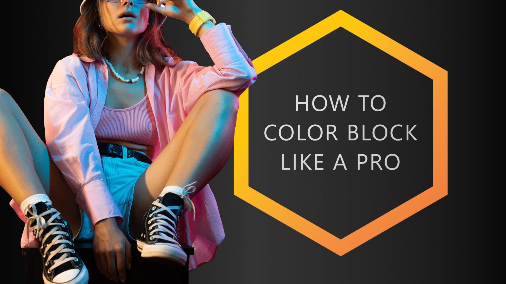
![Color Blocking [Full Guide to In-Your-Face Outfits]](https://images.squarespace-cdn.com/content/v1/5d91f9da52210569ede7ff3a/1646746930918-379H8IHBYZUTHYHXRC3P/COLORBUX+Banner+Color+Blocking+Fashion+Guide+Thumbnail.jpg)
Color Blocking [Full Guide to In-Your-Face Outfits]
Color blocking is the art of pairing together multiple blocks of solid bold colors that contrast strongly. The result is one cohesive outfit that stands out due to its stark color contrast and eye-catching composition.
What is Color Blocking?
Color blocking is the art of pairing together multiple blocks of solid bold colors that contrast strongly. The result is one cohesive outfit that stands out due to its stark color contrast and eye-catching composition.
Color blocking is a trend that's been around for a few years now and it's not going anywhere soon. It pairs together two or more bold color “blocks” to create a well-composed outfit.
The blocks are typically large pieces of clothing that are made up of one or maybe two solid and attention-grabbing colors. Pairing two or more very bold and strongly contrasting blocks of color is color blocking at its finest.
Now that we’ve scratched the surface, let’s get into more detail, shall we?
This color blocking crash course will teach you not only the basics, but also provide many tips and little secrets on how to rock color blocking in your day-to-day life.
Color Blocking Vocabulary
Schemes and Palettes
Before we get into the nitty-gritty of color blocking itself, it's important that you understand the vocabulary used to describe color blocking and color schemes.
A color scheme, in color theory terms, refers to any collection of colors chosen from any given color relation. Some examples of color relations include monochromatic, analogous, triadic color schemes, complementary, and so on.
Choosing a few colors and variations that pair and match well, then putting them together into a scheme, results in a color palette.
Each color palette has its own unique characteristic that sets it apart from other color palettes. Here’s an example for a color palette:

We go into much more detail on color palettes in our dedicated article. Check it out here to learn more.
The main idea behind color blocking is to use a color palette that includes two or more bold colors that contrast strongly against each other.
Though this isn’t an easy feat, when done correctly, you create a cohesive-looking outfit with eye-catching color contrast and composition. If you know how to put together a clothing color palette using a few bold colors, you’re ready to color block!
Contrast
It’s important to note that color blocking will only truly be “blocking” if the colors you're pairing contrast strongly enough against each other.
For example, pairing red and blue together would be fine because they are contrasting colors. However, pairing red with burgundy wouldn't work so well because they don’t contrast as much.
There are two types of contrast when it comes to color:
Contrast of hue (color contrast)
Contrast of luminance (difference in brightness)
If two colors are far apart on the color wheel, they have a lot of color contrast. If their hues are very different from each other, it’s very easy to tell two colors apart.
If one color is much brighter than the other, they have much contrast of luminance. Luminance is a fancy word to describe “perceived brightness”. Note that we’re emphasizing the word “perceived” – there’s a difference between actual brightness and perceived brightness.
It’s not that important that you understand the difference right now, but if you’d want to find out more later, you can open this link to our article about contrast. It explains everything in detail.
Canvas and Accent Colors
Canvas colors are those that make up the bulk of your outfit and that function as a type of “canvas” that you can “paint on”. Does that make sense?
Typical canvas colors are neutrals like black, gray, white, and brown but also navy blue, denim, or beige. These colors are the base upon which you add accent colors.
Accents are those that accentuate your outfit (obviously). By doing so, you give your get-up its much-needed character and appeal.
Any color can function as an accent but if you wish to color block, it’s almost mandatory that you accent with bright and bold colors.
The color-blocking trend is most commonly associated with solid, boldly colored tops and jackets (as accents). However, color blocking can be done with almost anything: pants, skirts, jeans, shorts, socks (duh), etc.
The key to making it work is to keep everything else really simple and neutral, so the color-blocked items stand out even more.
How to Color Block an Outfit
Now that you understand the theory, let’s dive into color blocking headfirst.
Easy in-your-face color blocking is the goal, right? So, listen up.
1. Choose Two Contrasting Colors
You'll want to start by combining two colors that contrast quite considerably. You can use any colors, but strong colors picked straight from the color wheel work great for this step.
As an example, let’s choose cyan (blue-green) and magenta (bright purple). Both are very bright, so they don’t have much contrast of luminance. They are, however, very far apart on the color wheel, so they do have a lot of color contrast.

Two colors that strongly contrast each other are magenta and cyan. They color block well.
Pick out at least one piece of clothing in each color and set them aside. Ideally, both pieces of clothing would be worn right next to each other to maximize the effectiveness of contrast (if not, that’s not a deal-breaker).
Make sure that both clothing items are solid (not patterned) and that their color is bright and strong. This is vital to simple color blocking success!
Themed clothes work if the theme’s color pairs well with both color blocks.
2. Find a Suitable Canvas Color
Next, fill up the rest of the outfit using pieces of neutral color. The goal here is to find your canvas color.
Black, gray, or white clothes work well with almost any bold accents, so you’re always good to go with those. We suggest doing so.
Browns and blues might be slightly trickier, but if you follow our guide to color palettes, you’ll quickly understand whether they work for your chosen accents or not.
Let’s add black as a canvas for our example outfit, shall we?

Add black to magenta and cyan and you get a very attention-grabbing color palette.
Get all those pieces of clothing you haven’t used as accents out of your closet and complete your outfit.
If you don’t have enough clothes in these (up to now only) three colors, then add a fourth. Stick to our Golden Rules of Color in Fashion to be sure to choose the right addition.
3. Make Sure the Colors Harmonize
Now that you’ve got all the necessary clothing items out of your wardrobe, you can easily see if the colors work well with each other (or not).
If they do, then you’re all set.
If they don’t pair well, then simply exchange one of the two bold color blocks.
Seriously, that’s all.
Here’s the resulting outfit from our color-blocked palette:

Looks pretty decent, right?
Obviously, you could do a lot to enhance the look of this outfit. And you know what? Let’s talk about how to go about doing that.
Repeating Blocked Colors
Well thought-through outfits repeat colors in multiple garments. That is what makes any get-up truly “cohesive”. Many people tend to forget this.
For example, if you have a tie that is red (or has red in its pattern), repeat the same red by wearing a pocket square of the same color.
If you’re feeling extra fancy, make sure your socks have the same red in them as well. Here’s a photo to prove to you that it makes an outfit truly cohesive:
Now, the outfit above isn’t what you’d typically call “color-blocked”. For that, the accents in red are much too small in proportion to the canvas. Color blocks have to be large, remember?
Check out this color-blocked style instead:

The light blue of our Colorbux socks is repeated in the sweater, making the color look super legit in the context of the outfit. The brown of the jacket (though arguably not an accent color, but rather a secondary canvas) is repeated in the shoes.
What a great color blocking double whammy!
Color Blocking with Patterns
Patterns are a tricky subject in the world of fashion. Though many people love them and wear them often, incorporating patterns into outfits (correctly) isn’t an easy task.
More often than not, patterns tend to be made up of different shades, tints, and tones of various hues – all arranged to lines, squares, dots, and whatnot. This makes pairing patterned clothes with other items quite difficult.
Now, as we’ve discussed before, color blocking is typically done with only solid-colored pieces of clothing. This should exclude patterns (and themes/prints) altogether, shouldn’t it?
Well, yes and no. Many patterns look quite monotonous from afar, so they could pass off as a solid. Also, sometimes patterns are made up of such large lines or shapes that the piece of clothing in question color-blocks in itself already.
Imagine a sweater that is part red, part purple, and part blue. All parts are split apart by some intricate design, forming a large pattern. Now imagine putting together an outfit using that sweater.
Tough, right?
Yes, this makes color blocking more difficult than usual. But it also makes it easier in a way.
The good thing (when having to work with multi-colored pieces of clothing) is that the piece in question predefines the colors you must focus on. It takes care of the brain work, so to say.
As soon as you understand this, the rest of the process is easy:
Repeat and reuse colors from the pattern elsewhere in your outfit.
Opt for a neutral canvas color – one that harmonizes with the pattern’s colors.
Make the patterned (or themed/printed) garment the focal point of the whole get-up. Make sure that it draws/gets the most attention.

Though not classic color-blocking, the outfit in the image above illustrates how to go about pairing with patterns and how to get them to be the focus of the desired style.
It’s important that none of the colors in the pattern clash with any of the colors in the rest of your outfit. This can happen quite easily if you don’t pay attention.
If you keep an eye on these pointers, it’ll be a breeze for you to put together color-blocked outfits using patterns.
Bold Versus Subdued Color Blocking
Bright colors block well with each other (and also typically look great when done correctly). However, bright colors are only effective if the color combinations don't clash too much because otherwise your outfit won't look cohesive.
Oftentimes, people don’t have many super flashy clothing items in their closet. If you’re one of those people, you’ll find it hard to put together a bold color-blocked get-up.
Color blocking doesn’t always have to be bold! You can also use lighter, less saturated colors for more toned-down outfits that still get their point across.
Note that we wrote “lighter”. As we’ve already discussed, it’s typically best to color block with colors that have high “perceived brightness”.
Well, light colors like rose (light red), baby blue, or mint (light blue-green), are great alternatives to color block with because they have high perceived brightness (due to their lightness). Why not try some of those out?
Just remember to stick to solid colors, ok? And also make sure the colors harmonize.
In any case, color blocking with less bold colors is certainly more low-key, so go ahead and wear it on days when you want to keep things a bit more casual!
If color blocking intimidates you, start small by branching out into lighter colors while sticking to simple color combinations. Try not to opt for overly flashy colors or too many different colors at once if you’re not quite ready for it yet.
Going for less flashy or in-your-face color combos makes putting together a color-blocked outfit quite a bit easier. Just remember the 10 Golden Rules for Color in Fashion - they make color pairing a breeze.
Color-Blocked Style
Color-blocked outfits are trendy, bold, and in your face! If you want to give color blocking a try but don’t know where to start, we’ve given you a guide for some ideas on how to not just get started with color blocking, but to master it.
Of course, there are infinite possibilities when it comes to color blocking and color schemes. But by using the pointers we’ve outlined in this article (and our many other posts), you should be able to quickly put together get-ups easily and effectively.
And that’s what we at Colorbux are all about: Getting you places by teaching you color.
We give you the keys to the Lambo so that you know what you’re doing when it comes to style and fashion. And now that you’ve learned (almost) all there is to know about color blocking, go knock some socks off!
Also, if you’d like to show your appreciation, we’d seriously enjoy a nice Google review. It would help us out a bunch since we’re pretty slim (to say the least) when it comes to online feedback on third-party platforms.
ARTICLES OTHERS LIKE:
![Monochrome Style [Full Guide Plus Examples]](https://images.squarespace-cdn.com/content/v1/5d91f9da52210569ede7ff3a/1642857375701-LH2G67A31EQKYG3TVZ0T/COLORBUX+Monochrome+Style+Guide+One-Colored+Outfits+BANNER+Thumbnail.jpg)
Monochrome Style [Full Guide Plus Examples]
Monochrome style is what you get by creating a cohesive look using only one color. In fashion and design, you also incorporate different shades, tints, and tones of the same family on the color wheel (hue) into a monochromatic color scheme.

Monochrome Style – when done right – can be absolutely mesmerizing. Sadly, most people who try out a monochromatic Outfit get it wrong.
No, it’s not as easy to pull off as you might think. There are quite a few factors you have to consider when putting together a monochrome color scheme for your clothing.
What is Monochrome Style?
Mono means “one” and chroma means “color”. So, monochrome style is what you get by creating a cohesive look using only one color. In fashion and design, you also incorporate different shades, tints, and tones of the same family on the color wheel (hue) into a monochromatic color scheme.

Monochromatic looks use only colors from the same hue. In this example the hue is blue.

This color palette consists of only variations of blue: shades, tones, and tints.
Monochromatic clothing can be created through layering or wearing items together in order to create a monotone outfit that is still eye-catching and stylish. The monotonous nature of monochromatic clothes means they're easier to put together than an outfit with multiple colors.
There’s just one quite obvious catch with all clothing pieces having the same color: You have to own every piece in the same color.
Key Things to Remember
There are a few things to remember when creating a monochrome outfit:
Make sure there is some variation in the shades, tints, and tones of the color palette you choose. For example, if you're wearing all shades of blue, add in a pop of very light blue somewhere in your outfit to accent and make the whole get-up more interesting.
Don't be afraid to mix different textures together. This will add visual interest to your look.
Accessorize! A monochrome outfit can still use accessories to add personality. Try adding a scarf or belt of the same color family to make what you're wearing more complex-looking. Wear matching makeup to complete the look.
Black and white are not in fact part of the monochrome scheme of any hue. This is quite important to note, so there's more on this later in the article.
Examples of Monochrome Outfits
Here are a few monochrome style examples to give you an idea of how it can be done:
Example 1: Shades and tints of red.
The key to creating a monochromatic look is to make sure there is some variation in the shades, tints, and tones of the color palette you choose. In this example, the different shades and tints of red create a cohesive monochrome look.
The outfit is also styled in a way that adds visual interest; The layering of different clothing items and various degrees of lightness create dimension. Accessories such as a belt, matching shoes, and a watch help to pull the outfit together and add personality.
Pink is a light variant of red. As such, we can create a monochromatic look easily. | Socks: Pineable
Example 2: Shades of Brown.
This monochrome outfit uses different shades, tints, and tones of brown to create a pleasing look.
Brown is essentially just a form of orange or yellow-orange. Though it’s not always easy to perfectly match various browns, that shouldn’t actually be the goal.
Different brown-ish colors are hard to tell apart but, therefore, easy to pair with each other.

Example 3: Variations of blue.
This monochrome outfit uses different shades and intensities of blue to create a cohesive look. As mentioned earlier, it's important to add some variation to your color palette to avoid looking too monotonous.
In this example, there is some variation in the tones of blue, but they all fall within the same color family on the color wheel.

Black and White - An Exception to Monochrome Style?
You may have noticed from the examples of monochrome outfits above that black and white were not included as colors within the monochromatic schemes. It may seem odd that they were left out given that they are simply very dark/light versions of any hue.
There is a reason for this.
Yes, even though white is technically a very light form of blue (or yellow, orange, green, and so on, for that matter), it shouldn’t be used in monochromatic style. The same goes for black, obviously.
You could, however, put together an outfit consisting only of either black or white pieces of clothing to make an entirely new type of monochromatic look: an achromatic one.
Achromatic color schemes are defined as schemes that lack “color” and saturation. They consist of either various shades/tints of gray, black, white, or all of them together.
Effectively, you can make three different types of monochromatic (actually achromatic) outfits using colorless clothes:
All-black
All-white
Gray (including or excluding some white or black elements)
All three options are classic staples in fashion. They’ve been used countless times on the runway and are – quite honestly – simple to pull off.
Most people own many clothing pieces in black, white, or gray. In fact, black is the most common color in clothing, so it’s super easy to put together all-black outfits. Just swing open your dresser and slap on all the black clothes you want and you’re good to go.
Presto! You’ve put together your first monochromatic/achromatic outfit.
Dichromatic Outfits
Dichromatic outfits are those that incorporate two different hues. For example, an outfit that consists of reds and blues would be considered dichromatic.
In fashion, the most common color pair for two-colored get-ups is black and red. In fact, any other color paired with black is quite common.
Dichromatic outfits using black as one of the two colors are among the easiest outfit combos to pull off. Seriously. Just put on your favorite black clothing pieces and sprinkle in accents of only one other color. It’s that easy.
For example, slip on a black suit, black shoes, and a black shirt. Now, accent with a red bowtie and red suspender and you’ve got yourself a perfectly viable dichromatic outfit.

Pair black with another color and you’ve got yourself a dichromatic outfit.
It looks composed, sophisticated, and (most importantly) thought-out. Plus, it’s the easiest way to put together an outfit using color. Hands down.
DICHROMATIC SOCKS:


A true classic themed pair of socks: The Spicy Chili. We all love them - in secret - and because of the easy to combine blue base color, these socks go well with many types of outfits.
Colors used:
Blue (base)
Red (accent)
Monochrome Versus Polychrome
Polychrome means “multiple colors”. Any outfit that makes use of multiple hues counts as a polychromatic one. Typically, polychromatic outfits are harder to put together than monochromatic ones – at least if you want them to look good.
Going monochrome makes pairing colors easier because you only have to use colors that come from the same color family. You don’t have to pay attention to clashing, analogous pairing, complementary schemes, or whatnot. It all doesn’t matter.
But this is also what makes monochrome style so difficult to pull off.
You must actually own all pieces of an outfit in your desired color to be able to even think about donning a monochrome get-up.
It is for this reason that many people shy away from wearing only one color. It is also why most usually go polychrome: ease of use.
Now, if you’re struggling with putting together smashing outfits that are polychromatic, we’ve got you covered! At Colorbux, this is what we do all day – we get you places by teaching you color.
More precisely, we show you how to use color in fashion effectively (and correctly) to make the impression you want to make using the clothes you already own.
And guess what? We give you all the info for free. Go through our list of articles here and see for yourself.
Thanks for reading. We hope you learned a lot about monochrome style and how to use it. If you have any questions, please don’t hesitate to contact us. Seriously.
Also, if you’d like to show your appreciation, we’d seriously enjoy a nice Google review. It would help us out a bunch since we’re pretty slim (to say the least) when it comes to online feedback on third-party platforms.
ARTICLES YOU MIGHT LIKE:

Which Color is Best for a Suit?
The best color for a suit is a rather dark navy blue. A dark blue suit complements almost every skin tone and hair color. Also, navy blue looks great with both black, brown, white, and gray, making it a good match for any shoe or shirt color.
There are many colors that gentlemen might want to consider when looking for a new suit. But there are only a select few that are ideal and only one color that sits at the top.
You might be wondering if black is the best choice or if there's something else out there that might work better for you. In any case, in this article, we're going to explore a few aspects you need to consider.
The most common colors for suits are black, navy blue, most shades of gray, and brown.
Which of the four that looks the best has to do with a lot of different factors. First and foremost, it depends on which color fits your skin, hair, and personality the best. Other factors are occasion, style/cut of the suit itself, and even season.
The Ideal Color for a Suit
All in all, the best color for a suit is a rather dark navy blue. A dark blue suit complements almost every skin tone and hair color. Also, navy blue looks great with both black, brown, white, and gray, making it a good match for any shoe or shirt color.
Now, it’s important to note that just because there is such a thing as a “best suit color”, this doesn’t mean you’ll only need the one suit for the rest of your life. Most men tend to own multiple, in fact.
So, if navy blue isn’t your preferred color or you already have such a suit, then we suggest taking a look at the following valid alternatives.
The Most Common Suit Colors
Black
Let's start with black. Black is one of the most popular colors for suits, and it is most often worn during serious or formal occasions such as funerals, weddings, job interviews, etc.
It looks very elegant and timeless but, sadly, can also make you look larger. This maybe isn’t what most of us want.
If you’d like to wear a black suit, nonetheless, we recommend wearing a lighter color shirt in combination with a colorful tie. This will reduce that “overwhelming” look and add some variety to your outfit.
Try to accent a predominately black outfit with a bold accent color.
Black clothing comes with a few decent benefits:
Black goes with almost any other color. This makes pairing, mixing, and matching a breeze.
The color is suitable for many different occasions. There are only a few times you shouldn’t wear too much black, like at a kids’ birthday party, for example.
Black clothing isn’t flashy (obviously), so you rarely stand out in ways that others might not like.
There is a lot of color-psychological symbolism behind black. When worn, black is a symbol of class, sophistication, business, elegance, and sexiness while often also having an overbearing, even sometimes evil character to it.
Be sure to know what you’re doing if you choose to wear an all-black outfit.
Nonetheless, black is always going to be a staple in any man's wardrobe. If you wish to have a second suit on hand, then we seriously recommend opting for a pure black one. Another very valid candidate for the role as a second suit would be gray.
By the way, black is one of the best colors for a tie. And yes, it also fits a black suit perfectly.
GO WELL WITH BLACK SUITS:


Who says, non-conformists can't style like the big boys? Style Punk socks bring out the rebellion in any ordinary mortal. Get your office pals out of their seats and bring on the rock and roll! Warning: insanity could be inevitable. Wear with caution.
Colors used:
Gray (base)
Light yellow-green (accent)
(Light) blue (accent)
Light blue-purple (accent)
Red (accent)
White (sub)
Black (sub)
Gray
Gray is another color that looks good on almost everybody and isn't too difficult to match with.
Gray is a great color for business suits as well as more casual attire. As a rule of thumb, you could say that the darker the gray, the more “suit”-able it is for more serious occasions, and the lighter the gray, the more casual the suit.
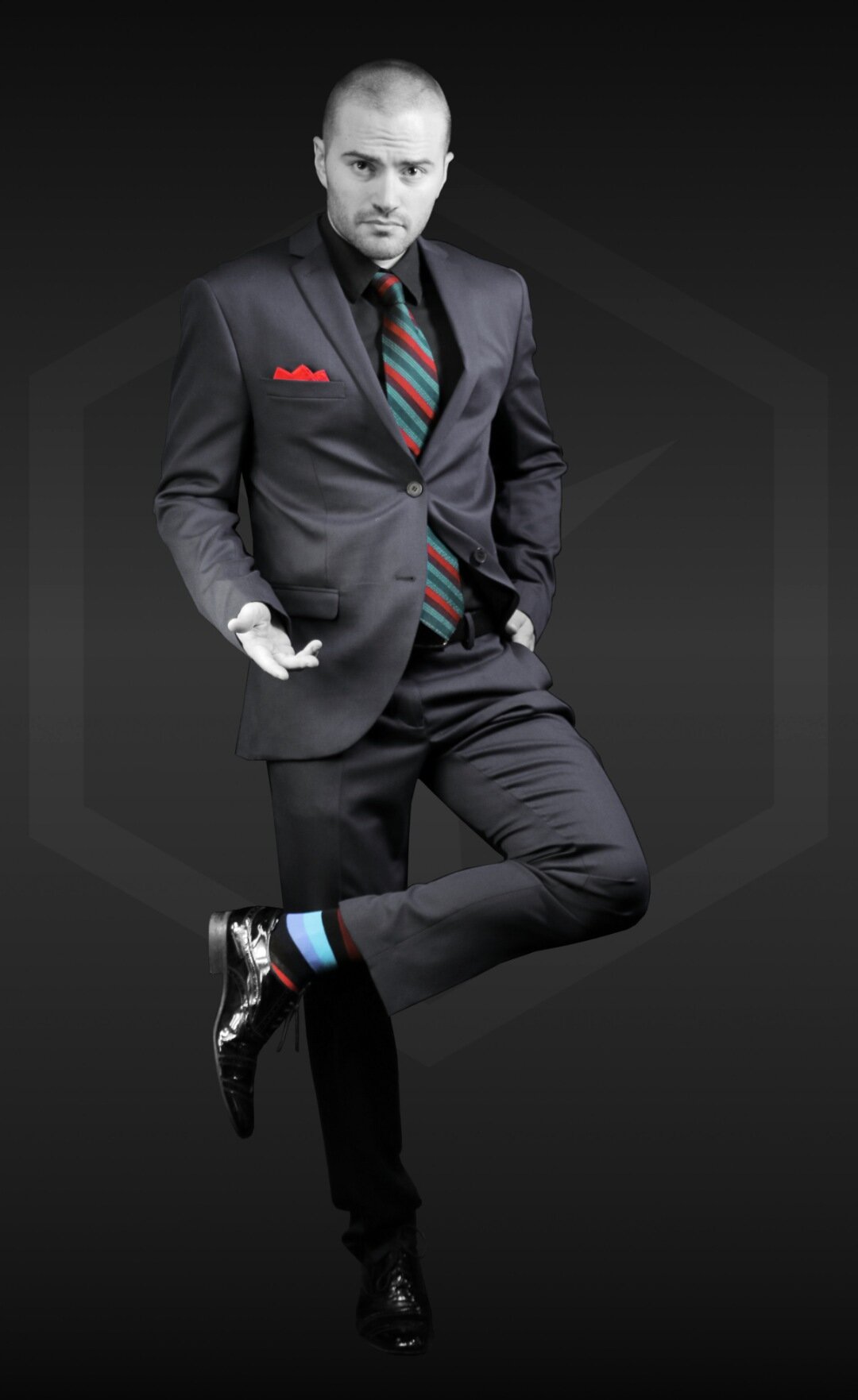
We go into much more detail on the topic of dark versus light colors in this article, if you’re interested.
A dark, charcoal, or anthracite gray suit is a great choice because it brings with it all the benefits of a black suit without actually being black. Since dark gray is less dark than black, it is also less overbearing and slightly more friendly-looking. It lightens the mood in an office setting compared to an all-black get-up.
A light gray suit, on the other hand, is maybe too casual for the office (depending on the office, of course). Light gray suits are best for formal summer or spring events like weddings or garden parties.
We go into a lot of detail concerning the color psychology of gray in another article of ours, but here’s a short summary just so you know what you get with a gray suit:
Gray symbolizes sophistication, elegance, stability, simplicity, neutrality, and/or minimalism. In fashion, gray is a neutral color typically used to make an outfit less noticeable and prominent. Yes, even more so than black.
In other words: choose gray as a suit color if you wish to have a good all-rounder in your wardrobe that you can wear to both formal and semi-casual events, but also to the office.
We suggest opting for a darker type of gray for maximum efficiency. Colors like anthracite or charcoal are ideal options.
By the way, don't be afraid to try out gray suits with some patterns like pinstripes or plaids. Just make sure that the rest of the outfit uses solid colors and textures.
Blue
There are many variations of blue that are common as suit colors. But what is typically the case, is that they’re rather dark. Or more precisely, maybe: blue suits are rarely light.
The most often seen kind of blue suit is either royal blue, or navy blue. Sometimes you’ll stumble across a baby blue or even a muted blue suit, but that’s not very likely.
Dark blue is a great suit color. It’s elegant and sophisticated, yet still casual enough. | Socks: Pineable
As with gray, the darker the blue, the more suitable it is for serious occasions. And obviously, the opposite is also the case; the lighter the blue, the more playful it looks and the less fitting it is for business and “black-tie” events.
Royal blue is one of our favorites and happens to be one of the easiest bold colors to match with. You can easily put together a blue suit with almost any* color shirt/tie and it will look great! Royal blue is another color that looks good on many men, but it especially looks nice on people who have fair skin and light hair.
A navy-blue suit is an absolute classic. If you read our orange short answer box at the beginning of this article, you already know: Navy blue is the “best” color for a suit. Why? Let us go into detail towards the end of this article, ok? We need more space for this.
There is a load of color-psychologic meaning behind blue, but here’s a short summary for you:
The color blue symbolizes calmness, intelligence, sincerity, and confidence. It projects a sense of calmness and security on a wearer and on others.
Wear a blue suit to look smart and confident. Lean towards darker blues to add some more authoritativeness.
Pro tip: Blue is one of the best colors to wear if you wish to make a good first impression. It’s also a great color for monochromatic outfits.
Brown
Last but not least, brown (and variations of brown, like beige and tan).
Brown is another suit color that can be worn all year round depending on what you decide to wear it with. This color looks great on people with lighter skin.
If you have a rather dark complexion, we recommend staying away from wearing a lot of brown because it might not look right with your skin tone. We explain why in our article on the ideal clothing colors for dark skin.
All types of brown can be worn for casual occasions or even (if you're feeling really bold) to formal events as well.
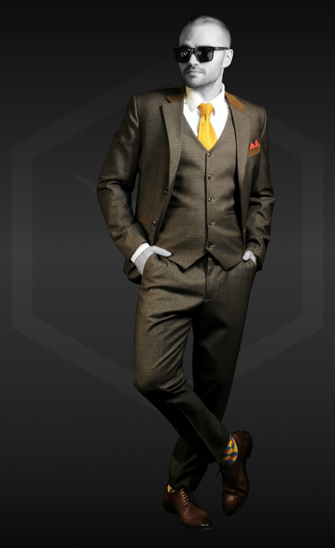
Keep in mind, though, that (as with all the previous colors) the darker the brown, the more suitable it is for times when it’s important to look serious.
Light brown suits (tan, khaki, or beige) are great for semi-casual events, where people like to mingle and small talk. Summer cocktail parties are the ideal occasion to rock that beige linen blazer you’ve been hiding in the closet. Conversely, don’t wear it to important business meetings or black-tie events.
Brown and dark brown suits are good all-rounders like gray suits. Sadly, though, when you predominately wear brown, you shouldn’t accent with black or gray. That just looks wrong. So, you restrict the number of possible accessories you can wear when you opt for a brown suit versus a gray one.
Variations of brown are perfect for the spring and summertime because they don’t absorb as much light and heat in warmer weather. You can easily match them with lighter colors like yellows, light blues, and light greens to complete that fresh look people are going for when spring arrives.
The Best Suit Color
Now that we know which colors are the most common choices for suits, we also start to realize why they are the most common: ease of use.
The whole idea behind wearing a suit is to look authoritative, dependable, classy, sophisticated, and/or professional. Wouldn’t you agree?
So, it’s important to find a suit that helps you “look the part” while being easy to wear. And by that, we mean the suit should be easy to pair with all types of shirts, shoes, belts, and other accessories.
This begs the question: “Which color suit can do all that?”. Well, the answer is:
Navy blue.

If you wear a navy blue suit, people regard you as intelligent, trustworthy, and calm. And, since navy blue is a mixture of blue and black, the color-psychological properties of black are inherited as well.
This means that you are also perceived to be sophisticated, authoritative, and classy.
Almost any other color goes well with a navy blue suit. Especially the most common clothing and accessory colors (neutrals) such as black, gray, brown, white, and blue work extremely well with navy blue.
No other color except for white works with the other four neutrals.
And no, this doesn’t mean you should go for a white suit. Please, don’t even think about it – unless you’re a member of a boyband, of course.
The majority of common accent colors harmonize well with navy blue, too. Colors like orange, yellow, and red pair beautifully when worn as ties, pocket squares, or Colorbux socks (obviously).
A navy blue suit can be worn in almost any setting. It’s formal enough to wear to a classy dinner party, yet casual enough to wear to a summer get-together with friends. What’s more, navy blue suits are so professional looking that they’re considered the heart of classic business attire.
There’s no other suit color that is as versatile, easy to wear, or fitting for almost all occasions as navy blue.
What About Charcoal/Anthracite?
Now, that said, dark gray suits come in as a close second. Arguably, you could say it’s a tie. But there are two small facts that help navy blue outrank dark grays.
Dark gray looks hideous when paired with brown. So, you can forget to wear brown shoes or belts with a charcoal suit.
Anthracite and charcoal suits aren’t very casual. The lack of color in dark gray makes for a much less “happy-go-lucky” vibe.
In other words: dark gray is less versatile and can’t be worn on as many different occasions as navy blue. It’s as simple as that.
But is dark gray the definite number two? Certainly yes.
What Color Should Your First Suit Be?
If you haven’t bought a suit yet, this might be the ultimate question for you, right? Well, before we get to the answer, ask yourself this: “What do you need the suit for?”.
We know now which is the best suit color overall, but is it the one you’d want on your first suit? The answer depends on two things:
You and your preferences
The reason for buying a suit
As we’ve learned in this article, certain color suits are better worn to occasions where other colors tend to lag and vice versa. And now that you know which is best for what, you can make up your mind more easily.
In short, and to be completely honest with you, the choice is up to you. But if you want our input, here it is:
Your first suit should be either navy blue or dark gray. Either color is easy to pair with others and is suitable for a vast variety of occasions. You rarely fall flat with a navy-blue or charcoal-colored suit.
Black, brown, and light-gray-colored suits are those you should maybe consider purchasing after you already own the first two options.
If we’d have to make an ordered list in which any man should consider buying suits, it would look like this:
Navy blue
Charcoal/anthracite/dark gray
Black
Mouse gray/light gray
Brown
Beige
Light/muted blue
Any other color

If you’re a newcomer to the world of suits, we really hope this list helps.
If you’d like to show your appreciation, we’d seriously enjoy a nice Google review. It would help us out a bunch since we’re pretty slim (to say the least) when it comes to online feedback on third-party platforms.
What To Look Out For When Choosing a Suit Color?
To sum up this article, let’s briefly go through the aspects you should consider when choosing a suit color.
What occasion are you wearing the suit for? Are you going to the office or are you attending a wedding? Opt for a darker suit color if the event is more formal and serious.
Make sure the suit color doesn’t clash with your skin tone. If you have darker skin, try not to wear dark brown. Most any other common suit color will do, though.
Ideally, wear the right seasonal color. Dark blue is fine for all seasons, but the other colors do actually have some seasonality. Read this article to learn more about which color is best for which season.
Which color psychological effect do you wish the suit to have on others? Color can strongly affect how you are perceived by those around you. Learn more here.
Make sure you like the color you’re wearing. If you don’t feel good donning a certain color, then don’t do so.
Obviously, there are many more aspects you might have to consider when picking a suit color. But we think we’ve listed the most important ones, right?
In any case, don’t choose to wear a navy blue suit just because we say it’s the “best” choice. Find out for yourself which color is best for you.
Nonetheless, we hope this article helped you on your journey to the perfect suit color. If so, remember to leave us some feedback. We’d really appreciate it. Thanks for reading.
OUR NEWEST ARTICLES:

Clothing Colors That Make You Look Tan
You need to wear light and bright colors from either the orange or the blue side of the color wheel to enhance your tan. Any other color will either not affect your tan at all or make you look paler.

There are many different clothing colors that help you achieve a natural-looking tan when you're a bit heavy on the "pale scale". But, which colors best help you have a more colored complexion? Well, let's find out.
Clothing colors make a huge difference on your complexion. If you have quite fair skin, then lighter clothing, which are white or pastel-colored, may not make you look as bronzed as you might think. This is due to the lack of contrast with your skin tone.
Conversely, if you’re already slightly tanned or have naturally olive skin, then the opposite can be the case! Weird, right?
What to Wear to Look More Tanned
Clothing colors that enhance a natural tan are those that complement and contrast brown. Those are colors like orange, yellow, red-orange, teal, turquoise, lilac, blue-purple and various light pastels. It’s typically best to wear clothing that is significantly lighter than your skin if you wish to look tanned. Make sure the contrast to the tanned skin is just right, though.
Yes, it’s not easy to pick out the right color to make you look tan. There are many different solutions (luckily), so strap in and let us tell you what you should look out for when trying to enhance your natural tan.
How to Enhance a Tan Using Color
The only thing better than a nice tan is a healthy, natural looking one. The great news is that achieving one can be as easy as choosing the right clothing colors.
You might not think that the color of your clothes make such a difference in how you look, but it does! And it's not just about light or dark clothing either - what matters most is the contrast between your skin and the color of your clothes.
Complementary Colors to Tan
One way to achieve contrast to your skin tone is by choosing colors from the complementary side of the color wheel.

Orange’s complementary color is blue and its split-complementary colors are blue-green and blue-purple.
For tan (a light tone of orange) it means that you pick a color that is on the cold side of the color wheel. We suggest opting for colors such as turquoise, teal, mystique purple, or lilac.
Typically, going full complementary (blue) can yield mixed results. Especially if you have pale skin, blue isn’t the ideal choice. We explain why in our full article on the best clothing colors for fair skin.
If you are quite tanned, though, then a bold, strong blue may actually do the trick. Just always pay attention to the contrast of luminance. Don’t know what we mean? Let us explain.
Contrast the Lightness of Your Skin
Something light on something light makes both things look light, right?
Man, we should write more poetry (not)…
The same goes for things that are dark. But guess what? This is true until it isn’t anymore. Let us show you what we mean:

A super bright gray next to pure white looks very light as well. You can obviously tell the difference between the two, but you’d consider both to be very light colors.

If you put white next to a slightly darker tint of gray, you suddenly notice a large difference and the gray seems rather dark.

Hold up the same gray tint next to pure black and you suddenly realize that the gray you thought was dark is effectively still extremely light.
You see? Light is light, and dark is dark – until it isn’t. This is the power of contrast.
Anyway, enough theory for now – back to the topic of how to make skin look more tanned.
Now that you know the logic behind contrast, the following might be a lot clearer:
If you want to look more tanned, you must make your skin seem not only browner but also darker. To do so, your clothing has to be lighter than your skin tone. Significantly lighter, to be exact.
To make your skin look darker, you must make it seem darker than what you’re wearing by opting for lighter colors that contrast the lightness of your skin enough, yet not too much.
However, this is a problem if you have very light skin. Then wearing similarly light clothing has the opposite effect. More on this later in the article. At least now, thanks to the color theory above, you know why.
Analogous Colors to Tan
Colors that are to the left and right of tan (orange hue) are considered analogous. Analogous colors enhance each others’ coloring because they are similar enough, yet not indistinguishable.
Do you remember what we said about contrast of lightness? Well, the opposite applies to contrast of hue.
To enhance coloration, you either go complementary (we’ve covered that), or you lean towards the analogous side of the spectrum.
Applied to tan, this means:
To make your skin look browner, you must enhance its coloration by wearing very similar or very different colored clothing. Anything in between won’t cut it.
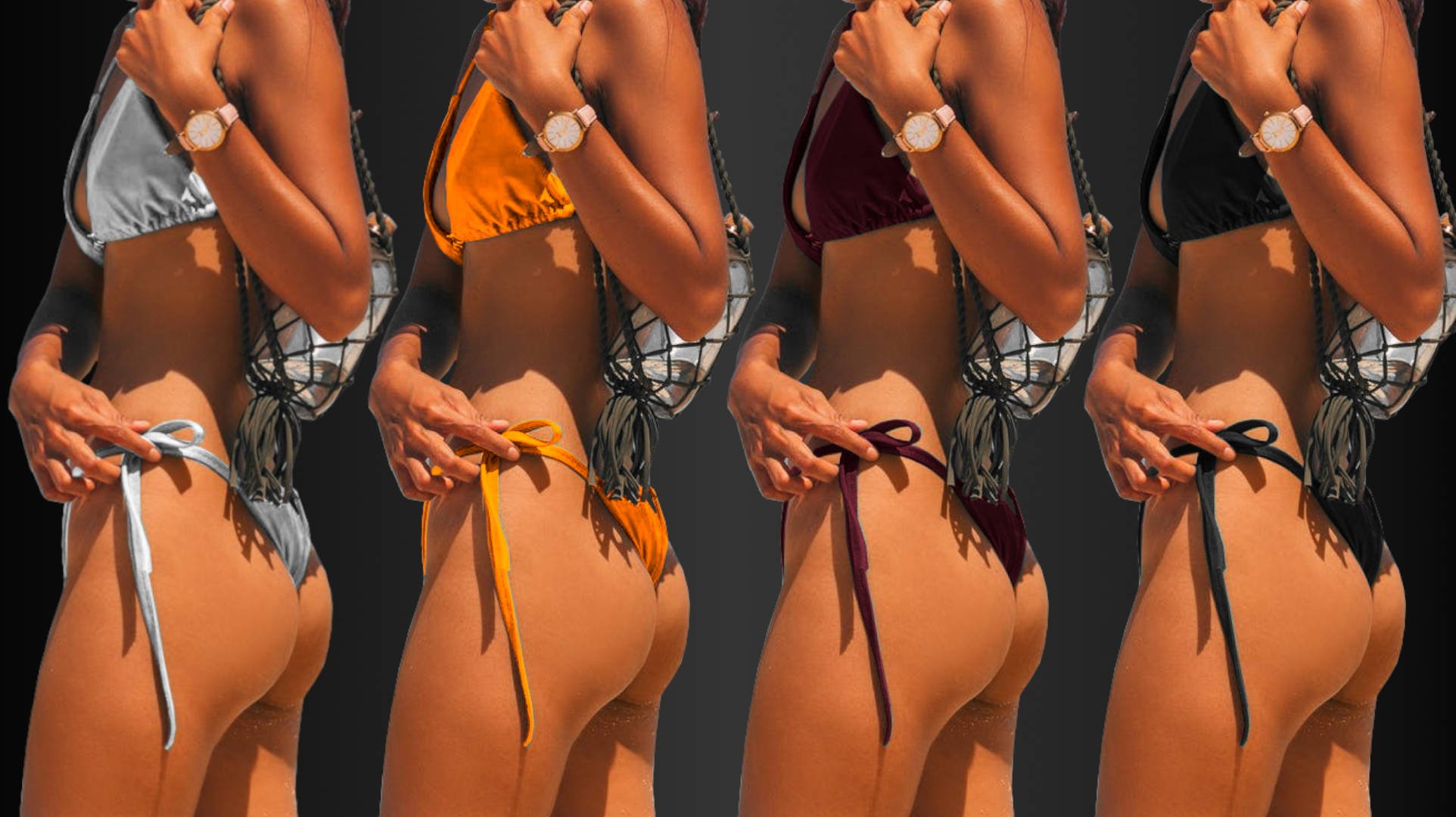
Which color bikini makes the model’s skin look most tanned?
Ideal Colors to Wear to Look More Tan
Now we know that to look tanned, you should wear colors that are
significantly lighter than your skin tone and
either very different or rather similar to its hue.
This gives us quite a spectrum of clothing colors to work with. Sadly, there are some very common colors you might have to cross off your list of favorites if you want to look like you’ve spent some time in the sun.
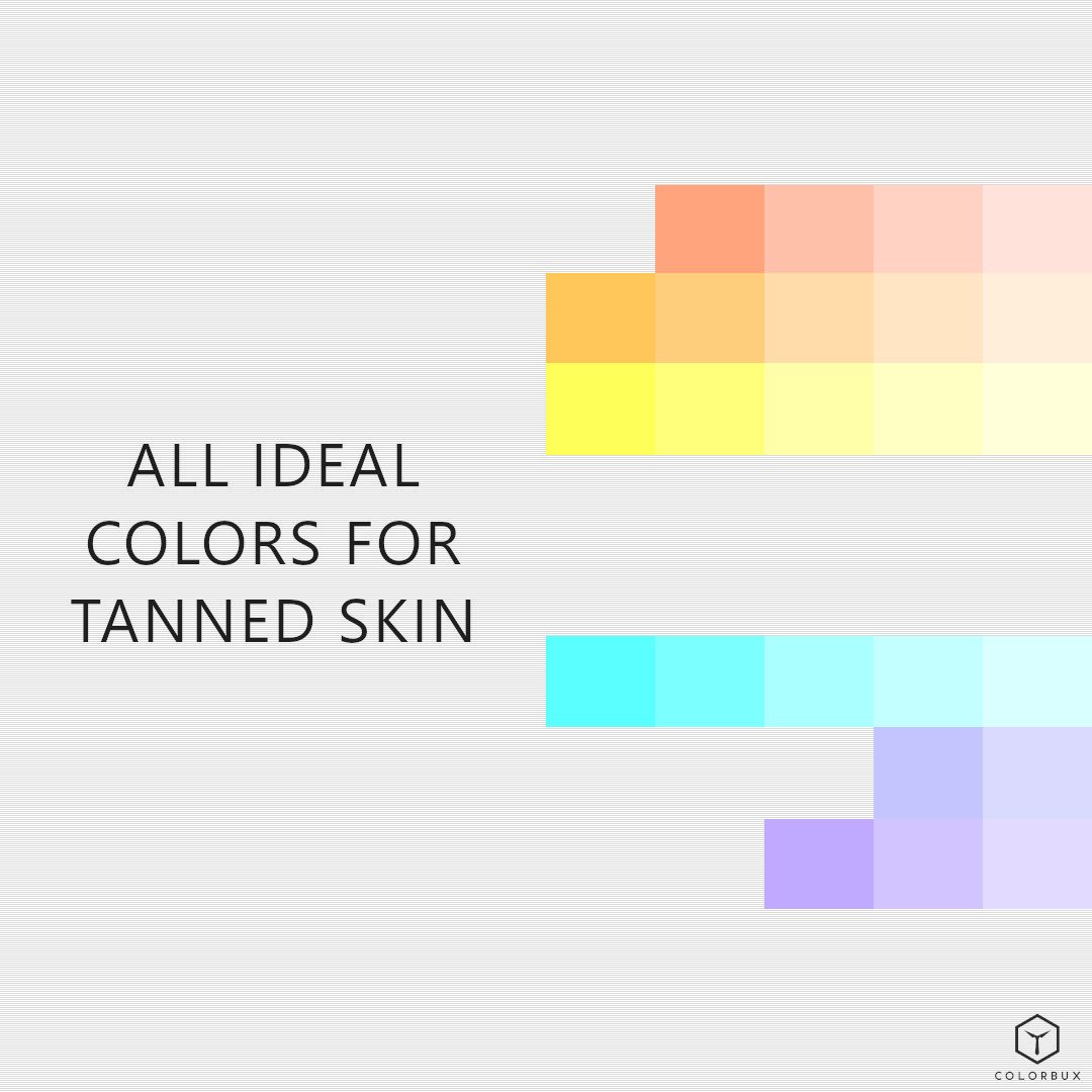
Some perfectly good choices for tanned skin include:
Skin
Light Orange
Light Yellow / Sunshine
Aqua
Light Blue
Light Lilac
Less Ideal (But Still Viable) Colors to Wear
Less ideal colors to help you look tan are those that fit only one of the two criteria above and are either
significantly lighter than your skin tone or
either very different or rather similar to its hue.
These are colors like red- or green-infused pastels (too little/much hue-contrast) or any type of dark color (not lighter than skin) that is either on the orange/yellow side or the blue side of the color wheel.

These colors include:
Light Pink
Rose
Lavender
Lilac
Light Green
Lime
Chartreuse
Blue
Navy
Teal
Blue-Purples
Brown
Rust
Mustard / Olive
Be Careful with These Picks
There are three colors you should be careful with when trying to look tan. Heads up: It’s important to not wear too much of them.

Pink: Though often a great choice for clothing; when it comes to looking tan, you should think twice. Pink can make you look sunburnt rather than tan because it brings out the red in your skin undertone. The same goes for any other type of red, by the way. More on that later, though.

Baby blue: One of the easiest colors to wear any time of the year. But sadly, most baby blues are too dark to help you look tan. Don’t believe us? Well, blue is the color with the lowest amount of luminance. You’ll have to add a lot of white to blue to make a baby blue that is light enough to be lighter than your skin tone. That said, very light blue does actually work.

Black: The most common clothing color is one to maybe avoid when you’re trying to enhance your bronzed glow. Firstly, it is obviously darker than your skin, so it can’t help it look darker. And secondly, it just doesn’t fit the picture. Black just doesn’t give you the feeling of “sunshine” and “beach”, does it?
This is actually quite a pity because black is the color that hides sweat stains the best of all. Luckily, white isn’t that bad either.
Though all three of these colors are staples in clothing and fashion, none of them are good at enhancing a natural tan. Stick to other colors and you’ll do a lot better.
Can White Make You Look Tan?
White is often also a viable “color” to help you look tan – but not always. We purposefully put it in a category of its own because it can be a seriously sub-optimal choice for those of us who lack skin coloration.
In other words: white is bad for pale folks.
Why? Well, if you have fair skin, white is simply too similar when it comes to lightness. Plus, it lacks any coloration, so it can’t enhance (or reduce) any of your skin’s natural undertones.
And though this can be a good thing, it often is something to avoid.

As soon as you are tanned enough, white becomes a very good choice. This is because of the now apparent contrast (obviously).
So, if you can already boast a nice suntan, then go for white clothing. It’ll make your skin look super bronzed.
Colors to Avoid if You Want to Look Tan
If you want to avoid diluting your tan, then shy away from colors that fit none of the two criteria we’ve been talking about in the past few paragraphs. Avoid colors that are both
similar to or darker than your skin tone
and are on the red or green side of the color spectrum.
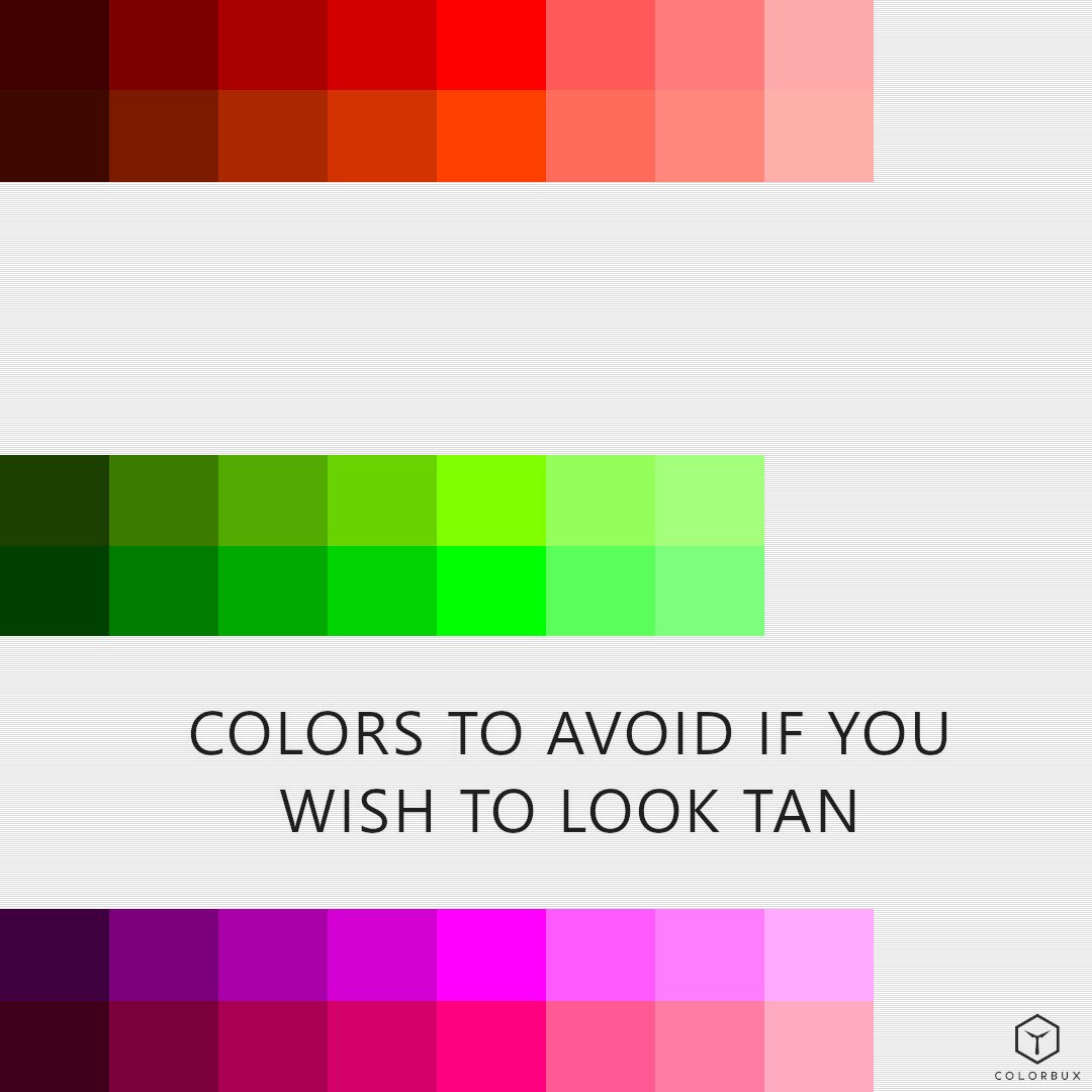
Classic jewel tones will look great when you’re pale – there’s no doubt about that – but they’re not ideal for highlighting a tan.
Red brings out the redness of your skin which, in turn, makes you look sunburnt rather than bronzed. The same goes for green. Being the complementary color of red, it highlights the red of your skin rather than the brown.
Darker colors also make your skin appear lighter than it most likely is. This is due to contrast – we’ve established that a few times in this article, haven’t we?
Colors to absolutely avoid if you wish to look bronze:
Muted/dark red
Purple
Forest green
Muted/dark green
Classic green camouflage wear
Short Summary
In this article, we explored some different colors of clothing that can help with enhancing a tan. It only takes a few well-placed colors and you’re good to go.
So now that you know some of the colors that can help you achieve a more tanned look, try incorporating them in your wardrobe. You may surprise yourself with how much better something as simple as a light-yellow shirt, for example, can bring out that bronzed glow you’ve been aiming for.
Gold and yellow are both warm colors that complement your complexion if it has a grayish cast. Other forms of bright and light orange have a similar effect.
Light and bright colors from the other side of the color wheel complement a natural bronze tone well and bring out the orange in your skin making you look tanner.
The key to looking tan is to have enough contrast between your skin tone and the color you're wearing. In order to achieve this, you need the right color clothing. Simply wearing a color that is just a bit lighter than your actual skin tone won't work wonders.
This is why you need light and bright colors from either the orange or the blue side of the color wheel to enhance your tan.
And with that statement we end our article on the topic and wish you all the best showing off that smashing tan of yours. If you’d like to read more about color in fashion, read up on our articles by clicking the button below or sign up to our member letter to get a few emails a month updating you on the latest tips and tricks in the world of color.
RECENT ARTICLES:

What colors are considered unprofessional?
Some of the most unprofessional colors include pink, orange, yellow, green, and purple. These colors are usually too flashy or bold to be worn in professional situations when you want to look more serious and authoritative.

You might think that only black, navy blue, and gray are considered professional colors. But this isn't necessarily the case. You can wear any color (or combination of colors) if it fits your profession and is appropriate for the occasion.
But that’s just it, right? How do you know what fits or is appropriate?
For instance, a lawyer might wear either black or navy blue but most likely never orange, right? It just doesn’t work.
And guess what? There are reasons for that!
Let us show you which colors are regarded as “unprofessional” and why.
Which colors are considered unprofessional?
Some of the most unprofessional colors include pink, orange, yellow, green, and purple. These colors are usually too flashy or bold to be worn in professional situations when you want to look more serious and authoritative.
But please note that our selection isn’t applicable to every job in the world. Certain professions simply require you to wear unconventional colors.
Does The Color Fit and Is It Appropriate?
As we’ve already established many times in our articles, the color you wear plays a large role in how people perceive you.
This, in turn, is one of the most important reasons why certain uniforms adhere to given color schemes – worldwide!
Doctors typically wear white, builders wear bright yellow or orange, and financial service providers wear shades or tones of blue or gray. Police uniforms are either dark blue or black and Buddhist monks’ robes are orange.
Professions are almost always associated with certain clothing colors. Pick any job. We’re sure when you picture a person in the corresponding attire, they’ll have some sort of notable color scheme to their wardrobe, no?
Stagehands wear all black, IT personnel opts for black printed shirts and blue jeans, carpenters wear mostly brown or tan clothing, and so on – you get the picture.
Obviously, this is all just prejudice and shouldn’t be taken too seriously. There are always exceptions. But, nonetheless, prejudices come from somewhere, right?
This fact is exactly what makes an outfit (or its color) appropriate or not.
It all has to do with the connotation. Which color suits which profession best and which should be avoided because we (as humans) just aren’t used to seeing them?
APPROPRIATE FOR THE OFFICE:
A bit different from burgundy. The colors on these “Bordeaux” socks go well with any smart-casual or business outfit.
Colors used:
Black (base)
Burgundy (accent)
Red (accent)
Bright blue-green (accent)
Light blue (sub)
Quick Guidelines and Examples
Here are some guidelines on what colors would look good in certain professions and which ones should be avoided:

Most professions have a certain clothing color scheme associated with them.
Medical staff typically wears white. It symbolizes cleanliness and purity, making it a great choice in the first place. However, a doctor will want to avoid wearing green because people sometimes associate it with death. However, other colors like browns, blue-greens, and purples are fine.
If you work in a rather casual office environment, then khaki pants or skirts are perfect for you since they match most decor without being too distracting. Keep your top solid instead of patterned and stick to colors like white, beige, and gray. Try not to wear too much black. It could be too serious looking in a more casual office setting.
A teacher will want to wear a shirt that's not too revealing and has sleeves. Some ideal colors for such a shirt would be light pink, white, and lavender because they're soft and subdued. They have a soothing effect on viewers – especially children.
A business executive might wear any color that fits their company's dress code and is appropriate for their level of authority. The more fun and casual the business setting, the lighter and brighter the colors can go. Darker colors are considered more professional and serious when it comes to business.
Waiters can go with light pink, white, and light blue. These are colors that make people look younger and give off a fun and quirky vibe. More prestigious establishments should stick to more serious colors like dark gray or burgundy, though.
Consultants should opt for any color that works best for their clientele. By that, we mean they should stick to what their clients are wearing and neither underperform nor overshoot. They might want to stay away from patterns, though, since they can be distracting.
An administrative assistant should stick to solid colors like brown, black, gray, and navy blue. Wearing too much white should be avoided because it might look too attention-grabbing.
Warm Colors Are Too Casual for Work
Generally speaking, warm colors are considered unprofessional. These include colors such as reds, oranges, and yellows. They are flashy and may attract too much attention. Sometimes, though, this is desired, depending on your field of work.

Warm colors are considered rather “unprofessional”.
When wearing warm colors in an office or business setting, people tend to assume that you’re somewhat naïve and unprofessional. This is due to color psychology.
Colors from the warm side of the spectrum tend to have a more open and cheerful connotation. Conversely, they are also regarded as naïve or childish.
For example, if you work in the banking industry as a clerk or in the back office, these brighter colors will clearly stand out and seem too joyful or childish for such a serious setting.
If you are an artist or work in a creative profession where bold colors are encouraged, these brighter colors may be appropriate. Warmer colors actually boost creativity and contribute to a happy and joyful environment.
A tip would be to wear warm colors during casual parties or gatherings outside of work rather than at work itself. A summer party is a perfect occasion to flash some warm colors.
Warm colors are unprofessional because they're too casual for some environments.
If you work in a serious environment, such as banking or law, these brighter colors will stand out and seem wrong. Even only as small accents in outfits, bright and warm colors are simply too distracting.
This especially goes for tie colors. If you’re looking to be perceived as a professional, then stick to less flashy tie colors.
We seriously suggest avoiding bright colors from the warm side of the color wheel if you work in an office. There are exceptions to this rule, though. If everyone else in the office wears strong colors, then it’s most likely encouraged to do the same.
Colors to Avoid in The Office
When people Google “unprofessional colors”, they usually mean to type: “colors not suitable for the office”. Well, let’s dive more into that, shall we?
If you're looking for a more professional look for the office (or a job interview, for that matter), then it’s less about what colors to wear and more about which ones to avoid.
Here’s a list of “sub-optimal” business clothing colors:
Yellow (too cheerful for business)
Orange (associated with construction workers and day laborers)
Pink (not the best choice for those in male-dominated fields like engineering and finance)
Purple or lavender (too sugary; these shades make people think of fairy tales and unicorns rather than the daily grind)
Bright green or chartreuse (both can clash with most other clothing colors as well as skin tones)
Bold red or magenta (these strong clothing colors are too flashy and attention-grabbing – especially in large amounts)
Ok, let’s say you like one or more of these colors and you can’t refrain from wearing them. Then please just do us this favor:
Only wear them sparingly and by all means, avoid pairing multiple of them.
It’s All in The Mix
The least professional colors you could wear in any job setting aren’t single ones. No, sir.
True problems (when it comes to looking unprofessional) lie with color pairings and combinations.
Imagine jumbled-up color schemes in any work setting. For example, multicolored or tie-dyed clothing pieces. Weird print or funky textures just aren’t suitable for most professional occasions.
Below you’ll see an example of a well-cut suit. For one, the color of the suit is arguably not ideal for the office. Also, the orange accents are most definitely not a good choice either.
This just goes to show that color changes everything. Although cyan and orange go well together (because they’re complimentary colors) and either of them could fit into a professional setting (albeit sparingly), together they somehow don’t cut it.

This color combination simply isn’t ideal for a professional office setting.
We’re just not used to seeing color combinations like this in work environments.
Yes, it truly boils down to that. A certain color or combination might be fine for one profession but very weird looking for another. And what we deem “weird” or “fine” has everything to do with experience and expectation.
Now you know which “unprofessional” colors to avoid. And although we haven’t covered the best options for a professional look quite yet, here’s a quick sneak peek:
It's best to stick with solids or neutrals, but if you're looking for a more casual look there are ways to add some flair.
You can add more spicy details like flashes of bright color, stripes, and patterns without going overboard.
We’ll be putting together a full-length guide to highly professional-looking colors and schemes soon, so stay tuned! You can read up on the best suit colors to wear first.
We seriously suggest subscribing to our member letter to be notified as soon as we release the article.
Thanks for reading.
ARTICLES YOU MIGHT LIKE:

What Clothing Colors to Wear with Gray Hair
The best colors to wear if you have gray hair are dark versions of blue or certain jewel tones. Colors like navy blue, teal, mystique purple, emerald, or ruby will complement gray hair very well and portray class and sophistication. Certain light variations of the same hues will help to make you look younger, though.
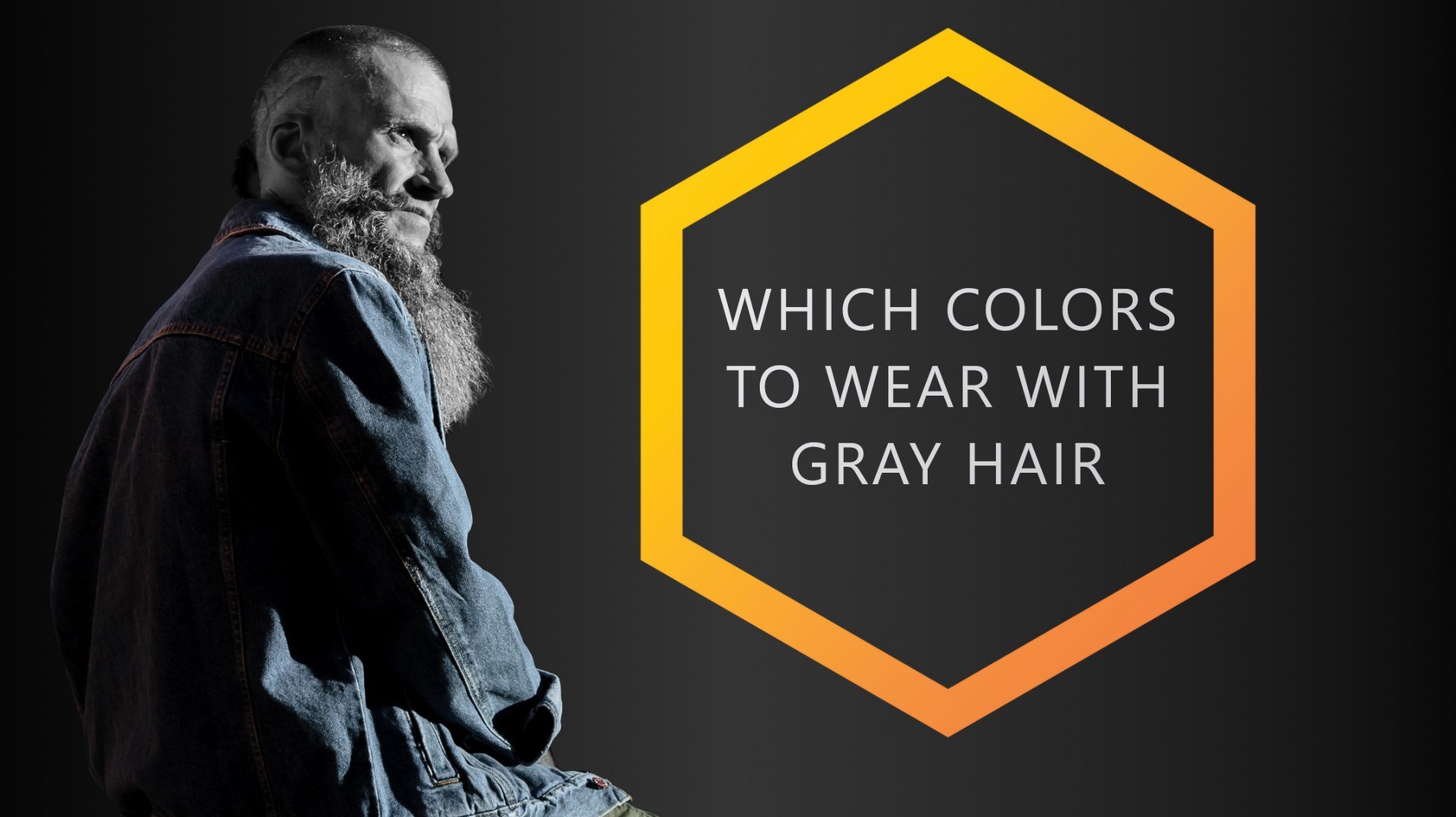
Gray hair is beautiful and knowing how to pair it with certain clothing colors can make you feel even more confident about your appearance. Choosing the right color such as teal or navy blue will make you look effortlessly chic!
But why these two colors exactly? Well, there are a few reasons why.
Colors That go Well with Gray Hair
The best colors to wear if you have gray hair are dark versions of blue or certain jewel tones. Colors like navy blue, teal, mystique purple, emerald, or ruby will complement gray hair very well and portray class and sophistication. Certain light variations of the same hues will help to make you look younger, though.
The gray hair trend is popular among celebrities, models, and the general public. We can all think of a few celebrities who have turned gray and aren’t afraid to show it.
Two million people in the USA turn gray every year according to the American Association for Hair Restoration Surgery.
Also, studies have shown that 6-23% of people at the age of 50 have at least 50% gray hair coverage.
Gray hair can look great with many different clothing colors, but it's important to know what colors complement gray hair best. Because yes, there are a few colors that clash when a gray-haired person wears them. And there are good reasons why.

Which colors are the easiest to wear if you have gray hair?
If there's one thing that can make or break an outfit, it's color. More specifically, the colors you choose to wear should complement your personal style and, of course, flatter your unique hair coloring.
People with gray hair know well enough that finding flattering clothing colors for their silver appearance can be a challenge. Fortunately, we've got you covered with a comprehensive guide that'll help you find the perfect complementing colors for your beautiful gray locks.
Best Clothing Colors to Wear with Gray Hair
For a person with gray hair there are typically three goals when it comes to choosing the right clothing colors to wear:
Pick colors that go well with gray (obviously)
Choose those that suit the occasion
Go for the colors that make you look younger
Preferably, you’d end up wearing an outfit that meets all three goals at the same time, right?
Nowadays, there's an increasing variety of more flattering clothing colors to wear with gray hair that will help you look and feel more youthful than ever. In fact, we’ve written a whole article about the topic. You can read it here.
However, we will discuss the topic of youthful colors in this article as well; so no need to worry. But let’s do so by listing the best clothing colors to wear with gray hair and explaining why and which of the three goals they help achieve – one by one.
Blue and its Close Relatives
Gray hair is a sign of wisdom and wearing the right colors will help support that connotation. Colors like dark blue and close relatives of the blue hue can do so.

Blue symbolizes intelligence, serenity, and calmness. Each of these traits is generally used to describe wise elders. Every color that has elements of blue in them, such as the colors of the blue-green or blue-purple hue, have similar color psychologic interpretations.
Darker versions of either of the three hues add a touch of elegance and sophistication making them even better choices to wear in outfits if you’d like to underline your life experience.
Lighter (baby blue, mint, or lavender) or brighter (indigo, turquoise, or amethyst) versions of the same hues help to make you look younger because they make your skin look more vibrant.
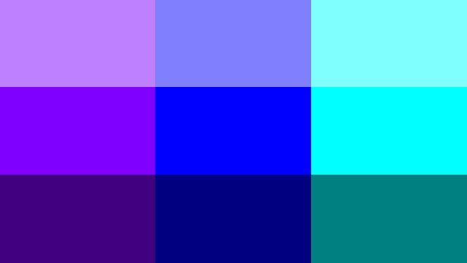
Lighter versions look more playful whereas darker ones look more classy.
Also, these colors (especially the darker ones) are great options to wear for almost any occasion.
Browns, Beiges, Nudes, and Tans
Colors that highlight your skin’s natural tone are great choices for when you want to look livelier. Browns, beiges, nudes, and tans fall into that category.

Colors that make your skin look more vital: brown, beige, nude, and tan.
It’s important to note, though, that you pick strong versions of these colors.
Pale colors, our muted variants, typically wash out your skin tone, enhance the contrast given by creases and wrinkles on your skin, and tend to focus a viewer’s attention on your hair color. This might not be what you’re going for.
Also, if you’re skin color is too similar to any of the above, we’d suggest avoiding it. For example, people with dark skin shouldn’t wear outfits that incorporate a lot of dark browns. We describe why this is the case in our full article about ideal clothing colors for dark skin if you’d like to learn more.
If you stay away from those versions of brown, beige, nude, and tan that don’t suit your skin and hair color, then you’re pretty much good to go.
Because, luckily, you can choose to don these colors every day for almost any occasion. They go well with many other colors and tend to give off a very sophisticated and classy air.
Dark Greens and Reds
As long as you stick to darker versions of green and red, you can wear both hues.
Bright red in combination with gray hair just gives off a “Cruella” vibe and bright green just doesn’t fit – it might seem like you’re trying too hard to look young again.
But darker shades of either color (as long as they’re not too dark) are great choices when it comes to gray hair. Both belong to the family of jewel tones and, therefore, look beautiful and classy with silver. Also, they complement very light or fair skin perfectly.
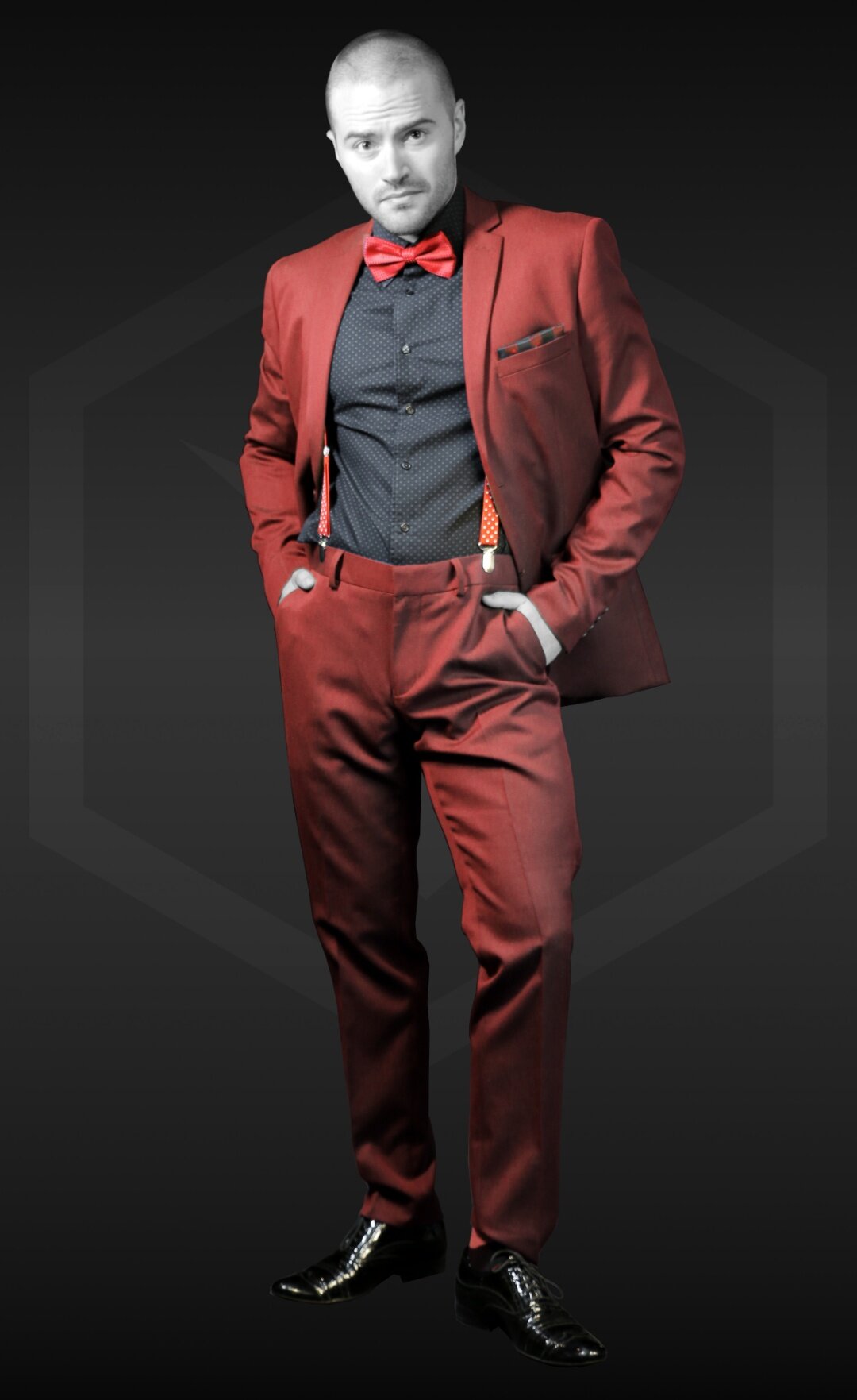
Dark reds like ruby or burgundy go very well with silver.
When it comes to applicability and usability for events, it’s another story, however. Though both colors look sophisticated, they might not be ideal for certain situations. Neither is ideal in a business setting or for a kid’s birthday, for example.
Moreover, they’re just not Spring or Summer colors, so you’re basically stuck having to wear them exclusively during the colder months of the year.
All Bright, Strong, and Bold Colors
Another great option is vibrant colors. They look particularly striking against gray hair with darker roots, by the way. They are also perfect if you're looking to stand out – and guess what? They help make you appear younger.
Just pick one or two of your favorite bright colors and hold them up to your hair. How does it look?
Well, you might find that not every bold color looks so great. There are a few bright colors you should try to avoid wearing if you have very gray hair, though. Let’s talk about those next, shall we?
Colors to Avoid if You Have Gray Hair
Now that you know the go-to colors for gray hair, let us tell you which ones you should maybe shy away from wearing – for various reasons.
Please note that this doesn’t mean that you have to cut the following colors out of your wardrobe completely. If you’re the type of person who wears bright yellow every day, then please continue to do so. Just know that there might be more fitting alternatives.
Gray Clothes Aren’t Ideal if You Have Gray Hair
Most types of gray and almost all muted color tones tend to make the wearer look older. This is due to the grayed-out nature of tones and the psychological connotation of dust, ashes, stone, and everything old.
By wearing a lot of gray, you do the opposite of making yourself look young and vital, so refrain from wearing too much of it.

There are many different types of gray to choose from.
There are exceptions, though. Very dark grays like anthracite or charcoal give off enough contrast to your hair coloring and skin tone that the “oldening” effect is reduced. Plus, the large amount of black in dark grays makes the color much more mysterious and sophisticated.
Any muted colors tend to have the same effect as pure gray. We seriously suggest staying away from wearing too many muted colors – especially muted reds, pinks, and violets! Those are classic “granny-colors”.
Lighter grays, silver, and tones are also not recommended. They are often too similar to your hair color making both look rather dull, frail, and sometimes even sickly.
In short: If you want to wear gray or toned colors, then make sure they’re dark.
Rose and Lavender Are Grandma’s Favorite
Unless you’re going for the “granny-look”, try to stay away from rose, light pink, or light lavender clothing. Seriously.

This is the classic “granny” color palette.
Remember Professor Umbridge from the Harry Potter movies? She wears colors that are basically reserved for elderly women who love cats. Hence the color choice for the character’s clothing.
It’s ok to wear a few rose-colored pieces here and there or to carry a lavender bag or so, but do yourself a favor and avoid wearing large clothing pieces in these colors (unless that’s what you want, of course).
Bright Yellow, Red, and Green
There are three bright colors that just look off in combination with gray hair and those are yellow, red, and green – in their brightest variants, of course. Interestingly, though, they aren’t suitable for different reasons:
Yellow (in its most saturated form) is the most luminant color of them all. This means that it has the highest perceived brightness of any fully saturated color.
Gray hair – especially light gray hair – has a very similar amount of luminance as bold yellow, making them not contrasting enough to harmonize well. This is also the reason why silver isn’t an ideal color when paired with gray hair. The contrast is just too low.
Strong red gives off enough contrast to gray hair but isn’t ideal for another reason: the connotation. We just think of Cruella Deville when we see someone with gray hair walking around in black and red. There’s just that devilish flair to a color palette like that.
Bright green is one of the rarest clothing colors out there. And because of that fact, it’s even rarer to see gray-haired people walking around donning the color. Due to its uncommonness – except maybe in the gym – the combo of gray and bright green is often regarded as awkward.
Off-White is Not Right
Any off-white color, no matter the undertone, is not recommended as a clothing color if you have gray hair. But why?
Contrast! So often it’s contrast.

Wearing white is fine when you have gray hair. But off-white isn’t ideal.
Every color that is not white, and is, therefore, the most luminant color there is, looks too much like your hair color. Then again, both colors aren’t similar enough to truly look the same.
If you like wearing super light colors, then opt for pure white. Alternatively, if it must be off-white, then go quite a way “off” white. Let’s say all the way to nude, sand, or beige.
Contrast is King
To conclude this article, we’d like to make it clear that we’re not trying to tell you what you should or shouldn’t wear. That’s entirely up to you.
Just be warned that there are some colors that don’t become your gray hair and others that look absolutely smashing. But, depending on the color of your skin and eyes, the occasion, the season, your preferences, or even the time of day, what looks fitting and what doesn’t may change dramatically.
It’s just always important to know that contrast is king.
Though most people choose their clothing instinctively correct according to contrast, it could be important for you to understand what we mean.
If the pieces of clothing in your outfit are too similar to your bodily features, you will tend to look dull and even unhealthy. On the other hand, if the contrast is too strong, features such as wrinkles, blemishes, and so on are overly pronounced.
Neither is most likely what you’re aiming for. We have many comprehensive guides on how to dress using color so that you can confidently say that you know you’re doing.
Read up on our articles to be sure to never go wrong again when it comes to choosing the right colors for your outfits.
ARTICLES OTHERS LIKE:


What Are Clashing Colors?
Two colors clash when they are too similar in some aspects, yet too dissimilar in others. We consider them clashing when they don’t harmonize or pair well. This is often due to a lack of luminance contrast combined with a bad contrast of hue.
Everyone’s heard of the phrase “clashing colors” before, but not everyone may know what that means.
How do colors clash? Certainly not in a physical capacity (usually), but when paired together, certain colors may not work well together visually. For example, red and magenta are typically considered to be clashing colors. But why is this?
Why Colors Clash
Two colors clash when they are too similar in some aspects, yet too dissimilar in others. We consider them clashing when they don’t harmonize or pair well. This is often due to a lack of luminance contrast combined with a bad contrast of hue.
There are various reasons why colors appear to clash and various ways in which colors can clash with each other.
In this article, we’re going to examine a few examples of colors that are considered to clash when put together, what types of colors clash, and why clashing happens. Read on to learn all about these subjects and more.
Which Colors Clash?
Let’s first identify which colors clash with each other so you know what to watch out for when assembling your wardrobe and choosing your outfit for the day.
Red and Magenta

Red and magenta together is a classic example of clashing colors. This is a good example of colors that are technically close to each other in hue, as red and blue make purple (and the brightest form of purple is magenta), but they still don’t look good together.
Bright Pink and Bronze

Bright pink and bronze is another example of colors close to each other in hue that don’t go well together. Also, because bright pink is so overpowering and bronze is typically shiny and metallic, this pairing can become garish.
Orange and Green

Orange and green are not close in hue and still clash strongly. Bright orange has a very similar amount of luminance as bright green does, making them indistinguishable to the color blind. The stark contrast in hue, though, makes them “vibrate” when paired.
Brown and Maroon

This may be obvious to some, but brown and maroon always clash. Because they are so close to each other in hue, they will mix from afar and create a flat look. On the other hand, up close you are able to distinguish them easily.
These are just a few of the most well-known offending color combos, and you should generally try to avoid using them in the same outfit if possible. While we could go on forever about countless clashing color combinations, let’s move on to the other topics we still have to cover.
What Are The Different Types of Color Clashing?
So, each of these colors belongs to different categories of color. When you mix colors of certain categories, the result can sometimes be garish and unsightly. This basically boils down to two different types of clashing. Most clashing color pairings will appear to clash because of discrepancies in hue or luminance.
Hue is considered as the “color family” from which the specific color comes. There are 12 hues on the color wheel. Therefore, every conceivable color falls into one of these twelve color families.
Luminance is defined as the perceived brightness of any given color. The stronger and brighter the color is, the higher its luminance. Also, colors with more added white (tints) are more luminant as well because they are perceived to be brighter.
Contrast of Hue
If two colors are too similar in hue yet also not similar enough, they tend to clash. More often than not, this is the case when both colors are two to three hues (color families) apart on the color wheel.
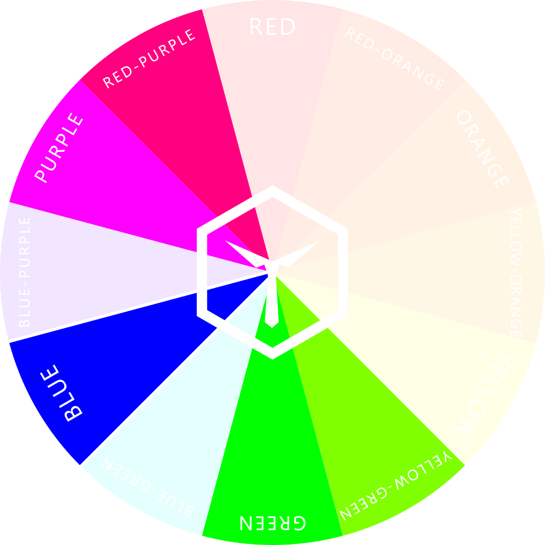
Two or three hues to either left or right of the blue hue are the hues of the “danger zone”.
Being either two or three hues to either the left or right on the color wheel is what we like to call the “danger zone”. A pairing like that should better have a lot of contrast of luminance to look at least decent.
Contrast of Luminance
If two colors are equally luminant, they will most likely start “vibrating” when put together. This is especially the case when both are incorporated in patterns such as stripes or checkers.

Yellow-orange and yellow-green vibrate heavily.
If either one of the two colors were less or more luminant, the vibrating or fluttering phenomenon would not happen.

Forest green (yellow-green with added black) doesn’t vibrate in combination with yellow-orange.
This vibrating or fluttering happens because both colors are too similar in perceived brightness. But, this only happens if both colors are from different hues. If both were from the same color family and would have the same amount of brightness, then they are often considered as one and the same color.
The Amount of Difference is the Key to Clashing
As we just learned, colors clash when they are too similar, yet still different from each other. If they do not contrast enough in luminance, they vibrate and if they have “bad” contrast of hue, they just look weird together.
If two colors are both very similar in brightness and live within the “danger zone”, they are bound to look bad together.
We suggest staying away from such color pairings when it comes to clothing and fashion – unless you’re going for that of course.
Sometimes clashing colors are exactly what you want. Who knows? The combination might not even look bad. We’d recommend wearing clashing pairs to a bad taste party, for example.
SOCKS WITH CLASHING COLORS:

Let’s play a game, shall we? A game of crosses and circles - and let’s play it where it’s usually not meant to be played: on our feet! Let’s call it Tic Tac Toes! How fun it must be. This design will blast your socks off (figuratively speaking, of course).
Colors used:
Purple (base)
Red-purple (accent)
Cyan (accent)
Magenta (accent)
Bright blue (accent)
Why Do We Dislike Clashing Colors?
The reason behind people finding certain color combinations unsightly is all because of our psychology. Many subject experts have explored color psychology in-depth, making many key discoveries that explain how our minds perceive and interact with the colors around us.
In Xiaoyan Deng’s scholarly article on the subject of color combinations and the psychology behind how we perceive them, she explained this relationship in a series of questions. She says, “Getting dressed each day, we must combine several articles of clothing, each of which has one or more colors. We frequently ask each other questions like, ‘Does this tie go with this shirt and suit?’ or ‘What color sofa will go with both the rug and the chairs?’ These questions seem simple because, when we see specific color combinations, we often have clear impressions of colors that go well together and colors that ‘clash.’”
Final Thoughts
Color clashing is the negative perception of colors that don’t appear visually coherent in our minds.
It can sometimes be a little more tricky than this basic definition, though. Color psychology scholars discuss theories like figural goodness and unity to explain why we may perceive certain colors as going well together, while others are hard to look at.
When it comes to how you dress, it can be difficult to pick out pieces of clothing that go well together, but that becomes even harder when you throw color combinations on top of that.
Luckily, most of what you’ve learned in this article not only applies to clothing but also to makeup. We have an article specifically about matching makeup and clothing colors so they don’t clash either if you’re interested.
Besides the known and widely agreed upon color combinations that we know to be “clashing,” you can also watch for a few specific indicators of whether or not certain colors clash. Make sure to keep the contrast of hue and luminance of colors in mind when pairing them together. This will help you decide if the colors go well together or not.
If you need more help on the topic, we suggest you read up on this article about which colors don’t go together. It goes into even more detail as to why certain colors don’t harmonize. Happy reading!
We hope the information we’ve outlined above has answered all of your burning questions about what clashing colors are, how to spot them, and why they exist in our perception. Thanks for reading, and for other interesting color topics, be sure to check out our other articles!
OUR NEWEST ARTICLES:

What Colors Do Not Go Together? (10 No-Nos)
In colors and fashion, certain colors just don’t go together. Some of the most common mismatched pairings found in outfits are white & silver, green & red, and brown & burgundy. These combinations and 7 others make up our list of “10 No-Nos” for color in fashion.

Too many people just grab the first set of clothing they find and throw together an outfit – no matter the color. This can often result in brutal color combinations that just look terrible.
Finding the right color combinations for your clothes can be a daunting task. For both men and women, there are guidelines to follow when deciding what colors go together well or don't go together at all.
The best way to go about deciding what colors do go together is by understanding which ones clash and why. Luckily, we've put together a list of the most common offensive color pairs in the world of fashion.
Number 10 might surprise you!
Colors That Don’t Go Together in Fashion (Top 10)
10 Colors That Don't go Well With Each Other
When you know which pairs to avoid at all costs, you're bound to make fewer mistakes when dressing up. Here are 10 no-nos when it comes to matching colors in your outfits:
1. White and Silver

While this may seem like a smart and wonderful idea, silver and white go together like oil and water (unless you mix in something special). Sometimes the clash is so overwhelming that it just looks tacky on you.
White and silver don't pair well because they are too similar and don't contrast.
That said, there are use-cases for this color combination. The combo works quite well when you show a lot of skin when wearing it. This is because your outfit will contrast with your skin well enough. For example, many wedding dresses are comprised of white and silver - but they always leave enough space for skin to shine through.
So, if you can't resist the temptation, make sure you go with minimal amounts of each color. Also, either show a lot of skin or diversify and add in other colors like black, blue, or dark brown to give some necessary contrast to the outfit.
2. Magenta and Red

You may be surprised to learn that red and magenta just don't work. It's amazing how so many people go through their entire lives without realizing this little fashion mistake.
Whether you're trying to wear a red shirt with a bright pink tie or a pretty magenta dress with red shoes, avoid pairing these colors together because it just looks bad! But why?
Magenta is the brightest, most saturated version of the family of purple. Because of this, magenta lies two slots counter-clockwise to red on the color wheel.
The Color Wheel shows us all hues divided into 12 families.
Every color that lies two slots apart from any other and has similar brightness and lightness is going to clash. It's as simple as that.
A color pairing from the red and purple families could work if the contrast is high enough, though. Go for a dark, deep purple and accent with a nice light red (rose), for example.
3. Green and Yellow

No. Just no. Do yourself a favor, forget this color combination (when it comes to fashion), and choose something else.
Maybe, just maybe, super dark yellow could work with bright green. But don't even think about wearing both bright variants together.

4. Green and Orange

This combo is an absolute no-no in clothing. Green and orange work terribly and clash heavily with one another.
In most cases, you'll want to choose two colors from the same color family in order for them to work well in a coordinating outfit, such as orange and brown or green and olive. But don't mix both of these families together.
Bright orange doesn’t go so well with a vibrant green when it comes to clothing because they clash with each other. This is due to the fact that both colors have similar luminance and are a triadic pair.
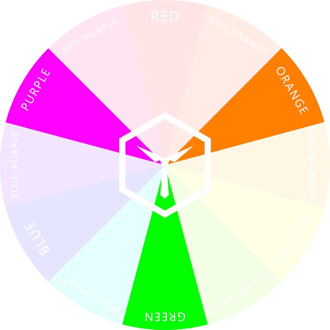
The triadic hues of green are orange and purple/magenta.
Interestingly, if you were to choose either a darker or lighter version of either color, for example, a very dark orange (aka brown), they would harmonize quite well. This is because brown has much a higher contrast to green than orange does.
Also, a triadic color combination is actually not a bad thing. Thousands of fashion designers have used triadic schemes to put together stunning outfits. You just have to know how to do it in the right way.
5. Green and Red

There's a lot of green in this no-go list, isn't there? Well, there's a good reason for that. Bright green just isn’t a great color for clothing. It’s just too unusual! More on this at the end of this article.
Anyways, green in combination with red just always gives off a Christmas vibe, doesn't it? Especially when you pair these two colors with white and/or gold of sorts, you will most certainly make anyone around you think of our favorite holiday season.

This color combination just reminds you of Christmas, right?
Why is that? Well, it's all about color palettes, how we perceive them, and what their meanings are from a socio-cultural perspective.
We discuss this topic in a few of our other articles. You can read about a Christmas color scheme in this post.
6. Brown and Gray

There's still the notion that brown and black are a bad match but, in all honestly, that's complete rubbish.
Average brown goes quite well with black, in fact. A color that it doesn't go well with, though, is gray - especially darker gray. But why?
The answer has to do with contrast (again). Both colors have a similar amount of luminance and, thus, don't have enough contrast to each other. Additionally, both gray and brown resemble bodily colors too much, reducing the contrast to a person's hair, skin, and eye color to a point where nothing is in the spotlight.
If you know how to accent an outfit correctly, though, you might be able to put together something awesome from this color pairing. Follow our guide on accenting with colors to learn how.
7. Purple and Yellow

Purple and yellow may go well when it comes to decorations, but not when matching clothes – unless you're the Lakers, of course.
It’s important to know that purple and yellow don’t actually clash. They just have a special look in combination: One that isn’t very common in clothing.
These colors are too difficult to go along with each other, especially when you're trying to create a look that flows naturally. This can be considered as one of the hardest color coordinations in the world.
You will not have an easy time trying to match them in any variation, be that as shades, tones, or tints. Trust us. You're way better off wearing gray or white with purple and dark brown or light blue with yellow.
8. Blue-Green and Yellow-Orange (Turquoise and Gold)

This is a massive no-no. Bright turquoise, a mix of blue and green, does not go well with anything halfway between yellow and orange – at least not in clothing and fashion.
Interestingly, in jewelry, this is quite a common combo. Think of a gold necklace with a pendant made of turquoise (the stone). Even in design, both colors go well together. But just not in clothing.
Why is that, you ask? The answer is simple:
Because the pairing is so uncommon that something just looks "off".

However, as soon as you darken the turquoise so much that it effectively is teal, the situation changes. Teal and yellow-orange look classy and sophisticated together – as long as you don't wear too much yellow-orange and only use it to accent your outfit.
9. Brown and Burgundy

Brown and burgundy are very similar, yet not quite the same. In fact, many people even mistake one for the other.
Brown is essentially a very dark variation of orange, whereas burgundy is a very dark red.
Now, do you remember what we wrote about colors that are two slots apart from each other on the color wheel? Well, red and orange are. Inevitably, brown and burgundy are as well.
From afar, both colors look almost identical but close up they don't. This makes it difficult for people to consciously tell what is wrong with the combination, even though it's quite obvious. Both colors are just too similar, yet not similar enough.
10. Nude and Yellow

Nude, a very light tint of red-orange clashes quite drastically with yellow – especially with light yellow. Astonishingly though, this combo is rather common among modern-day young women!
Separately, these colors look great on the ladies - there's no question about that - but together they make an outfit a complete mess! Why?
By now, you should be able to guess why... It's for the same reasons as with all the previous colors:
The contrast between both colors is too low
Both are too similar to your bodily features (especially nude is)
The distance between both hues on the color wheel is within the "danger zone"
We're not used to seeing this uncommon pairing
Nude is a great color to wear - just pair it with something other than yellow. Please.
Why Certain Colors Don't Pair Well
As we've proven so far in this article, there are actual reasons why certain colors don't go together in clothing and fashion. Here's the rundown for why some color combos don't pair well:
Not Enough Contrast to Natural Coloration
Both colors are too similar in color to bodily features such as hair, skin, or eye colors. Wearing clothes that resemble your body's own coloration just looks odd because of the lack of contrast.
Wrong Distance on the Color Wheel
When it comes to matching colors, there are a few ways of pairing that usually tend to work well. The most common are pairings using a complementary, split-complementary, analogous, or triadic color scheme.

The analogous, complementary, split-complementary, and triadic hues of blue.
Note that if you were to start out with the color blue (like in the image above), every "good" color to choose from falls into one of the four categories. The resulting "bad" colors are those that are either two or three positions clockwise or counter-clockwise to blue.
The “Danger Zone” hues of blue are those that are difficult to pair, mix and match.
Any color paired with another from two or three hues to the left or right on the color wheel will be difficult to pull off in any outfit.
So yes, the saying “blue and green should never be seen” does in fact ring true.
The Pairing is Unusual
Often, it's simply the fact that you've only very rarely come across an outfit with such a color combo that makes it seem like something's "off". Good examples are some of the pairings we've mentioned in this article like green and yellow or turquoise and gold.
The Combo Resembles a Certain Theme
Stand-alone colors are great, but sometimes, when two are paired, they make us feel a certain way or think of something specific. We mentioned red plus green resembling Christmas but there are other mixes that have similar effects.
Black and red combined make us think of Dracula, purple and orange make us think of Halloween, and green plus magenta are Barny’s, our favorite dinosaur, colors.
Finishing Thoughts
Obviously, there are many more color combinations that don't go well together. We've only listed our top 10 in this article since these are the ones that a lot of people seem to choose for their outfits.
If you were wondering what colors go together and which ones don't, this article should have given you a better understanding of which colors most definitely do NOT go well together. We've listed 10 no-nos for matching colors in your outfits to help avoid some common fashion mistakes.
If you’re still uncertain about how to pair colors, you can always just go for monochrome outfits. Then you can be sure all you’re clothes match up perfectly.
We have many other articles on how to effectively mix and match outfit colors to get the results you want. We suggest reading up on a few of our top articles on color in fashion here. You're bound to find one that interests you and can show you exactly how to pair color the right way easily.
COLOR PSYCHOLOGY:

What Color to Wear as a Wedding Guest (And What to Avoid)
As a wedding guest, you should wear either dark blue, brown, and gray, or light tans and nudes as base colors in your outfit. Do not wear too many flashy colors and avoid white and too much black at all costs. You are allowed to accent your get-up with small elements of color but be careful not to overdo it.

Weddings are a huge deal, marking one of the most important days of someone’s life. It goes without saying that a wedding is the time for the bride and groom to shine, and they certainly don’t want to be upstaged by any of their guests on their special day.
As a wedding guest, you’ll have a fine line to walk for what you can wear. You should aim to dress in a classy and refined way without upstaging the outfits of the bride and groom. And while this might sound like a lot to worry about, it really just boils down to color.
Wear These Colors as a Wedding Guest
As a wedding guest, you should wear either dark blue, brown, and gray, or light tans and nudes as base colors in your outfit. Do not wear too many flashy colors and avoid white and too much black at all costs. You are allowed to accent your get-up with small elements of color but be careful not to overdo it.

These are all legitimate colors to wear to a wedding. Obviously, black, gray, and brown are good choices as well.
As you can see, there are certain colors that should be avoided as a guest, and there are others that are more appropriate. In this article, we’re going to examine exactly what colors you should wear as a wedding guest, and which should be avoided by all means necessary.
Suitable Colors for Wedding Guests to Wear
Let’s first identify the suitable wedding colors you can wear to a wedding. These colors are going to help you blend into the crowd, not stand out, while still giving you a formal and dressy look.
Some safe colors include formal cool colors like gray, brown, tan, or muted shades of green and blue.
These are classic colors that are typically worn to formal events like weddings. So unless the bride or groom has specified that any of these colors should not be worn, you should be fine wearing these.

All of these colors are great choices to wear to a wedding.
Besides helping you not to stick out, these colors will also give you a cool, confident look, perfect for mingling and socializing with other wedding guests.
As we said, cooler colors like those previously mentioned are typical for most weddings. However, some brides and grooms (most of the time brides) may specify the exact colors they want wedding guests to wear.
If you’re given color guidelines to stick to, then any of those colors will/must be suitable. Additionally, the groomsmen and bridesmaids will often be given specific colors (or specific articles of clothing) that they will be required to wear.
How to decide what colors to wear
If you haven’t been given any specific color guidelines on what to wear to a wedding, there are a few things to consider that can help you decide. These key factors include the formality of the wedding, the location, and the seasonal weather.
Formality
If you’ve received a formal wedding invitation, you can assume that the bride and groom prefer their guests to wear traditional wedding guest attire.
If the invitation is more on the casual side, you can expect the wedding to be a little less formal, but this doesn’t necessarily mean that you should show up wearing casual clothing.
Darker colors tend to be more suitable for formal events. You can accent a primarily dark outfit easily with a few strategic color splashes. | Socks: Bordeaux
A more formal wedding will require classic colors, including jewel tones, navy, and metallic gold and silver hues.
Additionally, a wedding in the evening will generally be more formal, requiring guests to dress up in their finest. It’s perfectly acceptable to wear a black tux in this situation, for example. However, it may be a good idea to check with the bride before showing up to the wedding all decked out.
If you’re required to wear a tie, then opt for a rather subtle but friendly tie color. Read our article on how to choose the right tie color to find out more.
RELATED ARTICLE:

Location
The event location is also a factor you should consider when choosing your outfit. A barnyard wedding inevitably calls for less formal colors than a ceremony at the most luxurious five-star hotel in town.
In short, the general “vibe” of the place where the event is held determines whether a certain color palette is suitable or not.
As a rule of thumb: the more luxurious the location, the more you should lean towards more subdued and less bright colors. The more prestigious the event location, the less you’ll want to wear bold accents like a bright red tie or that flashy new yellow purse you just bought.
Season
The season and weather can also be determining factors when deciding the color for your wedding attire. If the wedding is in the fall or winter, you should opt for jewel tones and dark colors, including burgundy, emerald, plum, crimson red, or navy.

Stick to darker colors during the colder months of the year. Also, refrain from wearing groomsmen colors.
Again, you don’t want to stand out too much, so keep that in mind when choosing one of these colors. It’s generally a good idea to know which colors are suitable for which season – not just for a wedding. Read up on this topic here.
Alternatively, if the wedding takes place during the warmer months of the year, in summer or spring, brighter and lighter colors are more suitable.
You can try wearing pastel tints if it’s during the spring, such as blush or dusty blue. During the summer, brighter colors like lime green or fuchsia may be more appropriate, reflecting the warmth of the season in your outfit.
And this is especially true if it’s a destination wedding, somewhere tropical and beachy, you’ll definitely want to break out those bright, vacation colors!
Here’s our pro tip: go for neutral colors as a canvas and accent with happy, light, and bright colors like yellow, lavender, and rose. This is bound to look great and not draw too much attention to you.
RELATED ARTICLE:

Colors You Should Avoid Wearing to A Wedding
As a general rule for wedding guests, one should never try to be the center of attention. As such, you should shy away from wearing overly bright or out-of-place colors, in addition to the bride and groom’s main colors, black and white.
Black may be acceptable if the wedding is a highly formal event, but white is never suitable (as what is known as a canvas color). Only the bride wears white, signifying her purity and the joy of this momentous occasion.
Obviously, if you’re wearing a suit and tie, you are allowed to wear a white shirt. This goes without saying… By the way, white is one of the best colors to wear to hide sweat stains (just saying).
Again, if the bride and groom have not supplied you with color guidelines, you can safely choose any of the colors we’ve outlined above, based on location, formality, and the time of year.
As always, make your selection with subtlety and formality in mind.
Here are some other colors you should generally try to avoid when attending a wedding. They include white (never wear white), shades of off-white or ivory (too close to white), entirely black (it’s not a funeral), entirely red, or overly gold or sparkly metallic colors.
Each of these colors has the potential to draw the focus away from the bride and groom and onto you, which no one wants.
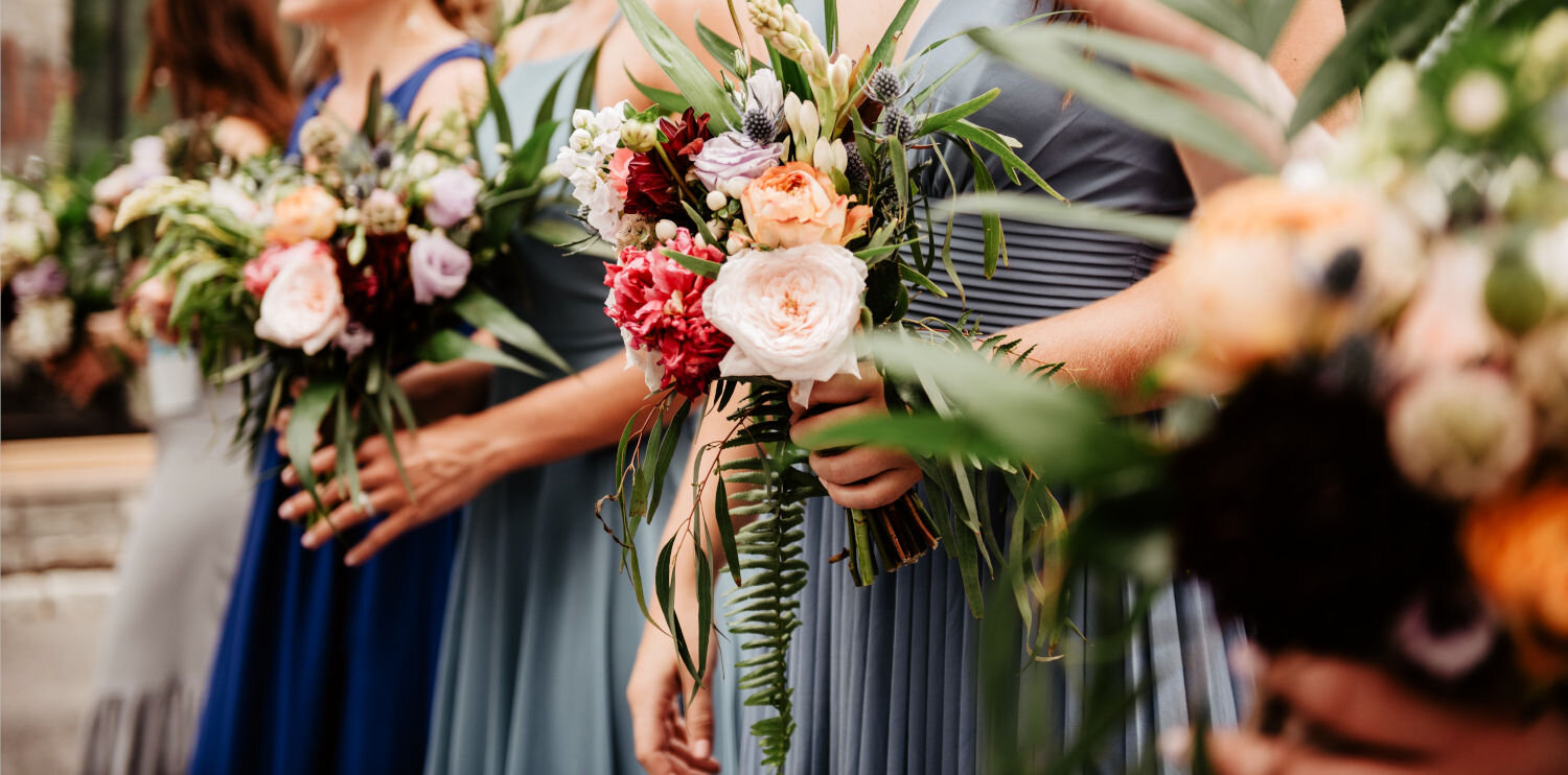
Pro tip: Try not to wear the colors that the bridesmaids are wearing.
In addition to these colors, you should avoid wearing the same color as the bridesmaid or groomsmen parties, and don’t wear the same colors as the parents of the bride and groom. The color of their outfits will usually be coordinated so all are uniform, and if you show up wearing one of those colors, it could cause unnecessary confusion.
You should also try to keep the coloring of your attire on the simple side. You don’t want to draw attention to yourself with too many flashy/strange patterns or clashing colors, for example. We highlight 10 rules you should follow when putting together an outfit with color in mind in this article.
What The Experts Say
Despite the seemingly simple nature of this discussion, color and psychology experts have also weighed in on what colors should and should not be worn to weddings and why that may be.
We’re going to explore the rich history behind wedding customs, where they came from, and why color is so important at weddings today.
To start, in Clare Finnell’s dissertation on the subject entitled “A History and Analysis of Weddings and Wedding Planning,” she goes into great detail on the origins of current cultural traditions for Western weddings.
Originally, the idea of the traditional western wedding originated in Medieval Europe. Finnell explains that “At the time, what we now think of as a ‘wedding’ was typically just a nice feast, not necessarily even one with decorations or special outfits unless the couple was very wealthy, in which case occasionally new or matching outfits would be worn for the wedding during this time period.”
As Finnell stated, color was not even an issue in early Western weddings. So, when did it become so important?
Indeed, the major concern of early weddings was security. Finnell goes on to explain that the groomsmen were originally knights whose job it was to protect the bride from potential kidnappings. Thankfully we (usually) don’t have to worry about that in modern times.
Knights were the original groomsmen at weddings.
Color did not become a key consideration in Western weddings until the Victorian era, where members of the aristocracy became hugely concerned not with safety, but with how much beauty they could bring to their weddings.
This sparked the requirement of color coordination among the bride and groom’s guests. Wearing the wrong color could deeply offend the marrying parties, which may have hurt the offender’s social standing.
While this is similar to today’s wedding climate, the ostracization one might face by wearing the wrong color to a modern wedding pales in comparison to what one may face in a Victorian-era wedding.
Here we see the most influence on modern-day weddings, with formal bridal and grooms’ parties, a color and dress code, and lavish decorations and feasts. We can thank the Victorian era for many of the traditions held by modern-day Western weddings.
Final Thoughts
When attending a wedding as a guest, the last thing you want to do is offend anybody. Wearing the wrong color is one way you might offend the wedding party, as strange as it may seem.
In order to avoid this situation, follow the tips we’ve outlined here for picking a color to wear.
If the bride and groom do not make requirements for the dress code readily apparent, tend towards the side of dark or muted, cool colors. You will hardly ever go wrong by choosing gray, tan, beige, or brown, along with muted shades of green or blue.
And remember above all other colors, stay away from white. This includes varying shades of white or off-white and ivory, as they will be close enough to the color that the bride will probably be wearing.
Obviously, it’s fine to wear a white shirt underneath an otherwise dark suit but please – we cannot overstate this enough – do NOT wear a pure white suit/dress as a wedding guest.
Make your selection with careful consideration, and good luck with all your wedding-attending endeavors!
OTHERS LIKE TO READ:

What is a Color Palette? (And How to Use it in Fashion)
A color palette is a selection of colors carefully chosen to complement and build off one another. This is important in fashion because most well-put-together outfits will have some kind of color scheme that ties each piece of clothing to all the others. The harmony of all colors within a palette makes or breaks an outfit.

Most people have no idea how to mix, match, and pair colors in an outfit, even though it’s actually quite easy to do. Most people’s wardrobe color schemes look like they just don’t care or sometimes even downright chaotic.
In this article, we dive into tried and true ways of how to put together color palettes from which to make the most harmonious outfits. Apply what you learn here so your get-up always looks fashionable and never chaotic.
What is a color palette, and how does that apply to fashion?
A color palette is a selection of colors carefully chosen to complement and build off one another. This is important in fashion because most well put together outfits will have some kind of color scheme that ties each piece of clothing to all the others. The harmony of all colors within a palette makes or breaks an outfit.
A piece of clothing’s color palette is one of its most important aspects, as multiple colors together have the power to carry a message – sometimes even a completely different one to the message sent by the individual colors themselves.
Here are a few classic color palettes (often called schemes), to help you understand the general idea:

This color scheme looks a lot like Halloween, doesn’t it?

How about a Christmas color palette? This one’s sure to jingle all the way!
This color scheme is Granny’s favorite. Light, slightly muted Pastels round off the “senior citizen style”.
Okay, so now we know the basics. You may be wondering how to select the right color palette. And how should you apply this to your clothing? We’ll take a look at that and more below, so keep reading to learn all there is to know about color palettes and how to use them in fashion.
How to Choose a Color Palette for Clothing
A color palette is defined as a collection of colors used together in one medium. This can be applied in the digital realm, in art, and most importantly, in fashion. In fashion, the medium is clothing, each speck of color representing a piece of the color palette.
When creating your color palette, you’re really just picking a selection of colors around which you model your outfits. You’ll always want to consider the following things when trying to choose a color scheme for your outfit:
What colors look best on you?
Which colors will send the message you want your outfit to send?
Which colors do you wear most often?
If you have certain key pieces of clothing in certain colors, it will make it much easier to assemble an outfit for the look you want. This is why our third item on the list above is most likely the most important.
The first step in deciding what colors to include in your wardrobe’s color scheme is to recognize the colors you’re naturally drawn to wearing already. Believe it or not, the three questions above, when answered correctly, will always yield the color you’re “naturally” drawn to.
Maybe you find you like to wear a lot of subtler colors such as blues, grays, and black. Or maybe you gravitate towards bolder colors, like reds, oranges, and yellows?
Whichever colors you might naturally pick, you should incorporate these into your outfit’s color palette. Always start by choosing the color “YOU”, the one that resembles YOUR style the most, and build your scheme from there.
AN ARTICLE PEOPLE LIKE:
5 Steps to the Perfect Outfit Color Scheme
Step 1:
Pick the color that resembles YOU the most.
For example, let’s go with a nice blue.
Step 2:
Add a very dark and/or a very light version of that color. Black and white count as well.
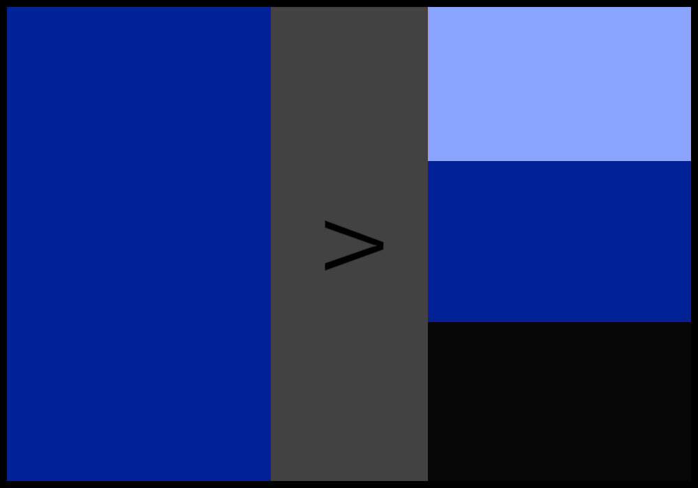
Let’s add both the darkest of blues (essentially black) and a sweet baby blue to our color scheme.
Step 3:
Include a dull/unsaturated variant of the color.
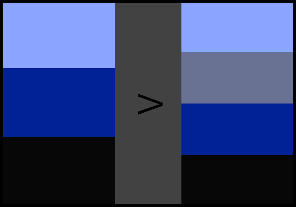
What about a rather desaturated blue-gray? Let’s include that in our palette as well.
Step 4:
Use the color wheel to choose one of the color’s analogous, complementary, split complementary, or triadic hues. Pick one variation of that hue. Alternatively, go for brown.
Let’s go for one of the triadic hues, shall we? How about red?
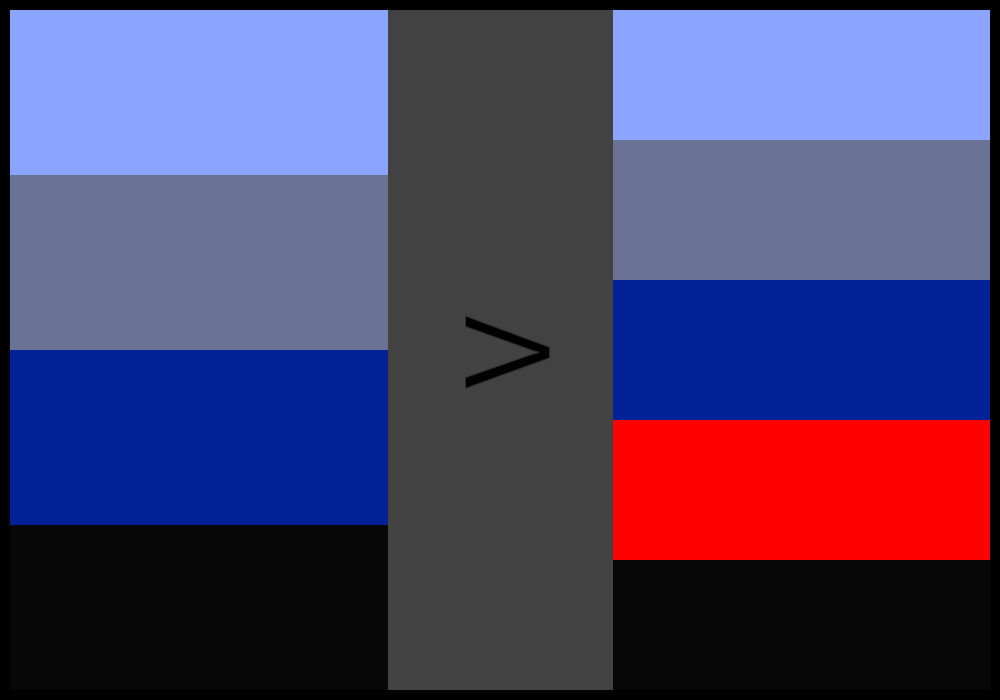
Pure red might be a bit too bold but what the heck! No risk, no fun. Let’s add bright red to the palette.
Step 5:
Out of the resulting palette, choose 3-5 colors.
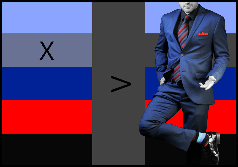
Just for the fun of it, let’s leave out the unsaturated blue. This way, we have a color palette consisting of four colors that we can choose our clothes from.
Choose all of your outfit’s pieces to be of these three to five colors. No exceptions. Try to pick out your clothing pieces so that their colors are as close as possible to those of the palette.
If we were to put together an outfit using the resulting color palette from our example, it could look something like in the image above.
Now, there’s not really a “bad” way of mixing your selected colors together (unless they clash heavily) but there is a “good” way!
To understand how to effectively put together your outfit using your new color palette, you have to grasp the concept of canvas and accent colors. Also, you have to know what to do if you have patterned or themed clothing items that fit your color scheme.
Let’s get to it!
Canvas and Accent Colors
Canvas colors are those that make up the bulk of your outfit and that can be easily paired with the rest of the colors in your color scheme. Think of solid standalone colors like black, white or gray.
Great canvases are made up of colors such as either of the three shades mentioned above, navy blue, denim, or dark brown. These colors are more commonly referred to as “neutrals”.
Your color palette will most probably have at least one neutral in it.
Similarly to what we see in real estate, one or multiple canvas colors (or sometimes called base colors) will form the basis of each of the looks in your wardrobe and can be easily mixed and matched with other more colorful pieces.
If you’ve gone through our 5 Steps to the Perfect Outfit Color Scheme above, then you already have a color palette to choose your canvas color(s) from.
This is the color palette from our previous example.
In our example scheme, either black or dark blue would make ideal canvases. Apparently, we picked navy blue for the resulting outfit.
For any outfit palette, try to stick to one or two canvas colors and around three or five colors in total.
If you include too many more than this, your wardrobe will start to look confusing. Others may not be sure what looks you’re trying to go for if you try to do too much at once.
Next, since you’ve chosen the base color(s), the rest are accent colors.
Accent colors are usually going to be bolder and more saturated. Your accent colors should be paired with the base colors to give your outfits a “pop” and flair. Obviously, they accentuate the outfit.
Their purpose is to add a dynamic element to any outfit, and they should be able to be paired with any of the base colors you selected.
After removing the canvas color navy blue, our example scheme is left with three colors to choose from as accents: black, baby blue, and bright red.
In the resulting outfit, baby blue is nicely represented in the socks and bright red makes the tie and pocket square pop while also contributing to the pzazz of the socks. Black is used as a sub-accent for the shoes and shirt.
Sometimes you may get your color palette down to the right colors, but there will be one color you want to wear that just doesn’t fit with the rest. That’s OK. True style comes from knowing when to break the rules.
Sometimes, as this study suggests, it’s even best to NOT match every color in an outfit perfectly. According to the researchers, an outfit is only truly fashionable when it’s colors are “moderately matched”.
Obviously, we don’t fully agree with that statement.
Perfectly matched pieces of clothing can be the pinnacle of fashion. It depends largely on the selected colors and color scheme, though.
More on that topic in another article, though… maybe! ;-) Here’s an article about which colors not to pair because we know they don’t go together.
Nevertheless, sometimes you’d like to wear a piece of clothing that has a pattern, a certain texture, or a theme of sorts that includes colors outside of your ideal scheme. Don’t worry, we’ve got you covered.
How to Handle Patterns and Prints
Your wardrobe’s color palette doesn’t just encompass the colors you’ve selected, it can also define which prints, themes, patterns, and textures you want to incorporate into your outfits.
When shopping, you’ll want to pick prints and patterns that are easy to mix and match, so you don’t end up always having to wear the same pair of pants with that one shirt, for example.
Let’s look at a quick example. Let’s say you’d like to wear a specific pair of patterned socks that obviously has a color scheme of its own.
A bit different from burgundy. The colors on these “Bordeaux” socks go well with any smart-casual or business outfit.
Colors used:
Black (base)
Burgundy (accent)
Red (accent)
Bright blue-green (accent)
Light blue (sub)
You think to yourself: “What can I do? This won’t fit anything else.” Well, my dear friend, you’re wrong - and we just proved it in our previous example…
Patterns and themes are easy to match. Do you remember that colors don’t actually have to match perfectly? Just give that print a go and see how it looks.
Sometimes it’s even fine if you incorporate those one or two minor splash of color from the theme or print into your outfit’s color palette. Try!
But, guess what? As with all things Colorbux, our socks are explicitly chosen to have easy-to-mix and match color schemes. So, if you’re looking for quick and simple color schemes to use for your whole outfit, give this a whirl:
The Ultimate Hack to Smashing Clothing Color Palettes
Note: This technique only works with patterned, themed, or otherwise multi-colored pieces of clothing.
Step 1:
Choose a piece of clothing that has multiple colors.
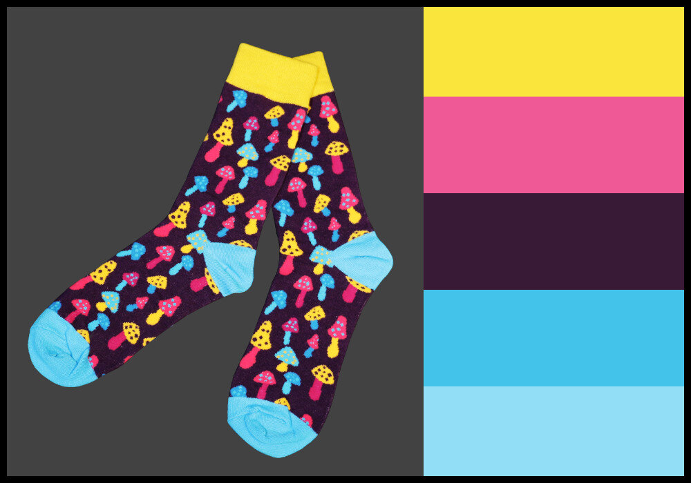
Step 2:
Pick one or two colors out of that piece’s color scheme.
Step 3:
Add dark and/or light variants of the 1-2 colors you picked to your outfit’s color palette. Black and white are options as well.
Step 4:
Put the resulting colors into one color scheme and choose all other pieces of your outfit according to that scheme.

Pro Tip: It’s sometimes best, not to go with all of the resulting colors. Maybe, pick only three (or even just two).
It’s also important to keep certain guidelines in mind when putting together an outfit. Having a great color scheme is good but, when applying the palette to your clothes, you have to think about contrast, placement, repetition, accenting, skin tone, and so on.
We have a comprehensive guide on the 10 Golden Rules for Color in Fashion that delves into the topic. Use what you’ve learned in this article plus what you will learn from the guide to maximize your fashion potential.
Seasonal Color Schemes
The last consideration to make when choosing a color palette is whether it goes well with the current season. You may in fact want to follow different color palettes for different seasons.
In our article about seasonality in fashion, you can have the full rundown but for now, here are a few tips in short:
Each of the four seasons has fashion colors that return (and rejoice) every year. This is because they fit the weather, temperature, foliage color, and overall “feeling” of the season well. No joke!
Fall (autumn) colors lean more towards warm hues (with dark, earthy tones and shades) than winter colors which are very neutral-heavy. Summer and spring color schemes consist of bright colors, with the spring colors leaning more towards light pastels and creams.

A classic winter color scheme.

A lovely choice of colors for springtime.

The colors of summer.

A great color palette for autumn/fall.
Interestingly, most of us have seasonal clothing in exactly the right seasonal colors. This is because we choose our clothing colors mostly instinctively while shopping and our instincts are guided by our momentary feelings which are, in turn, influenced by seasonality.
If you, therefore, choose outfit color schemes that are similar to seasonal color schemes, then you’ll have an easy time choosing the right clothing colors to wear in combination.
Start off by choosing one or two colors from the palette that is currently in season. Use our 5 Steps or the Hack method from the previous few sections to put together your personal color scheme for seasonally “correct” outfits.
When in Doubt: Where to Start When Choosing a Palette
The previous sections made some assumptions that you already have some colors that you know you want to include in your color palette. Well, if you have absolutely no idea which color to start with, we can help with that too.
A good way to decide on which specific colors to include is by identifying your skin undertone.
This essentially boils down to whether you have a cool or a warm complexion, and this is largely determined by hair color, skin color, and your genetic makeup.
Speaking of makeup, you can use the same palette you have for your clothing to help your makeup match as well.
Let’s take a look at how we can identify our undertones, which will help us know which colors suit us best. And remember, it’s important to wear the colors you’re comfortable with and enjoy wearing, regardless of the undertone. Don’t be afraid to be yourself!
We’re going to try several different tricks to help you find your undertone, but to start, you’re going to find something silver and something gold and hold them each up to your skin one at a time. Holding them up to your face and looking in a mirror helps as well.
Make sure you’re doing this test in natural lighting to achieve the best results.
As you do this, try to determine which piece looks the most flattering next to your skin. As in, which color complements your hair and skin tone the best?
If it’s silver, this means you have cool undertones, and if it’s gold, you’ve got warm ones.
Another way to find your undertone is by using the palms of your hands. Try holding your hands facing upward toward the sky, then examine your palms closely.
Determine if blue, red, or yellow is most prominent in your skin tone. If you’re seeing more blue than the other colors, you have cool undertones. If you’re seeing more red or yellow, then that means your undertones are warm.
But why does any of this matter? Well, depending on your undertones, certain colors will look more flattering on you than others. We have detailed guides on matching clothing colors to skin tones. Find them in our articles section:
Once you’ve found a color category that is easiest for you to choose a palette from, you can go on by following our 5 Steps to a Perfect Color Scheme above. That way, you’re bound to find the ideal palette in a jiffy!
A GOOD PLACE TO START:

Final Thoughts
Color is power, and a good color palette can set your wardrobe apart from all the rest. Remember to pay attention to which colors look best on you and incorporate these into your color scheme.
If you incorporate two or more bold colors that contrast strongly into your clothing color palette, then you’ve even found out how to color block. Read our guide to color blocking to learn more.
Hopefully, the information we’ve outlined above will help you assemble the best color schemes for your wardrobe so you can feel confident and be yourself.
And remember, ultimately, you should wear what you want to wear. Don’t limit yourself or your wardrobe based on what’s supposed to look good. As long as you feel confident in yourself, it really doesn’t matter what clothes you decide to wear!
And you know what? If the color palette you tend to find best is all-black, just go with that! There’s nothing wrong with it. If you don’t like mixing and matching colors, you can always go monochrome!
Thanks for reading this far. Apparently, you liked the article. If you’d like to show your appreciation, we’d love to see you share this article on any social media platform you prefer. You’d help like-minded people such as us find and enjoy this content as well.
#yourethebest
ARTICLES FOR YOU:

Clothing Colors That Never Go Out of Style
Colors that never go out of style are sometimes called neutrals. Neutrals are black, white, gray, brown, navy & denim blue, and some off-whites & tans. These colors are timeless, easy to wear, and almost always look fashionable when combined with each other. They are truly evergreen.
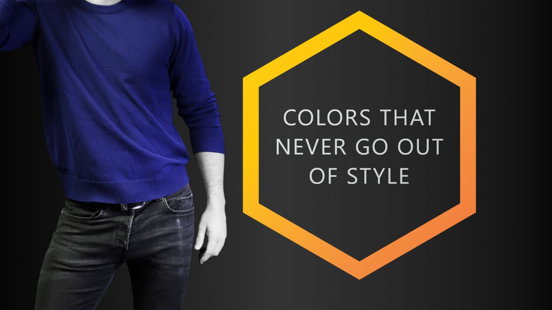
Neon’s come and pastels go, but neutrals… are forever! If you’re wondering which clothing colors never go out of style, pay close attention!
Investing in timeless fashion is a style tip the pros swear by. There are some colors we cannot live without, these are the ones that are fashionable season after season.
Colors that never go out of style are sometimes called neutrals. Neutrals are black, white, gray, brown, navy & denim blue, and some off-whites & tans. These colors are timeless, easy to wear, and almost always look fashionable when combined with each other. They are truly evergreen.

Neutrals are always on-trend no matter what season or occasion.
If a color is currently trending, we can almost guarantee it won’t be around for too long! Most trending colors are fads that rightfully have their time in the limelight, then phase out pretty quickly. We always recommend snagging some tops or accessories in these colors without going too far overboard!
However, stock your closet with colors that never go out of style and keep those hints of trending colors on hand!
Curious about which colors we might be hinting at? Well, scroll down below as we divulge our top tips on how to create a foolproof wardrobe year after year! Here are some outfit tricks you don’t want to miss.
Variations of White are Classics
There’s one color scheme that is always in, regardless of the time of year. If you know, then you know! White and off-white colors are the core and base of almost every outfit.
There is a reason we always tend to reach for them! They are so easy to pair with each other, as well as with other colors on the color wheel.
What are some variations of white? Well, think of very light grays, eggshells, creams, and maybe light nudes.

Do you see the difference? Left: white - right: eggshell
Off-white colors hold their place in your wardrobe quite perfectly. They don’t come and go throughout the seasons, instead, they stick around for the long haul.
We can guarantee you have a good amount of off-white pieces within your wardrobe that you don’t plan on parting with any time soon! For this reason, these pastels never go out of fashion, they are consistent regardless of what style you gradually evolve into.
Think of interior decorating; when paint shopping, you will most likely prefer a pastel color. Anything you paint on your walls, you will have to look at a day in and day out for the next 5 or so years.
This is why we typically choose near-white because they are the best colors to commit to long-term. They never go out of style, regardless of the season or event.

Take it from the professional paint company CertaPro Painters! They highly suggest sticking with practical colors when looking to freshen up your walls. Their recommendations for painting your space stay within the gray, beige, and off-white color range. They state how you should always “choose a color palette that will never go out of style”.
Trends are fun! But they aren’t practical in the long run. This tip also relates to clothing colors! When choosing more significant clothing pieces, like a winter coat or button-down shirt, stick to a more white-ish color you won’t have a hard time pairing with other colors.
Black & Whites are Always in Style
The absence of color strikes a strong chord here. Sophistication, class, and elegance are what white and black can bring to an outfit. Black and white are considered “neutral”, like the off-white colors from the paragraph above and some of the following colors in this article. They are versatile and extremely effortless.
From weddings to funerals, a day at the office to a night on the town, white and black are the perfect option for any outing. These two don’t lose significance, nor do they fall out of style.
What makes white and black so timeless is how uncomplicated they make styling an outfit. These two offer a base that a lot of other color options don’t! Every color matches one or both options perfectly.
This is why we always suggest you stock your closet with pants, blazers, dress shirts, dress-down clothes, and socks in both white and black.
Black and white go with every other color.
Whether we use them as a backdrop for a trending color, or on their own as a statement, both black and white are incredibly important pieces to own. If we can suggest any two colors you should own that never have and never will go out of style, then we choose white and black all the way!
In the wise words of Christian Dior, “You can wear black at any time. You can wear it at any age. You can wear it for almost any occasion”.
Take it from fashion designers like Karl Lagerfeld, Coco Chanel, and celebrity Diane Keaton, black and white are the ultimate choices for anyone’s wardrobe. Significant then, significant now, and significant always.
Dark Colors are your Friends
Colors that are the darkest shade in their color range are the staples that we stand by. Anything too bright or vibrant can appear tacky unless they are the current “in” color and not paired accurately. However, most dark colors have been able to stay relevant throughout the years without becoming a fad!
Unsure of which colors to start with? Try out a dark blue, like navy. Dark gray is also an excellent option, or look at forest or olive.
A pro tip is to look at the primary colors on the color wheel and choose the darker shades of those colors. Darker colors appear more subtle and can usually be used in a variety of settings. These colors are more relevant and timeless than their lighter opposites.

Navy blue is by far the most classic dark color should have in your day-to-day clothing arsenal. It is easy to pair with most other colors and is always a great choice if you wish to make a good first impression.
In fact, navy blue is one of the best colors to wear as a suit.
Want to add in some trending colors? Well, if you’re looking to acquire some vibrant clothing options to add to your collection, check out our COLORBUX sock collection! We are currently obsessing over the on-trend sky blues and pumpkin oranges. Browse here!
A RELATED ARTICLE:
Your Natural Color Scheme
When looking to see which colors are timeless, remember to count in your own coloring! Depending upon your skin tone and undertones, and your hair & eye color, the colors that stick around in your wardrobe might differ from ones in others.
That is okay! Just because your timeless colors don’t quite match up with everyone else’s doesn’t mean they aren’t fashionable or stylish.
The most important fashion advice we can give you is to feel comfortable and confident in your outfit. If you don’t love the color, then don’t wear it!
Choose clothing colors you think fit you best and follow our guides for matching colors to skin tones for more information to discover which colors might look best on you!
Browns and Other Evergreen Colors
There is one more classic color you can always count on to save your outfit (and possibly your day): Brown.
Most browns are very easy to wear. And by that we mean they suit most people’s skin tone and mix and match well with other colors.
Think of leather accessories like belts and shoes – they almost always look great, especially in combination with navy, white or black. Looks like that never go out of style which makes them timeless classics.

You can accent brown with almost any other color. Brown will never go and has never been out of style | Socks: Very Cherry
For some people, it might be difficult to wear a lot of brown, though. Maybe even for you. But, this is something you’ll just have to find out for yourself. You might find that brown is your new favorite color. We suggest giving it a try.
The same goes for tan, beige, sand, and nude. These color categories are all variations of brown varying either more to the yellow or the red side of the color wheel.
They are evergreen because they resemble natural skin tone (the same goes for darker brown) and can therefore never be “out of style”.
As you can see, colors that are great choices all year round are those that you see every day and are used to seeing everywhere you look.
Why Are These Colors Always in Season?
As you might have noticed, all the colors we noted in this article are very abundant in nature. This is actually the trait that makes a color a “neutral” in the eyes of a fashionista.
From the blues of the seas to the dark green of the forests, from the darkest shades of the night to the lightest colors (white) of the day, the colors we see all the time in nature are the ones that are easiest to wear.
If you’re ever unsure what to wear or simply don’t know what is currently trending, go for either black, white, gray, brown, navy, denim, off-white, or beige variants. If you wear those colors or palettes consisting of them you’re bound to have an outfit that is on point and definitely not out of style.
Fun fact: At least one or two of the aforementioned colors are usually in season. Think of the current trend of white shoes. Everyone is wearing blue jeans and white sneakers nowadays, right?
Although we do list different colors above that are timeless, if the color you love didn’t make the list, it doesn’t mean it isn’t a great color to wear. You are allowed to wear whatever you want to. Don’t allow anyone else’s opinions to tarnish your own. And definitely never let fashion trends dictate what you shouldn’t wear.
Now that you know which colors are always in style you might want to learn how to mix and match them with other colors to always get the perfect outfit, right? If so, we suggest reading up on our article on the 10 Golden Rules for Color in Fashion.
Alternatively, you can subscribe to our member letter to receive updates when we release new posts about all things color in fashion. We’d love to have you as a regular reader!
SOME ARTICLES YOU MIGHT LIKE:

What Color Catches the Human Eye Most?
Colors like red, orange, and yellow catch the human eye the most. This is why road signs and safety vests are made in these colors. Colors that are warm and bright stand out the most to humans because of various biological reasons.
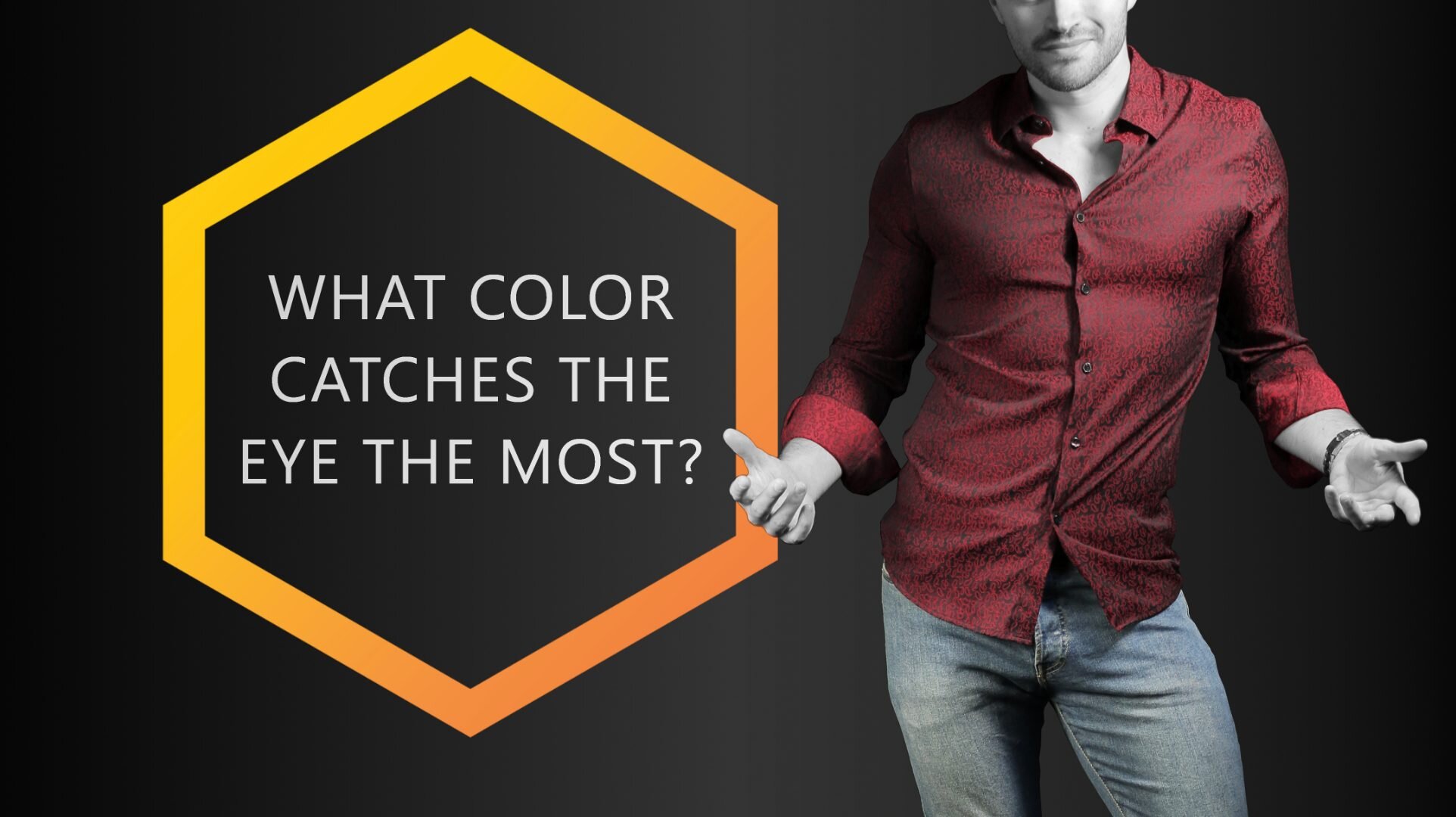
Have you ever wondered which colors catch the eye most? Maybe you want your outfit to stand out in a crowd, or maybe you want to make a striking first impression. Whatever your motivations may be, many have wondered the exact same thing!
What people have found is that some colors are more eye catching than others. Some colors may blend into the background and render the wearer less noticeable, while others will make the wearer pop out in a bright explosion of color.
But which color does which? Read on to learn which colors are best for catching the human eye, and why they’re so noticeable.
The color that catches the human eye the most is either red or orange. Yellow is also a valid candidate, in some cases. Colors that are warm, bold, and bright are more eye-catching than others.

Colors like red, orange, and yellow catch the human eye the most. This is why road signs and safety vests are made in these colors.
How Does Color Affect the Human Mind?
First, let’s explore what effects color can have on the human psyche.
Some colors will bring out different reactions than others. For example, warm colors may give the illusion of closeness, which will bring those colors out in a crowd and be more noticeable.
Colder colors have a distancing effect, which may make them harder to pick out in a large group of people or colored objects.
As D.L Bordeianu, L Hristian, and I.G. Lupu stated in their scholarly article on the effects of color on human psychology, “The physiological and emotional effects of colors are used to impress aesthetically. Taking into account the created impression we can speak about warm colors (red, yellow, orange) which give the impression of closeness and cold colors (blue, green, indigo) which give the impression of distance, i.e. increasing space.”
These scholars posit that certain colors give off a different impression, though they haven’t necessarily answered our question.

Where’s the difference? We’re sure you found it in about 5 seconds or less! We’re also pretty sure that you didn’t even notice the guy with the (not so) orange shirt in the left image…
Additionally, in Paul J. Locher and Calvin F. Nodine’s scholarly article on symmetry, “Symmetry Catches the Eye,” they posit that colors worn in symmetrical patterns are also more eye catching than asymmetrical variants of the same color.
Their study found that the eye movements of adults in their control groups were focused along the axis of symmetry in the images they were presented, suggesting that if a pattern in a certain color is symmetrical, it will better catch the eye than an asymmetrical pattern of the same color.
Depending on the industry, it can make quite the difference, which colors are best for catching the human eye. For example, in the housing industry it's generally best, not to paint rooms in overly bright or dark colors. It's typically best to stick to pastels. Anything else would catch the eye too much.
But we’ve come here to determine which color stands out the most to the human eye, right? Without further ado, let’s take a closer look at specific colors and whether they stand out visually or not.
OUR READERS’ FAVORITE:
Red and its Effects
Let’s start with an obvious one. You may be thinking, “Of course red will stand out visually, it’s aggressively bright!” And yes, you’re right. But is it the most noticeable color of them all? And what exactly makes red stick out so much?
Red is often associated with passion and heat and has been known to have an agitating effect on animals and people alike.
You know what color bullfighters use to goad the bulls, right? Yep, it’s red (or magenta). But beyond this, it’s also extremely visible. This is why stop signs, stoplights, and fire equipment are all red.
Things that are essential for people to notice are often colored red to make it easier. Red is the color of many ripe fruits. It is therefore a color we as humans are trained to see.
Although red is the color that is least visible from a distance, it is still the one that stands out the most in nature due to its contrast to green.
Red stands out. It’s a color rarely worn in large amounts, so as soon as someone does, heads start turning.
This color also often has the connotation of courage and bravery. If you’re looking to stand out from other people around you, red is the perfect color to pick. It will tell others that you’re bold and you don’t shy away from the spotlight.
Now that you know, it’s no wonder that red is a favorite among tie colors, right?
Is Blue Eye-Catching?
More often than not, blue is associated with serenity, coolness, and calm. It is a soothing color that reminds one of the skies, the ocean, or ice.
Blue is also seen as a typically masculine color, highly venerated among men. Wear this color if you wish to have a calming presence, or if you wish to communicate serenity or intelligence to those around you.
But does blue stand out, or fade into the background? More often than not, blue is a color that will not stand out as much in a crowd – unless the variant of blue is bright and garish, which most worn blues aren’t.

Blue is a very unoffensive color that typically blends nicely with its surroundings. The red soles of these shoes, on the other hand, are quite eye-catching. | Socks: Spicy Chili
Chances are that if you’re wearing blue, it’s going to be a cooler, darker shade, which will not be as eye-catching as some other colors. This is especially true for navy or dark blues, which may appear black or gray at first glance.
It’s safe to guess that blue is not the most noticeable color on the spectrum.
Green Blends Well in Nature
Green has many connotations, most of which are fresh, hopeful, and full of life. Green is known to be the color of spring and blooming things, and it also gives off a sense of cheer and joy. It has even been known to alleviate tensions and inspire restfulness.
As the most restful color for the human eye, green suggests safety and stability. This color – especially as a bright and bold green – can often be eye-catching, as people associate it with good things or with a “go ahead” mentality. Think of the green light at a stoplight.

Green and chartreuse (yellow-green) are not your typical clothing color. Therefore, they tend to stand out. | Socks: Vegan Candy
While green may not be the most eye-catching color out there, it definitely catches the eye more than a lot of other colors. It can be a great choice if you want your outfit to be memorable, but you don’t want to stick out too much.
As a general rule of thumb: The brighter and stronger the green, the more it stands out. The darker and less saturated it is, the more you will blend in.
Yellow is Explosive
Now let’s take a close look at yellow. Yellow brings with it thoughts of sunshine, light, brilliance, and joy. It is a cheerful color that claims attention and shares the pedestal next to red as one of the most eye-catching colors out there.
But why is this? Yellow has a warming effect on viewers, inspiring cheer, mental activity, and energy. Often things that are meant to grab your attention are colored yellow, like a taxicab for example.
Warning signs are often painted yellow as well so that people will be more likely to notice them and the warning they communicate.
Yellow is also a great color for contrast. Against a black or otherwise dark background, yellow will stand out even more.
This pair of socks is a great way to draw attention, by the way…

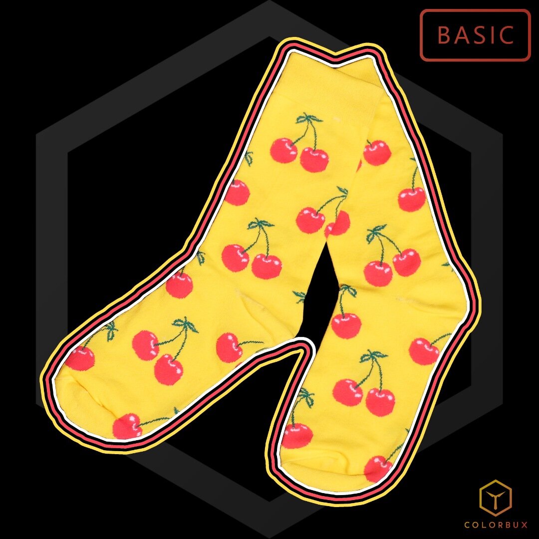
These socks aren’t just cherry - they’re very cherry.
These foot warmers are easy to match or combine with other pieces of clothing, so they make a great addition to any wardrobe.
Colors used:
Yellow (base)
Red (accent)
Dark green (sub)
So, if you’re looking to really stand out, try wearing some yellow with darker accents to make it pop. But if you’re going to be attending a more serious event or venue, it might be a good idea to wear more muted colors.
Yellow can sometimes come across as lighthearted and playful, which might not be the right message to send in some circumstances.
Orange Stands Out
Now onto orange. A mix between yellow and red, orange communicates warmth and bright light, but can also mean warning in some instances.
Also considered cheerful, it gives off a mix of red and yellow energy. With the energy of red and the cheerfulness of yellow, it can also represent enthusiasm and determination.

Orange is one of the most underrated and underused colors in fashion. It makes for great accents and when matched correctly, it can make any outfit extraordinary. | Socks: Color Crates
Similar to both colors it is comprised of, orange is one of the more visible colors on the color wheel.
It is a very hot color to the eye and will be noticed before cool and dark colors.
With exceptionally high visibility, orange is used to catch attention and highlight important things, whether that be communication, design elements, or articles of clothing.
Make sure to avoid wearing orange and most other warm colors for professional occasions. They tend to make you look less serious and authoritative.
Black Swallows Light
Black is the color of death, gloom, shadow, and absence of light. It is a mysterious color often associated with the darker things in life but is also regarded as a distinguished, formal color used for formal or stately affairs.
On a dark background, anything you wear that is black will fade and become hard to notice.

Black is classy and sophisticated, but it most definitely does NOT make you stand out.
Needless to say, in most cases black is not the color that will help you stand out. It’s not very eye-catching unless it’s surrounded by brighter colors.
Contrast can often be your friend, so if your aim is to stand out and you simply have to wear black, it could be a good idea to pair it with brightly colored accents, like white or yellow.
At the same time, black communicates elegance and prestige, so why wouldn’t you want to make it an integral part of your wardrobe?
The Most Eye-Catching Color
Taking all our findings into consideration, and those of the scholars referenced earlier, nothing catches the eye like bright, warm tones. This includes reds, yellows, and oranges above all else.
Green comes in close second to these warmer colors, with cool colors like blue and black falling far behind in terms of visibility.
The rule to consider here is: The brighter, stronger, and warmer a color, the more it will stand out. The higher the contrast and the more symmetrical its pattern, the more it will catch another human’s eye.
So, whether you’re bent on making a bold impression and sticking out in the crowd, or if you’d prefer to have a more muted presence, just choose clothing items with the appropriate colors.
It can also be helpful to remember the connotations people associate with each color, using them to your advantage in any situation in which you might find yourself.
Like we said earlier, yellow is fine if you want to send a message and draw attention, but it’s probably not the best choice when attending a funeral service. Black on the other hand… Well, we all know what color you’re supposed to wear to something like that, right?
OUR NEWEST ARTICLES:

How Does Clothing Color Affect First Impressions?
Colors affect first impressions in ways you can’t imagine. Wearing predominately blue makes you look more intelligent whereas wearing black helps you seem more authoritative. All colors have a certain effect - some of them are more desirable than others.
Whether you’re preparing for a job interview, having lunch with a new client, or going on a first date, first impressions matter.
A key aspect of first impressions is the color you present to others through your clothing. But does clothing color really affect how you’re perceived by those you meet for the first time?
The short answer is yes, it does. In today’s fast-paced social and work environments, snap judgments are made quickly and frequently.
Every little detail of your appearance contributes to how others perceive you, including the color of what you’re wearing.
Can the Color of an Outfit Affect First Impressions?
The color of your clothes can impact other’s first impressions of you very dramatically. For example, a mostly blue outfit makes you seem more intelligent and competent, whereas a mostly white one can make you look more outgoing and friendly. Color Psychology is the key to knowing what colors have which kinds of effects.
As suggested by this Study, the attire one chooses to wear often conveys a message to those who perceive them, sending signals about their competence, social class, and intelligence, among other things.
Read on to learn exactly how the color of your clothing affects first impressions.
First Impressions Start with a Look
Before an impression is made based on what you say or how you act, your value will be judged based on appearance alone.
Often, this starts at eye level. People will first notice the shirt, tie, or jacket you wear. They will eventually notice the rest of your ensemble, all the way down to your shoes, but you can be certain that the first thing they see will be the top pieces of clothing.
You can utilize this first look to your advantage by selecting the right color. Certain colors can communicate different things, so if you want to make the right first impression, it’s important you select the right color for the right occasion.
Be Bold
If you want to convey confidence and authority to those around you, it’s best to wear strong, vivid, and bold colors. This approach can be accomplished from multiple different angles.
You may choose to wear a solid yellow tie, for example, to demonstrate a confident and fun-loving demeanor. Or if you wish to convey bold authority, leaning towards darker colors would do the trick.
To look more authoritative, go for dark blues, blacks, or charcoal grays. These heavier colors are timeless, perfect for any formal affair where you might want to impress.
Be Unforgettable
In many instances, it will play to your advantage to make a lasting impression. This is especially true for first impressions in job interviews or on dates. To ensure you’re not easily forgotten, try wearing a creative and imaginative pattern, choosing colors from the pattern for the rest of your outfit to pull your whole ensemble together.
A few examples of such patterns include:
Paisley: Paisley is a scrolling pattern of interwoven swirls and splashes of color, traditionally symbolizing the tree of life and fertility. This is certainly an unforgettable choice.
Floral: A floral pattern is just as it sounds; a pattern consisting of flowers and flower-like patterns. When paired with the right colors, a floral pattern can convey an impression of warmth, spring, or summertime.
Stripes: This classic pattern creates motion and sequence, and if worn right, can even make you look taller or thinner.
Floral Patterns are astonishingly easy to mix and match with other colors. | Socks: Squorange
No matter what pattern you decide to wear, it’s important to keep in mind the expectations of the first impression you’re dressing for. It may not always be appropriate to wear a floral tie to a job interview, for example – but wait, that actually could work nowadays!
Alternatively, wearing a strong, saturated blue suit makes you very unforgettable as well. This “secret weapon” immediately makes you more trustworthy and competent-looking. The same principle applies to web design, as this study suggests.
AN UNFORGETTABLE PATTERN:
The colors on this pair of socks are carefully selected to fit together perfectly. We suggest combining these bad boys with other accent pieces containing yellow, red, or light blue. Pick two of these colors to match if you’re feeling a bit daring.
Colors used:
Dark blue (base)
Yellow (accent)
Red (accent)
Light blue (accent)
Purple (sub)
Pale pink (sub)
Pale green (sub)
Be Approachable
Maybe the first impression you’re going for is a friendly and approachable vibe. You want a prospective employer, for example, to feel comfortable around you. You want them to know how friendly and easy-going you are.
Choosing a look with bold colors and zany patterns may not be the best choice in this case, as those may serve to be intimidating or off-putting to some. Instead, try wearing softer colors. Light, soft colors are often seen as more inviting and less in your face. Light greens, yellows, blues, and coral are some such colors with a friendlier appeal.

Light colors make you look friendlier. Wear them if you mean to give off that vibe. | Socks: Rainbowie
Another nice thing about these lighter colors is that they’re easy to pair with a wide array of other colors and patterns, so you can build your look around them easily!
DRESS WITH FIRST IMPRESSIONS IN MIND
As stated before, it’s important to keep in mind the occasion you’re dressing for and to intentionally dress for that specific occasion. You wouldn’t want to wear bright, fun colors to a funeral, for example. Or maybe you would, depending on whose funeral it is.
When selecting your outfit, you want to imagine the message you wish to convey through first impression. If you’re meeting a prospective employer for the first time, you will want to appear confident and competent. If you’re meeting a potential romantic interest for the first time over dinner, you may want to dress in friendlier more approachable colors.
Keep in mind that dressing with a purpose does not necessarily mean you can’t express your personality through what you wear. Quite the opposite, it simply means you tailor your own unique style and personality to the specific occasion on which you will be making a first impression.
Don’t worry, you can still wear your favorite pair of colorful socks.
The Psychology of Color
There have been countless studies led on the effect that color has on one’s mood and psychology. Each of them has proven various things about the power of color, but they all prove one thing:
Color has a profound effect on human emotion and initial impressions.
In her article on color and psychology entitled “Color Psychology: What Colors Should You Wear and Why,” Vanessa Van Edwards posits that colors almost always create the same impressions for different people. She goes onto give the color blue as an example.
Blue is often associated with blue skies, which has a positive connotation evolutionarily since that typically means there are no incoming storms to worry about. So universally, blue is a color that projects calm and stability.
Dark blue is one of the most versatile colors in fashion and is, therefore, one of the best colors for a suit, in fact.
Blue, especially darker blue, is the color of calm and intelligence. | Socks: Bordeaux
The power of color is real. Beyond simple connotation, the color you wear has been proven to affect your mood. In many cases, a person’s mood may shift to reflect the color they’re wearing on a given day. Some people pick out clothing to wear for the day based on the color that represents the mood they’re already in.
However, others choose colors of clothing based on the mood how they want to feel. If you have never tried this tactic, we certainly suggest you give it a shot – more often than not, it works like a charm!
Brighter colors like pinks, yellows, and whites have been known to boost one’s mood, making them feel lighter and happier. Conversely, more aggressive colors, like red, can cause feelings of anger or hostility.
But, bright colors that come from the warm side of the color wheel stand out much more. They are much more eye-catching than colder and darker colors.
Returning to Vanessa Van Edwards’ article, she even goes on to cite research that has proven how color can affect more than just your mood. The colors we perceive in the world around us may even affect our respiration, heart rate, or blood pressure.
WHICH COLORS MAKE THE BEST FIRST IMPRESSIONS?
There are a lot of colors to choose from when deciding what to wear. But which colors make the best first impressions? Let’s take a look:
Blue: Blue is known as the color that is often associated with wisdom and truth. Its calming effect can put others at ease when meeting you for the first time. As such, this color will counteract tension.
Green: Green is often associated with vitality, safety, and harmony. It also reminds us of money, which could be a good connotation to make in certain scenarios.
Brown: Often seen as masculine, brown is the color of stability.
Black: Known as one of the power colors, black can convey mystery and seriousness. It also has a thinning effect, often giving the wearer a more elegant look. It is also a color that pairs well with other colors, such as a green or blue tie, and is the color that hides sweat marks the best.
Black is the most authoritative color of all. Wear it to make a serious and elegant impression.
These are some of the best colors to wear when making a first impression. There’s been a lot of mention of mood and color in this discussion of color, and you may be asking why mood should matter when making a first impression.
Well, the simple answer is:
The way you make people feel when meeting them for the first time will last.
If a person is angry the first time they see you, anger will become a continuous feeling associated with your name and memory. Needless to say, this is probably not the association you would want to create with a prospective employer or romantic partner.
Wear Colors According to How You Want to be Perceived
Color can be an immensely powerful tool when utilized correctly, especially when making first impressions. Remember to take the time to reflect on the kind of message and feelings you want to convey when selecting clothing for the first encounter with someone important.
Often this first impression will last, painting a picture of who you are in this person’s mind for an indeterminate amount of time thereafter.
Clothing itself is a tool that communicates all sorts of information about the wearer. It can convey the appearance of wealth, power, confidence, friendliness, or even hostility and passion.
It can be the difference between being soon forgotten and be remembered long after. The clothes you wear say a lot about who you are, and you should want them to say the right things, shouldn’t you?
RELATED ARTICLES:

Clothing Colors That Reduce Redness
To look less red you have to choose a clothing color that is neither complementary to your redness, nor analogous or warm. This leaves only a few valid options: blue, blue-purple, yellow, gray, and cool brown. These are all the colors that can help to make your skin look less red.

Are you looking high and low for those clothing colors that can reduce redness? We’ve got you! Down below we’ve comprised a list of options that might help your red face/skin look less red!
It’s important to narrow down the colors that work best for you, as every person will have a different reaction to certain color combinations.
Keep scrolling as we have created the ultimate guide on ways to reduce visible signs of redness in your complexion. Whether you’re naturally red-toned or are currently suffering from a sunburn, don’t fret! Here are our top do’s and don’ts when trying to tone down your complexion and look less red.
Clothing Colors to Look Less Red
To look less red you have to choose a clothing color that is neither complementary to your redness, nor analogous or warm. This leaves only a few valid options: blue, blue-purple, yellow, gray, and cool brown. These are all the colors that can help to make your skin look less red.
It might be (or rather: it is) important to know that “red skin” is rarely just “red”. Most people actually turn more red-orange when they have a sunburn and very light-skinned individuals tend to have a natural red-purple glow to their skin.
Though both colors have a lot of red in them, they are very different from each other. Our color wheel can show you the difference more easily:
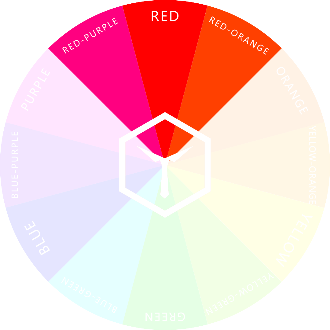
Both red-purple and red-orange have quite large amounts of red in them. Do not wear these colors if you want to hide your redness.
In any case, the rules for reducing redness by choosing the right clothing colors are very similar – whether you have more of a purple or orange tinge to your skin tone. Here are the tips we put together to help you look smashing even if you’ve slightly neglected to apply sunscreen yesterday...
Do Not Match Your Red Skin Tone
This is our number one tip, tried and true. Do not, by any means, wear the colors red, red-purple, or red-orange.
We’ve expressed the method of matching colors to make them “pop” extensively within our eye color enhancing series (for blue and green eyes). When you match a clothing item to your eye color, it will exaggerate their appearance and help make them pop. If you dove deep into that guide, then you might know where we are headed.
This method also applies to the redness in your complexion! If you Clothing Colors That Reduce Redness
Looking high and low for those clothing colors that can reduce redness? We’ve got you! Down below we’ve comprised a list of options that might help your red face/skin look less red!
It’s important to narrow down the colors that work best for you, as every person will have a different reaction to certain color combinations.
Keep scrolling as we have created the ultimate guide on ways to reduce visible signs of redness in your complexion. Whether you’re naturally red-toned or are currently suffering from a sunburn, don’t fret! Here are our top dos and don’ts when trying to wear a shade, tint, or tone of red or red-orange, it will draw out the redness in your appearance.
Those rosy tones will become more apparent and pull forwards any signs of redness you might be trying to hide, as stated by Beverly Rhoades in this publication.
If you’re looking to reduce the redness in your appearance, wear colors that don’t enhance its visibility.
Beverly Rhoades has concluded how using these tips and tricks can assist in toning down the visible inflammation that a skin problem like rosacea unfortunately bears.

You can reduce the redness of Rosacea by wearing certain colors and leaving others in the closet.
Are you dying to wear red, but afraid of the outcome and no idea where to start? Try deeper and darker reds that lean more towards purple. Some shades of red could work for you, but you would only know if you tested them out.
Stay closer to the burgundies of the color range, and far away from the scarlets!
ANOTHER INTERESTING ARTICLE:
Stick To Cooler And Darker Colors To Reduce Redness
It’s not a secret that warmer colors help to bring warmth back into your complexion. If you’re looking to liven up your appearance and sport a beautiful and youthful glow, then warmer tones are the way to go.
However, this often means that any redness you might have will become enhanced by this color range. To tone down the rosiness, we highly suggest sticking to cooler and darker colors. These color choices will lessen the vibrancy of your complexion, as they don’t encourage your natural warmth to shine through.
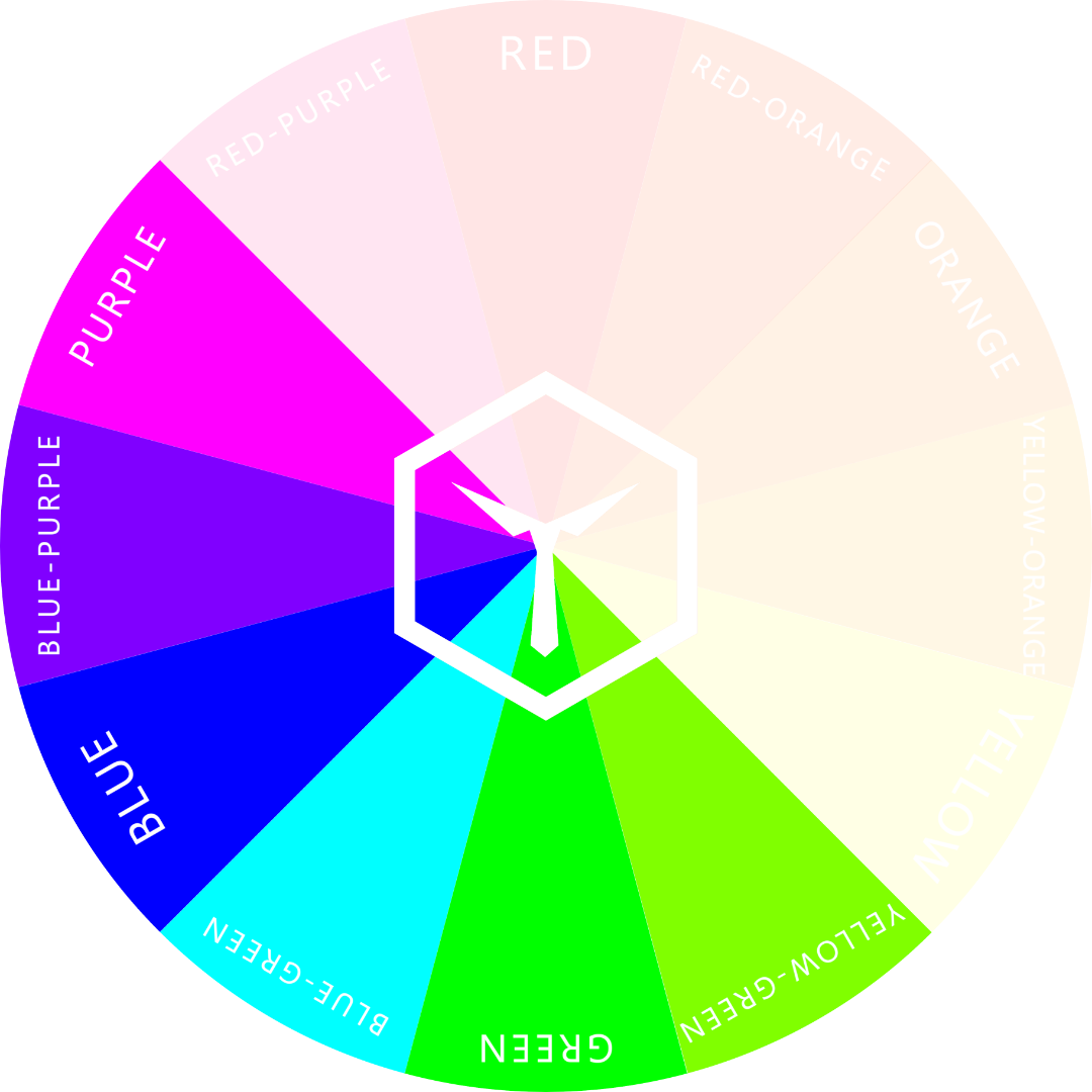
Wearing cold colors helps you to look less red.
Darker colors can play down the redness in your appearance, helping it to appear less intense. Remember, the darker the color, the more it will overpower the redness.
SOME RATHER COLD COLORS:
Let’s play a game, shall we? A game of crosses and circles - and let’s play it where it’s usually not meant to be played: on our feet! Let’s call it Tic Tac Toes! How fun it must be. This design will blast your socks off (figuratively speaking, of course).
Colors used:
Purple (base)
Red-purple (accent)
Cyan (accent)
Magenta (accent)
Bright blue (accent)
Gray and Brown Are The Way to Go
Colors like gray or brown are a good pick if you tend to have red skin (or a sunburn). Look towards toned blues (grayed out) and cooler browns to de-emphasize red even more.
Brown is a natural and neutral color that can help your skin look less red.
It is amazing how well a neutral color can dim any redness in your complexion. By not adding, enhancing, or drawing attention to the redness, these clothing choices can actually reduce the coloring of your skin.
With this being said, not every neutral is ideal – be careful with black and white. These two neutral clothing options can draw attention to your redness, ultimately putting it at the center of attention.
As black and white completely lack any color, your red complexion will become enhanced as there is nothing drawing the attention away from it. With a black or white background, any color will appear more vibrant, forcing your redness to stand out even more than before.
Have you ever worn white on vacation after lying down in the sun all day? The redness overpowers the white completely making it all you can see. If you are accustomed to sunburns, you know what we mean!
Black, on the other hand, can have a different result. As it is a darker color, it can sometimes also help to overcome the redness.
Depending on the individual, the outcome black will have can range drastically.
Should you have very light or even pale skin, you should stay away from wearing black. This is, even more, the case when your skin is irritated, burnt, or just slightly red.
But, if you have a more tanned complexion and are experimenting with clothing options, we suggest giving black a try, what can it hurt?
Avoid Neons and Pastels
There is something about neon colors that enhance and highlight the red in skin tones. They are great for when you are rocking a tan, but not when you look like you’ve been out in the sun a little too long.
The more vibrant the color, the more it will set off the vibrancy in your complexion. You want nothing that will enhance the redness in your appearance, and neons will do just that.
Regardless of the color, blue, green, or even yellow, neon’s will enhance the severity of the color, making it look more pronounced.
A similar effect comes with wearing certain pastels! Pastels will drain any skin undertone from your complexion, forcing the redness to appear more prominent. They, therefore, also have the ability to make you look washed out and sick.
The only pastels that you can actually pull off with reddened skin are light blue, lavender, and maybe lilac or mint. Due to their colder, more blue-infused nature, they pair much better with the rose color of burnt, irritated, or flushed skin.
You can also go for beige tints since they’re just brown with various portions of white added.

These pastels are the only ones that can possibly help your skin look less red.
Purples and Blues To The Rescue
Do you want to be as bold as you can without putting your rosy tone in the spotlight? Then purple and blue are some brilliant colors to lean towards. As long as you steer clear of the overly bright and bold versions of these colors, they can do wonders for your appearance.
Try to stick with a cooler (more blue) purple, as its color won’t exaggerate your redness or drain the warmth from your complexion. Instead, it will complement it in the best way.
Blue is an extremely popular color for clothing for many reasons - reducing redness is one of them. | Socks: Spicy Chili
Deep, dark purple also looks incredible on a lot of different skin tones and undertones, so this could be your new go-to while experiencing some redness.
The same thing goes for blues: the deeper and darker, the more subtle your redness will look. Obviously, don’t go too dark or it will look like you’re wearing black.
The National Rosacea Society recommends sticking with “red-reducing colors such as blues” if you struggle with rosacea. The same goes for every other type of redness, even though most are much less pronounced and serious.
As a general rule of thumb, you could say: “When in doubt, go with blue.”
Green Makes Red Skin Stand Out More
Green is a tricky color when it comes to masking “red”.
Although used in makeup to color correct any visible signs of redness on the skin, as it sits directly across from red on the color wheel, this duo can actually have the opposite effect when worn together.
Since green contrasts and enhances red, be very careful with wearing it if you experience any redness. According to the Color Book, green will push red to look more vibrant!
Complementary colors help each other to appear more intense when paired together. You can use this to your benefit though. If you have red hair, wearing green will enhance the natural coloration of it immensely.
How to Look Less Red
Redness, whether it is natural or temporary, can be frustrating to deal with. The hardest part of pairing clothing with your complexion is the uncontrollable elements that come into play.
It might already feel difficult to decide what to wear based on your skin tone and undertones, and adding in redness can also eliminate and shrink your color options even further.
Often, the only way you can ensure a seamless end result is by testing out the clothing beforehand. If you know what colors work best with your appearance, rock them!
When looking to reduce the visibility of redness though, we highly recommend sticking to neutral, dark, and cold colors. These colors can offer you the superpower of diminishing the appearance of a red face.
Remember, it’s all about how comfortable and confident you feel in your own skin. Luckily, the colors we just mentioned above are those that are most often the easiest to pull off anyway.
In other words: don’t overthink what you’re doing. Go for a simple outfit composed of light blue jeans, a gray shirt, and maybe a dark blue jacket of sorts.
ARTICLES YOU MIGHT LIKE: