
Dark or Light Colors in Clothing?
Contents:
It is always up to us to choose between dark or light colors in clothing. Color can be a major indicator of our personalities and our moods are always affected by the colors, tints, and shades we wear or the ones we are surrounded by.
Every color has characteristics that make it unique and the effect that each one has is different. The photons that make up light and, ultimately, color as well cause a sensation in the eye. These photons reach the so-called “rods and cones” of the retina inside of the eye. The rods and cones then convert what they “see” into nerve-information about color. The brain interprets the inputs of the optic nerves and makes sense of the information.
The brain processes the information and gives the resulting “colors” names, such as “blue” or “red” and so on. It also interprets the lightness of the colors, meaning the shades or tints, sometimes (rather incorrectly) referred to as “luminance”. It simultaneously gives these colors, tints, and shades a meaning. More about what clothing colors say about you in another article.
In this article, we’ll focus on tints and shades. You’ll find out how we, as human beings, react to certain dark or light colors and why we do so.
The Signals the Wearer Sends
The colors in our clothing and their combination tell others a lot about our personality. This happens mostly unwillingly and unknowingly because people choose what to wear according to their personality traits and current emotional state. Most people have no idea why they choose to wear a certain shirt or specific color trousers at any given time.
Sadly, we can’t expand on this interesting topic in this article. We will go into greater detail concerning colors and personality in another article. Be sure to subscribe to our newsletter to benefit from updates as soon as they are published. However, we will cover the topic of tints and shades and what messages they send in this article:
We always have to know what to wear at home, at the office, while jogging, at parties, family gatherings, and so on. What and how we select our clothing for these occasions is influenced by our age, mood, preferences in clothing, weather, what our peers wear, and many other variables.
According to psychologists, the color we prefer to wear most is the color that gives us more room to be ourselves. Light colors point towards people whose personalities tend to be more sensitive and calm, while dark colors point towards those who are strong and straightforward.
We seldom consciously decide: “should I wear dark clothes today or would something light or bright be better?”. This is a bit of a pity because we send so many different unconscious messages when wearing dark versus light clothing:
Darker colors in clothing…
...show seriousness, stability, and determination. Studies find, they influence the perception of competence and boldness.
...can convey feelings of sadness or depression, mostly in western countries.
...make the wearer blend in better with his/her surroundings.
...reduce the regular effects of fully saturated colors (full chroma), making them less apparent.
...are more suitable for prestigious events and high-end business.
Lighter colors in clothing…
...show openness, familiarity, and happiness.
...can convey feelings of friendship, fun, and compassion.
...make the wearer stand out in groups or crowds.
...make the whole outfit appear less serious.
…can make you look younger.
...are more suitable during spring or summer and for casual and smart casual wear.
As you can see, the effects of dark and light colors in clothing are completely different. Of course, it always also depends on the hue (the color) and the saturation of that color. It goes without saying that a dark shade of red (i.e. burgundy) has a completely different effect than a dark shade of blue (i.e. navy blue), even though the colors are very close on the color wheel and are very similar in shade.
A Bit of Color Theory
Shades are made when you add black to a color creating a darker value. Tints, on the other hand, are created when adding white to a color creating a lighter value. The “value” or “lightness” describes the amount of black (or white) in any given color. Therefore, shades are always darkened colors and tints are colors that are lighter.
When speaking of the brightness of colors, we normally refer to the amount of saturation in any color, making the hue brighter and more intense.
How to Combine Shades and Tints
Many people don’t have much of a concept of how to combine colors. It’s the same or even worse for combinations of shades and tints. Most of us construct an outfit by simply throwing together pieces of clothing we like, which, at a bare minimum, don’t look bad when combined.
What we often overlook when combining outfits, is the contrast between the pieces of our outfit. Contrast does not only describe the relation between black, white, and gray. It does the same for shades and tints of color.
For instance, a dark blue (i.e. navy) has a strong contrast to light pink, whereas it has a rather weak contrast to a dark red (i.e. burgundy). This is because shades contrast very little to other shades and tints very little to other tints. However, when combining shades with tints, the contrast is more apparent.
Interestingly though, the contrast in color is not simply defined by adding or subtracting black or white to or from the hue. “Color contrast” or the difference in hue is also measured as the distance between two colors within the color wheel. More about this topic in another article.
In the following example, you can see the same symbol twice. One version is in color, the other is fully desaturated (black and white).

Chromatic

Fully desaturated
Please note that in the black and white picture, you can see almost no difference between the two colors, but in the colored one, you most certainly do. This is because both colors have similar amounts of luminance (shade/tint).
The same principle applies to clothing and you can use it to your advantage:
Wearing an outfit that has a low difference in luminance but high contrast in hue gives anyone a very unsettling feeling.
The opposite is less displeasing, though still quite peculiar.
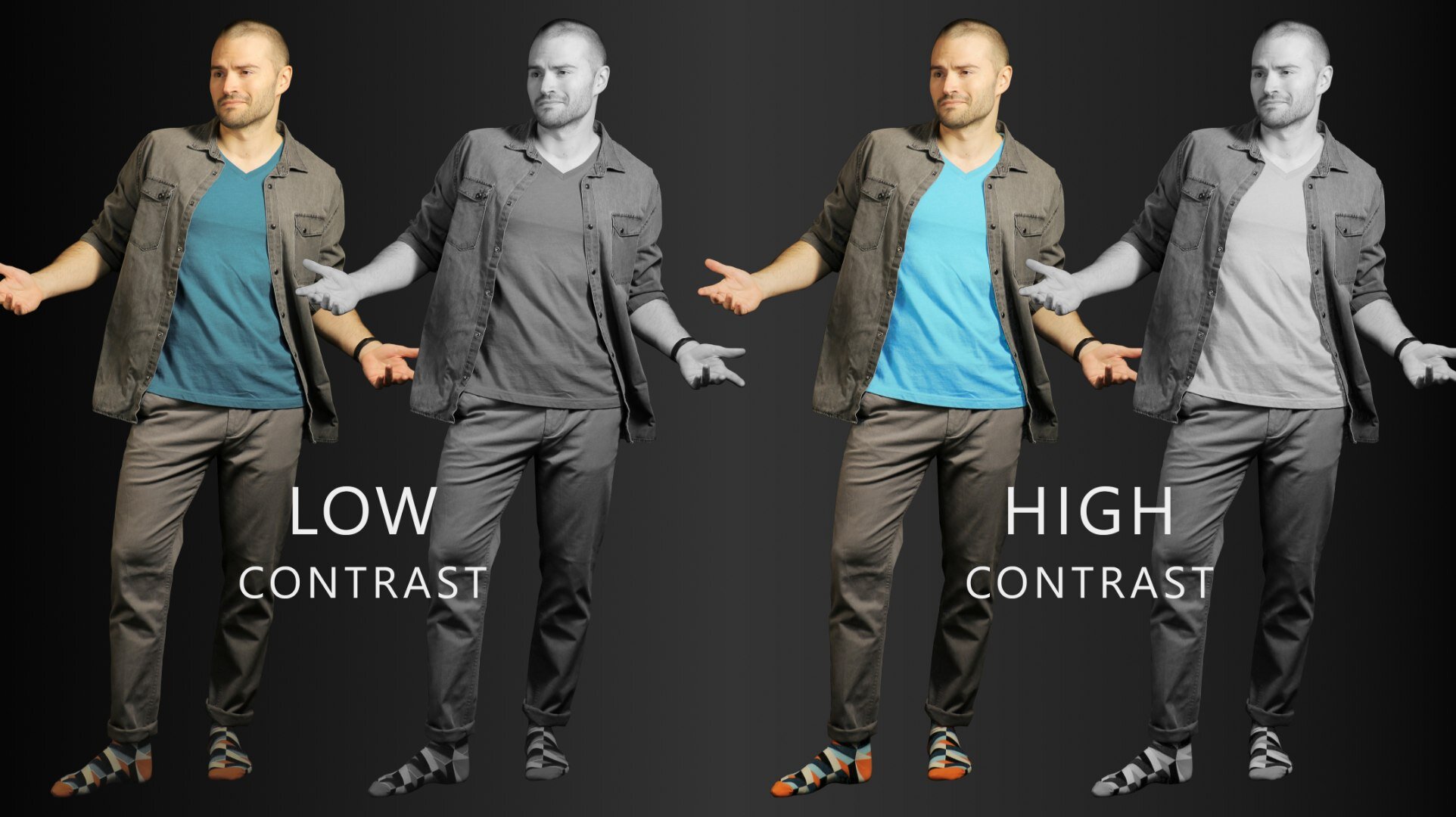
Low versus high contrast in clothing. High contrast looks much more pleasing. | Socks: Color Crates
It becomes apparent very quickly how crucial it is to make sure that an outfit is constructed with a “normal” amount of contrast in mind. For the purposes of this article, we’ll focus on contrast in luminance (shade/tint).
Most people instinctively choose an outfit that has a normal amount of contrast. Imagine if you were able to actively and consciously choose how to make your clothing style appeal to others. It would be a lot easier to make people think of you the way you want them to. The contrast in clothing plays a large role in this.
Putting together an Outfit With Contrast in Mind
When thinking about what to wear we all have basic routines. Some of us just seem to know what to wear as soon as we get out of bed and some spend ages in front of the closet and still can’t come up with anything useful. Most of us are somewhere in between (lucky us).
At COLORBUX, we like to propagate the following method to put together an outfit:
Start with the one piece of clothing you simply have to wear now.
Look at that piece of clothing and define which color(s) it has.
If the piece has two or more colors in it, stick with those two colors (plus shades and tints of them) for the whole outfit. If the piece is only one color, use shades and tints of that color plus the same for a color that goes well with the first one.
You can always change the canvas color of your outfit if you think it looks good or at least better than if you use the base color of the initial piece of clothing you picked.
Choose an accent color to stick out. Use a very saturated hue of one of the already present colors in your outfit for a quick and easy fit.
Here’s an example of how we work when putting together an outfit:

Dark versus light clothing: Formal versus casual? | Socks: Bordeaux
We started with a pair of socks (of course).
These socks are made up of red (in three different shades) and blue (one tint, one shade, and one fully saturated with the hue leaning towards blue-green). The base color of the socks is black.
Since the socks have a dark red (burgundy) in them, we’ll pick a burgundy pullover to match and since the light blue color of the socks goes well with a light blue shirt, we’ll wear a similarly colored shirt under the pullover.
Yes, the base color of the socks is black, which we could pull off in this outfit. But we suggest going for a different approach: If we switch out black for another canvas color – in this case, a light brown (camel/beige) – we get a much lighter and more casual outfit. The darker look on the left seems more fitting for formal occasions.
As an accent, we chose to stick with the already present bright blue-green. Since it is now spring, we decided to go with a bright turquoise pair of sunglasses.
Why we picked certain shades/tints in our example outfit
We adjusted the color of the canvas to suit the current season. Also, it seemed more fitting to go with a light brown due to the smart casual look of the color combination used in the socks and the pullover-shirt style.
If you were to pick a suit to go with the same pair of socks, you would have three options: Either go with gray, black, or blue as a canvas color (for the suit). In the example below, you can see the first two canvases.

Same color scheme - different canvas shade. Color values ARE important. | Socks: Rainbowie
As you can see, the outfit seems incredibly different just because we changed the shade/tint of the canvas. Nothing else changed!
The whole look and feel changed from “light and outgoing” to “serious and formal” when the suit switched from gray to black. The same effect can be achieved when changing out other clothing pieces for darker shaded substitutes – it’s just a little more subtle.
In other words, you pick the lightness or darkness of any outfit according to the occasion. Always use the average value (= lightness/darkness, remember?) of the whole outfit as a starting point to define the impression it will give others and how fitting it will be for the particular event, weather, season, etc.
Not sure whether to pick lighter or darker socks than your trouser color? Read our article on “should socks be lighter or darker than pants?”.
Other Things to Keep in Mind
Our goal is not to make you think that the color values of an outfit define everything concerning the signals you send out to others. It’s important to remember that it always depends on what you wear.
A basic T-shirt will never look formal no matter how dark it gets! A suit will never be appropriate attire during a football game no matter how light gray or even white you make it!
Good threading always looks (and feels) good – even from afar. This is why we can tell apart a high-quality (mostly expensive) piece of clothing from a thin and cheap rag. We’ve been conditioned to see these differences since we were old enough to wear clothes.
Nevertheless, you can always make up for less expensive (looking) attire by constructing your whole outfit well. We’ll be showing you more about this topic, but for now, here’s one quick example:

A cheaper cotton shirt versus a high-end silk shirt - both of similar navy blue color. | Socks: Space Cubes
As you can see, the more expensive threading (on the right) looks better, even though both shirts worn are of the same color and the whole outfit is very well-composed. It helps to wear high-quality materials - they, more often than not, simply look better.
Nevertheless, it’s always possible to look fantastic without having to pay a fortune for your outfit. It’s also possible to look terrible when wearing expensive clothing. So here’s something to remember:
It’s not just about what you wear, it’s always also about how you wear it.
This is what COLORBUX is all about. We tell you how to make the best outfits possible with the clothes you already have in your wardrobe – and if you need a pair of socks to go well with that lime-green tie of yours, we’re here for you.
There is one more thing you maybe should know about dark and light colors:
Dark clothes heat up quicker in direct sunlight. Though this doesn’t actually increase your body’s core temperature, it’s not very comfortable, is it?
We suggest sticking to lighter colors while spending time out in the sun. For more info (and there’s a lot of that), read our article on the topic.
Dark and Light Colors in Clothing – the Short Version
The values of the colors we wear make us feel differently. Light colors also send other signals to our peers than dark colors do. Dark outfits seem more serious and formal, whereas light attire seems more casual and outgoing. It has similar effects on the wearer him-/herself.
Dark clothing makes the wearer blend in better with a crowd. Light and bright colors in clothing do the opposite. This is why people – depending on their personality – choose either the former or the latter.
Some colors, dark or light, give us confidence when we wear them and some just don’t seem to fit our personality, skin tone, or other aspects. Sometimes it just doesn’t fit. But, if you know what to look out for and how to combine colors, shades, and tints, then maybe it can fit.
Combining shades and tints is no easy task. As with everything: beauty is in the eye of the beholder. You should always wear what you think looks good and suits you. If you don’t feel comfortable in the outfit you’re wearing, then it’s just not worth it.
Also, always pay attention to how the clothing you wear goes with your skin tone. Shades and tints of clothing can appear very differently if you have a dark complexion or rather light skin.
For example, opt for lighter pastels from the orange or the blue side of the color wheel to enhance a tan.
When combining shades and tints of colors, you have to pay attention to a few things. Don’t overdo the contrast between the colors of what you’re wearing. The same counts for the contrast of luminance in your outfit. The middle ground is always best – so, mix it up (but not too heavily)!
When putting together an outfit, start with one piece and build from there. Pay attention, not only to the colors but also to the mixture of shades and tints. Stick to our building plan and follow the 10 Golden Rules for Color in Fashion for best results.
Thanks for reading! We hope you liked our article about dark or light colors in clothing. If you did, we suggest you subscribe to our newsletter to make sure you’re updated on the newest tips and tricks, as soon as we publish. You’ll also receive discounts and exclusive sale offers from time to time. All we need is your email.


![Top 8 Best-Matching Colors [Which Ones & Why]](https://images.squarespace-cdn.com/content/v1/5d91f9da52210569ede7ff3a/1651242239176-CXWJHIC3RXVB7QT9A8IS/COLORBUX+Best+Matching+Colors+Top+8+Pairs+BANNER+Thumbnail.jpg)

![Color Blocking [Full Guide to In-Your-Face Outfits]](https://images.squarespace-cdn.com/content/v1/5d91f9da52210569ede7ff3a/1646746930918-379H8IHBYZUTHYHXRC3P/COLORBUX+Banner+Color+Blocking+Fashion+Guide+Thumbnail.jpg)
![Monochrome Style [Full Guide Plus Examples]](https://images.squarespace-cdn.com/content/v1/5d91f9da52210569ede7ff3a/1642857375701-LH2G67A31EQKYG3TVZ0T/COLORBUX+Monochrome+Style+Guide+One-Colored+Outfits+BANNER+Thumbnail.jpg)

