
The 10 Golden Rules for Color in Fashion

“I can’t wear color and I can’t match colors, so I guess I’ll just wear black (again)!” Does that sound familiar?
I mean, you already have clothes that have at least some color in them and that fit you, so why does it have to be the process of color matching them that ends up dulling your overall look?
Here’s the truth; combining colors to make a useful palette is a skill that has to be learned. Nobody was born with it – not even the greats. And if they learned how to do it, so can you.
As a skill, it doesn’t have to be difficult, but it’s something you should acquire. Why? Not only does it help you stand out in a crowd, it determines your overall vibe – something people can easily pick up on.
You’ll be able to change how people feel about and react to you by simply using the right color combinations for the right occasion.
Here are the 10 Golden Rules for Color in Fashion that will help you with your chromatic endeavors:
10 Golden Fashion Rules:
- 1. Work WITH Your Skin Tone
- 2. Be Smart About Your Natural Contrast
- 3. Monochromatic Looks
- 4. Use Analogous Colors
- 5. Combine (Split-)Complementary Colors
- 6. Repeat Colors in Your Outfit
- 7. Wear no More Than 3 Different Hues
- 8. Neutral Colors Are Your Friends
- 9. Accessorize and Accent!
- 10. Follow Seasons and Social Guidelines
Please note: All rules are derived from very reputable sources on the internet and cross-referenced with what we like to call "THE Color Book". We highly suggest you check it out should you want to learn the ins and outs of the world of color.
Fashion Rule #1: Work WITH Your Skin Tone
The first color rule is to work with your skin tone and not against it. Your skin tone is the underlying hue of your skin - emphasis on underlying.
Some people look better in warm colors, while some look outstanding in cooler colors. Your skin tone determines if warm or cool colors are best suited for you.
Using the color wheel to explain; warm colors are those with a tinge of red and orange. Cold colors are those, which are on the opposite side of the color wheel and have a slight tinge of blue.
Now that you understand what warm and cold colors are, how can you figure out what skin tone you have?
Here are two ways you can find out:
The vein test: Look at the color of the veins on your wrist in sunlight. If they look greenish, then you’re a warm color person. If they look bluish or purplish, then cool colors work best for you.
The metal test: Put on a gold watch on one hand and a silver one on the other. If the silver watch looks good on you, cool colors suit you better. If it’s the gold watch, then warm colors are your go-to.

The results for both the vein test and the metal test: Red-orange skin with underlying blue-green hue (veins). Both gold and silver (in this case titanium) look good.
Now, what if you find that both color temperatures suit you? Or none?! Trust us, the latter is NEVER the case – the former is though… and we know how it feels.
We’ll be publishing a full guide on matching clothing to skin color soon, so be sure to subscribe to the newsletter to get the update, but for now – here’s a quick teaser:
Most people have ONE (yes, only one) hue that they should not wear because it doesn’t match their skin. For Patrick, it’s red-orange. What..?!
Plus, we also have articles on which colors to wear if you have pale skin or if you have dark skin. Click the links to check them out.
Fashion Rule #2: Be Smart About Your Natural Contrast
Contrast (in color theory) is the difference between the lightness and darkness of colors. The greater the difference, the higher the contrast. For example, black and white are “colors” with the highest contrast. An example of colors with low contrast are off-white and beige; also, burgundy and navy blue.
It’s important to note that there’s a difference between “contrast in luminance” and “color contrast”. Find out more by clicking the links.
Your natural contrast is the difference between the lightness and darkness of your face and hair. People generally fall into 3 types:
Low contrast – light skin, light hair, light eyebrows, and facial hair. The same is the case for all dark features. Examples are Daniel Craig and Justin Timberlake – but also the young Idris Elba.
Medium contrast – tanned skin, dark hair, dark eyebrows, and facial hair. Examples are Danny Glover and Enrique Iglesias.
High contrast – light skin, dark hair, dark eyebrows, and facial hair. Furthermore, the complete opposite can also be the case (dark skin, light hair). Examples are Kit Harrington and Keanu Reeves. But also the now older and more white-haired Idris Elba...
With that said, a low contrast person like Justin Timberlake would look great in tan or khaki pants, light-blue blazers, and a light-pink shirt. Low contrast people should, generally speaking, wear low contrast clothing.
Someone with medium contrast, such as Danny Glover, can easily do with dark-blue pants and an orange turtle-neck. Such a person can pull off low, medium, and high contrast outfits - but are still best off wearing medium. Lucky them!
High contrast gentlemen, like Kit Harrington, can pull off the dark grey pair of trousers, white shirt, and brown jacket look. In other words, high contrast demands high contrast.
So, as a general guideline: If you are in high contrast, wear high contrast – if you are low contrast, wear low contrast (and so on). This does not always have to be the case, but when in doubt, stick to this rule.
Fashion Rule #3: Monochromatic is Good – But Only With Very Neutral Colors
In a simple definition monochromatic means “one color hue, different shades or tints.” Tints are lighter versions of a hue, while shades are darker ones.
An example of this would be an outfit with a medium-gray pair of trousers, a light-gray shirt, a charcoal-gray jacket, and a dark-gray pair of shoes. In this case, the “hue” (or lack thereof) would be gray – with different shades and tints of it throughout the outfit.

Yes, the image is unsaturated to prove the monochromatic (rather achromatic) point. | Socks: Color Crates (in black and white)
As you can see, an outfit can be monochromatic without having actual “chroma” (color) in it. Pure gray is the complete lack of color (unsaturated).
Wearing the monochromatic look is pretty easy to do with cooler, neutral colors such as blue and gray as seen in the example above. It does become tricky with warm and bright colors, like yellow and orange. This is because they easily exaggerate one another and usually make you stand out too much.
The only warm color that you can pull off easily in a monochromatic look is brown. Brown and its shades and tints, like for example beige, sand, and dark maroon, are simple to match and get right in a single-hue outfit.
In general: Neutral colors (black, gray, white, blue, and brown) are the best choices for monochromatic outfits. Why? Because of simplicity.
Fashion Rule #4: Use Analogous Colors
Analogous colors (or hues) are colors right next to each other on the color wheel. They are usually in groups of three. To illustrate, pick a color; let’s say purple. Then either to the right or the left on the color wheel, take the two adjacent hues.
In the case of purple, those two hues would be blue-purple and red-purple – both with their respective tints and shades.

Analogous colors are those that are to either side of any given color.
Often occurring in nature, this color palette is usually used to strike a balance. So, if you’re looking to come off as sturdy and reliable, strategically using this color rule is your best bet.
In the following example, a yellow-green hue is used as the accent color, whereas its two analogous hues (yellow and green) are used as the canvas, sub-accents, or additional accents.

If you shade yellow-green, you get olive, which is the canvas color of this outfit. The light green T-shirt is nothing other than a tinted green shirt and the beige of the shoes is nothing other than a desaturated, slightly shaded yellow.
The whole example outfit is constructed using the analogous colors of those found in the socks. It is a perfect example of how to use analogous hues to quickly put together a well-composed outfit.
More detailed information on analogous colors here.
Fashion Rule #5: Combine (Split-)Complementary Colors
Complementary colors are directly opposite each other on the color wheel. They create striking color-contrasts and are very eye-catching. They create very bold, in-your-face looks and should be used if you’re looking to stand out in a crowd.

The complementary color (opposite on color wheel) of blue is orange.
If the color combination looks a bit too saturated, you can opt for wearing a tinted version of the color which still gives a similar effect. Donning a blue suit with a white dress shirt and an orange tie is an example.
Pro tip: When wearing a bold, saturated color as a canvas, try accenting the outfit with the canvas’ complementary color to make the entire outfit “pop” even more.
If accenting an outfit with the canvas’ complementary color is too “in your face”, try using a split-complementary color. These are the colors that are analogous to the complementary color. Huh..? - Okay, let me explain:
Split-complementary is strong when it comes to color contrast.
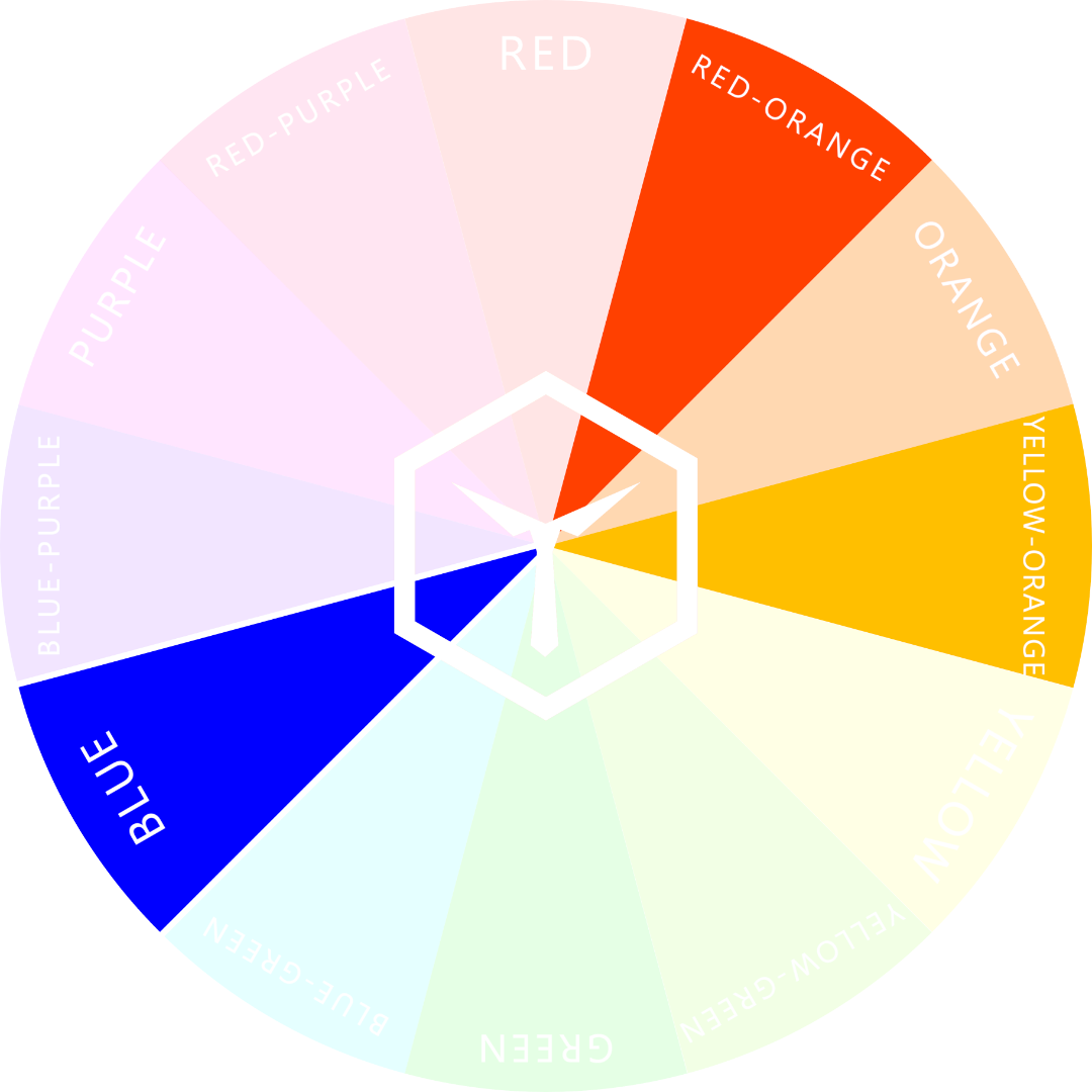
Split-complementary colors are just like complementary colors. But instead of picking the opposite color, you’d go with either of the adjacent ones on the opposite side. Like in the image, an example is to combine blue and yellow-orange, or blue and red-orange. These give a less color-contrasting look, but are still pleasing to the eye.
Fashion Rule #6: Repeat Colors in your Outfit
This could be the most important rule of them all – but still, we rarely see people write about it. Why is that? We don’t know!
Using a color once per outfit is fine and dandy, but it gets really interesting as soon as you start repeating colors throughout your outfit – at least in small doses. Take a look at the following example:
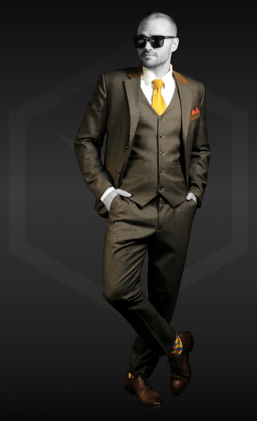
It is clear that the canvas color of the outfit is brown. The different tints, shades, and intensities of brown are repeated so often throughout the look that it makes it fairly apparent.
The two accent colors (red-orange and yellow-orange) are each repeated once. Both are prevalent in the socks, whereas red-orange is repeated in the pocket square and yellow-orange is repeated in the tie. These repetitions legitimize the choice of both the accent colors.
Now here’s the fun part:
The sub-accent color in the outfit is blue-green, which is found in the socks as well. This hue is complementary to the red-orange in the outfit. Boom! And guess what? If you mix all three colors of the socks together, you get… brown. Double boom!
Is your mind blown yet? The whole look makes sense! Do you see now that if you’re able to reverse-engineer an outfit, you will also be able to put together one using the same principles?
Here’s this golden rule explained in one sentence:
Repeating the same color at least once legitimizes it within your outfit!
A color that is repeated, was not randomly, but purposefully chosen. Otherwise, it could seem like the light blue pair of socks you’re wearing were just “the last ones in your drawer”.
Fashion Rule #7: Wear no More Than 3 Different Hues
Like with all of these “Golden Rules”, this fashion rule is more of a guideline you should stick to. You don’t have to follow this guideline, but if you do, you can’t really go wrong.
So, if you stick to using a maximum amount of three hues per outfit, you will always look fashionable. This is mostly because if you use only three hues, at least two of them must be repeated at least once (remember rule #6?). This naturally makes your outfit seem concise and well-composed.
If you choose to wear three colors in your look, try using a triadic combo.
As the name suggests, this involves mixing 3 hues in an outfit. Not the same as complementary colors, triadic colors are equidistant to one another on the color wheel.
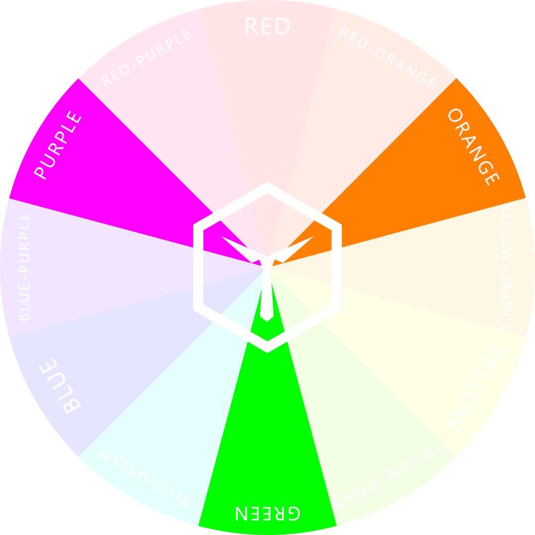
A rather “funky” triadic combo: green, purple and orange.
Outfits in these colors are usually worn for casual or less formal occasions, because they tend to “pop” in a rather extreme way. They also evoke a sense of balance and coordination – when done correctly.
Sometimes, when wearing “triadic” colors, your get-up can seem a bit “funky”. Always check yourself in a mirror to make sure the outfit actually looks socially acceptable. Often, triadic can seem a bit over the top.
Wearing a pair of red pants, a blue shirt, and a yellow jacket is another good example for a triadic combo outfit.
Fashion Rule #8: Neutral Colors are Your Friends
Neutral colors are those that have earthy and natural tones that are, more often than not, quite unsaturated.
They are very versatile and safe to work with. These include gray, khaki, black, white, olive, beige, navy blue, “denim blue” and brown.
Gray pants with a navy top make for an appealing, neutral look. Even though this color combination is quite common, it’s definitely a safe bet – mainly because both canvas pieces are of a neutral color.
In our example photo, Patrick is wearing exactly this combination. In addition, he’s wearing black shoes as a sub-accent color and a pair of “Space Cubes” to accent the navy blue shirt.

Neutral colors are the easiest to wear. When in doubt, wear neutral colors – even as accents. More experienced “color-combiners” though, should opt for more bold and saturated accents like in our example.
The accent colors in the socks (orange and cyan) go well with the rest of the outfit. Why? Well, cyan is analogous and orange is complementary to navy blue. So, the Golden Rules 4 and 5 were implemented correctly (and easily).
By the way, to find out which colors just never go together, we suggest reading our article on the topic.
Fashion Rule #9: Accessorize and Accent!
The devil’s in the details. Accessories add personality to your outfit. They are the little extra things you wear for some added spice in your look.
Accessorize correctly and you’ll be receiving compliments all over the place. The opposite is the case if you do it wrong or if you over-do it.
A rule of thumb is to wear accessories of the same color and style. For example, a silver watch (with a black dial), a black ring, and a silver bracelet. This will create balance and “symmetry”. Have a look at our example:

Four accessories per Outfit: hat, bracelet, ring and watch. All of them chosen to match.
Try to go for a maximum amount of four accessories per outfit. Accessories can be rings, watches, glasses, hats, bracelets, and other small pieces. Pick up to four pieces, match them according to color, and you’re good to go.
Side note: The only accessory you’re always allowed to wear without having to match it perfectly is a wedding ring, of course.
The same principle for accessories counts for accents as well. Use a maximum of two accent hues in an outfit – it’s best even, to only use one. It then becomes apparent that the accent is actually an accent and not simply a blob of color.
Rule #9 is closely tied to Rule #6. This means that you should try to repeat the color of the accessory or accent within the same outfit at least once. Why? Legitimacy!
Fashion Rule #10: Follow Seasons and Social Guidelines
This one might seem like a no-brainer. But sadly, a lot of people fall into this trap:
Sometimes, you follow all previous Golden Rules but somehow, the color scheme you chose just doesn’t seem to fit. If so, ask yourself: “Am I dressed according to the circumstances?”.
What do we mean by “circumstances”?
Well… If you disregard the type of event you’re dressing for, the current season, or what your peers are wearing, there’s a good chance that your outfit will seem out of place. In short: Colors always also have to be chosen according to context.
We write more on this topic in our article about “What Clothing Colors Say About You”. We suggest you check it out:
We cover the topic of seasonal colors in another article in a much more detailed manner. But for now, here are some key pointers:
Every season has its vibe. Matching your clothes to the seasonal change is both fashionable and functional.
For colorful and warm seasons, such as spring and summer, you can change your color scheme to brighter or lighter hues. Think Saffron, Coral Pink, and Biscay Green.
Autumn and winter beckon on subdued, darker colors like Woodbine, Rust, and the favorite Classic Blue.
Using the wrong seasonal color pallet can seem awkward. For instance, imagine someone wearing a combination of dark green, bright red, and clean white in summer. Wouldn’t that combo be much more fitting towards the end of December – let’s say around Christmas..?
Seasonal colors are part of the trends that come and go every year. According to a study by the Jiangnan University, these trends are not easy to predict. But, if you stick to our tenth fashion rule and maybe read our article on seasonal colors, you'll be fine.
How to Use the 10 Golden Rules
Be smart when wearing color. Understanding and using the basics of color in clothing is easy. And with our 10 Golden Rules for Color in Fashion you have a simple list of guidelines to follow.
If you like, we invite you to do one of the following things with your new insights:
Either copy this article into your own .doc and print out the 10 Golden Rules with all the information you need for yourself
or download our FREE infographic in high resolution and print it out.

Go to our Downloads page to get this infographic as a high-res pdf.
Download our FREE PDF here.
Use either print to guide you through your clothing decisions. We recommend sticking the rules to the inside of your closet, so you always have them at the ready when you need them.
Color and style work hand in hand. When you pay attention to your style, people pay attention to you. With constant practice and by paying attention to certain trends, you will begin to see positive results in how you present yourself.
From now on, knowing how to combine colors for a terrific outfit will be a walk in the park. And as with all things, Rules can be broken as well. The goal is to have fun with your style and explore what works best for you.
OUR NEWEST ARTICLES:


