What Are Clashing Colors?
Everyone’s heard of the phrase “clashing colors” before, but not everyone may know what that means.
How do colors clash? Certainly not in a physical capacity (usually), but when paired together, certain colors may not work well together visually. For example, red and magenta are typically considered to be clashing colors. But why is this?
Why Colors Clash
Two colors clash when they are too similar in some aspects, yet too dissimilar in others. We consider them clashing when they don’t harmonize or pair well. This is often due to a lack of luminance contrast combined with a bad contrast of hue.
There are various reasons why colors appear to clash and various ways in which colors can clash with each other.
In this article, we’re going to examine a few examples of colors that are considered to clash when put together, what types of colors clash, and why clashing happens. Read on to learn all about these subjects and more.
Which Colors Clash?
Let’s first identify which colors clash with each other so you know what to watch out for when assembling your wardrobe and choosing your outfit for the day.
Red and Magenta
Red and magenta together is a classic example of clashing colors. This is a good example of colors that are technically close to each other in hue, as red and blue make purple (and the brightest form of purple is magenta), but they still don’t look good together.
Bright Pink and Bronze
Bright pink and bronze is another example of colors close to each other in hue that don’t go well together. Also, because bright pink is so overpowering and bronze is typically shiny and metallic, this pairing can become garish.
Orange and Green
Orange and green are not close in hue and still clash strongly. Bright orange has a very similar amount of luminance as bright green does, making them indistinguishable to the color blind. The stark contrast in hue, though, makes them “vibrate” when paired.
Brown and Maroon
This may be obvious to some, but brown and maroon always clash. Because they are so close to each other in hue, they will mix from afar and create a flat look. On the other hand, up close you are able to distinguish them easily.
These are just a few of the most well-known offending color combos, and you should generally try to avoid using them in the same outfit if possible. While we could go on forever about countless clashing color combinations, let’s move on to the other topics we still have to cover.
What Are The Different Types of Color Clashing?
So, each of these colors belongs to different categories of color. When you mix colors of certain categories, the result can sometimes be garish and unsightly. This basically boils down to two different types of clashing. Most clashing color pairings will appear to clash because of discrepancies in hue or luminance.
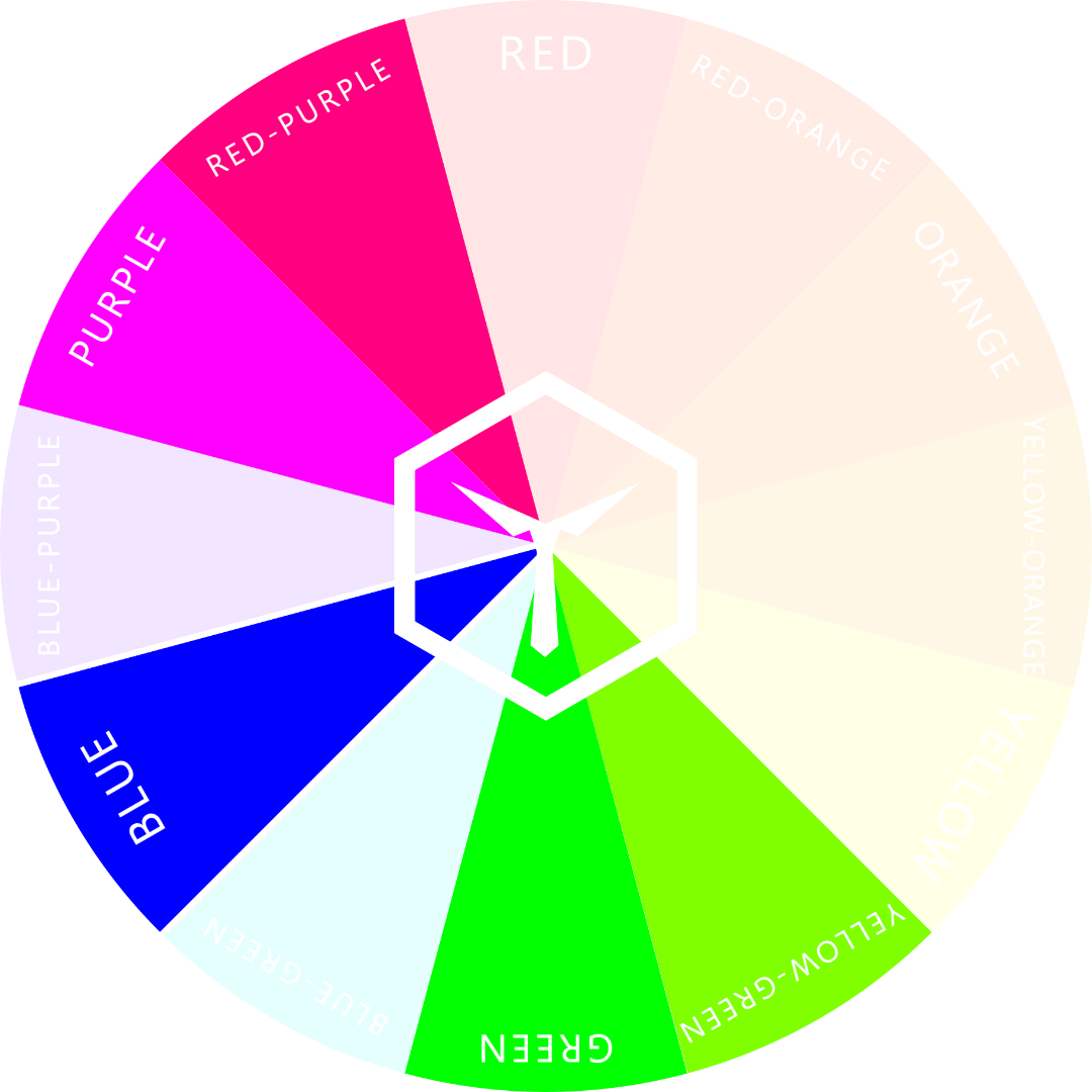
Hue is considered as the “color family” from which the specific color comes. There are 12 hues on the color wheel. Therefore, every conceivable color falls into one of these twelve color families.
Luminance is defined as the perceived brightness of any given color. The stronger and brighter the color is, the higher its luminance. Also, colors with more added white (tints) are more luminant as well because they are perceived to be brighter.
Contrast of Hue
If two colors are too similar in hue yet also not similar enough, they tend to clash. More often than not, this is the case when both colors are two to three hues (color families) apart on the color wheel.
Two or three hues to either left or right of the blue hue are the hues of the “danger zone”.
Being either two or three hues to either the left or right on the color wheel is what we like to call the “danger zone”. A pairing like that should better have a lot of contrast of luminance to look at least decent.
Contrast of Luminance
If two colors are equally luminant, they will most likely start “vibrating” when put together. This is especially the case when both are incorporated in patterns such as stripes or checkers.
Yellow-orange and yellow-green vibrate heavily.
If either one of the two colors were less or more luminant, the vibrating or fluttering phenomenon would not happen.
Forest green (yellow-green with added black) doesn’t vibrate in combination with yellow-orange.
This vibrating or fluttering happens because both colors are too similar in perceived brightness. But, this only happens if both colors are from different hues. If both were from the same color family and would have the same amount of brightness, then they are often considered as one and the same color.
The Amount of Difference is the Key to Clashing
As we just learned, colors clash when they are too similar, yet still different from each other. If they do not contrast enough in luminance, they vibrate and if they have “bad” contrast of hue, they just look weird together.
If two colors are both very similar in brightness and live within the “danger zone”, they are bound to look bad together.
We suggest staying away from such color pairings when it comes to clothing and fashion – unless you’re going for that of course.
Sometimes clashing colors are exactly what you want. Who knows? The combination might not even look bad. We’d recommend wearing clashing pairs to a bad taste party, for example.
SOCKS WITH CLASHING COLORS:
Why Do We Dislike Clashing Colors?
The reason behind people finding certain color combinations unsightly is all because of our psychology. Many subject experts have explored color psychology in-depth, making many key discoveries that explain how our minds perceive and interact with the colors around us.
In Xiaoyan Deng’s scholarly article on the subject of color combinations and the psychology behind how we perceive them, she explained this relationship in a series of questions. She says, “Getting dressed each day, we must combine several articles of clothing, each of which has one or more colors. We frequently ask each other questions like, ‘Does this tie go with this shirt and suit?’ or ‘What color sofa will go with both the rug and the chairs?’ These questions seem simple because, when we see specific color combinations, we often have clear impressions of colors that go well together and colors that ‘clash.’”
Final Thoughts
Color clashing is the negative perception of colors that don’t appear visually coherent in our minds.
It can sometimes be a little more tricky than this basic definition, though. Color psychology scholars discuss theories like figural goodness and unity to explain why we may perceive certain colors as going well together, while others are hard to look at.
When it comes to how you dress, it can be difficult to pick out pieces of clothing that go well together, but that becomes even harder when you throw color combinations on top of that.
Luckily, most of what you’ve learned in this article not only applies to clothing but also to makeup. We have an article specifically about matching makeup and clothing colors so they don’t clash either if you’re interested.
Besides the known and widely agreed upon color combinations that we know to be “clashing,” you can also watch for a few specific indicators of whether or not certain colors clash. Make sure to keep the contrast of hue and luminance of colors in mind when pairing them together. This will help you decide if the colors go well together or not.
If you need more help on the topic, we suggest you read up on this article about which colors don’t go together. It goes into even more detail as to why certain colors don’t harmonize. Happy reading!
We hope the information we’ve outlined above has answered all of your burning questions about what clashing colors are, how to spot them, and why they exist in our perception. Thanks for reading, and for other interesting color topics, be sure to check out our other articles!
OUR NEWEST ARTICLES:


