

Clothing Colors That Make Blue Eyes Pop
To enhance blue eyes, wear neutral colors like blue, black, white, and brown. Accent your blue irises with variations of orange, blue-green, or blue-purple to make them pop. But, make sure to use these accents sparingly and as small splurges of color relatively close to your eyes.
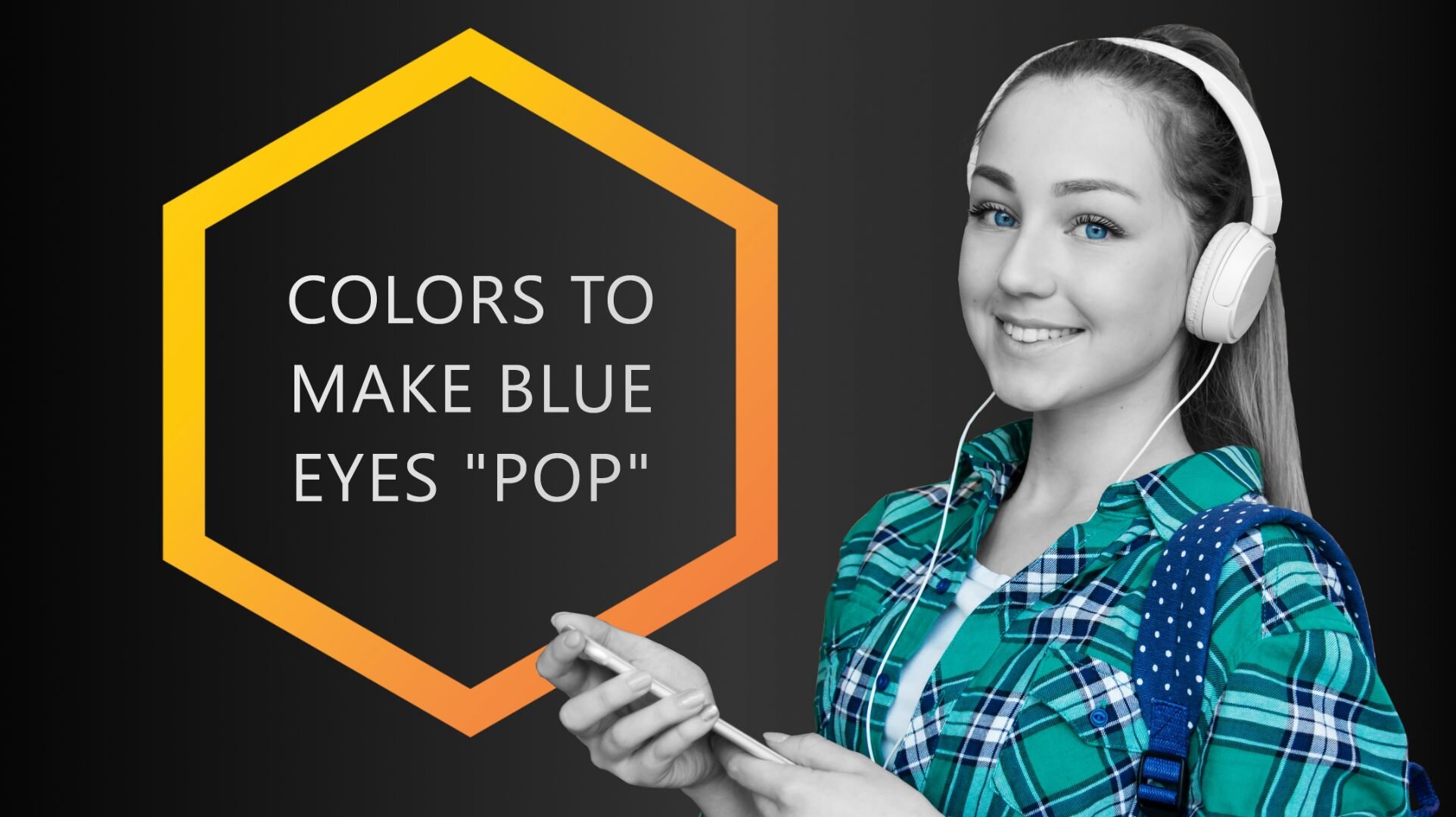
Blue eyes already stand out all on their own, and if you’re rocking a pair, you definitely know this! However, there are some clothing colors that complement blue eyes and help them to appear more intense. Sadly, there are also colors that do the opposite.
If you’ve been searching high and low for the colors that can make your blue eyes bluer and make them pop, well look no further!
How to Make Blue Eyes “Pop”
To enhance blue eyes, wear neutral colors like blue, black, white, and brown. Accent your blue irises with variations of orange, blue-green, or blue-purple to make them pop. But, make sure to use these accents sparingly and as small splurges of color relatively close to your eyes. Try them on a shirt, tie, or even makeup.
Down below we give a lot more insight into what you should lean towards when wanting to emphasize those gorgeous baby blues.
As always, these suggestions are just that, suggestions. If you feel comfortable in one color more than another, we completely support that! Always stick to your own personal preferences over other’s opinions. How YOU feel is always what matters most.
Remember, depending on your skin tone (dark or light) and undertones, these colors can create various results. Continue reading for more insight on what clothing colors will accentuate those beautiful blue eyes of yours!
Wear Blue to Make Your Eyes Bluer
Matching your eye color to your clothing color is one of the easiest ways to intensify your blue eyes.
From what we will explain within this article, the other colors that emphasize your baby blues might push you out of your current comfort zone. So, if you don’t feel confident enough wearing burnt orange, then this trick is definitely for you.
The best way to enhance your eye color without feeling uncomfortable in your own skin? Wear another blue! If you want to add contrast and depth, then choosing a deeper and darker blue than that of your eyes will do just that.
The blue in your clothing will enhance the blue in your eyes, especially if you choose a bolder, stronger blue than the one you have.

Blue clothing is always a great choice for blue eyes.
If you want to lighten your eye color, lean towards a softer, lighter blue. If you want to deepen and enhance the color, choose a darker shade.
And so on... You get the picture.
Are you in love with the blue you were blessed with? Try to find a shade/tint/tone that matches your own, this will make your eyes extra intense and enhanced.
Celebs with blue eyes swear by this one for their red carpet looks! Henry Cavill understands the power of pairing blue clothing with his blue eyes.
It’s remarkable how rewarding this choice of clothing color can be! When he chooses to wear blue, his eyes shine and appear more intense. This is a fantastic way to compliment his eyes and enhance them.
Find him on the red carpet rocking a striking blue suit in various shades, ultimately always drawing attention to one of his most famous features!
Contrasting Colors Complement Blue Eyes
This one is a little bold, so just keep on reading. We know some people might feel like they can’t rock this duo, but hear us out!
Orange sits opposite of blue on the color wheel. This means the two colors complement each other, and according to Color Harmony, are thus “that which completes or makes perfect”
When you are looking to intensify a color, find the color that contrasts it. For blue, that color is orange! Color theory proves that orange and blue have the highest contrast. These colors naturally emphasize one another!

Orange enhances the blue of your eyes by complementing it.
As seen in print, this is a huge game changer for photographers. Just check out this article posted by Expert Photography for more information on how they use orange and blue in their photos. Doing this allows them to grab their viewers’ attention and draw them in, while creating insane photos.
Variations of Orange are the Way to go
From bronze to pumpkin and papaya to amber, the shades that orange ranges in are vast! Carrot orange isn’t the only shade out there, so think beyond the stereotypical orange we know and hate to love. Deep shades of orange, like bronze, can intensify the blue in your eyes immensely, and appear extraordinary.
Check out our Space Cubes socks for the perfect example of how striking blue and orange look together!


The color cyan isn’t the easiest to combine with others. Luckily, there are many accessories out there that contain the color cyan - so these space cubes are easy to match!
These socks look great when worn with a navy blue suit, a cyan tie, and an orange pocket square.
Colors used:
Black (base)
Cyan (accent)
Orange (accent)
Actually, though, wearing orange socks doesn’t really enhance the color of your blue eyes. For that, both colors have to be placed fairly close to each other.
We suggest trying out an amber or orange-brown tie to accentuate your blue irises. For the ladies, try bronze makeup.
Black, White, and Brown for Blue Eyes
If you aren’t looking to attain too much attention with your outfit, but are still wanting to enhance those gorgeous gems, stick to neutrals. Although they aren’t full of vibrancy, they do work with your eye color and not against it.
Neutrals allow for the vibrant color in your eyes to stand out all on its own. Think of them as the ultimate backdrop!
Black will help intensify the blue and encourage them to stand out – especially if you have light blue irises. Wearing black will bring all the focus to your face, allowing the blue to take center stage.
Its omission of light allows for the blue to appear brighter than normal. However, because black is so harsh, it depends on your skin tone if this one would work for you. Sometimes it can appear too intense and completely wash out your appearance. More on that topic here.
White works the same way! When you enter a room with white walls and white furniture, any color that is chosen to accent the space will immediately steal the show.
Wearing white will do the same to help your blue eyes shine. The absence of color will automatically draw attention to the only color in the space, or on your appearance, and make them appear more pronounced.
On another note, there is something about brown that intensifies the blue hue in your baby blues.
It’s satisfying how brown shades can flatter your eye color very naturally! Again, you’re looking to add contrast and depth.

Brown (actually dark orange) complements blue eyes in a very natural way.
Brown shades are amazing when wanting to exaggerate the blue in your eyes. Brown will allow the blue to stand out, while not appearing too harsh against them as black can.
Several makeup artists swear by using brown eyeshadows or eyeliners on blue eyes, this is a universal go-to for anyone rocking this eye color.
And, there’s even an explanation for this. Do you remember what happens when you add black to orange? Well, you get brown... Since both black and orange are great colors for blue eyes, brown must be as well, right?
Depending on how much black is added to the orange, you get a darker, more “brown” brown. The orange portion gets less pronounced, making the color easier to pull off in an outfit but not necessarily less effective for making your blue eyes pop.
Isn’t it great that the most common clothing colors (blue, black, white, and brown) are simultaneously the ideal colors to wear for blue-eyed people?
RELATED ARTICLE:

Analogous Colors Enhance Blue as Well
This one is maybe just a side note but it might be interesting for you if you like to wear blue-purple or blue-green often.
Both of these hues help your blue eyes to stick out – albeit not as much as the previous few examples. Since there is quite a large amount of blue added to both blue-purple and blue-green (obviously), your natural blue gets accentuated.

Mint (light blue-green) is a color that makes blue eyes deeper and more intense.
Choose colors like mint (light blue-green) or lavender (light blue-purple) as easy-to-use clothing colors. Teal (dark blue-green) can be a great choice as well – especially as a canvas color. Stay away from large amounts of dark blue-purple, though. It might make you look like a sad magician (no offense to magicians who are going through a rough patch).
The Key to Bluer Eyes
Blue eyes have a lot of color options that can accentuate their appearance and help them to shine. There are a few honorable mentions we have to consider that don’t fully make the list but are still decent options for blue-eyed people.
For example, green is a pretty good choice when looking to make blue eyes pop. Green harmonizes blue when paired together, and according to Color Harmony, these two colors “flow quite easily from one to another“ and they also “always please the eye“ .
However, it’s best to be mindful. Depending on your personal preferences, hair color, and skin tone, some shades might not have the same effect on you as they do on other blue-eyed individuals. It’s all about testing out what works best for you!
But here are the keys to the “Benz” when it comes to blue eyes:
Wear the standard neutrals and accent with variations of orange, blue-green, or blue-purple. A classic Denim look will get you a long way. Accent it with a few tads of bright orange for maximum effectiveness. Or, try out a bright blue-green top if you’re feeling adventurous.
Happy driving!
ARTICLES YOU MIGHT LIKE:

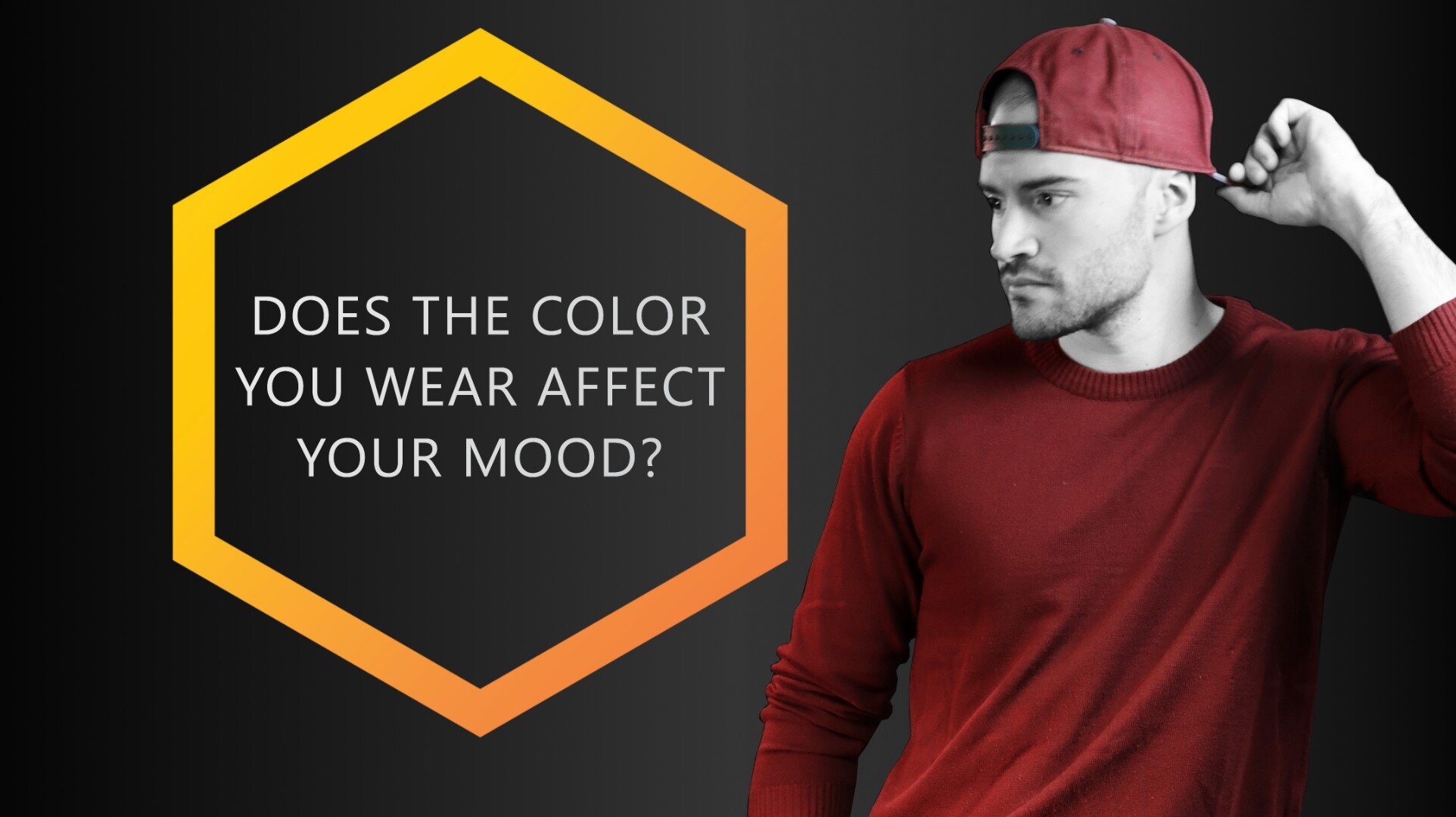
Does the Color You Wear Affect Your Mood?
The colors you wear can affect your mood in ways you can barely imagine. You should be smart about choosing the hue, shade and temperature of the clothing colors you wear. They can make a big difference in how you feel.
Imagine if we told you the color of clothing you wear can affect your mood, impacting the way you feel. Would this change the way you put together your outfits?
Well, it’s true! Colors can majorly impact our emotions, from encouraging happiness to even inspiring creativity. Clothing can alter your mood in ways you might not have realized before.
There are certain outfits we wear that can enhance or change the way we were previously feeling before putting them on. For example, when you’re feeling unmotivated and lazy, a good way to get moving is to put on some workout clothes. It can inspire you and shift your mood, encouraging you to become productive, work out, and get moving.
Often, we turn to clothes to uplift our spirits and change the way we feel about ourselves. Hoping to feel powerful and influential? Reach for a crisp, dark suit, formal shoes, and a sleek hairstyle. And yes, obviously, the colors you choose for such a get-up matter a lot.
Not only does what you wear affect your mood but so do the colors those outfits are in.
Research on The Effects of Color on the Moods of College Students (Kurt & Osuekeshows) shows how color can “change our mood from sad to happy, from confusion to intelligence, and from fear to confidence. It can actually be used to level out emotions or to create different moods”.
READERS’ FAVORITE:
Clothing Colors Affect Your Mood
The colors you wear can affect your mood significantly. When you’re happy, you unconsciously reach for lighter, bolder and warmer colors and when you’re sad, you instinctively choose the opposite. But you can also do it the other way around. For example, lighten your mood by wearing colors that affect your mood positively or go for colors that make you more self-confident when you feel shy.
If you’re familiar with color psychology, then this will resonate with you. If not, don’t worry! Within this article, we will give you a quick run-down to understanding color psychology and how it can influence and alter your emotions!
Does the color you wear affect your mood? Absolutely yes! If not, how could something like color therapy even work?
As always, this information is somewhat subjective. Every person is unique! Some colors can impact you differently than they would with others, and sometimes they might not affect you at all. It all depends on who you are and how you feel. However, for us here at Colorbux, colors do impact our emotions! So, let’s get started!
What is Color Psychology?
Before we can begin to fully understand the emotional impact of colors, we need to give a slight introduction into what color psychology is. It’s important to understand the background behind everything. So, bear with us.
Color psychology is the study of how colors can affect your emotional and mental state. In other words: It defines what colors “mean”, how they are interpreted, and what they symbolize.
You will often see businesses promoting certain colors as their brand logos because of the impact and influence these colors can have on their consumers.

This is the color scheme of Colorbux. We use these plus dark gray, (almost) black, and white.
When decorating your house, your business, or your office space, the decision on what color to paint or accent your room with will affect the mood of everyone that enters the space.
It’s believed that certain colors are more motivating, uplifting, and inspiring than others. However, these decisions depend on what emotions and moods you want to bring forth with the room itself.
We discuss the psychology of the most common colors for clothing in a separate article if you’re interested. You can find it here.
We also discuss all these colors individually in articles of their own. You can find the complete list right here:
In this article, we will focus on a few colors and what we can typically infer from them. We’ll answer the question “how does the color you wear affect your mood?” for each and every of the most common clothing colors right here.
But just so you know, you can also change your mood by tapping into Neuro Remapping. With a few exercises, you can remap your brain with ease. This Harvard psychology graduate tells you how:
How do Certain Colors Affect Your Mood?
Brighten Your Mood with Yellow
The brightest and arguably the boldest color for clothing on the color wheel is yellow. Yellow is also the most optimistic color in color psychology. It is believed to ignite creativity, happiness, and excitement!

Yellow: the color that sparks creativity and shouldn’t be taken too seriously. | Socks: The Light Stripes
This color, in its brightest states, will not only help you stand out in a crowd but encourage a glow from within. Summery, warm, and full of light, we can see why it is considered the best color to wear when looking to appear and feel more youthful, energetic, and happy.
Our Very Cherry socks are one of our favorite ways of adding a pop of yellow to your outfit! Guaranteed to boost your happiness. Send us an email asking for a secret discount code on all our socks.
Encourage Excitement with Orange
Orange is an extremely bright and warm color. Similar to yellow, it encourages us positively. It makes us feel excited, happy, and more adventurous.
The color of tangerines, fire, and gorgeous summer sunsets, orange is the true color of motivation. It is also often seen as the color of freedom and optimism!
There is nothing plain or bland about orange, so expect to be the center of attention while wearing it! These are also a great way to grab some eyeballs:


Squorange is a mix of elegance and “laissez-faire”. The orange squares pop out and give any outfit a perfect accent color. Combine these puppies with another orange accessory to make your look as stylish as possible.
Colors used:
Beige (base)
Orange (accent)
Black (accent)
Calm Your Soul With Blue
As this is the color of the sea and the sky, obviously blue represents tranquility! With its properties in instilling trust, loyalty, and security, blue is the perfect color to wear when looking to calm and stabilize yourself or others.
Not only does blue compliment various complexions dark or light, but it is also an amazing way to ground your emotions!
Balance Your Mood With Green
When you think of green, what’s the first thing that comes to mind? Personally, for us, it’s nature!
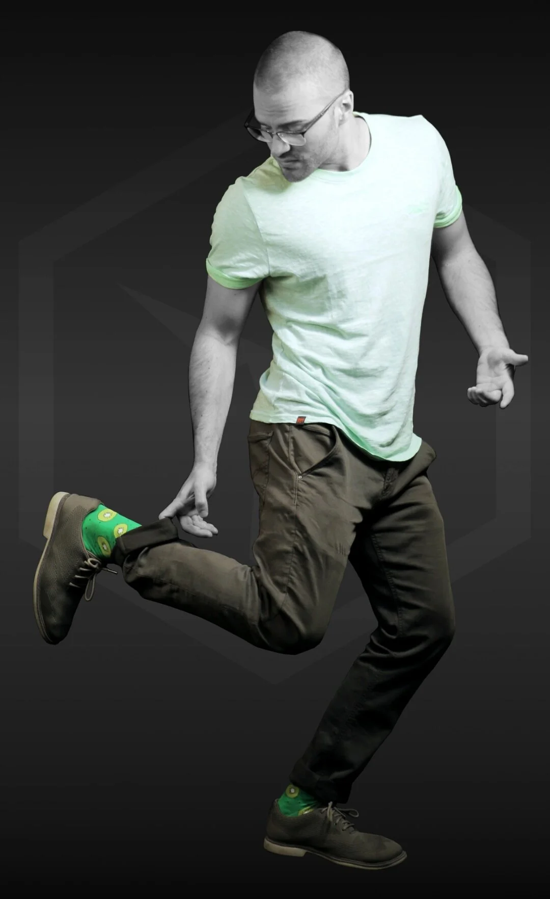
Green is such a balancing color. It’s not always easy to mix and match, but it’s definitely fun and yet soothing. | Socks: Kiwi Kicks
Did you know green is a color that stabilizes, renews, balances, and harmonizes your emotions? If you’re looking to encourage a refreshing, intuitive, and peaceful mood, green (especially dark green) is definitely a color we suggest reaching for more often.
A great way to add green to your wardrobe? Check out our Kiwi Kicks socks! Feel balanced and stabilized all day long.
Dominate With Black
Intense and powerful: black. Typically worn during formal and important events, its lack of color typically forces a more serious appearance. It garners feelings of intimidation, authority, dominance, and control in others. In turn, wearing black makes you feel stronger and more authoritative.
Also, if you’re looking to hide your emotions, and appear mysterious, black is the perfect choice for this.
In a research study conducted by Damhorst and Reed on the effects of color on emotions, they found how “men rated models who wore dark jackets as more powerful and competent than models who wore light jackets”.

Black: dominance, power, and sex appeal - especially when mixed with red.
Look powerful, feel powerful. On the other hand, wearing black can also make you feel emotions of sadness, grief, and loneliness.
Depending upon the situation, either direction is possible.
Wearing black in strong sunlight can also make you feel hot. Maybe you’ve noticed? Though this effectively doesn’t increase your core temperature, it’s still quite annoying.
Ignite Your Emotions With Red
There is a reason Valentine’s Day is marketed using red decorations (red hearts, red roses, red balloons, etc.). This is because the color red encourages passion, desire, and excitement. And yes, most probably it encourages those feelings in you as well.
This gorgeous color is an obvious choice when looking to be bold and attract attention. If you’re wanting to feel strong, courageous, and sexy, while gathering all eyes on you, red is our top recommendation! Passionate, strong, and used to excite, we guarantee any red clothing pieces will be a huge hit.
How Dark or Light Clothes Make You Feel
The lightness of any given color has an influence on your mood.
In general, the lighter a color, the more it will “lighten” your mood. Isn’t it obvious?
On the other hand, darker clothing colors tend to make the wearer more “serious” and often reduce the feeling of being elated or joyful.
Though this rule is mostly true, it does have exceptions – but those are due to cultural differences and depend strongly on the hue of the color. We go into more detail in various other articles including one on Dark Versus Light Colors in Clothing.
What is clear, is that darker colors are perceived to be more dominant. The most dominant of colors being black, as a study published in the Journal of Experimental Psychology proves.
Cold Versus Warm Color Clothing
Not just the lightness of your outfit, but also its color temperature impacts your mood.
As a rule of thumb, you can say that the warmer a color, the more it “warms up” your mood. Obvious again, right?
These are the cold colors of the color wheel.

These are the warm color of the color wheel.
Cold colors that lean more towards the blue side of the color wheel are rather calming and soothing on the soul. Wear them if you have to be more at ease, like, for example, when at a job interview.
Warm colors are more energetic and make you feel that way when you wear them. Colors that are neither warm nor cold don’t really influence your perceived energy.
Wear Clothing According to Your Mood
When selecting an outfit, it is important you do so with your own emotions and mood in mind.
If you want to feel powerful, sharp, and intimidating, black is the ideal choice. However, if you are looking to spark your own creativity, or glow from within, and genuinely feel happier, lean more towards brighter colors like yellow.
Depending on who you want to influence, the color you end up choosing can range drastically.
But remember, if your favorite color is green, and it brightens your mood and inspires you to work harder, then don’t let color psychology stop you!
As always, these suggestions are just that, suggestions. And, as always, they’re based on scientific analysis and expertise. More often than not, personal experiences and preferences impact the way we view and feel about a specific color. There are no set-in-stone rules when making personal fashion choices.
So, if you feel like wearing all black, do so. If you don’t, then don’t. It’s up to you.
But, if you want to influence the way you feel on any given day, give color psychology a try and pick the opposite of what you feel like wearing.
Trick Your Brain - Change Your Mood
Did you hear about the 2002 study where the participants had to hold a pencil sideways in their teeth? No? Well, let us explain:
The participants of the study wear asked to hold a pencil between their teeth without their lips touching it. In doing so, they activated the muscles used to smile. While biting on the pencil they had to watch entertaining videos and rate their experience after watching.
Those that activated their “smiling muscles” reported much more positive experiences while watching compared to the control group. Or in other words: the videos were rated funnier because the pencil biters were “smiling”.
But what does this have to do with color?
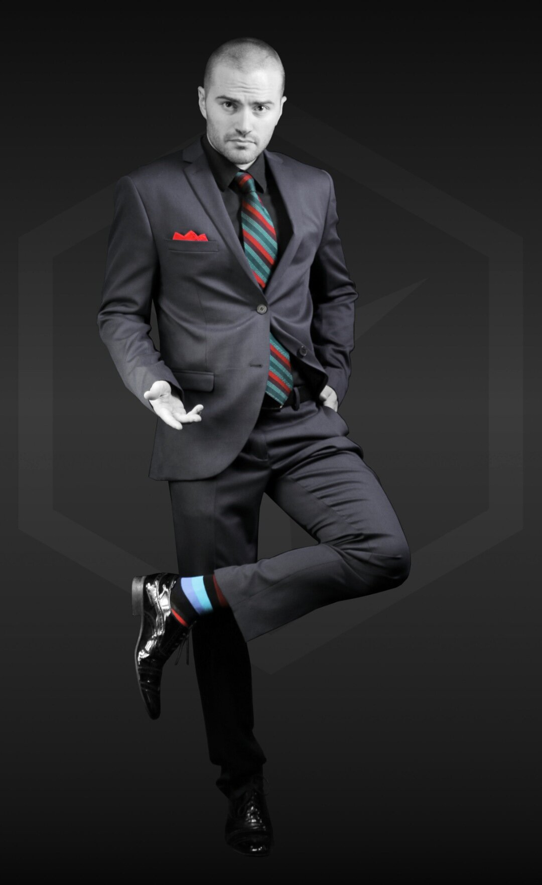
Well, it proves that you can influence your mood by “tricking” your brain into thinking it feels a certain way. So, for example, you can make yourself feel more confident by wearing a combination of dark blue and black.

This is an outfit that boosts confidence and anyone can wear.
Wear the colors you want yourself to feel like wearing. (Does that even make sense?) Anyway, the best part about this tactic: it actually works.
Thank you for reading our article. Please take a moment to send us your feedback. It helps us to improve the quality of our writing so you can enjoy reading even more.
Sending your feedback takes only two clicks. Thanks!
ARTICLES YOU MIGHT LIKE:


Clothing Colors That Make You Look Younger
Colors that are light, bright, and warm make your skin look more vibrant and healthy. In turn, wearing these youthful colors makes you look younger. Wear light colors that enhance your skin's undertone and visually reduce the contrast within your skin. Light tints of yellow, red, and blue-green look very youthful. So do many strong colors.

We can all agree that, after a certain age, a common goal of ours is to look as youthful as possible. Did you know there are some colors that can help in brightening your appearance and help your complexion appear younger? Well, believe it.
From anti-aging treatments like Botox and Dermal Fillers to collagen supplements and working out daily, looking younger is on all of our minds. As we age, we tend to reach towards products and activities that can keep our bodies and our appearances as youthful as possible.
But what if there was a simple trick you could take advantage of every day to look younger?
Choose the right colors for your outfit! It’s important to pay close attention to colors that bring out your “glow from within” and to know what works against them.
Which Clothing Colors Make You Look Younger?
Colors that are light, bright, and warm make your skin look more vibrant and healthy. In turn, wearing these youthful colors makes you look younger. Wear light colors that enhance your skin's undertone and visually reduce the contrast within your skin. Light tints of yellow, red, and blue-green look very youthful. So do many strong colors.
Down below we will list our best tips and tricks to appearing as youthful as possible by simply using color. We all would like to look as young as we did in our mid-20’s, right?
Just remember, you’re skin tone and undertone can affect the way certain colors appear on you! Try to find something you enjoy wearing. Confidence is key!
A SIMILAR ARTICLE:
To Look Younger: Lean Lighter, Not Darker
If you knew we were heading here, you read our mind! There is a reason dark colors are worn specifically for when we mourn or want to look professional and powerful.

Light = playful / Dark = serious. | Socks: Rainbowie
There are not many who can pull off wearing dark colors without appearing somewhat like the walking dead and a lot who cannot.
Darker colors can (in many cases) pull all of the vibrancy away from your complexion, accentuating the blemishes- such as our fine lines, hollows, and wrinkles. It acts as a contrast, making your complexion appear ghastly against it – especially if you have very fair skin.
Research published in the Journal of the American Academy of Dermatology proves that high contrast within skin influences the perception of age, attractiveness, health, and youth – but in a bad way.
On the other hand, high contrast between elements of the face (brows, eyes, lips, etc.) and the skin makes you look younger, as this study suggests.
This means that people think you look younger if you have less contrast on your skin, but more contrast between your skin and your lips, eyebrows, lashes, hair, and so on. So, how do we accent some of these features but not the others?
Now that’s a tough question...
Dark colors age us (but only visually, of course). They are too harsh with too much contrast to our bodily features. For example, when you wear black or a really dark blue, these colors can accentuate your darker features and highlight your lightest ones. This enhances things like wrinkles, blemishes, and impurities.
Those under-eye circles, your pale complexion, and if your skin is experiencing any dullness, will be extremely visible when you wear darker colors as well.
Although, when you wear lighter colors, these can bring out and highlight your skin’s colorful undertones, making you appear more youthful.
If you are planning on wearing black, don’t wear too much of it or too close to your face! Black can drain you from your own coloring, leaving you looking pasty and dull. Keep black as an accent color or use it as a statement if you wish to have an overall younger appearance.
As stated by the prolific graphic designer Herman Cerrato, pure white is the “color” of purity, innocence, and yes, youth. Therefore, it’s no surprise that most hues that have a large amount of white mixed into them seem more youthful. This effect on the colors themselves transfers to the wearer of those colors as well.
More on the symbolism of white clothing in our article on the topic. Read it by clicking on the link.
Lastly, light colors like baby blue and playful pink have a specific connotation in common: naivete! Since we as human beings are used to seeing these light colors in children’s bedrooms and on toys, they look even more youthful to us.
LIGHT AND PLAYFUL:


Bananas in the sky without diamonds! Nothing makes your ankles stand out more than a pair of light blue socks with bananas on them. These puppies are perfect as an accent piece.
Colors used:
Light blue-green (base)
Yellow (accent)
Light yellow (sub)
Tones and Certain Pastels Look “Old”
Although lighter colors bring out the life within, that doesn’t mean it relates to every light color out there. Some colors don’t bring out anything, and can actually make your situation worse than it is.
Avoid any colors that are grayed out, lack vibrancy, and come to close to your own skin undertone. They will more often than not strip the color from you. Sadly, this relates to a lot of common clothing tones and pastels!
Take Benjamin Moore Proposal AF-260 pink, for example, this color can negatively impact your complexion. As this color is light but lacks the vibrancy bright pink has, it won’t do anything for your complexion, except wash it out completely, making you look older than you are.

The gray undertone in it will emphasize nothing but your age, and make you appear meek. This goes for most toned colors, as these washed-out colors will make you look dull and toned down (obviously). You need something that will bring out the youthful complexion within you!
We suggest going for more vibrant pink instead. Remove the gray portion of the color and you get the following:

Much better (and more youthful), isn’t it?
Tired of feeling “old”? Try RevitaaPro! It reduces fatigue and stress helping you become more lively and energetic again.
Brighter Colors Will Bring Life Back into Your Complexion
Brighter colors are more fun! For good reasons. Not only are they pretty to look at, but they can make you look and feel younger.
They have this vibrancy that helps your skin tone look more vibrant as well.
Bright yellows, corals, and even bright pinks have the ability to make your complexion look radiant. They bleed life back into your appearance.
Choosing the perfect bright color depends on your skin tone and undertone. Look back to our article, The 10 Golden Rules For Color In Fashion for this specific reference and more information or check out our articles on clothing colors for light and for dark skin.
Each individual has a “color category” that can help them look their best and present themselves unlike ever before. Are you high or low contrast? Are you warm-colored or rather cold? These specifics can change the colors and shades/tints of colors we would suggest. Every color can affect a person differently.
But, as a general rule, going for strong and bold colors will make you look more youthful.
Think of Halle Berry, Cindy Crawford, and JLO. They make reds and vibrant pinks their go-to colors for red carpets. These specific bright colors bring a vibrancy to their complexion that helps them garner this youthful glow! They look stunning and young whenever they grace us with these jaw-dropping outfits.
Men, on the other hand, can make use of small smidges of bright colors in their outfits to look young and ambitious. Stick to our guide on accent colors for men to learn all you need to know and to never go wrong when accenting your get-up.
FOR A YOUTHFUL LOOK:


The Light Stripes can be used to easily convince any multi-nation army to do your bidding. But, for those of you who have no intention of dictatorship, these socks will function as a great accessory to any remarkable outfit.
Colors used:
Yellow (base)
Red (accent)
Dark blue (accent)
Bright blue-green (accent)
Seafoam (sub)
Black (sub)
Warm or Cold Colors?
It’s true, warm colors can shed some light and bring life back into your appearance. Warm attracts warm!
When you wear a warmer color, such as red-orange or yellow, you are bringing vibrancy back into your complexion.
But sadly, there’s one little exception to this guideline... If the hue of one of these warm colors matches your skin undertone perfectly, it can have the opposite effect. More on this topic in the future. Get our Member Letter in the meantime.
That healthy glow we all strive for, the one that dwindles as we age, appears whenever we wear more color. Especially warmer colors!
All 6 of the warm hues.
The other 6 cold hues.
On the other hand, cooler colors are known to cool our skin tone down, so the warmth isn’t drawn out. Cool tones often make us look ashy and sometimes even sickly, whereas warm tones can add warmth (obviously) and glow back into our complexion.
Take yellow, for example. There is a reason it is referred to as a sunshine color, and it’s not just because it is the color of the actual sun.
When you wear yellow in its true, fully saturated form, not in a shade, tone, or tint, this can truly brighten your complexion and make you look young and vital. It can add light back into your appearance and lower the harsh contrast.
Yellow is also one of the most eye-catching colors. Wear it if you would like to stand out.
Every person has a specific “type” of yellow they can pull off like a dream. Just because yellow didn’t work for you before, doesn’t mean it can’t work for you ever again. Maybe you weren’t trying the right kind of yellow or were wearing too much of it. A little goes a long way.
We have a full article on the most youthful of colors. Check it out here:
It’s More Than Just Color
As our skin looks duller as we age, (thanks to reduced levels of collagen production), any colors that enhance or highlight these factors you should definitely stay far away from.
It is important you reach for colors that bring out your inner glow. Wearing these vibrant colors we mention above can actually boost your mood as well!
There are multiple studies that show certain colors, such as yellow, can actually influence our emotions and current state of mind.
Sadly, yellow isn’t the most ideal color if you have gray hair. There are many other options that give you the best of both worlds, though. You can read up on them by following the link.
It’s important you feel comfortable and confident in the clothing you wear. This can not only impact how you present yourself, but how you feel as well. When you feel good, you look good.
Happy people are known to represent “rays of sunshine” almost like they are bursting with happiness from within. And for good reason! Happier people exude happiness from the inside out, and crazily enough, they also appear more youthful.
So, as always, it’s more than just color – even though the right colors get you a long way.
SUGGESTED FOR YOU:
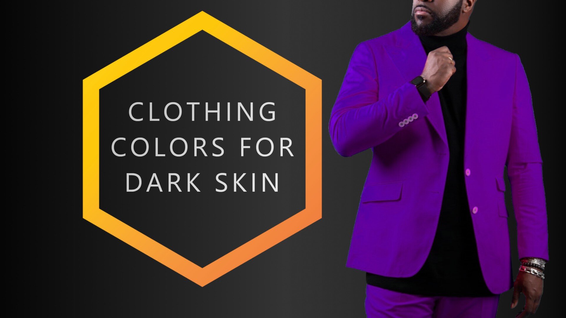
![Clothing Colors For Dark Skin [Full Guide]](https://images.squarespace-cdn.com/content/v1/5d91f9da52210569ede7ff3a/1619362688267-WQ4E92SA45GK19RP0L55/COLORBUX+Clothing+Colors+For+Dark+Skin+BANNER+Thumbnail.jpg)
Clothing Colors For Dark Skin [Full Guide]
In general, bright and light colors suit dark skin the best. Opting for colors on the warm side of the color wheel is also recommended. Stay away from dark yellows and other dark olive shades and tones. Pink and rose are always great on dark skin. When mixing and matching colors, make your outfit have a decent amount of contrast.
Getting good quality clothing is one thing, but getting the right styles and colors that perfectly accentuate your skin tone - dark or light skin - is quite another.
But here’s the catch; choosing the best clothing colors for your skin tone isn't an exact science. Though this can be a good thing, it can also become confusing if you aren’t quite fashion-aware. However, as with most things, it gets better with practice.
You don't need to become a fashionista, but it's crucial to get used to what sits perfectly with your skin tone and come to terms with what doesn't. Beyond feeling good, you also want to look good, right?
Seeing as one article may not substantially cover all skin tones (in addition to the fact that some skin tones have already been treated on this blog), this post will deal with the best clothing colors for dark skin. Of course, we'll also touch on the colors that don't cut it.
Which Colors Look Best on Dark Skin?
In general, bright and light colors suit dark skin the best. Opting for colors on the warm side of the color wheel is also recommended. Pink and rose are always great on dark skin. But, stay away from dark yellows and other dark olive shades and tones. Also, when mixing and matching colors, make sure your outfit has a decent amount of overall contrast.
The following image illustrates the colors that look best on dark skin.

Stick to colors over 25 luminance that are not of olive color. These colors tend to look great on dark skin.
You have probably heard otherwise, but trust me when I tell you that picking out your clothing color with your dark skin tone in mind will go a long way to making your outfit turn out better.
Guidelines for picking clothing colors as a dark skin person
Before we delve right into it, it's essential to get some things straight first.
While 'dark skin tone' is an umbrella word, it comprises different complexions ranging from Africans, people of the Mediterranean to Indians and some from far east Asia.
Side Note: To know for sure your dark skin tone's complexion, you may need to take a look at the Fitzpatrick scale.
You should also note that many dark skin toned people also have dark eyes and hair color, which is otherwise known as "low contrast complexion". You should note this because eye and hair color complement your clothing and contribute to the general outcome of how you look.
People with dark skin tones can also have eye and hair color that is not dark. Whatever the case, what's most important is to consider this when picking out clothing colors. We write more about contrast in our article about dark versus light clothing colors.
Lastly, the tips in this post are not unbreakable laws set in stone. They are suggestions and should be treated as such. In the end, it's entirely up to you what you choose to wear.
PEOPLE ALSO READ:
Contrast
The first thing (probably the most important thing) to note here in terms of color contrast is that various colors appear different when placed against others.
When it comes to fashion and picking out clothes, this makes all the difference. For instance, the color blue will appear differently against a green background compared to how it will look against a white or a black one, for example.
There are two types of contrast: contrast of luminance (lightness) and color contrast. Both are relevant in fashion and for the topic of the best colors for dark skin.
In short: The two hues blue and yellow have high contrast of luminance and high color contrast – even though both are fully saturated. Blue has a low lightness, whereas yellow is quite luminant, which makes for high contrast in luminance. Also, the two colors are rather far apart on the color wheel, which makes them have high color contrast.
All hues and colors fall into one of the two following categories: warm colors and cold/cool colors.
These are all the warm hues of the color wheel.
These are the cold hues of the color wheel.
When two colors that fall in the same category are put against each other, they will often drown each other out slightly, sometimes making for a less exciting combination. But, they also tend to harmonize better.
On the other hand, if the colors are from the two different categories, they complement each other earnestly. This makes both colors “pop”. Strongly contrasting colors are harder to pull off, though.
The former is low contrast, while the latter is high contrast.
More contrast = more “pop”.
Try contrasting your dark skin tone when putting on clothes. Seriously. Black, dark grays, and other dark colors – especially dark brown and olive – are usually not the best choice if you’re looking for contrast. To put this plainly: Wear clothes that have very different colors than your skin.

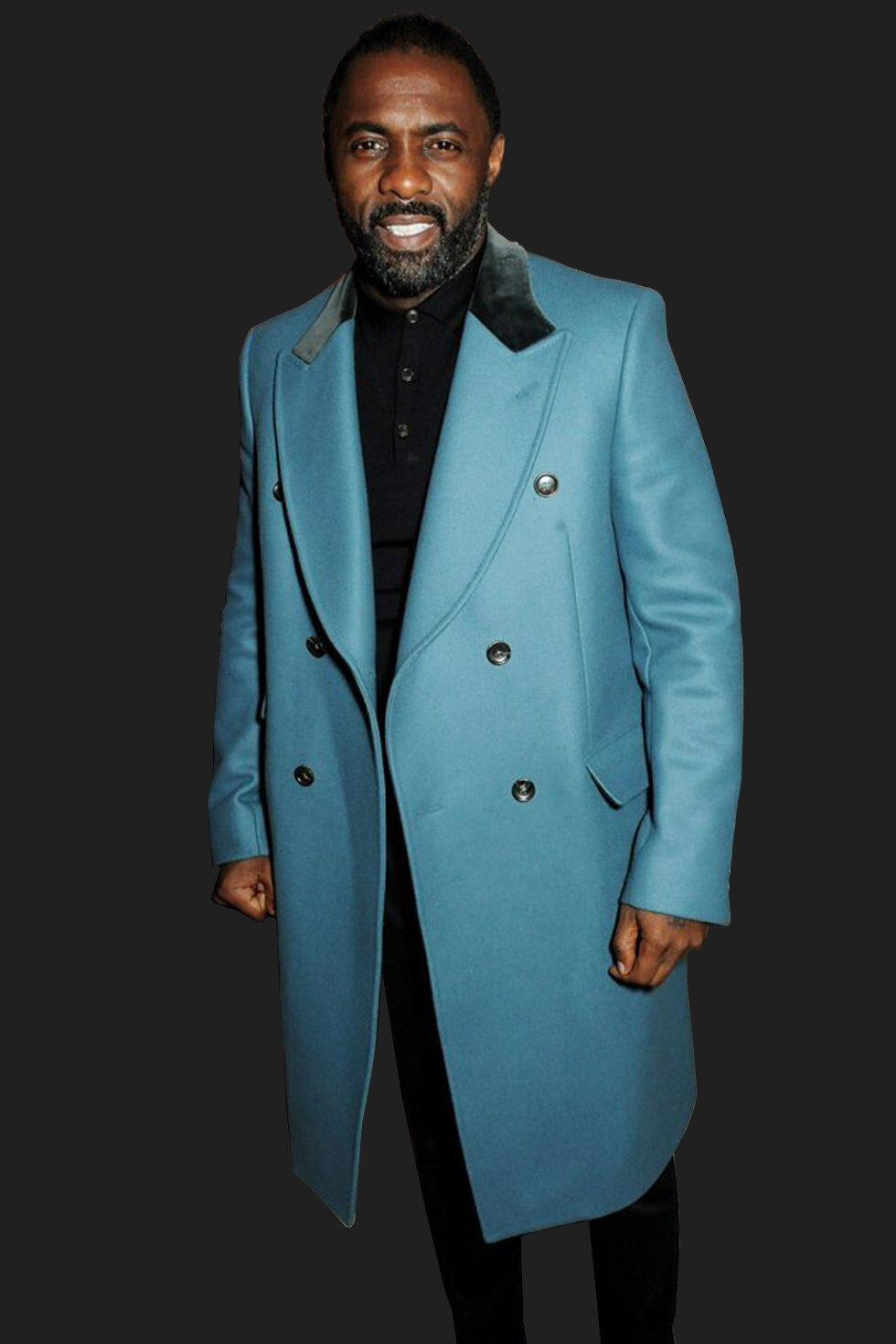
Quite a dark and somber look for Idris Elba. We reckon a white shirt would have suited his complexity better with the black suit and tie. Original image: Esquire.com
Such a dark outfit like the one Idris Elba is wearing in the image above looks rather somber and overly serious. This is because he’s a rather low contrast person (his hair, skin, and eyes are all dark), and wearing all black highlights nothing really – except the shining contours of his face, which makes him look much too serious.
Swapping out the black shirt for a plain white one would have worked wonders and changed his whole look from somber to spot-on. So, what do we learn? Contrast is necessary for a balanced look. If your personal features make you “low contrast” like Idris, wear more contrasting color combinations.
THESE GO WELL WITH DARK SKIN:


The colors on this pair of socks are so trippy! Only the brave dare to wear these Shrooms for a day at the office. What about you? Wanna try some?
Colors used:
Purple (base)
Blue-green (accent)
Yellow (accent)
Red-purple (sub)
Warm Colors and Dark Skin
For people with dark skin tones, clothes in warm colors (e.g., orange, pink, yellow, red, etc.) are the surest way to go.
Dark-skinned people are usually better off than people of lighter complexion when rocking warm or bright clothing colors.
Warm hues properly accentuate their usually warm or olive skin undertone and bring out the shine in a way that isn’t possible for pale-skinned individuals (that usually have cold undertones).
Bright, bold, and warm is by far the easiest way for people with dark skin to stand out. Check out Idris Elba:

Nevertheless, be careful not to overstretch this advantage. For instance, don't wear many warm-colored clothing pieces that are too light (for example pale yellow) or overly shiny (like gold). This is because the contrast might become excessive, so much so that your clothes become too showy, consequently looking way too overbearing.
Contrast is good – but don’t overdo it (unless you want to).
An absolute classic that always looks great on dark skin: a light pink (or rose) shirt, some khakis, and a pair of white sneakers. Now that’s serious style.
WARM AND CUDDLY (COLORS):

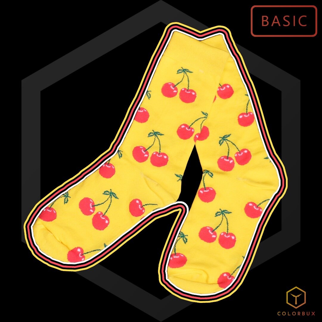
These socks aren’t just cherry - they’re very cherry.
These foot warmers are easy to match or combine with other pieces of clothing, so they make a great addition to any wardrobe.
Colors used:
Yellow (base)
Red (accent)
Dark green (sub)
Cold Colors and Dark Skin
If you are a dark-skinned person, then wearing cool colors like dark blues can look somewhat off. They tend to tone your complexion down and make you appear duller. Cold colors usually go better with paler skin tones.
As a dark skin person, you can, however, work your way around pulling off cold colors, but you have to be careful. One way to go about this is to wear cold colors in mostly lighter tints or tones. Or better, you can combine them with warm (and bright) colors to balance out the temperature a bit.
For individuals with darker skin, cold colors make awesome accents. Accessories like sunglasses, ties, or socks look great when they have a bright (and cold) color. For example, grab a pair of Tic Tac Toes from our shop, pair them with a nice light blue pocket square and a nice gray jacket over a plain white shirt. Now, wouldn’t that be fetching?
RATHER COLD COLORS:


Let’s play a game, shall we? A game of crosses and circles - and let’s play it where it’s usually not meant to be played: on our feet! Let’s call it Tic Tac Toes! How fun it must be. This design will blast your socks off (figuratively speaking, of course).
Colors used:
Purple (base)
Red-purple (accent)
Cyan (accent)
Magenta (accent)
Bright blue (accent)
Neutrals
As it often goes with anything that has to do with color in fashion, it’s mostly about wearing unoffensive canvas colors and accenting with bolder colors. “Unoffensive colors” are generally referred to as neutrals and consist of black, white, khaki, gray, beige, brown and other similar colors, that are very abundant in nature (and fashion).
Their prime advantage and edge are that they mix well with both warm and cool colors and go well with virtually every skin tone.
There are two main ways that wearing neutrals can make you stand out as a dark skin person – even though the whole point of wearing neutrals is not to stand out.
First, wear them as canvas pieces following them with bold, colorful accent pieces. For instance, wear a gray suit and accompany it with a red tie.
Second, wear one neutral color. Period. In fashion, we call this a monochromatic outfit. “One-color-looks” look stylish no matter what color you choose, but usually it’s best to pick a neutral one.
We’ll be discussing the topic of monochromatic looks in a future article. Be sure to subscribe to our member letter to be notified as soon as we publish it.
Note: In a way, gold and silver are considered neutrals as well. So, you can combine both colors. But with clothes, you do one at a time.
Which colors NOT to wear on dark skin
As with many things in color fashion, making an outfit look “good” depends on many different factors. It depends:
which color combinations you choose
how much of each color is in your outfit
how all the colors interact with each other and with your skin tone, eye and hair color
in which context you wear which color and what color psychology says about it
So, you can imagine it’s not very easy to say which colors you should wear and which you should stay away from. But, if you wear to neglect all other factors that make an outfit’s color composition look “good” and only regard skin tone, you’d categorically have to stay away from the following colors:
all dark colors (below 25% luminance)
colors that are too similar to your skin tone (browns and olives)
cold colors that make your complexion look sickly (especially blue-greens like teal)
But to put this shortly: stay away from dark browns, teal, dark turquoise, navy blue, olive, and dark army green if you have dark skin. Black is always fine to wear, even though it has very low luminance (perceived brightness).
RELATED ARTICLE:
A Short Recap
It's been stated here that warm color clothes look better on people with dark skin tones. And cool colors go a long way to complement neutrals when used as accents or combined with warm colors.
Go for colors that don’t closely match your own skin color. We suggest staying away from olive shades and tones and, in general, going for brighter and lighter colors instead.
Brighter and lighter colors also make you look younger, by the way.
However, as we stressed before, these suggestions are not a one-size-fits-all rule. They are not set in stone. They can be considered or, better, tweaked into what works best for you.
The goal is to feel great and look great.
But, if you stick to the colors we suggest, you almost can’t go wrong. Make sure to also always follow the 10 Golden Rules for Color in Fashion so you mix, match, and pair colors the right way. It’s actually quite easy to do once you get the hang of it.
ARTICLES YOU MIGHT LIKE:

Should Socks Be Lighter Or Darker Than Pants?
Socks should either perfectly match your trouser color or contrast it strongly. Something in between will probably look weird. Stick to brighter and lighter socks for dark pants and darker, more subdued socks for light pants. If strong contrast of lightness is too hard to pull off, go with strong color contrast.

So, you’ve put your entire outfit together, are flawlessly dressed (obviously), but realize that you’re not too sure which socks to wear with your dress pants. The question, whether socks should be lighter or darker than pants, pops into your mind. You’re stumped. Now what?
Don’t fret! We’ve curated a guide on how to pick out the perfect pair of socks for your outfit, and why you should feel confident in doing so! First of all, here’s our short (but sweet) answer to whether sock should be lighter or darker than pants:
Socks should either perfectly match your trouser color or contrast it strongly. Something in between will probably look weird. Stick to brighter and lighter socks for dark pants and darker, more subdued socks for light pants. If strong contrast of lightness is too hard to pull off, go with strong color contrast.
Our Very Cherry socks are a perfect match for dark pants, whereas our Spicy Chili pair might not be the best choice for blue jeans because the colors are too similar, yet not perfectly the same. A nice red pair of socks would have been more fitting.
However, our concrete (and much longer) answer for this lighter or darker debate? Let’s find out. Scroll down below to discover what we recommend wearing on your feet in certain situations, and why we suggest them.
Sometimes, life throws us through loops! Maybe your sock drawer is completely empty… except for that one set of socks that don’t go with anything. What do you do? Simple. You wear those socks with pride. Or you choose to go sockless that day.
No one is judging! However, if you are looking to coordinate your future outfits appropriately, we suggest paying attention! Down below are some rules we like to follow when choosing which socks we should wear with our pants and if they should be lighter or darker.
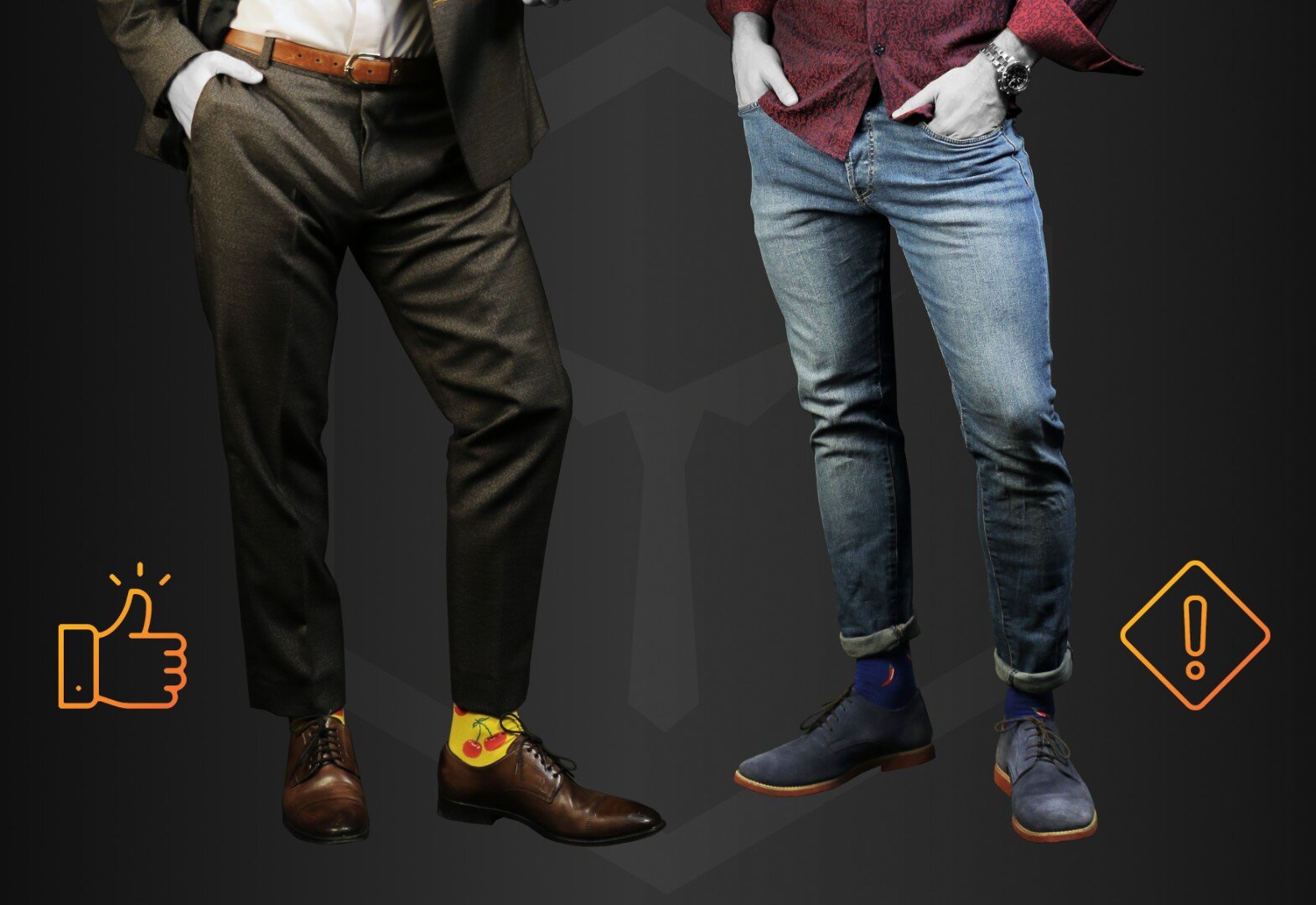
Match Your Socks to Your Pants
First off, before we start with shades, we always recommend matching your socks to your outfit and not your shoes. When in doubt, this is the safest route!
For example, if you are going to wear a gray suit with brown shoes, go for socks that match the gray of your pants. There are some exceptions, of course.

If you have socks that match both shoes and pants, you’re always good to go. In such a case, your legs don’t seem neither visually “stretched” nor “shortened”. | Socks: Squorange
If you match your socks accordingly, they can add an extension to either your pants or your shoes. Sometimes the former is better than the latter, sometimes it’s the other way around. Sometimes, like in the image above, it can be neither. So, it’s important to know what you’re doing.
We recommend matching your socks to your pants in most cases, so go with gray socks like your dress pants or some color to accent. Otherwise, your shoe might look extra tall and boot-like. Plus, you’re legs might seem shorter.
Repeating your trouser color is usually not the best choice, though. Here at Colorbux, we’re advocates of wearing socks with contrasting colors (obviously). We’d usually like them to stick out – but in a pleasant way, of course. So this is where it becomes important if the socks are darker or lighter than pants.
READERS ALSO LIKE:
It Depends on the Color of the Pants
This one is important! The color and shade or tint of your dress pants can make an enormous difference with the pair of socks you choose.
If your dress pants are darker, we recommend going with a tint lighter when you pick out a set of socks. If your dress pants are on the lighter side, we suggest choosing a darker shade of socks.
For example, a lighter gray suit? Try a darker pair of dress socks. Monochrome is always a safe bet, especially when you are working with neutrals like gray. So, you can spice up your outfit with a small smidge of color, right?

We seriously suggest contrasting your trouser color with your socks. It just screams “character” - especially if the the outfit is well-composed. | Socks: Tic Tac Toes
If you have chosen a suit in the middle of its own color range, you could go either way, lighter or darker – but this one depends on the occasion. Darker is typically for more professional and formal settings, and lighter for less professional occasions. More on this topic in this article on dark versus light clothing colors.
Pro tip: We like gray socks. We really do! Gray is a very versatile color that can be paired with almost any outfit. From navy to black, to even brown, gray hits the mark every time. Neutrals are your friends, use them!
What About Bold Socks?
When you decide to break out your bold dress socks, like Colorbux’s Super Fruit or Spacecubes, we suggest doing this with a darker suit. In this case, go lighter!
Pair your lighter and brighter socks with a darker pair of pants. Your socks can become your outfit’s accent color. We also suggest wearing bold socks with a non-patterned, solid-colored suit, as this can really let the socks shine.
Paring a fun sock with a patterned suit can create an overwhelming outfit, and they might clash. Therefore, it’s best to keep your brighter socks for solid-colored outfits.
For a more daring look, you can also pair a darker pair of colorful dress socks, like our Bordeaux set, with a lighter suit. We suggest this combo with a less formal setting.
It’s been said that bold socks are only meant for less professional occasions. However, we believe you can make a significant statement wearing a fresh pair of striking socks to the office.
Remember, your dress socks are a great way to add your personality and a pop of color to your style. Don’t feel restricted to only wearing them to dinner dates and parties.
If you want to keep your outfit on the “put-together” spectrum of suit dressing, we suggest wearing a navy suit, our Flamingo socks, and a tie that matches the base light blue from the socks.
This example shows a well-balanced outfit you can rock in any setting. Don’t forget, our fashion rule #6 from our Golden Rules For Color in Fashion suggests you repeat colors within your outfit!
SOME OF OUR BOLD SOCKS:


Use Your Clothing Piece as a Guide
When in doubt? Use your clothing piece as a guide. If you’ve read our article, Should You Wear Dark or Light Colors? you might remember this one! If not:
Within it, we discuss all things contrast. You can play up your outfit depending on the contrast you want it to have. If your outfit already has two or more colors, stick with one of the primary ones and dress your socks accordingly to their shades and tints.
If your outfit has one color? Then coordinate your socks dependent upon that one color’s shades and tints. Here, you can always adjust your outfit around your choice of socks (especially if they are on the bolder side). Or choose your socks around your outfit choice.
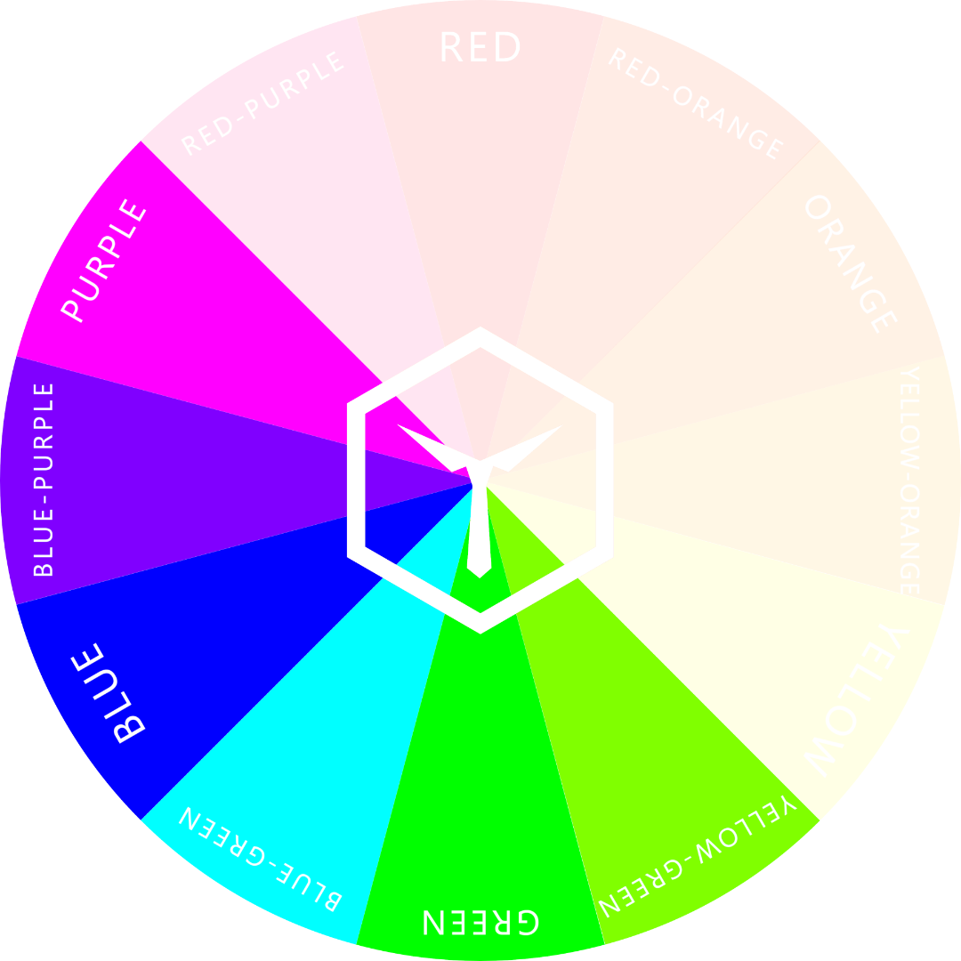
Head back to the color wheel! You can always adjust your sock choice to feature analogous colors.
If you look at our article, 10 Golden Rules For Color in Fashion, you’ll understand what we mean by this. Haven’t had a chance to check it out? Let’s summarize. Analogous colors typically refer to one color on the wheel and the two sitting on either side of it.

The analogous hues of purple are red-purple and blue-purple.
For example, blue’s analogous colors would be blue-green and blue-purple. Both colors would complement blue and strike a balance.
You can put together a seriously well-balanced outfit if you follow these guidelines, like how you can pair blue-green socks with a blue pair of pants.
Dark or Light Socks?
After researching, discussing, and personally pairing outfits together, we’ve concluded that your socks can be both darker and lighter than your pants. This conclusion depends on the outfit itself.
It is important to note how many factors can change your overall decision on what to wear. Color theory can come into play, the specific shade or tint of your pants, the occasion, and even your own personal desire and tastes!
Overall, we suggest pairing darker pants with lighter tinted socks and lighter pants with darker shades of socks. This is the easiest route we can suggest.
Other than that? Do what your heart tells you! Go bold, go bright, be extraordinary.
OUR NEWEST ARTICLES:

Clothing Colors That Make Green Eyes Pop
Wearing purple, forest green, or deep red will make your green eyes pop for sure. In general, a strong color contrast will always do the trick with green eyes. It is suggested to go for black and/or white clothing to really make the emerald color of your iris draw attention.

If you have a set of gorgeous green eyes, we envy you! But, contrary to plain brown or blue eyes, choosing clothing colors that make green eyes pop can be harder than it seems.
Sometimes having a vibrant eye color can lead to a lot of clothing mishaps. Do you have green eyes and struggle to find the perfect outfit to match, or even to make them pop? If so, please pay attention!
Within this article, we will list some tips and tricks on how to accentuate your green eye color and how to draw attention to those green irises.
Please note, although we are giving insight on what we think (and know) would look amazing, your personal preference, skin tone, and undertones will affect your overall decision.
Which colors go best with green eyes?
Wearing purple, forest green, or deep red will make your green eyes pop for sure. In general, a strong color contrast will always do the trick with green eyes. It is suggested to go for black and/or white clothing to really make the emerald color of your iris draw attention.
Continue scrolling for all our suggestions on ways to emphasize one of your best assets, which we list below!
When in Doubt, Match it Out
Sometimes it’s hard to step out of our comfort zone. Are you someone who tries to stick to neutral colors? Does the idea of a deep red or purple freak you out? We understand that! Sometimes it is easier to stick with what we feel comfortable in, instead of trying something out-of-the-box.
If you don’t feel confident jumping right into new ideas and colors, we suggest sticking to what matches. One way to bring out your gorgeous green eyes? Keep it simple. Choose another green!

Dark green clothes can make your slightly lighter eye color pop in ways you can’t imagine.
We suggest sticking to deeper greens to do this. Possibly an emerald or forest, as these hues will not only enhance your eyes and help them stand out but will also not stray from your regular style.
Neon green and pastel are not only far from comfort, but could also weaken your eyes’ presence, depending upon your skin tone and undertone. So, be careful with bright greens.
Our biggest advice is to stick with deeper shades! Need further “realistic proof”? Check out this academic article: The Eyes Have It, or Do They? The Effects of Model Eye Color and Eye Gaze on Consumer Ad Response. Within it, they express how “some attorneys advise clients to match clothing color to eye color to better draw attention to the eyes and evoke trust”. By doing this, wearing an outfit that matches their eye color, will accentuate them even more, drawing all attention to their eyes.

Take it from a celebrity like Amanda Seyfried! She has a set of gorgeous green eyes and wears bold green dresses to play them up while exaggerating and emphasizing their color. This trick works well for men too, it’s not just a secret only women can use.
Rocking a pair of green eyes? Next time play up your suit with a forest or emerald green tie. We guarantee you’ll be bombarded with compliments. No one will be able to keep their eyes off of you! Don’t forget to add our Kiwi Kicks Socks to your outfit as well!
Color Theory for Green Eyes
If you’re unsure of what might match with green, we always suggest heading back to color theory. Take a look at the color wheel!
Green, a secondary color, has many potential matches on the wheel. Look at the complementary, monochromatic, analogous, split complementary, and triadic matches. Within this range, you will find various options that can emphasize your green eyes.
Check out our 10 Golden Rules for Color in Fashion to learn all you need to know about pairing colors using a color wheel.
These colors include shades and tints of red, blue, and yellow. A secondary color will always feel complimented by the two colors that created it, therefore variations of yellow and blue will definitely work incredibly well with green eyes.

All colors from blue to yellow will work well with green eyes.
However, let’s focus on two color families we tend to shy away from! Yes, we are talking about red and another secondary color, purple.
Complement With Red
Obviously, it’s detectable by any color wheel observer that green matches with the primary color red, as it sits directly across from it. Therefore, anything within the red range can significantly complement your green eyes.
Remember the photo of Amanda Seyfried? She wore red lipstick that complimented her green eyes fantastically. Men can do the same with a red tie, for example.
In our opinion? Red can do a substantial job at making the green in your eyes appear more vibrant. The two powerful colors can play each other up perfectly. Both colors, therefore, appear more intense.

Red, especially a deeper or darker red, contrasts green eyes in ways no other color can.
The “Color Book” explains how “complementary colors enhance or emphasize the qualities of their opposites”. For example, look at a rose. The stems on the rose are just as emphasized as the rose petals themselves, this is because the red makes the green more intense, while the green does the same to the red.
Remember, there are more shades of red than your typical “fire-engine” or “candy apple” red. Don’t let your fear of red itself stop you from wearing it.
We suggest sticking with the darker shades! Anything darker, like burgundy or wine, can deepen and make your eyes appear richer, without the color red itself appearing too vibrant. Check out our Funky Tiger Socks to add a fun amount of red to your outfit!


What the funk?! These groovy socks are for the big cats of the 70s. And if you’re not from back then, these puppies will teleport you back in time. Be the Funky Tiger with these bad boys. Show ‘em where the disco's at!
Colors used:
Red-purple (base)
Green (accent)
Orange (accent)
Yellow (accent)
Blue (accent)
Blue-green (accent)
Make Green Eyes Pop With Purple
We know, this one seems out of typical comfort zones, but hear us out! Our personal favorite is pairing your green eyes with shades of purple.
It’s important to remember that purple is a secondary color created by a mix of red and blue, and both colors can play up green eyes. Purple itself is a very flattering color. Have you ever noticed how well green pairs with purple? Well, it’s true, and we have evidence!
Realistically, a deep shade of any color can accentuate your eye color, creating an exaggerated effect. It can make it more pronounced!
Where we do normally suggest darker colors… in this case, any shade of purple has so much potential! Light purple tints can make your green eyes appear otherworldly. Give lavender a try! What do you know? Purple might become your new favorite color!

Lavender goes well with green eyes, doesn’t it? For ladies, this color is easy to pull off - but for you guys out there: lavender dress shirts are a pro tip. Lavender ties and pocket squares are a safe bet as well.
A little secret: We swear purple works magic on green eyes. Don’t you dare leave this color to the ladies alone! It’s true, women have been keeping this weapon a secret for years as a way to play up their gorgeous greens. If you look at any celebrity, model, Instagrammer, or makeup guru who sports a pair of green eyes, they swear by emphasizing them with purple makeup. Why? Simply because it works insanely well.
Use Neutral Colors With Stark Contrast
We don’t recommend black and white for every skin tone and undertone… to accentuate green eyes, however, we can make an exception.
Have you ever noticed how pronounced green looks against all white? It is almost captivating. It has a similar effect to black!

This color pallet is mesmerizing. Do you see how the color green pops out? And, it’s not even a bright green!
Think of a stereotypical image of a black cat. Their entire being is black, but their eyes are yellow-green, making their eyes the most focused aspect of them. Their black fur creates a setting where the yellow-green has no choice but to stand out; and stand out it does! The same can go for your green eyes! Creating a space where they can become the focus is extremely important in making them pop. Play them up, don’t tone them down! Test it out with some black and white outfit choices and use a principle that experts call “Contrasting”.
By toning down most of your clothing and only accenting very small parts of an outfit, you make the accents (in this case: your green eyes) “pop”. We explain everything in and around this topic in our article on Accent Colors in Fashion, so we suggest you check it out if you’re interested.
In The End, It’s up to You
Well, there you have it, ladies and gentlemen! A quick guide to making your green eyes more pronounced.
Please remember, not every color above will work with your skin tone and undertone. Some individuals might also not enjoy wearing the colors listed above. Again, that’s ok! At the end of the day, it’s all about personal preference.
Nothing we listed above is set in stone. However, if you’ve felt a little lost lately, the above information can definitely lead you in the right direction! Enjoy!
If you liked this article, we’d strongly suggest subscribing to our email list so you get regular updates on all things color in fashion. It would be nice to have you as part of the club!
YOU MIGHT ALSO LIKE:

Fashion Color Trends for The Year 2021
There are many sites on the internet where you can research the upcoming color trends in fashion. And, there’s always one place people refer to: Pantone. For this article, we’ll also be using other sources and our own experiences to forecast color trends.

2021, one year further into our second attempt at the roaring 20s!
Since 2020 was a slow year for fashion opportunities, we keep faith in the world that 2021 will offer new possibilities to impress others with our stylish take on modern fashion.
Read on to find out how we can knock you off your socks using the most popular colors of 2021. Here is our full forecast of the most trending fashion colors for the year 2021:
Fashion Trend Forecast
| COLOR | SEASON |
|---|---|
| Illuminating | All Year |
| Ultimate Gray | All Year |
| Raspberry Sorbet | Spring |
| Burnt Coral | Spring |
| Marigold | Summer |
| Desert Mist | Summer |
| Green Ash | Fall/Autumn |
| Mint | Fall/Autumn |
| French Blue | Winter |
| Cerulean | Winter |
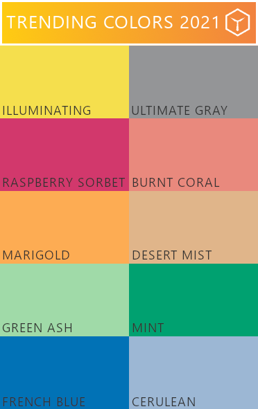
All the trending colors of the year 2021
There are many sites on the internet where you can research the upcoming color trends in fashion. And, there’s always one place people refer to: Pantone. For this article, we’ll also be using other sources and our own experiences to forecast color trends. But yes, Pantone influences our decisions quite a bit.
Why Should You Care About Color Trends?
We get it. You're just a regular person, going about your life and trying to look as fly as you can. Sometimes you grab a copy of GQ on your way to the office, but generally speaking, you don't care about fashion trends. You're your own person after all!
However, if you're anything like us, you've seriously been lacking inspiration lately. Color trends can be an ideal tool to kickstart your creativity again. Let’s have a look at this year’s top colors, shall we?
Pantone Color of the Year 2021: Illuminating Yellow
Pantone has been appointing a color of the year for 20 years now. The experts at the Pantone Color Institute carefully analyze color trends to come to the ideal conclusion.
This year the color combination with the great luck of becoming immortalized in fashion and interior design is Pantone 17-5104 and Pantone 130-0647.

Illuminating #f5df4d

Ultimate Gray #949597
A bright, illuminating yellow coupled with a cool, ultimate gray.
Why choose such a bold, youthful yellow? 2021 is a year for looking forward, for being uplifted by the resilience of the human spirit. Seems logical after such an epidemically plagued past year, doesn’t it?
As we describe in our article about the meaning and interpretation of yellow clothing, yellow symbolizes positivity and happiness. We suggest reading up on our article, should you wish to learn more about the color psychology of yellow.

Middle gray gives a nice contrast to a rather saturated yellow and gives the whole combination an aura of “strength and resilience”, without being overbearing. We think it’s a great color combination – but rather difficult to pull off in clothing.
Building a color palette from these two colors might be fun, though. It could even result in outfit combinations you would have never thought of otherwise.
Nevertheless, this color pairing will be everywhere in 2021. Just wait and see! But, there are several other colors that will be strong contestants – more on those in the following paragraphs.
Bananas in the sky without diamonds! Nothing makes your ankles stand out more than a pair of light blue socks with bananas on them. These puppies are perfect as an accent piece.
Colors used:
Light blue-green (base)
Yellow (accent)
Light yellow (sub)
The Pantone Color(s) of The Year in Fashion
Do you want a pop of this bright and cheerful yellow color in your 2021? Why not have a look at our Banana Sky Socks? A yellow accent piece to make your ankles sing.
Pair with a gray suit to let everyone know that you're solid and dependable as well as energetic and fun.
Did you know that the interior “Performance Pack” design of the new Polestar 2 uses a similar color scheme? Accenting dark gray with a bright yellow just seems brutally right, doesn’t it? It almost feels like some sort of guilty pleasure...

Absolutely on trend with this color scheme. | Image credits: Polestar
Throughout Spring, you will see fashion brands and companies take this bright yellow to a more subdued level before popping back out in full vibrancy in the Summer. Get a headstart on the daffodils springing up and get your friends and family excited for warmer weather.
To learn more about seasonality in fashion, we suggest reading up on our corresponding article.
Raspberry Pink – The Spring Color Trend
Pink may be the most polarizing of all the on-trend hues, but we already see everything from flamingo pink to watermelon pop up in collections and shop windows.
Poppin' pink's cousin magenta is not only a part of the Rocky Horror line-up anymore. It's time to keep it from horrifying you and get comfortable with this eye-catching color injection.
Check out what Pantone has to say about the color pink – namely two variations of the hue:

Raspberry Sorbet #d2386c

Burnt Coral #e9897d
Pantone 18-2043 Raspberry Sorbet: vivid and tantalizing for your senses
Pantone 16-1529 Burnt Coral: inviting and friendly
We’re pretty sure that Raspberry Pink and Burnt Coral will be the most trendy colors during Spring 2021. As soon as nature reverts back to its green and flowery self after Winter, people will be donning this color!
Both of these colors are great on dark skin, by the way. Seriously, if you have dark skin or even a rather strong tan, Raspberry Sorbet and Burnt Coral will look great as part of your outfit.

Oh so bright! These Super Fruit socks will brighten up your day like an irradiated glowstick. They work great as an accent to literally almost anything and are bound to attract some looks.
Colors used:
Bright red-purple (base)
Cyan (accent)
Dark red (accent)
Totally on Trend: Orange
Do you see yourself as a bit of a firecracker? Then this trending orange will become your new soulmate. Orange exudes both warmth, and as one of the rarest colors found in menswear, it can truly help you stand out in a crowd.
Avoid pairing it with something weird, though. It could make you look more clownish than Clooney-ish. Paired with a nice brown Tweed, Charcoal, Ultimate Gray, or even black, it will surely look great.

We’ll be diving into how to match and pair orange in a future article. We suggest you subscribe to our member list to get an email every time we publish a new post (1-2 times a month).
A pocket square to match our Squorange socks will pull your whole look together. Orange in your outfit says you're fearless and radiate warmth. There's a reason you can find it in the Gryffindor colors. Roar like a lion (or a… griffin)!
Specific Orange Variations To Note:

Marigold #fdac53

Desert Mist #e0b58a
Pantone 14-1050 Marigold: comforting and warming
Pantone 14-1127 Desert Mist: fine sand between your toes
Our prediction for these two orange variations is that they’ll be most prevalent during Summer 2021. We’re almost certain you’ll be seeing both colors almost everywhere in fashion during the warm months.
Squorange is a mix of elegance and “laissez-faire”. The orange squares pop out and give any outfit a perfect accent color. Combine these puppies with another orange accessory to make your look as stylish as possible.
Colors used:
Beige (base)
Orange (accent)
Black (accent)
Evergreen, Ever On Trend?
We've all been locked down, locked away from nature, and craving getting out in the green.
The Japanese art of forest bathing is a method of being in nature and de-stressing from bustling city life. For many of us, this is still an impossible dream.
It's no wonder green is taking part on stage in 2021. Bring a part of nature into your fashion with some pops of color.
Our hot tip: these kiwi classics for a subtle yet effective way to get noticed. Slide your feet into these bad boys, open your windows, cross your legs, breathe in deeply, and ahhh, forest bathing right in your living room.
Some Pantone Greens for 2021:

Green Ash #a0daa8

Mint #00a170
Pantone 13-0117 Green Ash: menthol fresh and soothing
Pantone 16-5938 Mint: technicolor green for a bright future
Our prophecy for the two greens mentioned above is that we’ll see a lot of them in Autumn 2021. Both colors would also fit springtime, but we don’t think that people are ready for them quite yet.
What the funk?! These groovy socks are for the big cats of the 70s. And if you’re not from back then, these puppies will teleport you back in time. Be the Funky Tiger with these bad boys. Show ‘em where the disco's at!
Colors used:
Red-purple (base)
Green (accent)
Orange (accent)
Yellow (accent)
Blue (accent)
Blue-green (accent)
Don't Step on My Blue Suede… Socks
One variant of blue made it onto this year’s Pantone list of Spring and Summer Colors: French Blue.
Shades of blue are never far from the red carpet or the runways. You may be bored of blue, but blue does not have to be boring. Add some spice to your outfit with these chili socks on a beautiful, versatile azure (french blue) base.

French Blue #0172b6

Cerulean #9cb7d4
Pantone 18-4140 French Blue: our personal favorite color – so Parisian!
Pantone 15-4020 Cerulean: the color of clear skies in springtime
At COLORBUX, we believe that blue – especially French Blue – will be a trending color for Winter 2021. Why? Well, let’s call it gut feeling… We also explain why in our article on color seasonality.


A true classic themed pair of socks: The Spicy Chili. We all love them - in secret - and because of the easy to combine blue base color, these socks go well with many types of outfits.
Colors used:
Blue (base)
Red (accent)
Color Trends 2021 – Now What?
Trends come and go. So, it’s absolutely fine if you think it’s not worth pursuing them – we understand. Especially when it comes to color in fashion, we understand that you can’t just always swap out your whole wardrobe every other season.
But, you know what? We’re pretty sure you have a few different colors stored away in your closet, right? Maybe some of them actually match the colors we mentioned in this article?

This is what COLORBUX is all about! We teach you how to use the clothing colors you already have easily, successfully, and efficiently to make the impressions you want to make.
If you'd like to further explore color trends in fashion, you will enjoy our article on the topic. At COLORBUX, we hope to get you noticed in all the right ways. Stay awhile, have a browse of our style articles, and make a lasting impression! Remember, don't be bland - dress the smart way.
THIS COULD INTEREST YOU:

Ideal Clothing Colors for Pale Skin
If you have fair or pale skin, it’s usually best to wear colors that are saturated but don’t clash with your skin undertone. Wear clothes that have a medium amount of luminance and a decent amount of chroma.

Contents:
- 1. Guidelines to Color on Fair Skin
- 1.1 Skin Undertone
- 1.2 Pastels
- 1.3 White and Black
- 1.4 Neutral Colors
- 1.5 Jewel Tones
- 1.6 Blue
- 1.7 High Luminance
- 2. Colors to Wear if You Have Pale Skin
Choosing the perfect color of clothing based on what pairs well with your skin tone can feel overwhelming. We’re not saying that you have to be an expert in the area, but we do recommend becoming well versed in colors that work best for you.
It’s important to know what makes you shine, and what makes you, well not. Finding colors and the proper shades of those colors is crucial if you are looking to stand out in a crowd, and not fade into the background.
Not only do you want to feel powerful at work or at an event, but you also want to look powerful too, right?

In this post, we will address what clothing colors work wonders for pale skin, and what to stay away from. So take some notes!
We promise that regardless of what you were previously taught to believe, choosing the color of your wardrobe based on your skin tone can change your overall look for the better.
The Best Color Choices for Pale Skin
If you have pale skin, it’s best to wear colors that are saturated but don’t clash with your skin undertone. Wear clothes that have a medium amount of luminance and a decent amount of chroma.
Please note, not only does your skin tone affect these results, but so does the color of your eyes and hair. This is not a foolproof guide! Results may vary for every individual, especially with personal preference.
Continue scrolling for all the information on the ideal clothing colors for pale and fair skin. You’ll even find a helpful image with all the top suitable colors towards the end of the article.
Guidelines to Color on Fair Skin
Don’t Wear Colors That Match Your Skin Undertone
In order to do this, you will need to discover your skin’s undertone. Not sure what that is? Well, undertones are the natural colors under your skin’s surface. They don’t change throughout the year as our skin tone does. Playing on these hues is the best way to accentuate your overall beauty.
Pale skin rarely tans, instead, your light skin burns under even the slightest bit of sunlight. You probably have blue or green eyes, with blond or red hair. This skin color normally has a cooler undertone.

The hue (left) of the skin (right) makes the skin color look rather pale when you pair both together.
Any color that has the same hue as your skin tone will wash you out completely, creating a very unflattering look to your appearance. You want something that will add a good amount of contrast to help bring out your best features! But not too much contrast, as that will be too harsh. Just the right amount to help your natural tones pop in a flattering way.

The same pale skin would benefit much more from a hue other than its own, making it appear less sickly.
However, it is important to remember that your eye and hair color can change the way things look on you. Optometrists suggest that although your skin tone might be very light, if you already have some natural contrast from your hair, then you can handle more contrast in what you wear.
Wondering what undertone you have and how you might go about finding it? Head over to our recent article: “The 10 Golden Rules For Color in Fashion” for a quick and easy way of how to find out your true skin undertone.
Avoid Most Pastels
Don’t wear something that will wash out your color more than necessary. This means you need to steer clear from certain pastel tints. Certain pastels can dull you out more than your skin color already appears.
The wrong tint of pastel can portray you as meek. Any hues that are “washed-out” can force you to look washed-out too.
If you are tanned enough, though, then pastels can actually make you look even more tanned. It just takes enough brown in your skin. If you don’t have that brown (yet), then stay away from most pastels.
If you are looking to sneak these in, as you love the color scheme itself, try not to wear them close to your face, or all by themselves. Find a pastel tint, such as baby blue, and don’t let it overpower your outfit, this will keep you looking your best. We suggest adding a pop of pastel to your socks or pocket square as an accent!
A great example of such a “pop” would be our Very Cherry socks.
These socks aren’t just cherry - they’re very cherry.
These foot warmers are easy to match or combine with other pieces of clothing, so they make a great addition to any wardrobe.
Colors used:
Yellow (base)
Red (accent)
Dark green (sub)
Learn how to use accent colors correctly and easily in our article about accent colors in men’s fashion.
Depending on your skin undertone and how much natural contrast it has to your hair and eyes, pastel colors can look great, though. Generally, the less natural contrast you have, the easier it is to pull off pastel colors.
People with darker skin or olive skin have it much easier when it comes to wearing pastels. Light and bright colors suit dark skin very well.
Skip White and Black
Similar to washed-out colors, it is important to stay away from stark colors as well! Unfortunately, black isn’t a universal color as it is often advertised as. Don’t wear anything that appears too harsh against your pale skin tone, this includes white and black.
The contrast of black will be too drastic to your pale skin, creating an extremely harsh look. Therefore, leaving your skin looking pale. It also gives a gothic vibe to your overall appearance, stripping you of your color (unless this is your aim- then this is perfect, and black is the color for you).
White, on the other hand, will not be enough contrast, it will be too little against your pale skin and can make you look sick. Remember, white is too close to your skin color; it will clash, and wipe you out.
Side note: if you have a pale complexion, but with darker hair, then you might be able to pull off black. It won’t look as drastic as it would on someone with pale skin and pale hair, as you are considered high contrast and can wear high contrast color schemes.
To learn more about dark and light colors in fashion, we suggest reading up on our article on the topic.
Wear Neutral Colors
Wear the proper neutrals. Even though we’re telling you to stay away from white and black, we do suggest wearing grays, browns, and greens. These colors can help bring the most needed life back into your complexion. They won’t make you look dull or washed out, instead, they will help you look less pale, which is the overall goal.
Aim for a gray that is darker than your skin tone, as a lighter gray can wash you out (What? Again..?). Being on the paler side, we suggest medium to charcoal gray shades. A medium gray will offer just the right amount of contrast, without being too dramatic or overwhelming.
Hot tip: Try one of the most trending colors of 2021 - Ultimate gray!
The contrast of a medium gray against your pale skin will look fantastic. The same goes for brown. This can help a more pale individual look more alive!
Do you have blue eyes to go with your rather light skin? Check out our article on how to make blue eyes pop to learn more about the use of neutral colors.
Gravitate Towards Jewel Tones
Anything emerald will look fantastic with your fair skin! This deep and bold green will look striking against your complexion, bringing life to your appearance, especially if you have green eyes (#swoon). We also highly suggest other jewel colors as well, such as amethyst, sapphire, and ruby. These bold colors will play up your complexion and contrast them in the right way.

This deep green jewel shade suits the skin next to it perfectly.
If you can wear a certain color in the form of jewels, you can also easily wear it on clothing.

Contrary to the green jewel tone, this dark red jewel tone makes the skin next to it look rather pale. This is because it has the same hue as the skin.
Personally? Emerald Green is a color you cannot go wrong with. This is something we see a lot of fair skin individuals rocking, and we strongly support it. It represents a royal power we cannot get enough of.
To learn more about the green hue and all its variations, read up on “What Does it Mean if You Wear Green?”
Be Careful With Blue
Shades are extremely important, as we previously noted with the gray category. Certain shades of a specific color can make a giant difference with various skin tones.
For example, blue can sometimes make someone with fair skin look odd, especially if the blue matches their veins. This will make their underlying hue (= undertone, remember?) stand out, and not in a good way! It might make you look ghastly.

Blues in all shades and tints can be powerful. Often, they are easy to wear but for cold, pale skin they sometimes aren’t. Socks: Style Punk
Be careful with the shade of blue you choose, because it can make you look sickly and cold. It is the coldest of all the colors, after all.
Give navy a go! Navy is a great way to pull a look together effortlessly. Navy is known as a powerful color, helping you appear more dominant. You can also consider a royal blue, this color can accentuate your appearance, rather than clash and diminish it.
Go Bold, but Shy Away From High Luminance
Very luminant colors, for example, yellow or orange, will overpower you. They are too bright for your skin tone, and not in a good way. If you want a extreme pop of color, we suggest sticking to certain bold colorings, but nothing in the “high luminance” category.
Save those light+bright colors for your accents, such as socks or pocket squares. Just don’t wear them on a large scale.
Slight pops of these colors can bring an outfit to life, especially when you enjoy them. Check out our “Very Cherry” or “Pine-Able” sock collections for the perfect amount of boldness to add to your style!
Colors to Wear if You Have Pale Skin
Since we’ve covered what not to wear, we can now put together a nice list and diagram of colors you should wear if you have fair skin:
The following diagram shows the colors that are best suited for fair-skinned individuals:
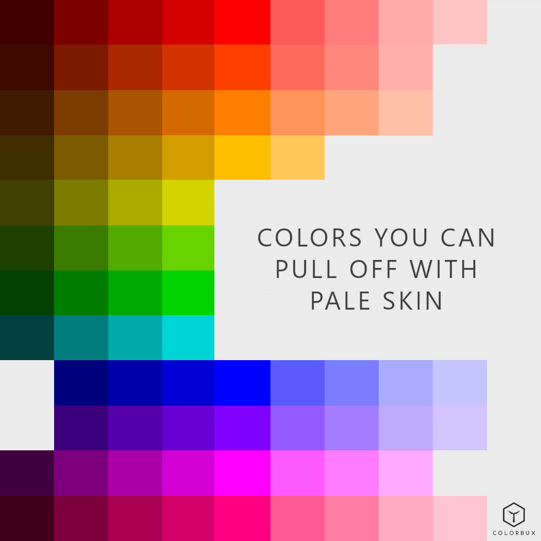
If you have light or pale skin, you show wear these colors. They’ll (most probably) look fantastic!
Now you have a basic color guide if you have pale skin. Go out and rock it.
Now, we are in no way stating that you cannot wear any of the colors listed above to “avoid”. Try out everything – you might be surprised how good it looks. If you think you look fantastic in a certain color, then don’t let anyone tell you differently! Be bold, be you!
And yes, you’re awesome! (Obviously - you’ve read this far…) ;-)
Also, if you’d like to show your appreciation, we’d seriously enjoy a nice Google review. It would help us out a bunch since we’re pretty slim (to say the least) when it comes to online feedback on third-party platforms.
ARTICLES YOU MIGHT LIKE:
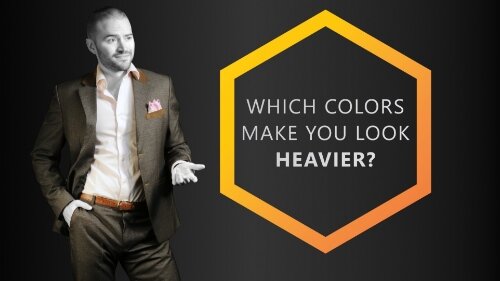
Which Colors Make You Look Fat? (And Which Make You Look Thinner)
Certain colors can make you look heavier than you actually are. There are quite a few factors that are responsible for making a color "put on weight". And it's not as easy as: "Wearing white makes you look fat and black makes you seem thin". Even though it’s a decent rule of thumb, there’s much more to it than just that.

Have you ever wondered which colors make you look fat or maybe simply heavier than you actually are? Well, you’re not alone – many people do so. In fact, “appearing heavier” is a major reason why people choose to wear specific colors and disregard others.
We are taught that wearing the color black makes you look slimmer and white makes you appear larger – at least in general. But is this really the case?
I think we might find that it’s not that simple.
In the next few paragraphs, you’ll find out exactly which colors and color combinations you should wear and which you should avoid depending on your body composition.
Colors That Make You Look Heavier
Colors that make you appear heavier are either white or very light versions of most hues. Light gray is also known to make people look heavier than they actually are.
The common factor in all these colors is their luminance. Luminance is the correct terminology for how “light” a color appears to be. Luminance changes depending on hue (color type/wavelength), chroma (saturation/brightness), and color value (lightness/darkness).
White is the “color” with the highest possible luminance since it can’t get any “lighter” (100%).
The hue with the highest amount of luminance is yellow (97.6%). The hue with the lowest amount is blue (29.6%). Now you know why bright blue (not light blue) looks darker than yellow.
Sidenote: Please remember that lightness is not brightness. A light color is one with added white, whereas a bright one is saturated and has neither added white, nor black, or gray. A light color is also often referred to as a tint.
Higher luminance in colors makes it easier to see contours and shadows within (and on) the colored surface. This means that it’s easier to see the actual shape underneath.
This fact is paramount because the more shape you see, the easier it is to recognize bulges and lumps in certain places of a person’s body. In other words:
Colors of higher luminance make a person look heavier. Sadly, they also make you look younger (dilemma alert) - but that’s another story.
So, we suggest NOT wearing the following hues including their tints:

We regard hues with a luminance above 60% as unhelpful when it comes to visually reducing body weight.

The colored fields (over 60% luminance) represent those colors you should most likely NOT wear if you wish to look less heavy. The hues within the white box are fully saturated. The colors to the left of the box are shades (+black), those to the right are tinted (+white).
The colors in the image above could make up a definitive list of colors that “make you look fat”, but guess what? They don’t. Well, I said it wouldn’t be that simple, didn’t I?
By the way, if you’re looking to not only appear less heavy but actually be less heavy, you can try boosting your digestion. Biofit, a GMP-certified and USA-made supplement, can help with the issue. More on Biofit here:
Context Makes You Look Heavy (or Not)
A study by Lancaster University has had very interesting findings on the subject of perceived weight due to color. The study suggests the opposite of what we just found in the previous few paragraphs – but only under certain conditions.
Apparently, the color black makes objects appear heavier and white look less heavy. But here’s the clue: This is only based on visual information alone. As soon as the objects were held up, so you could feel their weight, the white-colored ones were rated heavier.
But what does this mean for us?
Context is Relevant for our Judgment of Weight by Color
Let’s further indulge in the topic of contrast and contours on people’s bodies, shall we?
What we’re really asking is not if a color makes us look fat, rather whether a color accentuates certain parts of our bodies or not.
People judge the weight of others by looking at certain body regions and seeing if there is excess fat there. All human beings do this automatically and unconsciously. So, it comes as no surprise that if it’s easy to see those “love handles” and “flabby bits”, we naturally tend to think a person is heavier.
Often, those of us that are slightly overweight know exactly what type of clothing to wear to “hide” or “disguise” protrusions around the belly and upper thigh regions. Such clothing items are often large and hang down from the shoulders like drapes. Why? Because they cover contours that way, making it hard to recognize the form underneath.

The dark shirt covering the light T-shirt has a slimming effect on the torso.
The same goes for colors with lower luminance. Clothes of darker and more somber colors hide the shape of the body underneath it better. This is because it’s harder to see contours and cast shadows.
But hang on, here comes the fun part…
Fitting in with your Surroundings
Dark clothing can also make you look fatter if you wear it in the wrong context!
For example, if you wear an overly dark outfit to an outdoor summer party you’re bound to be perceived as bigger than you actually might be. Why?
Well, because most others at the event won’t be wearing dark colors and because the context (the environment) in which you’re standing is light and bright.
Imagine standing in front of a white backdrop donning a black outfit. It’s hard to see the contours of your body because the background is so light and your clothing is so dark. But wait, that’s a good thing, isn’t it?
Yes, it is. BUT there’s more…
Since the contrast to your background (your surroundings) is that strong, it’s easy to recognize your silhouette. In other words, the outline (and in thus the shape) of your body is easily seen.
If you combine the simplicity of your silhouette being distinguishable with the fact that dark objects are generally perceived as heavier (in contrast to white/light objects), you understand why people suddenly judge you to be bigger.
Contrasting and Silhouetting with Clothing
If you wear clothes that are eye-catching and at the same time others that don’t, you’ll be able to direct people’s eyes to those parts of your body that make you look less chubby.
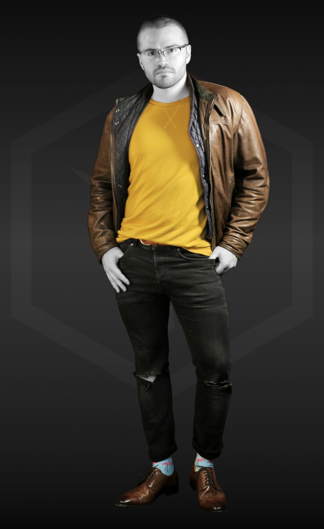
The yellow-orange sweater draws people’s attention and makes the model's legs seem rather skinny. The leather jacket contributes to the appearance of the torso being much wider than the lower body half. | Socks: The Flamingo
Also, if you do so inconspicuously and intelligently you not only look less heavy but more fashionable as well. This is why, for example, dark trench coats make you look slimmer when worn with lighter or brighter clothing underneath – but only if the trench coat is open!
The open coat shows what you wear underneath and consequently makes your body look long and slim because of the “visual borders” the coat generates. This is contrasting and silhouetting at it’s best.
Rules for How to Wear Colors to Look Thinner
If we put together what we learned in the past paragraphs, we can start to formulate a few rules or guidelines for which colors to wear to NOT look fat.
1. Choose darker colors to wear if you wish to appear slimmer and less heavy. Dark objects appear to be smaller than light ones. But be sure to always consider your surroundings (context). For example, if you’re going outside during summer you shouldn’t wear dark clothes – compared to your light/bright surroundings you’ll look overbearing and heavy. For people that have dark skin, this is not that easy to pull off though. Why? We tell you in this article.
2. The actual hue (red, blue, purple, etc.) of any color does not influence perceived weight. Important is only the luminance (perceived lightness) and the chroma (saturation) of your clothing. For example, be aware that a bright blue has the same luminance as a darkened, toned yellow, but has much more chroma. So, it’s safe to say you can choose the hues you wear according to your preference.

Both blue and dark, unsaturated yellow have the same luminance.
3. Bright colors make you stick out! If you do not wish to stand out, we suggest you stick to wearing muted, or dark colors as canvases. Use light and bright colors only as accents (i.e. scarf, tie, socks, etc.) to divert attention away from “problem areas”.
4. Sometimes you might wish to look heavier or bulkier. In that case, you should accent the regions you would like to look bigger (i.e. shoulders, chest, etc.). Choose light or bright colors to make that happen and use dark colors in the other parts of your outfit to contrast (i.e. legs or head). This contrast makes the light and bright elements seem even bigger while making darker elements look smaller.
This is how you emphasize with accents. The accents seem larger due to their brightness, which in turn makes the other parts of the outfit look smaller and less “lumpy”. | Socks: Bordeaux
5. Make use of the principle of contrasting and silhouetting. The contrast within your own clothing should accentuate the important regions and de-emphasize the problematic ones.
It’s important to note that actual body weight and composition play a large role in how heavy you might look. Also, how clothing is tailored makes a huge difference. But don’t fret quite yet; the difference that clothing color makes gets bigger the heavier you actually are.
An overweight person can seem to be over 10% lighter in dark clothing than the same person dressed in a bright red shirt and tight, light blue jeans.
Simple Color Combinations You can Wear to Look Slimmer
Here are three outfit combinations that are guaranteed to make you look slimmer. There are many other possible combinations but these are some of the easiest to pull off with what is most likely already in your wardrobe.
Try a pair of dark blue jeans with a gray T-shirt covered by a black jacket. The very dark jacket gives a slimming effect since the silhouette of the brighter T-shirt underneath looks either V-shaped (if the jacket is zipped up) or simply thin (if the jacket is open). Wear a pair of white or brightly colored shoes and colorful socks to pull people’s focus away from your legs. If you are a “bottom-heavy” person, we suggest switching pants and jacket colors.
Go for a dark gray suit that you combine with a black shirt and a colorful tie and pocket square. The bright accents (tie, pocket square, and socks) make your canvas (suit and shirt) seem smaller and less heavy because their brightness draws the most attention.
Middle gray is a great “color” to wear since it has the least contrast to everything surrounding it – on average. Wear an opened, gray button-down shirt over a bright, eye-catching T-shirt. The outline of the gray shirt makes the silhouette of the tee slim. We also suggest accenting your feet (shoes/socks) with an interesting and fitting color or two.
OTHER ARTICLES YOU MIGHT LIKE:

Seasonal Colors in Fashion – When to Wear Which Colors
Seasonal colors are those that fit the current season well. Combining colors gives you a color scheme that, depending on the combination, makes you think of certain events. Therefore, seasons are associated with certain color schemes.

Many people love to be noticed when they walk around or attend meetings or parties – especially when wearing a snazzy getup like a suit, dress, or tuxedo. What about you? Are you that type? If so, you’re in for a treat with this article.
This article is all about what time of year it’s best to wear which color. But, why is this even important? And why does this concept of seasonally dependent colors seem so familiar?
As everybody knows, most people don’t have even the slightest idea of which seasonal colors to wear or of seasonal clothing colors in general. This is a pity because colors (in fashion) are meant to be embraced by every man, woman, and child in this world. Funny enough, children are the ones who care about color the most, actually!
Every color you wear harmonizes or antagonizes with your personality. And, depending on the current season, one color can seem fitting (to your character) when another might not. Makes sense, right?
Well OK, let’s figure out everything there is to know about seasonal colors in fashion and why the concept somehow seems to make sense.
What are Seasonal Colors?
One Color Scheme Per Season
Quite simply, seasonal colors are those that fit the current season well. Suitable colors for winter, spring, summer, or fall can vary drastically. Choosing colors according to how often you encounter them in nature during that season is usually the best way to start.
For example, take fall (or autumn): The colors you find outside during this time of year are brown, orange, red, and olive. Other, less obvious examples would be yellow, dark green, or burgundy.
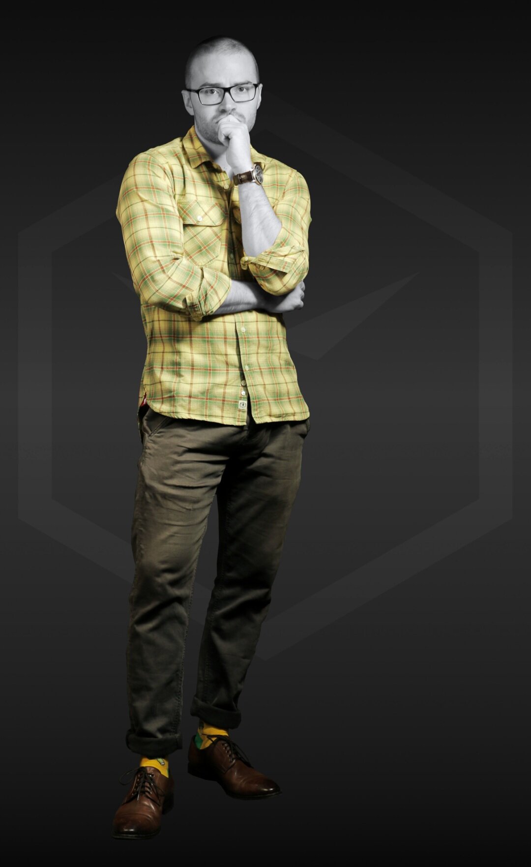
But why do we associate these colors with fall? Well, because we’re used to them. Or rather, we’re used to seeing combinations of these colors during that time of year. Seeing orange and red blobs on a brown background just remind us of fallen leaves, right?
And you know what? The same goes for clothing (and fashion in general).
A study on Seasonal Changes in Color Preferences even suggests that color preferences are linked to variations in environmental colors - especially in leaf color. So, we could even go so far as to say that the color of the foliage outside influences seasonal color fashion trends the most.
According to another study by the University of Maribor, springtime is associated with light yellow, summer with light blue, autumn with red, and winter with dark blue undertones. This theory paired with one on leaf color might be the key to understanding seasonal color preferences in clothing and fashion.
Seasonal Clothing Colors
A frequently asked question on the internet is: “Which colors should I wear in different seasons?” Well, most find it hard to choose the color they should wear. And you know what? We don’t blame them. It’s not easy. But we can make it easy.
If you wear color combinations that are similar to those found in nature during your current season, your usually good to go. Literally.
Each season allows us to wear different varieties of colors. Take a moment to think about this. Seriously.
And..?
If you keep in mind what we just said about seasonal color combinations, you can create different “color schemes” for each time of the year. For simplicity’s sake, let’s just stick to the “big 4” and maybe a few holiday seasons, OK?
By the way: A man’s (or woman’s) body features and preferences are still the most critical factors that determine which color suits him (or her) the most. But each season has its impacts, and that is why we shouldn’t ignore the following paragraphs:
SOME COLOR PSYCHOLOGY?
Clothing Colors for Winter

Which are the colors you find outdoors during the winter season? Well, mostly dark, somber colors – especially dark browns and blues. And yes, if there’s snow outside, also white.
So, it comes as no surprise that anyone wearing dark clothing colors in winter will look spot-on. Dark materials complement a man’s (or woman’s) looks better in the winter season. Sprinkle in some white and you’re good to go.
Clothing that is black, dark gray, dark brown, or navy blue is usually most suitable for winter. We suggest adding a few sprinkles of brighter, more explosive accent colors to those otherwise quite somber outfits, though. We recommend going for bright or light accents from the same (or similar) hue.
For example, if you choose a predominantly dark blue canvas, try accenting with light blue. For a more daring look, try out a bright smidge of blue’s complementary color blue-green (cyan) – maybe in the form of a pocket square or socks.
The color cyan isn’t the easiest to combine with others. Luckily, there are many accessories out there that contain the color cyan - so these space cubes are easy to match!
These socks look great when worn with a navy blue suit, a cyan tie, and an orange pocket square.
Colors used:
Black (base)
Cyan (accent)
Orange (accent)
You might say: “What about the whole winter = Christmas thing?”. This is a very legitimate question.
Well first off, Christmas time isn’t necessarily in winter. For the southern hemisphere, it’s actually during the “summer months”. But yes, Christmas clothing color schemes do also give the feeling of winter. More on this topic later in this article.
Another benefit of dark clothing is that it absorbs more light and will therefore heat up slightly. This keeps you a little bit warmer in those winter days and nights.
Spring Season Colors

Spring seasonal clothing colors are white, light pinks, tints of blues, mint green, and lavender. Each of these colors looks fantastic on anyone – even on men. Seriously. You should try them.
Generally speaking, clothing colors for springtime are light and not bright.
Spring is considered the season of rebirth. There is an abundance of colors in nature with so many variations and contrasts available that sometimes selection becomes difficult. But the colors we mentioned should be a man’s first choice when it comes to choosing the most fitting clothes to wear for this season.
Light and warm colors are favorites for springtime, and light yellows and pinks are some excellent examples to wear for men. Especially when it comes to office style, we suggest going with lighter suits and shirts.
For example, try a light gray suit with a floral pattern shirt – like in the image below. You could also try a pair of colorful socks to bring yourself (and others) into that spring mood.
By the way, as an added bonus, these colors actually make you look more youthful, healthy, and energetic. Read more about this in our article on which colors make you look younger.

Summer Seasonal Colors to Wear

Bright and bold colors are a go-to in the summer season. They dominate all other variations of colors and for good reasons.
During summer the sun almost never seems to set. This gives people a lot of time to enjoy the outdoors during the daytime. Colorful clothing looks best under sunlight. The sun just makes the colors shine and glow the way they are supposed to. This is why bold colors tend to work well during the summer months.
Bright colors will create a glow around you and your personality. They make you seem more energetic and vital. Do not choose a heavy fabric or dark colors in warm and hot climates as they can make you sweat like you’re sitting in a sauna. All you have to do is carefully select a fabric that is easy and comfortable to wear in hot conditions – not just thin, but also bright or light textiles.

More often than not, it’s easiest to just wear less during summertime. But what if you’re not “allowed” to wear less? For example, if you work in an office and need to show up in a suit and tie every day.
Well, we suggest sticking to the same rule as with suit colors in spring. Suits (and shirts) for men with light colors are usually the best choice. Try a light gray, tan or beige jacket and pants with a plain white shirt. The classic baby blue shirt is also a great choice during summer.
In general, try sticking to light threading and tinted colors on hot summer days – especially when it comes to your canvas pieces (sweater, jacket, shirt, pants, etc.). You can (and should) mix in some nice colorful accents to bring out the “summer vibe” a bit. People will love it and so will you.
Autumn Colors to Wear

As fall approaches and summer’s about to end, fashion and clothing styles take a turn. As previously discussed, the colors of fallen leaves in autumn are considered to be the dominant seasonal clothing colors to wear. They include dark browns, reds of different shades and tints, and oranges.
Generally speaking, as temperatures drop, so do the values of the colors people wear. In other words, people tend to wear darker, less bright colors to fit the colder weather. The funny thing is that they do it unconsciously!
Think about it – you do it as well. But why? The answer is quite simple.
As soon as our brains notice that we receive less sunlight, we fall into a sort of “winter depression”. This has nothing to do with the very serious medical condition (depression). It does, however, affect our mood and desire to stand out – among many other things.
We tend to then wear clothes that help us blend in with our surroundings and keep us from being overly eye-catching. This “condition” starts during fall and ends sometime during winter. Interestingly, right around Christmas (hmm, I wonder why).
Look around you the next time fall starts rolling in. As soon as the trees start changing color, so do the clothes of every man, woman, and child. It’s actually very predictable.
Suddenly, colors like burgundy and dark brown start making appearances on the streets and in offices (just never pair the two).
The once beige suits are now swapped for black or dark gray ones and gone are those nice brightly colored summer skirts the ladies like to wear. Now, say hello to brown coats, tan boots, mustard-colored scarfs, and Bordeaux socks.
Isn’t fall lovely?
Seasonality Changes Clothing Colors
Why are clothing colors different for each different season? At least by now we all know this fact to be true – but why is it so? Here’s the quick and dirty answer:
Clothing for lower temperatures is (on average) less colorful than that for higher temperatures.
A slightly longer answer to this question would be that we are used to associating different colors and patterns with distinct seasons. As the season changes, our association with different colors changes, and the trends change according to seasons.
Brands studying consumers take their valuable customer feedback and choose their clothing colors for new arrivals accordingly. Makes sense, right?
Now, since large brands know that the “winter blues” (the depression-like state we addressed before) exists, they make their autumn and winter clothing darker and less brightly colored than their summer or spring collection.
RELATED ARTICLE:
The same is suggested by a study on Color Features of Luxury Brand Clothing published in the International Journal of Affective Engineering.
Summer is famous for those yellows and bright greens, and similarly, fall is renowned for deep reds and oranges. The spring season is associated with light tints of yellows, greens, and pinks, and winter is famous for its dark and cozy clothing styles and colors.
Why Should you Care for Seasonal Clothing Colors?
Usually, no one judges you for what colors you wear in which season. This is because people don’t consciously perceive a change in their own fashion color preferences.
But, if you want people to notice you for what you're wearing, or would like to be the center of attention for any big occasion, then seasonal colors do matter.
Sure, you could always just wear colors that never go out of style, but where’s the fun in that?
Like with dressing for the occasion, you can and should also dress according to the seasons. For example, wearing a light pink suit to the office can be considered fun and energetic during summer but during winter… Well, let’s just say it would be rather awkward. Same suit – different context.
Some studies have even shown that people are most attracted to clothing colors that are found in the environment of the season they are currently experiencing. This phenomenon is called “sticking to trends” and it’s what fashion is all about.
Trends make up the largest part of fashion, actually. But, there are always a few steadfast rules you can stick to look your best (with the clothes you already have).
Choosing Clothing Colors According to Temperature
We all know that you should wear less heavy fabrics during the hot days of the year. Similarly, most of us know that some types of textiles let our skin “breath” more easily than others. Some fabrics help us store heat better by insulating us from outside weather conditions and so on.
This is all-important to know, but what role does color play in regulating body temperature?
First off, we’ll be diving deeper into this topic in another article soon, so be sure to subscribe to our member letter to be informed when we publish it. But for now, the following information will have to do.
As already discussed, dark colors absorb heat from strong light sources much better than light colors. So, it makes sense not to wear a lot of dark colors during the summer. Conversely, it might be good to wear darker shades during winter, where every little ray of sun could then more easily warm you up.
Lighter colors on textiles – especially white – reflect (sun-) light strongly to a point where anything underneath them stays nice and cool. This is why the people in dessert-heavy regions of the world wear mostly white or other light colors.
This would be a great get-up to wear at the beginning of fall: it’s not too hot but also not too cold. | Socks: Color Crates
For gentlemen and ladies, such as our readers, customers, and ourselves, this means that on hot days, we should choose light colors and light fabrics to wear. Linen or light-weight cotton weaves are among the best picks. We should always look to wear tints or colors of higher value so we don’t heat up too much outdoors.
As temperatures drop, our color schemes of choice should become darker and (for autumn) warmer. We could maybe choose a dark brown or orange coat with a dark-colored shirt, just like the colors of fallen leaves.
As temperatures start to rise again, we instinctively reach for clothes from our closet that are less somber. We should then actively choose lighter and brighter colors again to get everyone back out of the “winter blues”.
Holiday Season Colors
What are the colors of Christmas? They’re red, green, white, and gold of course!
Funny enough, most people forget gold – which actually isn’t a color but rather a yellow-orange with a metallic effect. But try to picture Christmas without gold. It’s just not the same, isn’t it? Without gold, it’s just the color scheme of the good old Italian flag.
As you can see, we all associate certain events with colors. This happens normally because we grow used to these events being presented in the same color scheme over and over again.
Most prominently, when we think of the colors we mentioned above, we think of Christmas time. Interestingly though, we only do so when these colors appear grouped. If we are just presented with red and white, we don’t normally think of everyone’s favorite December holiday. But, as soon as you add green and gold to the mix, you surely do. The same goes for any other color scheme.

This color scheme somehow just seems Christmas-y, right? Well now you know why.
Holiday colors have a lot to do with traditions. It’s how you grow up and get to know and love certain color schemes that make a connotation so strong.
Put everything in bright red and yellow/gold and you get a Chinese New Year theme. Decorate everything in white, green, and brightly colored dots and you set the mood for Easter. Go full orange, purple, and black and everyone thinks of Halloween.
But, what does this have to do with clothing? Well, everything!
To get yourself and the people around you in the mood for certain holidays, you should dress accordingly. Wearing a light blue sweater won’t bring up those Thanksgiving feelings, but a dark orange one definitely will!
Be smart about your clothing colors. It can make a big difference – especially when it comes to holiday clothing. It’s all about setting the mood and giving in to traditions.
If you’d like to learn more about color schemes and palettes, we suggest you read up on the topic in our designated article. What you’ll learn there could be quite an eye-opener.
Why Wear Colors According to Seasons?
As the seasons come and go, new fashion trends and seasonal colors come and go with them. The fashion industry continues to evolve, and with that, our sense of colors also keeps changing.
We all need to understand the relationship between colors and seasons. And if we use the knowledge in this article to better stand out while fitting in (what?), we can make life that much easier.
This is what COLORBUX is all about. We like helping you make small things in your life easier just by consciously choosing which colors to wear in certain situations. We highly suggest you read our other articles so you can stack up these small differences to actually change your life substantially.
COLOR PSYCHOLOGY:

What Clothing Colors Say About You
Colors are so effective that they communicate your position, intention, as well as your state of mind without you even knowing it. Learn about what the 3 primary and 3 secondary colors say about you.

Contents:
Meanings and Interpretations of Colors in Fashion
You have probably never considered this, but try to imagine a world without color. How drab and uninteresting would that be? Simply put, a world without color is unimaginable.
Every day, we see thousands of colors in varying shades and combinations and you may not be conscious of how that affects you, but it does. In this article, we will discuss what clothing colors say about you and what the meanings and interpretations of different colors are, as it relates to clothing.
We are surrounded by colors, most of which have been seamlessly integrated into our lives. The sky is blue, the fields are green, and sand is, you know – sandy. These are basic colors we can all relate to, but do colors represent anything more than their appearance?
Let’s first understand what colors mean before we talk about their interpretations in clothing.
Do Colors Have Meaning?
Yes, each color has its meaning and says something about the wearer, which we will discuss in detail further on in this article. Colors play an integral role in our lives, maybe one you may not have paid attention to in the past, but definitely one you can’t deny.
Everybody, when faced with an important meeting or occasion to attend, has to first figure out the appropriate outfit type, and then the color. So, in that order, color is the second most essential factor in dress choice.
Apart from picking an acceptable color for your event, you should probably choose a color that will elicit the mood you want. So, in a way, clothing colors say what you want them to say. But it’s not that simple.
According to the renowned former American fashion designer and socialite, Lilly Pulitzer, color affects people's moods. So yes, you don’t want to be wearing a grim or sad color if you intend to inspire a positive and vibrant response in a meeting. More on this later.
Colors also have some biological, cultural, and psychological implications. From birth, we are introduced to certain colors. These colors are deeply rooted in our minds and often symbolize a mood, season, or occasion.
Here are a few of the cultural implications of some colors
Mourning: Black is the color associated with death in most western countries, and most parts of the world. But in Asia, the color that represents death and mourning is white. For instance, ancient Chinese wore all-white clothing for funerals, and when they were mourning the dead.
Gender Roles: Growing up, most male children's rooms are painted blue. Therefore, the color blue tends to be a favorite of many young male adults. For girls, the color is pink. This phenomenon is so widely studied, accepted, and now stigmatized, that even cartoons with female characters - like Barbie - tend to have the more “feminine” pink color.
Forces of good and evil: In most popular depictions, light represents good, while dark represents evil. This concept becomes ingrained in our minds from a very young age that it is almost impossible to think otherwise when we’re older. This is broadly supported by religion, pop culture, and widely adapted in movies and cartoons.
As you can see, the meaning of a certain color changes according to the context. But, the context and frame of mind are also shifted when you change color. Both players are therefore linked to one another.
Meaning of Colors in Clothing
The meaning and interpretation of colors in clothing transcends their basic and cultural implications. Colors are so effective that they communicate your position, intention, as well as your state of mind. They pass messages without you having to utter any words.
So, you must be conscious of the color of the outfit you choose, and the message it is transmitting. What a color says about you is not always what you were aiming for.
All colors are some combination of hue, chroma, and shade or tint. In this article, we’ll be discussing the meanings and interpretations of each of the three primary and three secondary hues of the color wheel.
Check out the interpretations of the following hues in clothing:
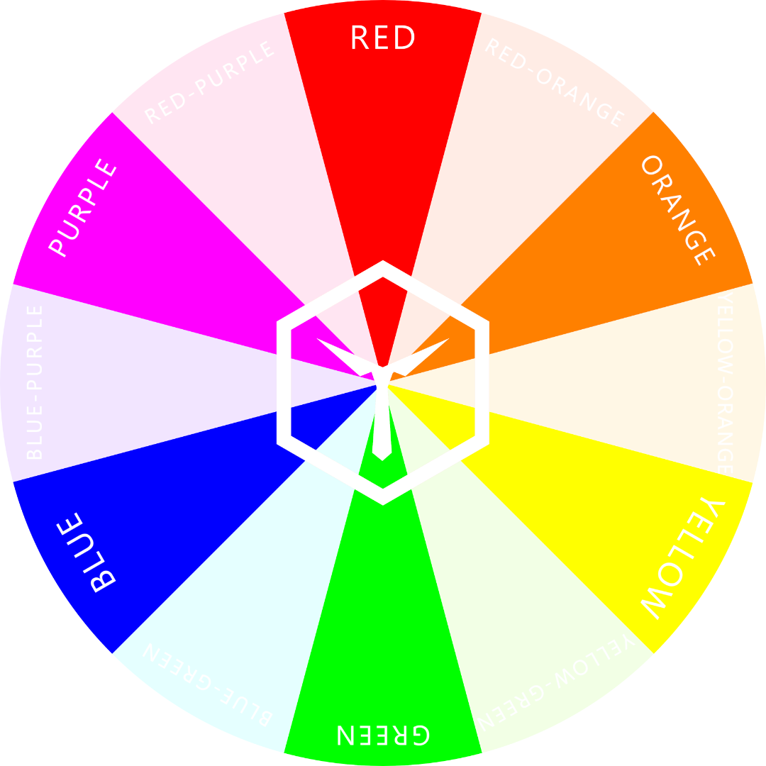
The 3 primary hues are: red, yellow, and blue.
The 3 secondary hues are: orange, green, and purple.
RED - the color of love, warmth, and passion
Red is usually associated with energy, love, warmth, and passion. So, if you are going to impress someone, red can be your first choice.
Red is one of the most vibrant colors on the color wheel and is often used to signify passion for a course or an idea. Do you want to show passion and commitment at a meeting? Try a touch of red. A red tie with a black or blue suit can create a lively aura that can be contagious.

As stated in a study on evolutionary psychology, red clothes are associated with higher attractiveness in persons of the other gender. The same goes for black clothing, by the way.
Depending on the context, red can also symbolize speed, fear or even danger. It is advised to use red – especially bright red – only sparingly within an outfit.
Note: red is best used as an accent color. This is because the color is too “loud” and contrasting. Using it as your canvas color would be counterproductive and appear rather “in your face” and unappealing.
BLUE - the color of trust, calmness, and intelligence
Blue is usually a cool and relaxing color that screams (rather, whispers) responsibility and intelligence. There are different shades and tints of blue representing varying interpretations. For instance, baby blue exemplifies peacefulness, while navy blue signifies power and depth.
Navy blue is one of the best colors for a suit, in fact. This is mostly due to the color’s inherent properties.
According to some studies, blue colors are mostly picked up by courteous, sympathetic, and shy people. Poise and calmness are the two most important qualities of these people.
Blue is so effective at building trust subconsciously that most brands, including Facebook and Twitter, have it as their brand color.
This is mainly because we, as human beings, tend to link the hue “blue” to trustworthiness, security and stability. Companies know and exploit this fact.
You can do the same with your clothing. Use blue as the canvas color for important events where you feel the need to seem competent or trustworthy.

YELLOW - the color of hope and happiness
Yellow is the color of the sun and more recently, the primary color of the smiley faces on our devices. Did you know that Pantone’s Color of The Year 2021 is Illuminating Yellow? Light Yellow is, therefore, the most trendy color of the year.
Studies show that yellow increases the production of serotonin in the brain, which in turn speeds up the metabolic process in the body and cheers you up.
People who prefer yellow are usually active and creative. They have big dreams and are ready to conquer. When they wear yellow, they also seem younger. This is why (in all seriousness) many women wear light yellow in spring and summer but adolescent boys never do.
It is also one of the most easily noticeable colors apart from yellow-green and yellow-orange (do you see the pattern?). Yellow and its analogous tertiary hues should, therefore, only be worn as clothing when you mean to stand out.
So, if you want to stand out and still inspire positivity, you should try the yellow tie you ignored for so long. Just remember Fashion Rule #6 – repeat the color at least once in your outfit. Otherwise, that tie will seem very random.
Also, if you’re male, only use bright and light yellows as accents. Ladies, however, can pull off bright yellow dresses easily (as long as it’s the right season for it).
Be warned: Yellow can not only mean youth, friendliness, and positive feeling. It can also mean caution, cowardice, and jealousy.
GREEN - the color of natural harmony and growth
Green is the color of nature and usually represents life, renewal, and energy. According to a study by the University of Amsterdam, green provides positive energy which influences your mood and that of your surroundings.
People who prefer green are usually active and more smitten by nature. Also, did you know that green can be a stylish color with which to mix up your usual appearance?
Simply combine some darker shades of green with beige or brown and presto! Instant class. All you need now is an old Mini Cooper in the same color scheme and you’ll be more British than 007.
Seriously though, earthy colors – especially green – seem environmentally beneficial (not like the Mini). A person wearing green shades and tints instantly appears to be more “down-to-earth”, friendly, reliable, and approachable.
Green is a very good hue to wear for social, smart-casual events. Pro tip: start with dark green or dark yellow-green (olive) in mind, when putting together your outfit.
PURPLE - the color of royalty, spirituality, and luxury
Purple, often referred to as “magenta”* or “violet”, is a magical hue, having the warmth of red and calmness of blue. It is usually associated with luxury and royalty.
Cleopatra of Egypt and the ancient nobility of Rome were crazy about purple. Partly because the pigment is so rare and hard to obtain. In nature, purple is almost exclusively found in flowers and fruit.
People who prefer purple are usually art-loving, creative, and sensitive as well. These people are usually unpredictable and dealing with them can be easy and difficult at the same time.
Note: Purple is another color that is awesome and unique, but is best used as an accent color. Wearing a black suit with a purple shirt is a combination that may be best reserved for royalty. But, if you want to pull off that look, be sure you’re the boss.
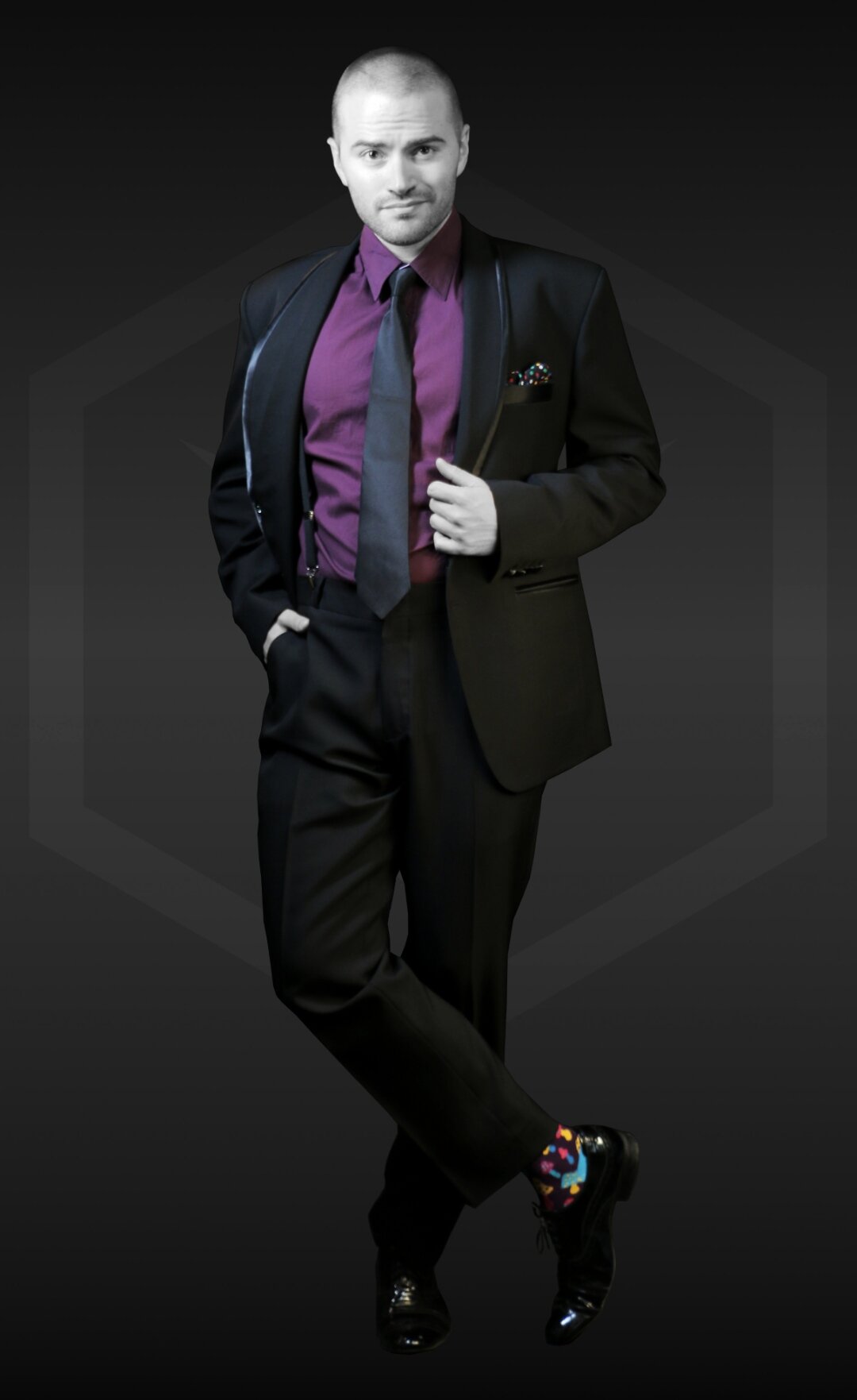
There are a few interesting facts about the hue that is situated between the hues red and blue: For many people, it is hard to define and name all the colors in between red and blue because all of them look somewhat like purple – but also violet, magenta, and fuchsia and even pink!
Why is that? And why is there so much controversy on this topic?
Well, a possible answer to this question could be that humans can’t actually see “pure purple” as it is in the color wheel. Wait, what?! Let us explain:
Human eyes are not able to pick up the wavelength of the hue “purple” because it is outside of our spectrum of color vision. Why do we still “see” it then? This is because (in the RGB color wheel) purple is opposite to green – and we can most definitely see green.
Now, our brains piece together a purple hue automatically by measuring the absence of the color green in any other hue. Does that sound complex? Because it is. But, it could also well be the reason why purple is so mysterious and exclusive.
*Magenta is a more fitting term than purple when used in conjunction with the color wheel. This is mostly due to the fact that many people regard purple to be rather dark and would not call the depicted hue in our color wheel “purple”. But, let’s not discuss purple any further in this article – this could go on for ages.
ORANGE – the color of fun, optimism, and action
Orange is the opposite of blue in the RYB color wheel and is, therefore, its complementary hue. This bright and strong hue radiates warmth, whereas blue seems cold.
This is why, when we speak of cold colors, we mean colors that have a blue undertone, and when speaking of warm colors, we mean those that have an orange undertone.
Being the warmest of all possible hues, orange has exactly that effect: It “warms up” people’s moods and drives motivation. Because of this, there are many companies that use orange as their primary brand color.
Think of brands like Gatorade and Nickelodeon who want to activate their customer base or others like Harley Davidson or Hooters that don’t shy away from using a bold color to show they stand for what they do.
A bit of fun trivia: this is also why COLORBUX follows this color scheme.
People who wear lots of orange, first of all, are very rare and hard to find, and secondly, truly want to stick out. It’s hard not to look at someone that is wearing bright orange colored clothing. This is why many emergency services and construction workers wear orange.
When you use orange as a canvas color in your outfit, you’re bound to look like a contractor on the job. But, if you only use orange as an accent color, you open up a world of nearly unlimited possibilities.
When used sparingly (like as an accent), orange quickly becomes the most remarkable part of an outfit – exactly because it’s so bright and “in your face”. You don’t even have to use a lot of orange. Small blobs of this warm hue here and there do the trick.
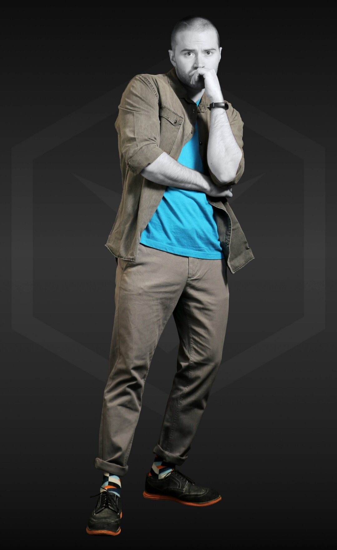
Not many people can wear a large amount of orange without looking like a traffic cone. More often than not, it’s people of darker skin tones who can rock a brightly colored orange outfit. Why? This has to do with the underlying tone of a person’s skin. Individuals with an underlying orange skin tone (mostly Caucasians) shouldn’t wear orange because it makes them look sickly and pale. More on this topic in another article.
Honorable mentions that are not on the color wheel
BROWN - the color of wholesomeness, stability, and peace
Brown is a very earthy and familiar color that elicits a sense of support and stability. This color usually represents friendliness, simplicity, dependability, health, and peace. People who prefer to wear brown over other colors are usually very dependable and neutral.
A brown jacket on a man usually gives the impression of intelligence and reliability. For instance, picture any mathematics or architecture professor. I bet he wears a brown jacket, right?
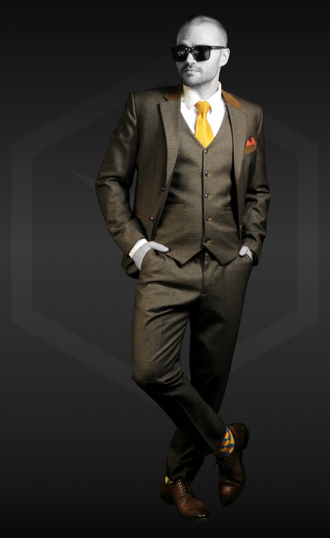
WHITE - the color of innocence and purity
White is the color that contains all (or sometimes none) of the colors of the rainbow. Yes, I know that’s hard to believe, but it’s true.
It is a symbol of innocence, purity, and simplicity. This is why it’s generally used as the color a bride wears at her wedding.
White attracts people who love freedom and are usually very organized in everything they do.
White can be the go-to “color” of different personality types. Most people choose to wear an all-white outfit on special occasions, though. If you want to stand out at an event you are hosting, wearing light colors is a good choice. This is where white, being the lightest of them all, helps a lot.
BLACK - the color of class, elegance, and sophistication
Although black has some negative connotations, like death, grief, and fear, it also has a remarkable appeal. Black is the most enigmatic color in the world, associated with elegance, sophistication, and class.
According to some studies, people who like to wear black are purposeful, ambitious, and artistic. Although they try to hide it, they are easily excitable and a bit more emotional than others. Showing up at an event wearing “all-black” creates a powerful and mysterious appearance.
Well, now you can’t claim you don't understand colors anymore – at least not the three primary and three secondary hues.
Good knowledge about what clothing colors say about you and the meaning and interpretation of colors in clothing has always been one of the weapons in a style conscious person’s arsenal.
Armed with the information in this article, you can dress to achieve the desired effect, any time, any day.
Should you have any further questions, please don’t hesitate to ask us. We’re serious! Just send us an email or a direct message on our social media pages.


![Top 8 Best-Matching Colors [Which Ones & Why]](https://images.squarespace-cdn.com/content/v1/5d91f9da52210569ede7ff3a/1651242239176-CXWJHIC3RXVB7QT9A8IS/COLORBUX+Best+Matching+Colors+Top+8+Pairs+BANNER+Thumbnail.jpg)

![Color Blocking [Full Guide to In-Your-Face Outfits]](https://images.squarespace-cdn.com/content/v1/5d91f9da52210569ede7ff3a/1646746930918-379H8IHBYZUTHYHXRC3P/COLORBUX+Banner+Color+Blocking+Fashion+Guide+Thumbnail.jpg)
![Monochrome Style [Full Guide Plus Examples]](https://images.squarespace-cdn.com/content/v1/5d91f9da52210569ede7ff3a/1642857375701-LH2G67A31EQKYG3TVZ0T/COLORBUX+Monochrome+Style+Guide+One-Colored+Outfits+BANNER+Thumbnail.jpg)


The 10 Golden Rules for Color in Fashion
Be smart when wearing color. Please. Understanding and using the basics of color in clothing can be easy. And with our 10 Golden Rules for Color in Fashion you have a simple list of guidelines to follow.

“I can’t wear color and I can’t match colors, so I guess I’ll just wear black (again)!” Does that sound familiar?
I mean, you already have clothes that have at least some color in them and that fit you, so why does it have to be the process of color matching them that ends up dulling your overall look?
Here’s the truth; combining colors to make a useful palette is a skill that has to be learned. Nobody was born with it – not even the greats. And if they learned how to do it, so can you.
As a skill, it doesn’t have to be difficult, but it’s something you should acquire. Why? Not only does it help you stand out in a crowd, it determines your overall vibe – something people can easily pick up on.
You’ll be able to change how people feel about and react to you by simply using the right color combinations for the right occasion.
Here are the 10 Golden Rules for Color in Fashion that will help you with your chromatic endeavors:
10 Golden Fashion Rules:
- 1. Work WITH Your Skin Tone
- 2. Be Smart About Your Natural Contrast
- 3. Monochromatic Looks
- 4. Use Analogous Colors
- 5. Combine (Split-)Complementary Colors
- 6. Repeat Colors in Your Outfit
- 7. Wear no More Than 3 Different Hues
- 8. Neutral Colors Are Your Friends
- 9. Accessorize and Accent!
- 10. Follow Seasons and Social Guidelines
Please note: All rules are derived from very reputable sources on the internet and cross-referenced with what we like to call "THE Color Book". We highly suggest you check it out should you want to learn the ins and outs of the world of color.
Fashion Rule #1: Work WITH Your Skin Tone
The first color rule is to work with your skin tone and not against it. Your skin tone is the underlying hue of your skin - emphasis on underlying.
Some people look better in warm colors, while some look outstanding in cooler colors. Your skin tone determines if warm or cool colors are best suited for you.
Using the color wheel to explain; warm colors are those with a tinge of red and orange. Cold colors are those, which are on the opposite side of the color wheel and have a slight tinge of blue.
Now that you understand what warm and cold colors are, how can you figure out what skin tone you have?
Here are two ways you can find out:
The vein test: Look at the color of the veins on your wrist in sunlight. If they look greenish, then you’re a warm color person. If they look bluish or purplish, then cool colors work best for you.
The metal test: Put on a gold watch on one hand and a silver one on the other. If the silver watch looks good on you, cool colors suit you better. If it’s the gold watch, then warm colors are your go-to.

The results for both the vein test and the metal test: Red-orange skin with underlying blue-green hue (veins). Both gold and silver (in this case titanium) look good.
Now, what if you find that both color temperatures suit you? Or none?! Trust us, the latter is NEVER the case – the former is though… and we know how it feels.
We’ll be publishing a full guide on matching clothing to skin color soon, so be sure to subscribe to the newsletter to get the update, but for now – here’s a quick teaser:
Most people have ONE (yes, only one) hue that they should not wear because it doesn’t match their skin. For Patrick, it’s red-orange. What..?!
Plus, we also have articles on which colors to wear if you have pale skin or if you have dark skin. Click the links to check them out.
Fashion Rule #2: Be Smart About Your Natural Contrast
Contrast (in color theory) is the difference between the lightness and darkness of colors. The greater the difference, the higher the contrast. For example, black and white are “colors” with the highest contrast. An example of colors with low contrast are off-white and beige; also, burgundy and navy blue.
It’s important to note that there’s a difference between “contrast in luminance” and “color contrast”. Find out more by clicking the links.
Your natural contrast is the difference between the lightness and darkness of your face and hair. People generally fall into 3 types:
Low contrast – light skin, light hair, light eyebrows, and facial hair. The same is the case for all dark features. Examples are Daniel Craig and Justin Timberlake – but also the young Idris Elba.
Medium contrast – tanned skin, dark hair, dark eyebrows, and facial hair. Examples are Danny Glover and Enrique Iglesias.
High contrast – light skin, dark hair, dark eyebrows, and facial hair. Furthermore, the complete opposite can also be the case (dark skin, light hair). Examples are Kit Harrington and Keanu Reeves. But also the now older and more white-haired Idris Elba...
With that said, a low contrast person like Justin Timberlake would look great in tan or khaki pants, light-blue blazers, and a light-pink shirt. Low contrast people should, generally speaking, wear low contrast clothing.
Someone with medium contrast, such as Danny Glover, can easily do with dark-blue pants and an orange turtle-neck. Such a person can pull off low, medium, and high contrast outfits - but are still best off wearing medium. Lucky them!
High contrast gentlemen, like Kit Harrington, can pull off the dark grey pair of trousers, white shirt, and brown jacket look. In other words, high contrast demands high contrast.
So, as a general guideline: If you are in high contrast, wear high contrast – if you are low contrast, wear low contrast (and so on). This does not always have to be the case, but when in doubt, stick to this rule.
Fashion Rule #3: Monochromatic is Good – But Only With Very Neutral Colors
In a simple definition monochromatic means “one color hue, different shades or tints.” Tints are lighter versions of a hue, while shades are darker ones.
An example of this would be an outfit with a medium-gray pair of trousers, a light-gray shirt, a charcoal-gray jacket, and a dark-gray pair of shoes. In this case, the “hue” (or lack thereof) would be gray – with different shades and tints of it throughout the outfit.
Yes, the image is unsaturated to prove the monochromatic (rather achromatic) point. | Socks: Color Crates (in black and white)
As you can see, an outfit can be monochromatic without having actual “chroma” (color) in it. Pure gray is the complete lack of color (unsaturated).
Wearing the monochromatic look is pretty easy to do with cooler, neutral colors such as blue and gray as seen in the example above. It does become tricky with warm and bright colors, like yellow and orange. This is because they easily exaggerate one another and usually make you stand out too much.
The only warm color that you can pull off easily in a monochromatic look is brown. Brown and its shades and tints, like for example beige, sand, and dark maroon, are simple to match and get right in a single-hue outfit.
In general: Neutral colors (black, gray, white, blue, and brown) are the best choices for monochromatic outfits. Why? Because of simplicity.
Fashion Rule #4: Use Analogous Colors
Analogous colors (or hues) are colors right next to each other on the color wheel. They are usually in groups of three. To illustrate, pick a color; let’s say purple. Then either to the right or the left on the color wheel, take the two adjacent hues.
In the case of purple, those two hues would be blue-purple and red-purple – both with their respective tints and shades.
Analogous colors are those that are to either side of any given color.
Often occurring in nature, this color palette is usually used to strike a balance. So, if you’re looking to come off as sturdy and reliable, strategically using this color rule is your best bet.
In the following example, a yellow-green hue is used as the accent color, whereas its two analogous hues (yellow and green) are used as the canvas, sub-accents, or additional accents.
If you shade yellow-green, you get olive, which is the canvas color of this outfit. The light green T-shirt is nothing other than a tinted green shirt and the beige of the shoes is nothing other than a desaturated, slightly shaded yellow.
The whole example outfit is constructed using the analogous colors of those found in the socks. It is a perfect example of how to use analogous hues to quickly put together a well-composed outfit.
More detailed information on analogous colors here.
Fashion Rule #5: Combine (Split-)Complementary Colors
Complementary colors are directly opposite each other on the color wheel. They create striking color-contrasts and are very eye-catching. They create very bold, in-your-face looks and should be used if you’re looking to stand out in a crowd.

The complementary color (opposite on color wheel) of blue is orange.
If the color combination looks a bit too saturated, you can opt for wearing a tinted version of the color which still gives a similar effect. Donning a blue suit with a white dress shirt and an orange tie is an example.
Pro tip: When wearing a bold, saturated color as a canvas, try accenting the outfit with the canvas’ complementary color to make the entire outfit “pop” even more.
If accenting an outfit with the canvas’ complementary color is too “in your face”, try using a split-complementary color. These are the colors that are analogous to the complementary color. Huh..? - Okay, let me explain:
Split-complementary is strong when it comes to color contrast.
Split-complementary colors are just like complementary colors. But instead of picking the opposite color, you’d go with either of the adjacent ones on the opposite side. Like in the image, an example is to combine blue and yellow-orange, or blue and red-orange. These give a less color-contrasting look, but are still pleasing to the eye.
Fashion Rule #6: Repeat Colors in your Outfit
This could be the most important rule of them all – but still, we rarely see people write about it. Why is that? We don’t know!
Using a color once per outfit is fine and dandy, but it gets really interesting as soon as you start repeating colors throughout your outfit – at least in small doses. Take a look at the following example:
It is clear that the canvas color of the outfit is brown. The different tints, shades, and intensities of brown are repeated so often throughout the look that it makes it fairly apparent.
The two accent colors (red-orange and yellow-orange) are each repeated once. Both are prevalent in the socks, whereas red-orange is repeated in the pocket square and yellow-orange is repeated in the tie. These repetitions legitimize the choice of both the accent colors.
Now here’s the fun part:
The sub-accent color in the outfit is blue-green, which is found in the socks as well. This hue is complementary to the red-orange in the outfit. Boom! And guess what? If you mix all three colors of the socks together, you get… brown. Double boom!
Is your mind blown yet? The whole look makes sense! Do you see now that if you’re able to reverse-engineer an outfit, you will also be able to put together one using the same principles?
Here’s this golden rule explained in one sentence:
Repeating the same color at least once legitimizes it within your outfit!
A color that is repeated, was not randomly, but purposefully chosen. Otherwise, it could seem like the light blue pair of socks you’re wearing were just “the last ones in your drawer”.
Fashion Rule #7: Wear no More Than 3 Different Hues
Like with all of these “Golden Rules”, this fashion rule is more of a guideline you should stick to. You don’t have to follow this guideline, but if you do, you can’t really go wrong.
So, if you stick to using a maximum amount of three hues per outfit, you will always look fashionable. This is mostly because if you use only three hues, at least two of them must be repeated at least once (remember rule #6?). This naturally makes your outfit seem concise and well-composed.
If you choose to wear three colors in your look, try using a triadic combo.
As the name suggests, this involves mixing 3 hues in an outfit. Not the same as complementary colors, triadic colors are equidistant to one another on the color wheel.
A rather “funky” triadic combo: green, purple and orange.
Outfits in these colors are usually worn for casual or less formal occasions, because they tend to “pop” in a rather extreme way. They also evoke a sense of balance and coordination – when done correctly.
Sometimes, when wearing “triadic” colors, your get-up can seem a bit “funky”. Always check yourself in a mirror to make sure the outfit actually looks socially acceptable. Often, triadic can seem a bit over the top.
Wearing a pair of red pants, a blue shirt, and a yellow jacket is another good example for a triadic combo outfit.
Fashion Rule #8: Neutral Colors are Your Friends
Neutral colors are those that have earthy and natural tones that are, more often than not, quite unsaturated.
They are very versatile and safe to work with. These include gray, khaki, black, white, olive, beige, navy blue, “denim blue” and brown.
Gray pants with a navy top make for an appealing, neutral look. Even though this color combination is quite common, it’s definitely a safe bet – mainly because both canvas pieces are of a neutral color.
In our example photo, Patrick is wearing exactly this combination. In addition, he’s wearing black shoes as a sub-accent color and a pair of “Space Cubes” to accent the navy blue shirt.

Neutral colors are the easiest to wear. When in doubt, wear neutral colors – even as accents. More experienced “color-combiners” though, should opt for more bold and saturated accents like in our example.
The accent colors in the socks (orange and cyan) go well with the rest of the outfit. Why? Well, cyan is analogous and orange is complementary to navy blue. So, the Golden Rules 4 and 5 were implemented correctly (and easily).
By the way, to find out which colors just never go together, we suggest reading our article on the topic.
Fashion Rule #9: Accessorize and Accent!
The devil’s in the details. Accessories add personality to your outfit. They are the little extra things you wear for some added spice in your look.
Accessorize correctly and you’ll be receiving compliments all over the place. The opposite is the case if you do it wrong or if you over-do it.
A rule of thumb is to wear accessories of the same color and style. For example, a silver watch (with a black dial), a black ring, and a silver bracelet. This will create balance and “symmetry”. Have a look at our example:

Four accessories per Outfit: hat, bracelet, ring and watch. All of them chosen to match.
Try to go for a maximum amount of four accessories per outfit. Accessories can be rings, watches, glasses, hats, bracelets, and other small pieces. Pick up to four pieces, match them according to color, and you’re good to go.
Side note: The only accessory you’re always allowed to wear without having to match it perfectly is a wedding ring, of course.
The same principle for accessories counts for accents as well. Use a maximum of two accent hues in an outfit – it’s best even, to only use one. It then becomes apparent that the accent is actually an accent and not simply a blob of color.
Rule #9 is closely tied to Rule #6. This means that you should try to repeat the color of the accessory or accent within the same outfit at least once. Why? Legitimacy!
Fashion Rule #10: Follow Seasons and Social Guidelines
This one might seem like a no-brainer. But sadly, a lot of people fall into this trap:
Sometimes, you follow all previous Golden Rules but somehow, the color scheme you chose just doesn’t seem to fit. If so, ask yourself: “Am I dressed according to the circumstances?”.
What do we mean by “circumstances”?
Well… If you disregard the type of event you’re dressing for, the current season, or what your peers are wearing, there’s a good chance that your outfit will seem out of place. In short: Colors always also have to be chosen according to context.
We write more on this topic in our article about “What Clothing Colors Say About You”. We suggest you check it out:
We cover the topic of seasonal colors in another article in a much more detailed manner. But for now, here are some key pointers:
Every season has its vibe. Matching your clothes to the seasonal change is both fashionable and functional.
For colorful and warm seasons, such as spring and summer, you can change your color scheme to brighter or lighter hues. Think Saffron, Coral Pink, and Biscay Green.
Autumn and winter beckon on subdued, darker colors like Woodbine, Rust, and the favorite Classic Blue.
Using the wrong seasonal color pallet can seem awkward. For instance, imagine someone wearing a combination of dark green, bright red, and clean white in summer. Wouldn’t that combo be much more fitting towards the end of December – let’s say around Christmas..?
Seasonal colors are part of the trends that come and go every year. According to a study by the Jiangnan University, these trends are not easy to predict. But, if you stick to our tenth fashion rule and maybe read our article on seasonal colors, you'll be fine.
How to Use the 10 Golden Rules
Be smart when wearing color. Understanding and using the basics of color in clothing is easy. And with our 10 Golden Rules for Color in Fashion you have a simple list of guidelines to follow.
If you like, we invite you to do one of the following things with your new insights:
Either copy this article into your own .doc and print out the 10 Golden Rules with all the information you need for yourself
or download our FREE infographic in high resolution and print it out.

Go to our Downloads page to get this infographic as a high-res pdf.
Download our FREE PDF here.
Use either print to guide you through your clothing decisions. We recommend sticking the rules to the inside of your closet, so you always have them at the ready when you need them.
Color and style work hand in hand. When you pay attention to your style, people pay attention to you. With constant practice and by paying attention to certain trends, you will begin to see positive results in how you present yourself.
From now on, knowing how to combine colors for a terrific outfit will be a walk in the park. And as with all things, Rules can be broken as well. The goal is to have fun with your style and explore what works best for you.
OUR NEWEST ARTICLES:
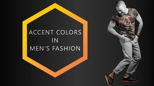
Accent Colors in Men’s fashion – How and When to use them
If you’re not new to accent colors in men’s fashion, you already know that accent colors do more than just complement the outfit – they define it. In this article, we teach you how to use accent colors effectively to spice up any outfit.

What are Accents in Clothing?
When speaking of accents in clothing, you are referring to wearable accessories. More often than not, these accessories are colored or textured in ways that accent the whole outfit and gives it a specific character.
When it comes to colors in fashion, a lot of variables come into play. If you’re not new to accent colors in men’s fashion, you already know that accent colors do more than just complement the outfit – they define it.
The same suit can have a completely different appearance when combined with various contrasting pocket squares, neckties, shirts, or other accessories.
According to the University of Nebraska, accessories, when used correctly, enhance the appearance of harmony of line, color, and texture. The same goes for accent colors, being an essential part of clothing accessories.
Before we delve into how and when to use accent colors, let’s understand what accent colors mean.
What are Accent Colors in Clothing?
An accent color is any color used in an outfit or piece of fabric that contributes the least in terms of visibility from a distance.
Accent colors are generally the second and third colors in the outfit or fabric and are in much smaller proportion to the main color. They are usually not the first things that catch your eye, or to come to mind when describing an outfit.
To describe a person's outfit, you first mention the main color before the accent colors. For example, a gentleman can wear a navy blue suit with a burgundy tie, and a white shirt.
Here, the color of the suit is the main color (we like to call it the canvas color), while the color of the shirt and tie are the accent colors. Nonetheless, in most circumstances, the choice of shirt and tie defines the outfit and makes it unique.
More often than not, the accent color is one of the (if not the only) components of the outfit that stands out the most.
OUR NEWEST ARTICLE:
In the field of environment color planning, an accent color is defined as such, if it takes up a maximum amount of 15% of the surface area. The same can be said for accent colors in fashion, although this percentage should then only be regarded as a rough guideline.
In the example image above, notice that the least prevalent colors make the outfit truly unique and note-worthy.
Accent colors also include other details, like the color of belts and shoes, pocket squares, jewelry, and any other accessories men wear to complete their outfit. They can also appear in larger pieces of clothing like jackets or pants - it’s just rather uncommon.
How to use Accent Colors
Believe it or not, there are techniques for combining colors effectively to produce smart and classy looks.
As a general rule in men’s fashion, less is more. You don’t want to end up pairing too many colors and drawing too much attention because you look like a Christmas tree on steroids.
Often, it’s best to just put together a color palette of three to five colors and dress accordingly.
By the way: If you wish to accent like a pro, you should try color blocking. Read our article on the topic by clicking the link.
Here are a few guidelines to stick to, should you want to use accent colors effectively in your personal fashion.
Shirts
The color of your shirt may be an accent color, but it acts more like a second “main color” or “canvas color” in the sense that, like the main color, it provides a backdrop for other accessories to be highlighted.
That said, for a classier and sharper look, the shirt underneath a jacket should be of a plain color. For a more dazzling look, try going for more vibrant colors on a themed or patterned shirt.

This patterned shirt fits extremely well - mostly because it’s colors are analogous to both blue and red. | Socks: Spicy Chili
Besides being the ideal look for business and executive occasions, using a plain colored shirt also allows you to be more flexible with your jacket choice in more casual settings.
The most common shirt color is white, as it goes with any color or pattern of jacket imaginable, and it’s ideal for serious environments. Other plain and common accent color shirts include light blue for a navy suit or light pink underneath a black suit. You can never go wrong with these combinations.
Alternatively, you can use a patterned shirt, such as one with stripes, to spice things up now and then. The principal is to avoid wearing bold stripes or multi-colored stripes (unless you choose to do so purposefully). A two-color small striped shirt is usually the better choice – it’s only logical that the accent piece shouldn’t have many different accent colors, right?
Neckties
In most cases, this should be – and rightly is – the most noticeable feature in a man’s outfit. A tie tells a story and should indicate the mood and occasion for the outfit. Brightly and lightly colored ties make you appear more cheerful, while dark colors create a more business-like and elegant look.
More about dark versus light colors in clothing in our other article here.
There are two basic ways to use a tie with an outfit; on the one hand, it is used to pair with similar colors, and on the other hand, it is used to contrast any of the other colors that are being worn.
To go for a more subtle look, choose a tie that is of similar color as the base or canvas color. For example, using a cobalt blue tie with a navy suit and white shirt. This is a decent and classy, but sadly, also a bit generic look.
The second tie combination involves using a complementary color to accent and contrast the main color. Such a look is much more daring and makes any wearer seem much more self-confident. An example of that would be to use an intense red or even orange tie with the same navy blue suit.
With regards to neckties, striped or patterned, spotted or plain, bright, or dark-colored, they all work well depending on the occasion. The primary determinant in the type of tie you should use is the color and style of the shirt you wear – another reason why the shirt is a little more than an accent piece.
Haven’t read enough about tie colors? Here’s an article about how to choose the right tie color.
Pocket squares
The use of pocket squares is less widespread in our day to day lives and they rather tend to be one of those accessories you include on special occasions, like when you’re feeling particularly stylish. Though you may look overdressed using a pocket square at work, it improves others' perception of your style and class.
Therefore, we suggest wearing pocket squares for classy events and dinners. Such occasions are perfect for showcasing your knowledge of fashion by combining accent colors effectively.
Matching a tie to a pocket square and a pair of socks can be tricky. But if done correctly, the look can be stunning. | Socks: Prime Cubes
Pocket squares function in the same way ties do with regards to how their colors should be combined. They can easily be combined in similar (analogous) or contrasting (complementary) styles.
It’s essential to note that a pocket square and a tie should never be of the same color, though they must follow the same sequence – they must both be combined in contrasting or similar colors, not in opposing combinations. More about this in another article.
Belts & Shoes
The rules for belts and shoes are rather straightforward, but can be neglected easily. The most apparent mistake is made by combining a black shoe with a brown belt and vice versa. A more subtle mistake is to use brown shoes with a black suit – which is simply painful to observe…
Both examples are big fashion no-nos. Then again, sometimes it’s fun to break conventional fashion rules.
The concept of analogous and complementing combinations can also work with belts and shoes at casual or more relaxed environments. However, for most business and official environments, the neutral black, dark gray, or brown color scheme is the preferred choice for shoes and belts.
In the near future, we’ll be writing more about belt and shoe colors in two separate articles. Hang in there! In the meantime, subscribe to our newsletter to be informed as soon as they are published.
Jewelry & Other Accessories
In men’s fashion, the least pronounced clothing accessory should be jewelry. However, all the jewelry – watches, rings, cufflinks and so on – should be of the same color-type, since this adds to the elegance of an overall appearance. Either all pieces are gold, all silver, or any other color. The only exception to this rule is the wedding ring.
Generally, glasses should match your shoes (and belt) and be small rimmed. Specs with thin frames aren’t as trendy as they used to be and they might seem a bit old fashioned. Nevertheless, it is often the most classy look you could ever go for as a fellow “Spec-ulator”.
In our example below, the color of the frame of the glasses is brown. Therefore, they match the belt, the shoes, and even the leather jacket, which are all analogous versions and shades of brown.
Sometimes, on a black canvas, brown shoes can look great. Make sure to at least repeat the color once in another piece of the outfit. In this case, brown is repeated in the jacket and belt. | Socks: The Flamingo
Bracelets, earrings, or other small accessories you may choose to incorporate, should be of rather desaturated shades or tints so they don’t distract from the overall appearance and make you look too wild and disorganized.
Socks, of course
This is the ideal piece of clothing to use for fashionable accents (duh). In the example image above, our model (Patrick) is wearing The Flamingo.
The light blue base color of the socks contrasts strongly with the canvas colors (brown and yellow-orange, ...and black) of the whole outfit.
The pink flamingos on the socks themselves are a classic accent. They complement not only the canvas colors but also the blue base color of the socks. The pink in combination with the blue element in the socks stands out and defines the whole outfit!
Also, because the socks are also much lighter than the pants and shoes, they “pop” even more. More on the topic in our article on “should socks be lighter or darker than pants?”.
So, it’s safe to say that the concept of analogous and complementing colors also applies to socks. We at COLORBUX usually suggest trying out complementing color schemes and being a bit braver when it comes to putting together outfits. That is precisely why we sell only colorful socks. The world is gray enough...
How NOT to Use Accent Colors
We’ve examined the appealing ways to use accent colors, now let us look at the ways not to use accent colors:
The accent items in your outfit should not have too many accent colors of their own. Maybe your tie can be spotted or patterned, your shirt may be striped or checkered, but they should not have so many different colors in them.
You should not use too many brightly colored accent accessories at the same time. This will appear disorganized and chaotic. Stick to two accent colors at maximum.
It looks very bland and uninteresting to use accent pieces that are the same as the canvas color. For example, an all-black suit with a black shirt, black tie, and black shoes, or an all-white suit with a white tie, white shirt, and white shoes can look awkward. Here’s how to put together a monochromatic look effectively.
Don’t use multiple bright and bold colors to complement each other. Bright primary colors like red, yellow, and blue, should only be used to accent neutral canvases like black and gray.
When to use Accent Colors
Accent colors are more than just colors that spice up and complete outfits. Every accent color you employ in your outfit makes a statement about you. The colors you choose to complement your outfit communicate details about you, the occasion, and even your social position.
We cover the topic of “What Clothing Colors Say About you” in another article, but for now, here’s the short version:
To show stability
Blue signifies a level of stability and intellect. It is a favorite of most powerful men, royalty and world leaders. Apart from using a navy suit, you can also use a navy blue tie and pocket square to accentuate a black suit. Such combinations work best while wearing a crisp white shirt.
To inspire passion
To signify extreme desire, passion, and love you can choose to use a red tie with a black or other very dark-colored suit. This can be extremely helpful when you have to inspire people or motivate team members or employees.
In certain settings and contexts, the “Burgundy Black” can even look erotic. Combine an all-black outfit with a burgundy tie and matching burgundy dress socks should you want to appeal to a particular other. This is subliminal sexiness at it’s best – use with caution!
To lighten the mood
No unhappy man picks up a yellow tie at random. Yellow is the happiest color and tends to brighten up any room.
Wearing a yellow accessory doesn’t just signify your cheerfulness, but it rubs off on others too. This can be particularly helpful if you hope to alleviate the gloom around you.
Yellow (or any analogous color) is usually not very business-like. In some cases though, that’s exactly what you need. We advise you to always make a statement – a well-educated statement. That’s what COLORBUX is here for.
By the way, bright and light colors often also make you look younger and more dynamic.
To signify power
Black is the most powerful “color” in the world. It expresses a quiet assurance that exudes confidence. Wearing a black tie with a gray suit, blue suit, or even a black suit, with a white shirt underneath is the easiest way to communicate power without saying a word.
In short: stick to very dark shades of colors to appear more serious.
Pro tip: Do NOT wear all dark and serious to a kid’s birthday party. You WILL ruin the mood – no joke intended, even though it is somewhat funny.
In the world of fashion, trends come and go, but the basic rules, combinations, and most significantly, class, remain constant. With accent colors in men’s fashion, feel free to experiment and develop your unique style, but don’t bend the rules too much.
OTHERS READ:

Dark or Light Colors in Clothing?
In this article, we focus on tints and shades of color. You’ll find out how we, as human beings, react to certain dark or light colors and why we do so. What are the effects of dark versus light color clothes and how should you choose which shades or tints of colors to wear?
Contents:
It is always up to us to choose between dark or light colors in clothing. Color can be a major indicator of our personalities and our moods are always affected by the colors, tints, and shades we wear or the ones we are surrounded by.
Every color has characteristics that make it unique and the effect that each one has is different. The photons that make up light and, ultimately, color as well cause a sensation in the eye. These photons reach the so-called “rods and cones” of the retina inside of the eye. The rods and cones then convert what they “see” into nerve-information about color. The brain interprets the inputs of the optic nerves and makes sense of the information.
The brain processes the information and gives the resulting “colors” names, such as “blue” or “red” and so on. It also interprets the lightness of the colors, meaning the shades or tints, sometimes (rather incorrectly) referred to as “luminance”. It simultaneously gives these colors, tints, and shades a meaning. More about what clothing colors say about you in another article.
In this article, we’ll focus on tints and shades. You’ll find out how we, as human beings, react to certain dark or light colors and why we do so.
The Signals the Wearer Sends
The colors in our clothing and their combination tell others a lot about our personality. This happens mostly unwillingly and unknowingly because people choose what to wear according to their personality traits and current emotional state. Most people have no idea why they choose to wear a certain shirt or specific color trousers at any given time.
Sadly, we can’t expand on this interesting topic in this article. We will go into greater detail concerning colors and personality in another article. Be sure to subscribe to our newsletter to benefit from updates as soon as they are published. However, we will cover the topic of tints and shades and what messages they send in this article:
We always have to know what to wear at home, at the office, while jogging, at parties, family gatherings, and so on. What and how we select our clothing for these occasions is influenced by our age, mood, preferences in clothing, weather, what our peers wear, and many other variables.
According to psychologists, the color we prefer to wear most is the color that gives us more room to be ourselves. Light colors point towards people whose personalities tend to be more sensitive and calm, while dark colors point towards those who are strong and straightforward.
We seldom consciously decide: “should I wear dark clothes today or would something light or bright be better?”. This is a bit of a pity because we send so many different unconscious messages when wearing dark versus light clothing:
Darker colors in clothing…
...show seriousness, stability, and determination. Studies find, they influence the perception of competence and boldness.
...can convey feelings of sadness or depression, mostly in western countries.
...make the wearer blend in better with his/her surroundings.
...reduce the regular effects of fully saturated colors (full chroma), making them less apparent.
...are more suitable for prestigious events and high-end business.
Lighter colors in clothing…
...show openness, familiarity, and happiness.
...can convey feelings of friendship, fun, and compassion.
...make the wearer stand out in groups or crowds.
...make the whole outfit appear less serious.
…can make you look younger.
...are more suitable during spring or summer and for casual and smart casual wear.
As you can see, the effects of dark and light colors in clothing are completely different. Of course, it always also depends on the hue (the color) and the saturation of that color. It goes without saying that a dark shade of red (i.e. burgundy) has a completely different effect than a dark shade of blue (i.e. navy blue), even though the colors are very close on the color wheel and are very similar in shade.
A Bit of Color Theory
Shades are made when you add black to a color creating a darker value. Tints, on the other hand, are created when adding white to a color creating a lighter value. The “value” or “lightness” describes the amount of black (or white) in any given color. Therefore, shades are always darkened colors and tints are colors that are lighter.
When speaking of the brightness of colors, we normally refer to the amount of saturation in any color, making the hue brighter and more intense.
How to Combine Shades and Tints
Many people don’t have much of a concept of how to combine colors. It’s the same or even worse for combinations of shades and tints. Most of us construct an outfit by simply throwing together pieces of clothing we like, which, at a bare minimum, don’t look bad when combined.
What we often overlook when combining outfits, is the contrast between the pieces of our outfit. Contrast does not only describe the relation between black, white, and gray. It does the same for shades and tints of color.
For instance, a dark blue (i.e. navy) has a strong contrast to light pink, whereas it has a rather weak contrast to a dark red (i.e. burgundy). This is because shades contrast very little to other shades and tints very little to other tints. However, when combining shades with tints, the contrast is more apparent.
Interestingly though, the contrast in color is not simply defined by adding or subtracting black or white to or from the hue. “Color contrast” or the difference in hue is also measured as the distance between two colors within the color wheel. More about this topic in another article.
In the following example, you can see the same symbol twice. One version is in color, the other is fully desaturated (black and white).

Chromatic

Fully desaturated
Please note that in the black and white picture, you can see almost no difference between the two colors, but in the colored one, you most certainly do. This is because both colors have similar amounts of luminance (shade/tint).
The same principle applies to clothing and you can use it to your advantage:
Wearing an outfit that has a low difference in luminance but high contrast in hue gives anyone a very unsettling feeling.
The opposite is less displeasing, though still quite peculiar.
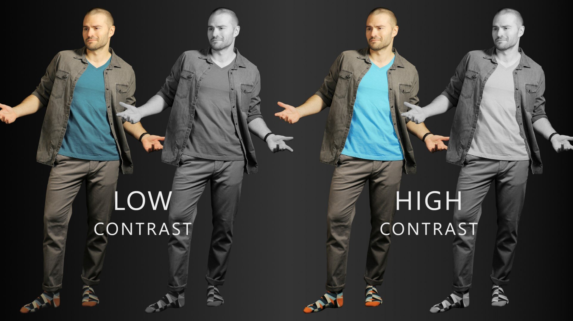
Low versus high contrast in clothing. High contrast looks much more pleasing. | Socks: Color Crates
It becomes apparent very quickly how crucial it is to make sure that an outfit is constructed with a “normal” amount of contrast in mind. For the purposes of this article, we’ll focus on contrast in luminance (shade/tint).
Most people instinctively choose an outfit that has a normal amount of contrast. Imagine if you were able to actively and consciously choose how to make your clothing style appeal to others. It would be a lot easier to make people think of you the way you want them to. The contrast in clothing plays a large role in this.
Putting together an Outfit With Contrast in Mind
When thinking about what to wear we all have basic routines. Some of us just seem to know what to wear as soon as we get out of bed and some spend ages in front of the closet and still can’t come up with anything useful. Most of us are somewhere in between (lucky us).
At COLORBUX, we like to propagate the following method to put together an outfit:
Start with the one piece of clothing you simply have to wear now.
Look at that piece of clothing and define which color(s) it has.
If the piece has two or more colors in it, stick with those two colors (plus shades and tints of them) for the whole outfit. If the piece is only one color, use shades and tints of that color plus the same for a color that goes well with the first one.
You can always change the canvas color of your outfit if you think it looks good or at least better than if you use the base color of the initial piece of clothing you picked.
Choose an accent color to stick out. Use a very saturated hue of one of the already present colors in your outfit for a quick and easy fit.
Here’s an example of how we work when putting together an outfit:

Dark versus light clothing: Formal versus casual? | Socks: Bordeaux
We started with a pair of socks (of course).
These socks are made up of red (in three different shades) and blue (one tint, one shade, and one fully saturated with the hue leaning towards blue-green). The base color of the socks is black.
Since the socks have a dark red (burgundy) in them, we’ll pick a burgundy pullover to match and since the light blue color of the socks goes well with a light blue shirt, we’ll wear a similarly colored shirt under the pullover.
Yes, the base color of the socks is black, which we could pull off in this outfit. But we suggest going for a different approach: If we switch out black for another canvas color – in this case, a light brown (camel/beige) – we get a much lighter and more casual outfit. The darker look on the left seems more fitting for formal occasions.
As an accent, we chose to stick with the already present bright blue-green. Since it is now spring, we decided to go with a bright turquoise pair of sunglasses.
Why we picked certain shades/tints in our example outfit
We adjusted the color of the canvas to suit the current season. Also, it seemed more fitting to go with a light brown due to the smart casual look of the color combination used in the socks and the pullover-shirt style.
If you were to pick a suit to go with the same pair of socks, you would have three options: Either go with gray, black, or blue as a canvas color (for the suit). In the example below, you can see the first two canvases.
Same color scheme - different canvas shade. Color values ARE important. | Socks: Rainbowie
As you can see, the outfit seems incredibly different just because we changed the shade/tint of the canvas. Nothing else changed!
The whole look and feel changed from “light and outgoing” to “serious and formal” when the suit switched from gray to black. The same effect can be achieved when changing out other clothing pieces for darker shaded substitutes – it’s just a little more subtle.
In other words, you pick the lightness or darkness of any outfit according to the occasion. Always use the average value (= lightness/darkness, remember?) of the whole outfit as a starting point to define the impression it will give others and how fitting it will be for the particular event, weather, season, etc.
Not sure whether to pick lighter or darker socks than your trouser color? Read our article on “should socks be lighter or darker than pants?”.
Other Things to Keep in Mind
Our goal is not to make you think that the color values of an outfit define everything concerning the signals you send out to others. It’s important to remember that it always depends on what you wear.
A basic T-shirt will never look formal no matter how dark it gets! A suit will never be appropriate attire during a football game no matter how light gray or even white you make it!
Good threading always looks (and feels) good – even from afar. This is why we can tell apart a high-quality (mostly expensive) piece of clothing from a thin and cheap rag. We’ve been conditioned to see these differences since we were old enough to wear clothes.
Nevertheless, you can always make up for less expensive (looking) attire by constructing your whole outfit well. We’ll be showing you more about this topic, but for now, here’s one quick example:

A cheaper cotton shirt versus a high-end silk shirt - both of similar navy blue color. | Socks: Space Cubes
As you can see, the more expensive threading (on the right) looks better, even though both shirts worn are of the same color and the whole outfit is very well-composed. It helps to wear high-quality materials - they, more often than not, simply look better.
Nevertheless, it’s always possible to look fantastic without having to pay a fortune for your outfit. It’s also possible to look terrible when wearing expensive clothing. So here’s something to remember:
It’s not just about what you wear, it’s always also about how you wear it.
This is what COLORBUX is all about. We tell you how to make the best outfits possible with the clothes you already have in your wardrobe – and if you need a pair of socks to go well with that lime-green tie of yours, we’re here for you.
There is one more thing you maybe should know about dark and light colors:
Dark clothes heat up quicker in direct sunlight. Though this doesn’t actually increase your body’s core temperature, it’s not very comfortable, is it?
We suggest sticking to lighter colors while spending time out in the sun. For more info (and there’s a lot of that), read our article on the topic.
Dark and Light Colors in Clothing – the Short Version
The values of the colors we wear make us feel differently. Light colors also send other signals to our peers than dark colors do. Dark outfits seem more serious and formal, whereas light attire seems more casual and outgoing. It has similar effects on the wearer him-/herself.
Dark clothing makes the wearer blend in better with a crowd. Light and bright colors in clothing do the opposite. This is why people – depending on their personality – choose either the former or the latter.
Some colors, dark or light, give us confidence when we wear them and some just don’t seem to fit our personality, skin tone, or other aspects. Sometimes it just doesn’t fit. But, if you know what to look out for and how to combine colors, shades, and tints, then maybe it can fit.
Combining shades and tints is no easy task. As with everything: beauty is in the eye of the beholder. You should always wear what you think looks good and suits you. If you don’t feel comfortable in the outfit you’re wearing, then it’s just not worth it.
Also, always pay attention to how the clothing you wear goes with your skin tone. Shades and tints of clothing can appear very differently if you have a dark complexion or rather light skin.
For example, opt for lighter pastels from the orange or the blue side of the color wheel to enhance a tan.
When combining shades and tints of colors, you have to pay attention to a few things. Don’t overdo the contrast between the colors of what you’re wearing. The same counts for the contrast of luminance in your outfit. The middle ground is always best – so, mix it up (but not too heavily)!
When putting together an outfit, start with one piece and build from there. Pay attention, not only to the colors but also to the mixture of shades and tints. Stick to our building plan and follow the 10 Golden Rules for Color in Fashion for best results.
Thanks for reading! We hope you liked our article about dark or light colors in clothing. If you did, we suggest you subscribe to our newsletter to make sure you’re updated on the newest tips and tricks, as soon as we publish. You’ll also receive discounts and exclusive sale offers from time to time. All we need is your email.