
Top 8 Best-Matching Colors [Which Ones & Why]

Contents:
Certain colors pair well whereas others just clash. There’s actually quite a bit of science that explains why and when colors harmonize. Did you know?
This article is all about the 8 most common and best-matching colors in fashion. Let us show you which ones pair the best and explain why they do.
As soon as you understand the reasons, you’ll even be able to find out which less common color combinations work beautifully. In a way, this is learning by example. Let’s begin, shall we?
Top 8 Best-Matching Color Pairs
- Black & white
- Blue & light pink
- Teal & gold
- White & beige
- Navy blue & red
- Brown & mustard
- Burgundy & pink
- Denim blue & white
What Colors Work Well Together?
1. Black and White
Though technically not “colors”, black and white are a staple in fashion and should be on the top of any list when it comes to matching colors.
They are the colors that contrast the strongest with each other – at least when it comes to contrast of luminance. Exactly this contrast is what makes this pairing so effective in fashion.
Especially high-contrast individuals, for example, those with light skin and dark hair, look best in a black and white get-up. The contrast the clothing gives off, underlines a person’s natural contrast – but only if there is enough of it.
Those of us that have similarly light (or dark) hair and skin won’t experience the same “chic” that black and white gives high-contrast folks.

Black and white are pefectly matching colors - even when white’s the main color.
Also, the lack of “color” in both black and white is a reason why they match very well with each other. It’s always easiest to match colors that have no apparent hue.
This is also why gray is easy to match with other colors, by the way.
Wearing black and white, on the other hand, enhances the coloration of your skin. It makes sure that any small tads of color in the outfit “pop”. The reason for that is again: contrast. This time, it’s the contrast of hue, though.
You can learn more about the two types of contrast (luminance & hue) in our dedicated article, by the way.
2. Blue and Light Pink
This color pairing is one most people absolutely love. And they love it for completely different reasons than the classic black & white combo. Blue and light pink…
…make use of the triadic color scheme
…have a decent amount of contrast
…are a good mix of typically “gendered” colors
Blue and light pink match well because they are part of a triadic color scheme. Triadic colors are those that are spaced in perfect thirds from each other on the colors wheel.

Blue’s triadic hues are red and yellow.
Blue’s triadic hues are red and yellow (the classic prime colors on the RYB color wheel). Light pink is a very light variation of red, making it also a triadically spaced color of any color within the blue hue.
Triadic schemes inherently have a lot of color contrast since the distance in between them on the color wheel is quite large. If one of the hues (in this case red) is either lightened or darkened (in this case to light red), the contrast of luminance (perceived brightness) to blue gets increased to a point where both colors harmonize beautifully.

Both colors have gender connotations associated with them. Though we don’t support these associations, they still are what they are to this day.
Paired together in clothing, though, blue and pink exude confidence in the wearer’s sexuality. It’s the mixing and matching of both male and female aspects that makes this color combination so interesting.
3. Teal and Gold
These might be two matched colors that you didn’t think of yourself. But this pair is an absolute beast in the world of clothing and jewelry.
Teal (also known as dark turquoise) matches very well with gold (a variation of yellow-orange) because of their triadic nature – just like blue and pink.

Both colors look very sophisticated on their own. But together, they pack an even stronger super chic and snazzy fashionista punch.
Gold (the metal) and turquoise (the gemstone) are not just a great look for jewelry – the combo is also great for clothing. Turquoise is the brighter version of teal, so it’s bound to look great with gold as well. Obviously, the same goes for their respective colors.
Therefore, it’s most likely due to this “exclusivity” of both the rare metal and the gemstone that their associated colors match as well as they do.
4. White and Beige
Oh, the classic country club look: a white polo shirt paired with khaki pants. Actually, matching the color white with any type of beige, tan or khaki gives your clothing the country club vibe.
Why? Well, the answer is: connotation.
We’ve been conditioned to associate the color white in combination with any form of light brown with cleanliness, exclusivity, and a degree of “savoir-vivre” – courtesy of the media.

Wearing items of light brown color makes white garments look even whiter and cleaner. Also, both colors go well with most other colors – so obviously, they pair well with each other, too.
If these three reasons aren’t enough to persuade you that matching white with beige is a great idea, then we don’t know what will be.
5. Navy Blue and Red
Do you remember number 2, blue and pink? Well, navy blue paired with red is blue-pink’s older brother.
Yes, this color combination is a rather “male” pairing. It makes sense, though. Since we’ve turned light red (pink) to the dark side and changed it to a bold and strong red, we’ve lost a lot of the “femininity”.

Also, we’ve made blue darker as well. In general, darker colors have a more male look to them. We cover the topic “dark vs light colors” in this article, if you’re interested, by the way.
Gender aside, dark blue and bold red pair well for the same reasons as blue and pink: the triadic color scheme and their decent contrast.
This pair belongs on this list because it’s a staple in the office world. Everyone knows what a navy-blue suit with a matching red tie looks like. It’s a great (and common) color combo.
6. Brown and Mustard
This is a less common color pairing but it’s fetching, nonetheless.
Brown harmonizes with mustard (a slightly dirty yellow-orange) because both colors are analogous to each other. Analogous means that their hues are right next to each other on the colors wheel.

One of the two analogous colors of orange is yellow-orange.
Brown is actually nothing else than a dark form of orange, did you know? Because of this, brown (dark orange) harmonizes well with colors from the hue next to it (here: yellow-orange).
Since brown is a very dark variation of orange and mustard is a slightly shaded, toned kind of yellow-orange, they have enough contrast to each other to not look too similar. This is important.
Humans don’t like colors that look kind of alike but not really. Do you know what we mean?
We explain exactly what we mean in our article about colors that don’t go well together. If you wish, you can read it by clicking on the link. No worries, it opens in a new tab. Your progress in this article will remain.
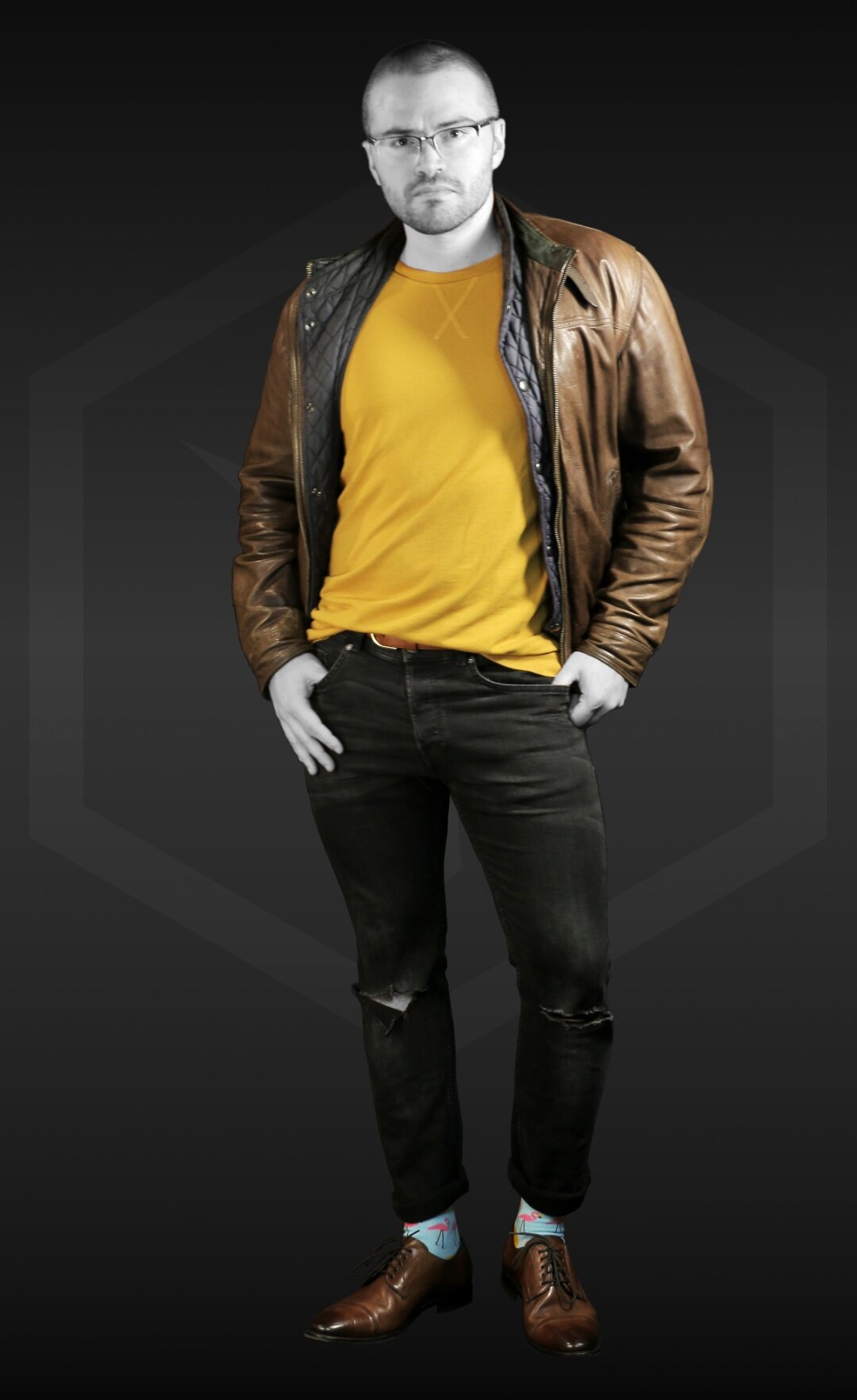
In any case, brown also goes well with mustard because both are earthy tones. They harmonize contextually and make for a great “down-to-earth” look.
7. Burgundy and Pink
Yes, our list wouldn’t be complete without some form of dark red. Enter stage right: burgundy.
Burgundy, a dark red variant, works well with quite a few colors. But the one it harmonizes best with is pink. Maybe you already know why?
You got it! It’s because burgundy and pink are both different variations of the same hue: red. Dressing in only one hue means you’re going for a monochromatic look.
These are very trendy nowadays, in fact.

Mixing burgundy and pink creates a very inconspicuous monochromatic outfit since the contrast (of luminance) between both colors is quite high. Burgundy is one of the least luminant colors, whereas light pink is very luminant. Therefore, they contrast strongly.
But, when it comes to color contrast (hue) they do not contrast at all, since both are types of red.
All in all, burgundy and red pair well because they contrast enough, yet not too much. But is this a very typical color combination in fashion? Not really.
8. Denim Blue and White
Another staple of contemporary fashion: denim blue and white.
Whether as a blue jeans and white shirt combo or as a dark blue suit and white dress shirt pairing, these two colors match perfectly. There aren’t many situations where this match made in heaven falls flat.

But why? Well, both colors are so-called “neutrals” in the world of fashion.
This means that they are “everyday colors” – ones that you can wear day in, and day out paired with almost any other colors.
Just like with white and light brown, this pair works. You can see that it does when you look at most modern street fashion: it’s all blue jeans and white shoes, right?
Also, they contrast well on all fronts and typically have a very positive connotation to them. What more could you want?
Why do Colors Match?
As you’ve most likely noticed by now, most colors match because of certain criteria. Colors are more likely to match when both…
…contrast well with each other but not too much
…share a legitimate connection on the color wheel (monochromatic, analogous, complementary, triadic)
…or at least one of the colors is commonly seen in clothing
…provoke a certain feeling when seen together (connotation)
If multiple of these criteria apply to any given color pairing, they are bound to be a good fit.
Sure, you can stick to these top 8 matching colors all the time when putting together outfits.
But if you really want to understand what makes colors harmonize and you know how to use color theory for fashion endeavors, then you’ll be able to put together the most fetching outfits possible - all by yourself.
And do you know what the best thing about this is? You can do it using the clothes you already have in your wardrobe!
This is what Colorbux is all about. We teach you how to dress using knowledge about color and composition so you can get the absolute most out of your get-ups.
We have a large palette of articles on our website. Click the button to read them all and find out all you would ever need to know about matching colors.
ARTICLES YOU MIGHT LIKE:


![How to Choose the Right Tie Color [Ultimate Guide]](https://images.squarespace-cdn.com/content/v1/5d91f9da52210569ede7ff3a/1647328953246-2F9L3J15P42J9N3WGMVE/COLORBUX+How+to+Choose+Neck+Tie+Color+BANNER+Thumbnail.jpg)