
What Color Catches the Human Eye Most?
Have you ever wondered which colors catch the eye most? Maybe you want your outfit to stand out in a crowd, or maybe you want to make a striking first impression. Whatever your motivations may be, many have wondered the exact same thing!
What people have found is that some colors are more eye catching than others. Some colors may blend into the background and render the wearer less noticeable, while others will make the wearer pop out in a bright explosion of color.
But which color does which? Read on to learn which colors are best for catching the human eye, and why they’re so noticeable.
The color that catches the human eye the most is either red or orange. Yellow is also a valid candidate, in some cases. Colors that are warm, bold, and bright are more eye-catching than others.

Colors like red, orange, and yellow catch the human eye the most. This is why road signs and safety vests are made in these colors.
How Does Color Affect the Human Mind?
First, let’s explore what effects color can have on the human psyche.
Some colors will bring out different reactions than others. For example, warm colors may give the illusion of closeness, which will bring those colors out in a crowd and be more noticeable.
Colder colors have a distancing effect, which may make them harder to pick out in a large group of people or colored objects.
As D.L Bordeianu, L Hristian, and I.G. Lupu stated in their scholarly article on the effects of color on human psychology, “The physiological and emotional effects of colors are used to impress aesthetically. Taking into account the created impression we can speak about warm colors (red, yellow, orange) which give the impression of closeness and cold colors (blue, green, indigo) which give the impression of distance, i.e. increasing space.”
These scholars posit that certain colors give off a different impression, though they haven’t necessarily answered our question.

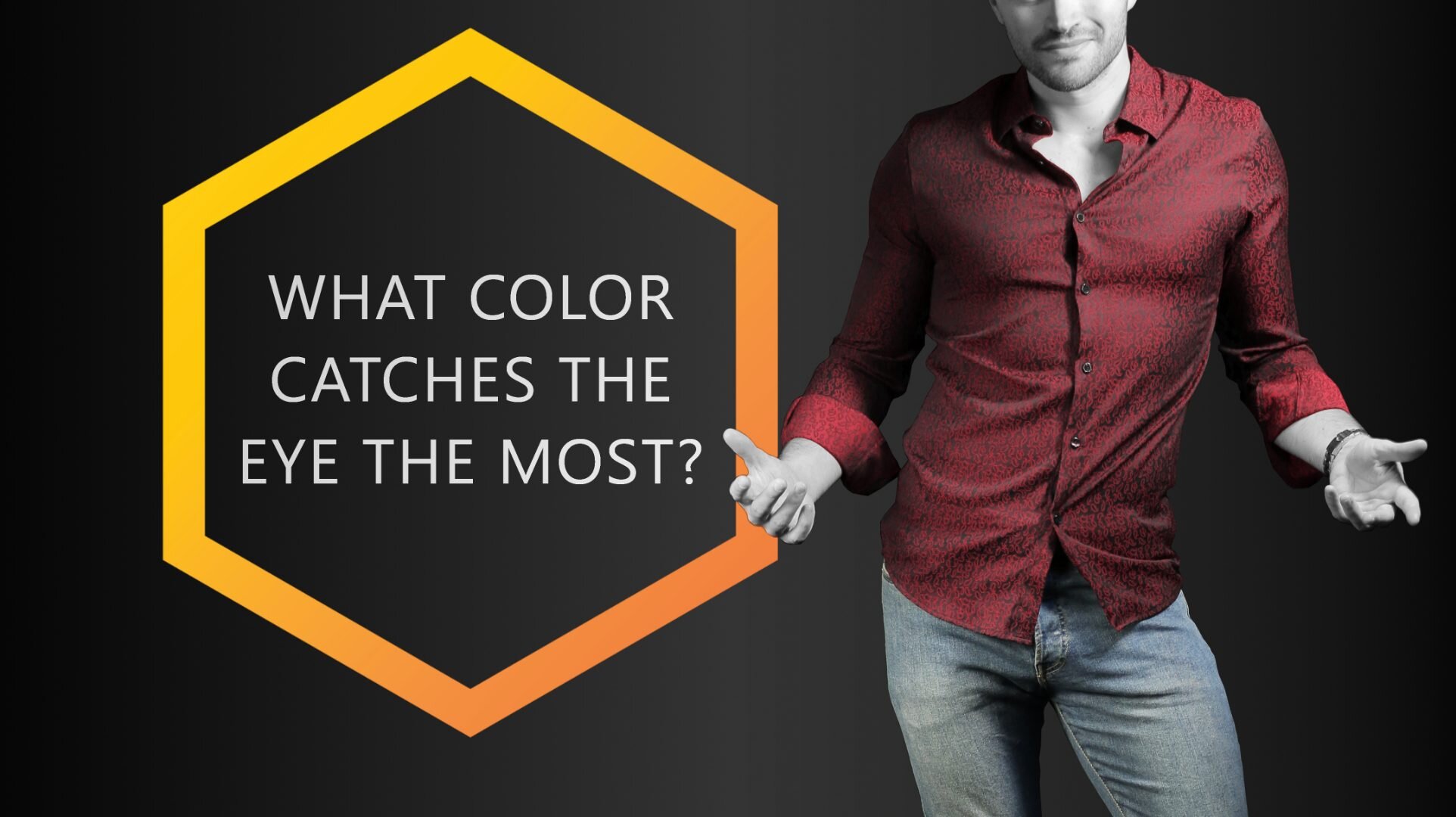
Where’s the difference? We’re sure you found it in about 5 seconds or less! We’re also pretty sure that you didn’t even notice the guy with the (not so) orange shirt in the left image…
Additionally, in Paul J. Locher and Calvin F. Nodine’s scholarly article on symmetry, “Symmetry Catches the Eye,” they posit that colors worn in symmetrical patterns are also more eye catching than asymmetrical variants of the same color.
Their study found that the eye movements of adults in their control groups were focused along the axis of symmetry in the images they were presented, suggesting that if a pattern in a certain color is symmetrical, it will better catch the eye than an asymmetrical pattern of the same color.
Depending on the industry, it can make quite the difference, which colors are best for catching the human eye. For example, in the housing industry it's generally best, not to paint rooms in overly bright or dark colors. It's typically best to stick to pastels. Anything else would catch the eye too much.
But we’ve come here to determine which color stands out the most to the human eye, right? Without further ado, let’s take a closer look at specific colors and whether they stand out visually or not.
OUR READERS’ FAVORITE:

Red and its Effects
Let’s start with an obvious one. You may be thinking, “Of course red will stand out visually, it’s aggressively bright!” And yes, you’re right. But is it the most noticeable color of them all? And what exactly makes red stick out so much?
Red is often associated with passion and heat and has been known to have an agitating effect on animals and people alike.
You know what color bullfighters use to goad the bulls, right? Yep, it’s red (or magenta). But beyond this, it’s also extremely visible. This is why stop signs, stoplights, and fire equipment are all red.
Things that are essential for people to notice are often colored red to make it easier. Red is the color of many ripe fruits. It is therefore a color we as humans are trained to see.
Although red is the color that is least visible from a distance, it is still the one that stands out the most in nature due to its contrast to green.

Red stands out. It’s a color rarely worn in large amounts, so as soon as someone does, heads start turning.
This color also often has the connotation of courage and bravery. If you’re looking to stand out from other people around you, red is the perfect color to pick. It will tell others that you’re bold and you don’t shy away from the spotlight.
Now that you know, it’s no wonder that red is a favorite among tie colors, right?
Is Blue Eye-Catching?
More often than not, blue is associated with serenity, coolness, and calm. It is a soothing color that reminds one of the skies, the ocean, or ice.
Blue is also seen as a typically masculine color, highly venerated among men. Wear this color if you wish to have a calming presence, or if you wish to communicate serenity or intelligence to those around you.
But does blue stand out, or fade into the background? More often than not, blue is a color that will not stand out as much in a crowd – unless the variant of blue is bright and garish, which most worn blues aren’t.

Blue is a very unoffensive color that typically blends nicely with its surroundings. The red soles of these shoes, on the other hand, are quite eye-catching. | Socks: Spicy Chili
Chances are that if you’re wearing blue, it’s going to be a cooler, darker shade, which will not be as eye-catching as some other colors. This is especially true for navy or dark blues, which may appear black or gray at first glance.
It’s safe to guess that blue is not the most noticeable color on the spectrum.
Green Blends Well in Nature
Green has many connotations, most of which are fresh, hopeful, and full of life. Green is known to be the color of spring and blooming things, and it also gives off a sense of cheer and joy. It has even been known to alleviate tensions and inspire restfulness.
As the most restful color for the human eye, green suggests safety and stability. This color – especially as a bright and bold green – can often be eye-catching, as people associate it with good things or with a “go ahead” mentality. Think of the green light at a stoplight.

Green and chartreuse (yellow-green) are not your typical clothing color. Therefore, they tend to stand out. | Socks: Vegan Candy
While green may not be the most eye-catching color out there, it definitely catches the eye more than a lot of other colors. It can be a great choice if you want your outfit to be memorable, but you don’t want to stick out too much.
As a general rule of thumb: The brighter and stronger the green, the more it stands out. The darker and less saturated it is, the more you will blend in.
Yellow is Explosive
Now let’s take a close look at yellow. Yellow brings with it thoughts of sunshine, light, brilliance, and joy. It is a cheerful color that claims attention and shares the pedestal next to red as one of the most eye-catching colors out there.
But why is this? Yellow has a warming effect on viewers, inspiring cheer, mental activity, and energy. Often things that are meant to grab your attention are colored yellow, like a taxicab for example.
Warning signs are often painted yellow as well so that people will be more likely to notice them and the warning they communicate.
Yellow is also a great color for contrast. Against a black or otherwise dark background, yellow will stand out even more.
This pair of socks is a great way to draw attention, by the way…

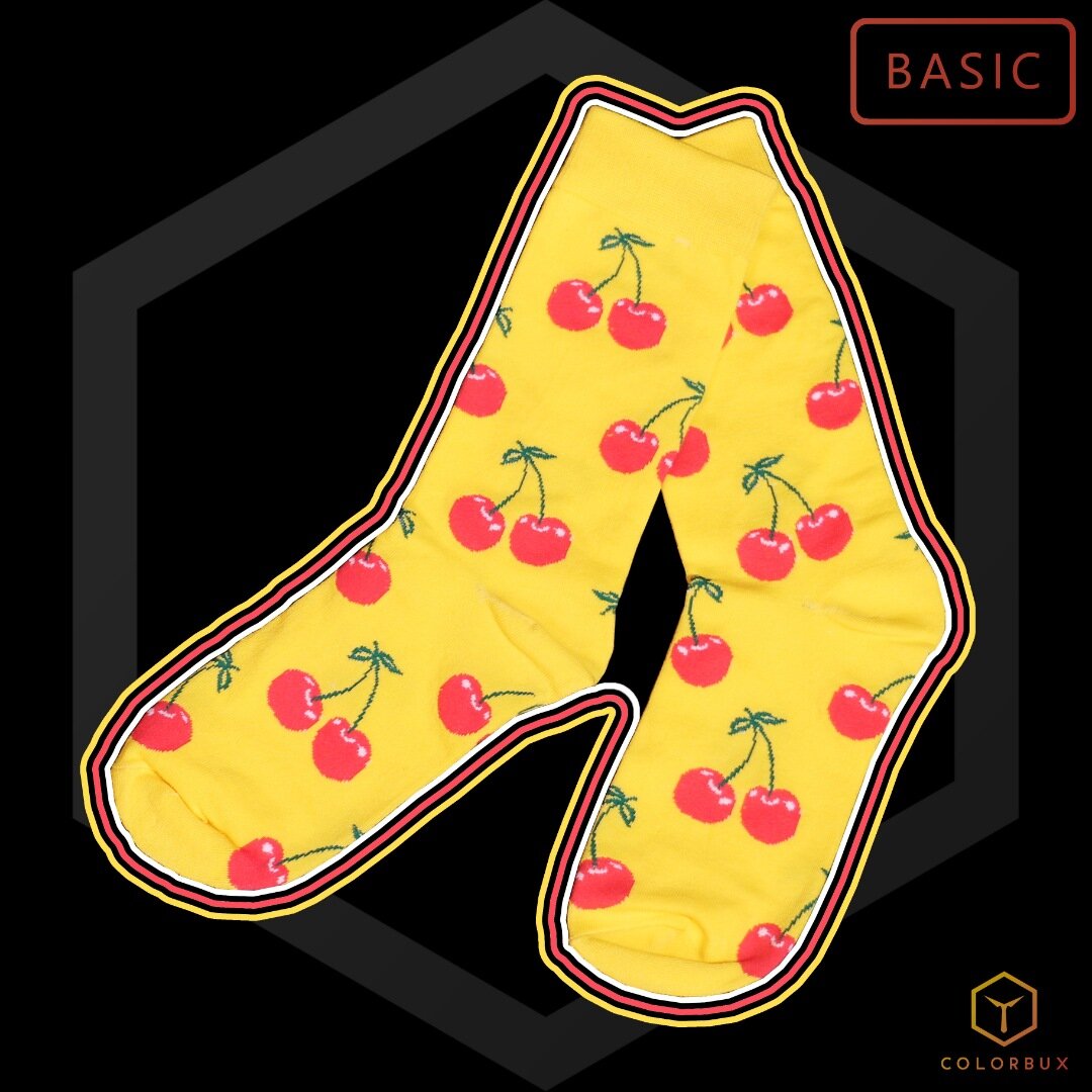
These socks aren’t just cherry - they’re very cherry.
These foot warmers are easy to match or combine with other pieces of clothing, so they make a great addition to any wardrobe.
Colors used:
Yellow (base)
Red (accent)
Dark green (sub)
So, if you’re looking to really stand out, try wearing some yellow with darker accents to make it pop. But if you’re going to be attending a more serious event or venue, it might be a good idea to wear more muted colors.
Yellow can sometimes come across as lighthearted and playful, which might not be the right message to send in some circumstances.
Orange Stands Out
Now onto orange. A mix between yellow and red, orange communicates warmth and bright light, but can also mean warning in some instances.
Also considered cheerful, it gives off a mix of red and yellow energy. With the energy of red and the cheerfulness of yellow, it can also represent enthusiasm and determination.

Orange is one of the most underrated and underused colors in fashion. It makes for great accents and when matched correctly, it can make any outfit extraordinary. | Socks: Color Crates
Similar to both colors it is comprised of, orange is one of the more visible colors on the color wheel.
It is a very hot color to the eye and will be noticed before cool and dark colors.
With exceptionally high visibility, orange is used to catch attention and highlight important things, whether that be communication, design elements, or articles of clothing.
Make sure to avoid wearing orange and most other warm colors for professional occasions. They tend to make you look less serious and authoritative.
Black Swallows Light
Black is the color of death, gloom, shadow, and absence of light. It is a mysterious color often associated with the darker things in life but is also regarded as a distinguished, formal color used for formal or stately affairs.
On a dark background, anything you wear that is black will fade and become hard to notice.

Black is classy and sophisticated, but it most definitely does NOT make you stand out.
Needless to say, in most cases black is not the color that will help you stand out. It’s not very eye-catching unless it’s surrounded by brighter colors.
Contrast can often be your friend, so if your aim is to stand out and you simply have to wear black, it could be a good idea to pair it with brightly colored accents, like white or yellow.
At the same time, black communicates elegance and prestige, so why wouldn’t you want to make it an integral part of your wardrobe?
The Most Eye-Catching Color
Taking all our findings into consideration, and those of the scholars referenced earlier, nothing catches the eye like bright, warm tones. This includes reds, yellows, and oranges above all else.
Green comes in close second to these warmer colors, with cool colors like blue and black falling far behind in terms of visibility.
The rule to consider here is: The brighter, stronger, and warmer a color, the more it will stand out. The higher the contrast and the more symmetrical its pattern, the more it will catch another human’s eye.
So, whether you’re bent on making a bold impression and sticking out in the crowd, or if you’d prefer to have a more muted presence, just choose clothing items with the appropriate colors.
It can also be helpful to remember the connotations people associate with each color, using them to your advantage in any situation in which you might find yourself.
Like we said earlier, yellow is fine if you want to send a message and draw attention, but it’s probably not the best choice when attending a funeral service. Black on the other hand… Well, we all know what color you’re supposed to wear to something like that, right?
OUR NEWEST ARTICLES:


