
What is a Color Palette? (And How to Use it in Fashion)

Most people have no idea how to mix, match, and pair colors in an outfit, even though it’s actually quite easy to do. Most people’s wardrobe color schemes look like they just don’t care or sometimes even downright chaotic.
In this article, we dive into tried and true ways of how to put together color palettes from which to make the most harmonious outfits. Apply what you learn here so your get-up always looks fashionable and never chaotic.
What is a color palette, and how does that apply to fashion?
A color palette is a selection of colors carefully chosen to complement and build off one another. This is important in fashion because most well put together outfits will have some kind of color scheme that ties each piece of clothing to all the others. The harmony of all colors within a palette makes or breaks an outfit.
A piece of clothing’s color palette is one of its most important aspects, as multiple colors together have the power to carry a message – sometimes even a completely different one to the message sent by the individual colors themselves.
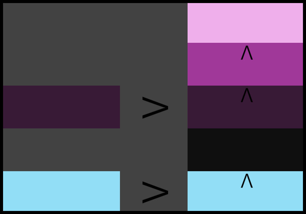
Here are a few classic color palettes (often called schemes), to help you understand the general idea:

This color scheme looks a lot like Halloween, doesn’t it?

How about a Christmas color palette? This one’s sure to jingle all the way!

This color scheme is Granny’s favorite. Light, slightly muted Pastels round off the “senior citizen style”.
Okay, so now we know the basics. You may be wondering how to select the right color palette. And how should you apply this to your clothing? We’ll take a look at that and more below, so keep reading to learn all there is to know about color palettes and how to use them in fashion.
How to Choose a Color Palette for Clothing
A color palette is defined as a collection of colors used together in one medium. This can be applied in the digital realm, in art, and most importantly, in fashion. In fashion, the medium is clothing, each speck of color representing a piece of the color palette.
When creating your color palette, you’re really just picking a selection of colors around which you model your outfits. You’ll always want to consider the following things when trying to choose a color scheme for your outfit:
What colors look best on you?
Which colors will send the message you want your outfit to send?
Which colors do you wear most often?
If you have certain key pieces of clothing in certain colors, it will make it much easier to assemble an outfit for the look you want. This is why our third item on the list above is most likely the most important.
The first step in deciding what colors to include in your wardrobe’s color scheme is to recognize the colors you’re naturally drawn to wearing already. Believe it or not, the three questions above, when answered correctly, will always yield the color you’re “naturally” drawn to.
Maybe you find you like to wear a lot of subtler colors such as blues, grays, and black. Or maybe you gravitate towards bolder colors, like reds, oranges, and yellows?
Whichever colors you might naturally pick, you should incorporate these into your outfit’s color palette. Always start by choosing the color “YOU”, the one that resembles YOUR style the most, and build your scheme from there.
AN ARTICLE PEOPLE LIKE:

5 Steps to the Perfect Outfit Color Scheme
Step 1:
Pick the color that resembles YOU the most.
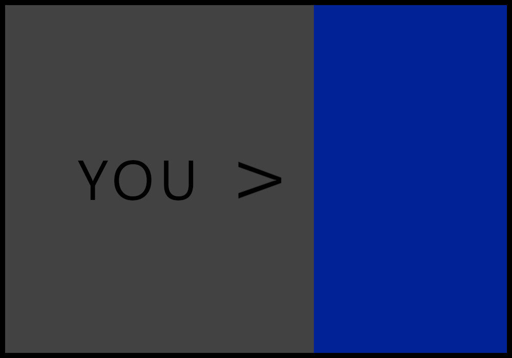
For example, let’s go with a nice blue.
Step 2:
Add a very dark and/or a very light version of that color. Black and white count as well.
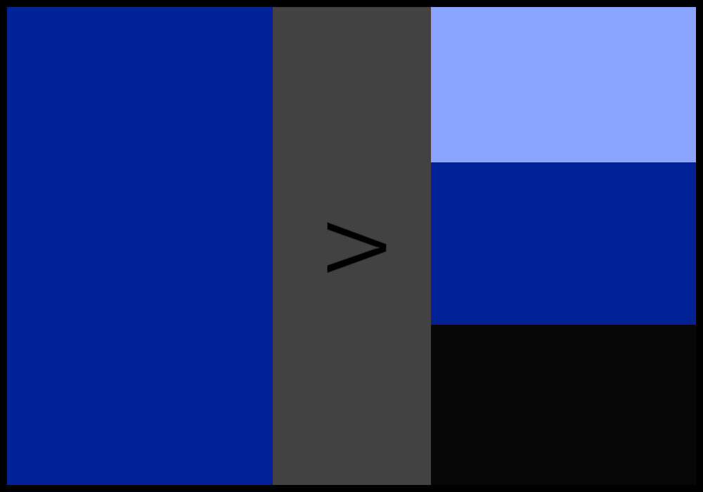
Let’s add both the darkest of blues (essentially black) and a sweet baby blue to our color scheme.
Step 3:
Include a dull/unsaturated variant of the color.
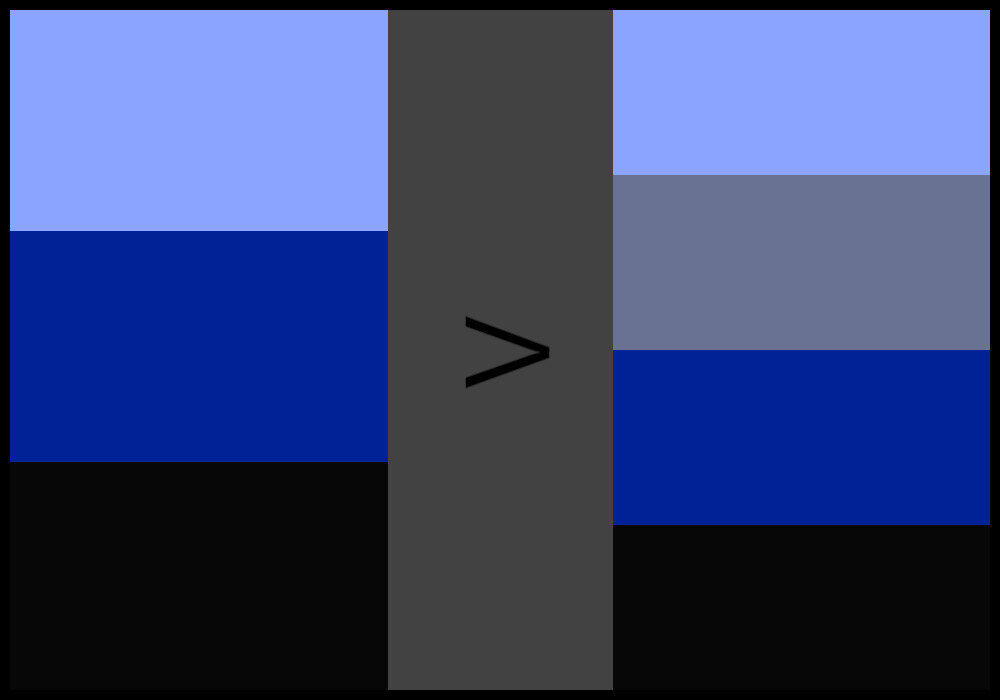
What about a rather desaturated blue-gray? Let’s include that in our palette as well.
Step 4:
Use the color wheel to choose one of the color’s analogous, complementary, split complementary, or triadic hues. Pick one variation of that hue. Alternatively, go for brown.

Let’s go for one of the triadic hues, shall we? How about red?
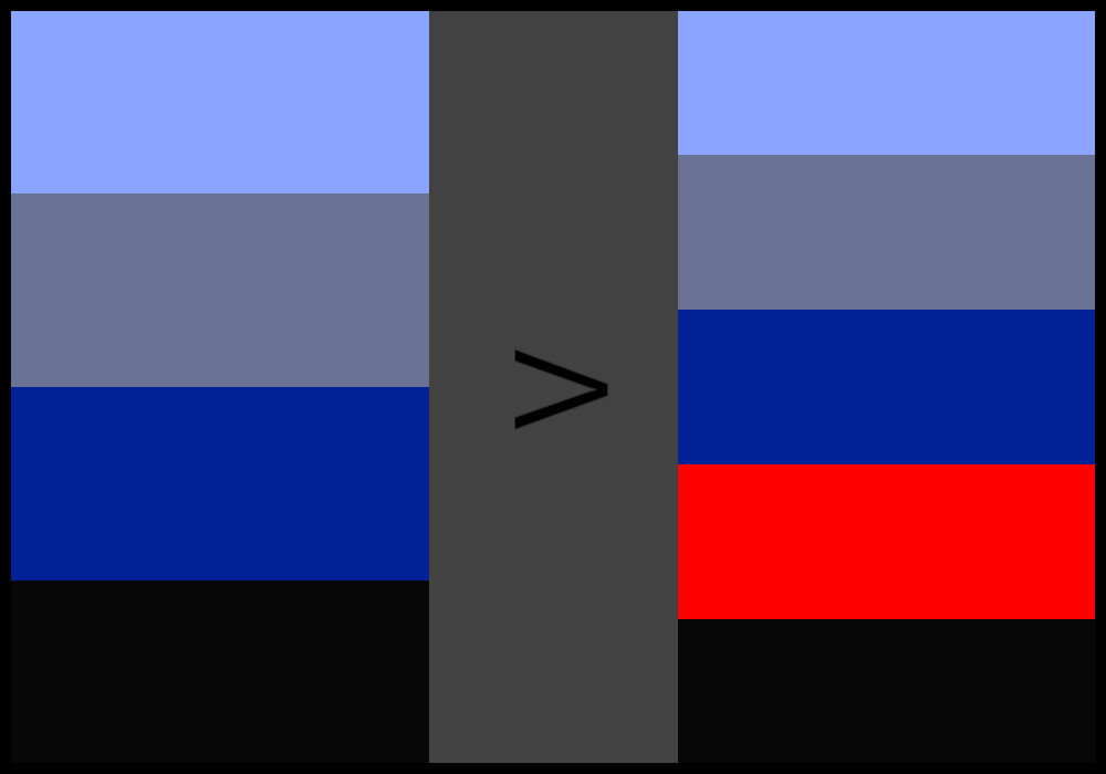
Pure red might be a bit too bold but what the heck! No risk, no fun. Let’s add bright red to the palette.
Step 5:
Out of the resulting palette, choose 3-5 colors.
Just for the fun of it, let’s leave out the unsaturated blue. This way, we have a color palette consisting of four colors that we can choose our clothes from.
Choose all of your outfit’s pieces to be of these three to five colors. No exceptions. Try to pick out your clothing pieces so that their colors are as close as possible to those of the palette.
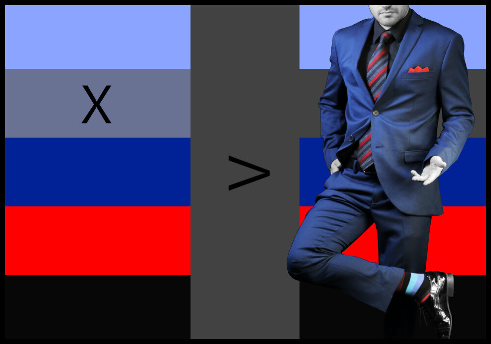
If we were to put together an outfit using the resulting color palette from our example, it could look something like in the image above.
Now, there’s not really a “bad” way of mixing your selected colors together (unless they clash heavily) but there is a “good” way!
To understand how to effectively put together your outfit using your new color palette, you have to grasp the concept of canvas and accent colors. Also, you have to know what to do if you have patterned or themed clothing items that fit your color scheme.
Let’s get to it!
Canvas and Accent Colors
Canvas colors are those that make up the bulk of your outfit and that can be easily paired with the rest of the colors in your color scheme. Think of solid standalone colors like black, white or gray.
Great canvases are made up of colors such as either of the three shades mentioned above, navy blue, denim, or dark brown. These colors are more commonly referred to as “neutrals”.
Your color palette will most probably have at least one neutral in it.
Similarly to what we see in real estate, one or multiple canvas colors (or sometimes called base colors) will form the basis of each of the looks in your wardrobe and can be easily mixed and matched with other more colorful pieces.
If you’ve gone through our 5 Steps to the Perfect Outfit Color Scheme above, then you already have a color palette to choose your canvas color(s) from.

This is the color palette from our previous example.
In our example scheme, either black or dark blue would make ideal canvases. Apparently, we picked navy blue for the resulting outfit.
For any outfit palette, try to stick to one or two canvas colors and around three or five colors in total.
If you include too many more than this, your wardrobe will start to look confusing. Others may not be sure what looks you’re trying to go for if you try to do too much at once.
Next, since you’ve chosen the base color(s), the rest are accent colors.
Accent colors are usually going to be bolder and more saturated. Your accent colors should be paired with the base colors to give your outfits a “pop” and flair. Obviously, they accentuate the outfit.
Their purpose is to add a dynamic element to any outfit, and they should be able to be paired with any of the base colors you selected.
After removing the canvas color navy blue, our example scheme is left with three colors to choose from as accents: black, baby blue, and bright red.
In the resulting outfit, baby blue is nicely represented in the socks and bright red makes the tie and pocket square pop while also contributing to the pzazz of the socks. Black is used as a sub-accent for the shoes and shirt.

Sometimes you may get your color palette down to the right colors, but there will be one color you want to wear that just doesn’t fit with the rest. That’s OK. True style comes from knowing when to break the rules.
Sometimes, as this study suggests, it’s even best to NOT match every color in an outfit perfectly. According to the researchers, an outfit is only truly fashionable when it’s colors are “moderately matched”.
Obviously, we don’t fully agree with that statement.
Perfectly matched pieces of clothing can be the pinnacle of fashion. It depends largely on the selected colors and color scheme, though.
More on that topic in another article, though… maybe! ;-) Here’s an article about which colors not to pair because we know they don’t go together.
Nevertheless, sometimes you’d like to wear a piece of clothing that has a pattern, a certain texture, or a theme of sorts that includes colors outside of your ideal scheme. Don’t worry, we’ve got you covered.
How to Handle Patterns and Prints
Your wardrobe’s color palette doesn’t just encompass the colors you’ve selected, it can also define which prints, themes, patterns, and textures you want to incorporate into your outfits.
When shopping, you’ll want to pick prints and patterns that are easy to mix and match, so you don’t end up always having to wear the same pair of pants with that one shirt, for example.
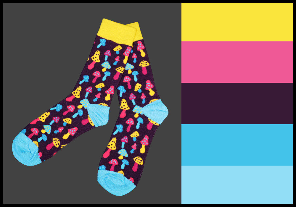
Let’s look at a quick example. Let’s say you’d like to wear a specific pair of patterned socks that obviously has a color scheme of its own.
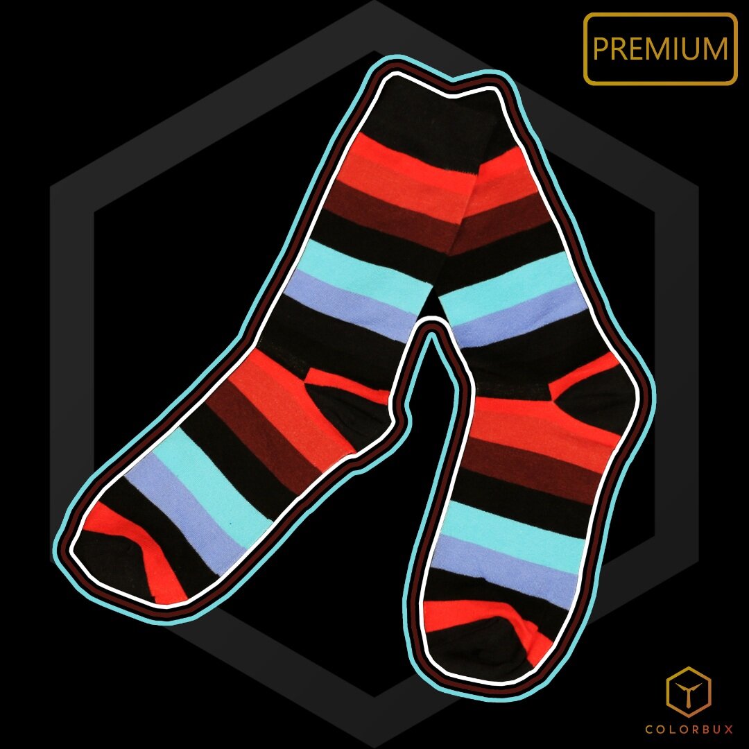
A bit different from burgundy. The colors on these “Bordeaux” socks go well with any smart-casual or business outfit.
Colors used:
Black (base)
Burgundy (accent)
Red (accent)
Bright blue-green (accent)
Light blue (sub)
You think to yourself: “What can I do? This won’t fit anything else.” Well, my dear friend, you’re wrong - and we just proved it in our previous example…
Patterns and themes are easy to match. Do you remember that colors don’t actually have to match perfectly? Just give that print a go and see how it looks.
Sometimes it’s even fine if you incorporate those one or two minor splash of color from the theme or print into your outfit’s color palette. Try!
But, guess what? As with all things Colorbux, our socks are explicitly chosen to have easy-to-mix and match color schemes. So, if you’re looking for quick and simple color schemes to use for your whole outfit, give this a whirl:
The Ultimate Hack to Smashing Clothing Color Palettes
Note: This technique only works with patterned, themed, or otherwise multi-colored pieces of clothing.
Step 1:
Choose a piece of clothing that has multiple colors.
Step 2:
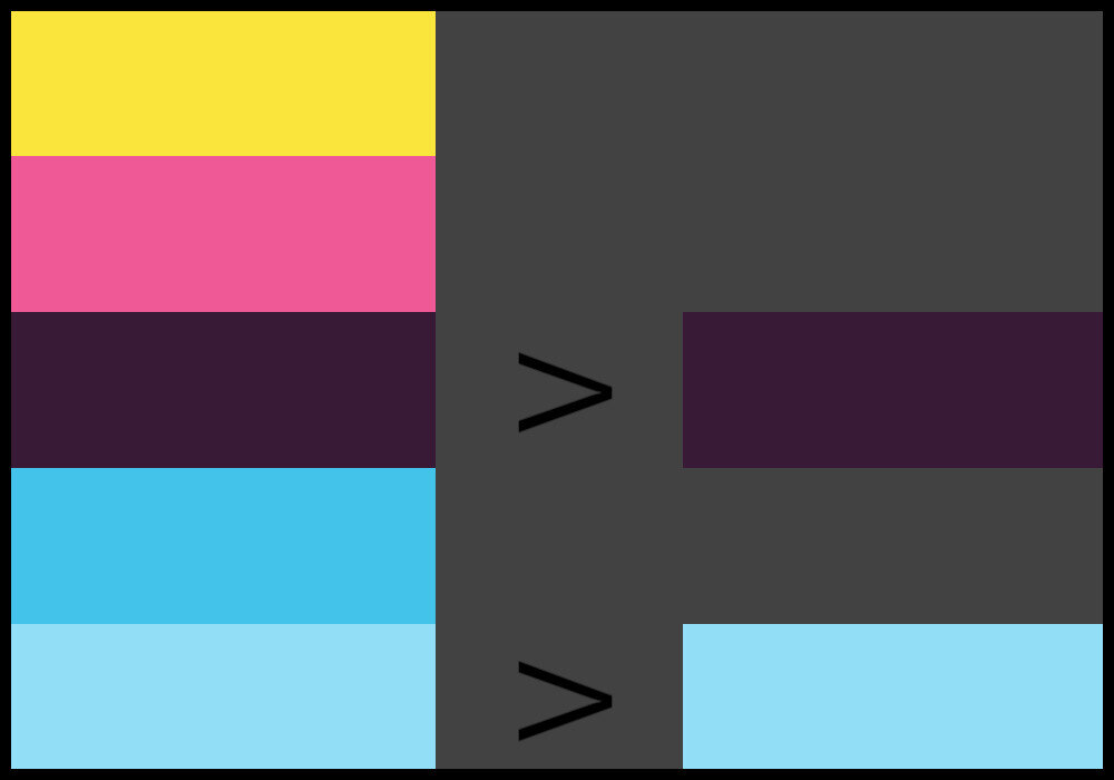
Pick one or two colors out of that piece’s color scheme.
Step 3:
Add dark and/or light variants of the 1-2 colors you picked to your outfit’s color palette. Black and white are options as well.
Step 4:
Put the resulting colors into one color scheme and choose all other pieces of your outfit according to that scheme.

Pro Tip: It’s sometimes best, not to go with all of the resulting colors. Maybe, pick only three (or even just two).
It’s also important to keep certain guidelines in mind when putting together an outfit. Having a great color scheme is good but, when applying the palette to your clothes, you have to think about contrast, placement, repetition, accenting, skin tone, and so on.
We have a comprehensive guide on the 10 Golden Rules for Color in Fashion that delves into the topic. Use what you’ve learned in this article plus what you will learn from the guide to maximize your fashion potential.
Seasonal Color Schemes
The last consideration to make when choosing a color palette is whether it goes well with the current season. You may in fact want to follow different color palettes for different seasons.
In our article about seasonality in fashion, you can have the full rundown but for now, here are a few tips in short:
Each of the four seasons has fashion colors that return (and rejoice) every year. This is because they fit the weather, temperature, foliage color, and overall “feeling” of the season well. No joke!
Fall (autumn) colors lean more towards warm hues (with dark, earthy tones and shades) than winter colors which are very neutral-heavy. Summer and spring color schemes consist of bright colors, with the spring colors leaning more towards light pastels and creams.

A classic winter color scheme.

A lovely choice of colors for springtime.

The colors of summer.

A great color palette for autumn/fall.
Interestingly, most of us have seasonal clothing in exactly the right seasonal colors. This is because we choose our clothing colors mostly instinctively while shopping and our instincts are guided by our momentary feelings which are, in turn, influenced by seasonality.
If you, therefore, choose outfit color schemes that are similar to seasonal color schemes, then you’ll have an easy time choosing the right clothing colors to wear in combination.
Start off by choosing one or two colors from the palette that is currently in season. Use our 5 Steps or the Hack method from the previous few sections to put together your personal color scheme for seasonally “correct” outfits.
When in Doubt: Where to Start When Choosing a Palette
The previous sections made some assumptions that you already have some colors that you know you want to include in your color palette. Well, if you have absolutely no idea which color to start with, we can help with that too.
A good way to decide on which specific colors to include is by identifying your skin undertone.
This essentially boils down to whether you have a cool or a warm complexion, and this is largely determined by hair color, skin color, and your genetic makeup.
Speaking of makeup, you can use the same palette you have for your clothing to help your makeup match as well.
Let’s take a look at how we can identify our undertones, which will help us know which colors suit us best. And remember, it’s important to wear the colors you’re comfortable with and enjoy wearing, regardless of the undertone. Don’t be afraid to be yourself!
We’re going to try several different tricks to help you find your undertone, but to start, you’re going to find something silver and something gold and hold them each up to your skin one at a time. Holding them up to your face and looking in a mirror helps as well.
Make sure you’re doing this test in natural lighting to achieve the best results.
As you do this, try to determine which piece looks the most flattering next to your skin. As in, which color complements your hair and skin tone the best?
If it’s silver, this means you have cool undertones, and if it’s gold, you’ve got warm ones.
Another way to find your undertone is by using the palms of your hands. Try holding your hands facing upward toward the sky, then examine your palms closely.
Determine if blue, red, or yellow is most prominent in your skin tone. If you’re seeing more blue than the other colors, you have cool undertones. If you’re seeing more red or yellow, then that means your undertones are warm.
But why does any of this matter? Well, depending on your undertones, certain colors will look more flattering on you than others. We have detailed guides on matching clothing colors to skin tones. Find them in our articles section:
Once you’ve found a color category that is easiest for you to choose a palette from, you can go on by following our 5 Steps to a Perfect Color Scheme above. That way, you’re bound to find the ideal palette in a jiffy!
A GOOD PLACE TO START:

Final Thoughts
Color is power, and a good color palette can set your wardrobe apart from all the rest. Remember to pay attention to which colors look best on you and incorporate these into your color scheme.
If you incorporate two or more bold colors that contrast strongly into your clothing color palette, then you’ve even found out how to color block. Read our guide to color blocking to learn more.
Hopefully, the information we’ve outlined above will help you assemble the best color schemes for your wardrobe so you can feel confident and be yourself.
And remember, ultimately, you should wear what you want to wear. Don’t limit yourself or your wardrobe based on what’s supposed to look good. As long as you feel confident in yourself, it really doesn’t matter what clothes you decide to wear!
And you know what? If the color palette you tend to find best is all-black, just go with that! There’s nothing wrong with it. If you don’t like mixing and matching colors, you can always go monochrome!
Thanks for reading this far. Apparently, you liked the article. If you’d like to show your appreciation, we’d love to see you share this article on any social media platform you prefer. You’d help like-minded people such as us find and enjoy this content as well.
#yourethebest
ARTICLES FOR YOU:


