
Which Colors Make You Look Fat? (And Which Make You Look Thinner)

Have you ever wondered which colors make you look fat or maybe simply heavier than you actually are? Well, you’re not alone – many people do so. In fact, “appearing heavier” is a major reason why people choose to wear specific colors and disregard others.
We are taught that wearing the color black makes you look slimmer and white makes you appear larger – at least in general. But is this really the case?
I think we might find that it’s not that simple.
In the next few paragraphs, you’ll find out exactly which colors and color combinations you should wear and which you should avoid depending on your body composition.
Colors That Make You Look Heavier
Colors that make you appear heavier are either white or very light versions of most hues. Light gray is also known to make people look heavier than they actually are.
The common factor in all these colors is their luminance. Luminance is the correct terminology for how “light” a color appears to be. Luminance changes depending on hue (color type/wavelength), chroma (saturation/brightness), and color value (lightness/darkness).
White is the “color” with the highest possible luminance since it can’t get any “lighter” (100%).
The hue with the highest amount of luminance is yellow (97.6%). The hue with the lowest amount is blue (29.6%). Now you know why bright blue (not light blue) looks darker than yellow.
Sidenote: Please remember that lightness is not brightness. A light color is one with added white, whereas a bright one is saturated and has neither added white, nor black, or gray. A light color is also often referred to as a tint.
Higher luminance in colors makes it easier to see contours and shadows within (and on) the colored surface. This means that it’s easier to see the actual shape underneath.
This fact is paramount because the more shape you see, the easier it is to recognize bulges and lumps in certain places of a person’s body. In other words:
Colors of higher luminance make a person look heavier. Sadly, they also make you look younger (dilemma alert) - but that’s another story.
So, we suggest NOT wearing the following hues including their tints:

We regard hues with a luminance above 60% as unhelpful when it comes to visually reducing body weight.

The colored fields (over 60% luminance) represent those colors you should most likely NOT wear if you wish to look less heavy. The hues within the white box are fully saturated. The colors to the left of the box are shades (+black), those to the right are tinted (+white).
The colors in the image above could make up a definitive list of colors that “make you look fat”, but guess what? They don’t. Well, I said it wouldn’t be that simple, didn’t I?
By the way, if you’re looking to not only appear less heavy but actually be less heavy, you can try boosting your digestion. Biofit, a GMP-certified and USA-made supplement, can help with the issue. More on Biofit here:

Context Makes You Look Heavy (or Not)
A study by Lancaster University has had very interesting findings on the subject of perceived weight due to color. The study suggests the opposite of what we just found in the previous few paragraphs – but only under certain conditions.
Apparently, the color black makes objects appear heavier and white look less heavy. But here’s the clue: This is only based on visual information alone. As soon as the objects were held up, so you could feel their weight, the white-colored ones were rated heavier.
But what does this mean for us?

Context is Relevant for our Judgment of Weight by Color
Let’s further indulge in the topic of contrast and contours on people’s bodies, shall we?
What we’re really asking is not if a color makes us look fat, rather whether a color accentuates certain parts of our bodies or not.
People judge the weight of others by looking at certain body regions and seeing if there is excess fat there. All human beings do this automatically and unconsciously. So, it comes as no surprise that if it’s easy to see those “love handles” and “flabby bits”, we naturally tend to think a person is heavier.
Often, those of us that are slightly overweight know exactly what type of clothing to wear to “hide” or “disguise” protrusions around the belly and upper thigh regions. Such clothing items are often large and hang down from the shoulders like drapes. Why? Because they cover contours that way, making it hard to recognize the form underneath.

The dark shirt covering the light T-shirt has a slimming effect on the torso.
The same goes for colors with lower luminance. Clothes of darker and more somber colors hide the shape of the body underneath it better. This is because it’s harder to see contours and cast shadows.
But hang on, here comes the fun part…
Fitting in with your Surroundings
Dark clothing can also make you look fatter if you wear it in the wrong context!
For example, if you wear an overly dark outfit to an outdoor summer party you’re bound to be perceived as bigger than you actually might be. Why?
Well, because most others at the event won’t be wearing dark colors and because the context (the environment) in which you’re standing is light and bright.
Imagine standing in front of a white backdrop donning a black outfit. It’s hard to see the contours of your body because the background is so light and your clothing is so dark. But wait, that’s a good thing, isn’t it?
Yes, it is. BUT there’s more…
Since the contrast to your background (your surroundings) is that strong, it’s easy to recognize your silhouette. In other words, the outline (and in thus the shape) of your body is easily seen.
If you combine the simplicity of your silhouette being distinguishable with the fact that dark objects are generally perceived as heavier (in contrast to white/light objects), you understand why people suddenly judge you to be bigger.
Contrasting and Silhouetting with Clothing
If you wear clothes that are eye-catching and at the same time others that don’t, you’ll be able to direct people’s eyes to those parts of your body that make you look less chubby.
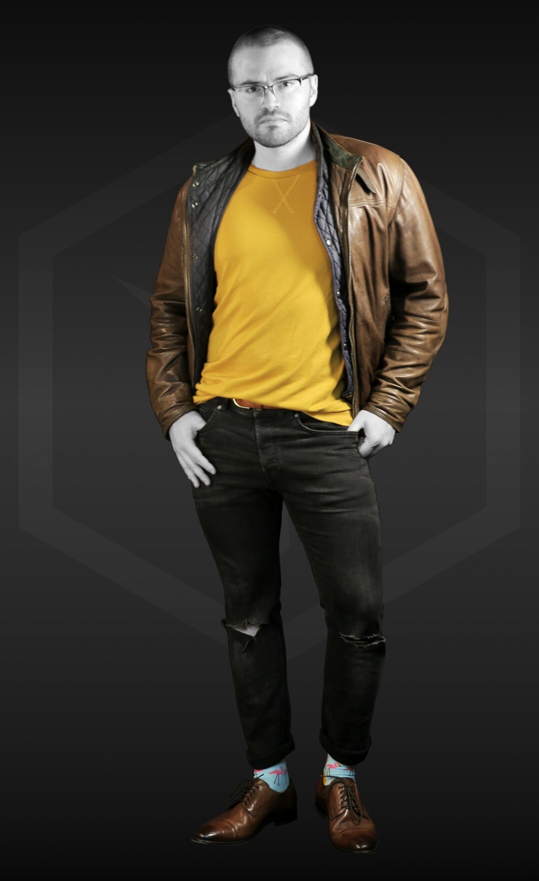
The yellow-orange sweater draws people’s attention and makes the model's legs seem rather skinny. The leather jacket contributes to the appearance of the torso being much wider than the lower body half. | Socks: The Flamingo
Also, if you do so inconspicuously and intelligently you not only look less heavy but more fashionable as well. This is why, for example, dark trench coats make you look slimmer when worn with lighter or brighter clothing underneath – but only if the trench coat is open!
The open coat shows what you wear underneath and consequently makes your body look long and slim because of the “visual borders” the coat generates. This is contrasting and silhouetting at it’s best.
Rules for How to Wear Colors to Look Thinner
If we put together what we learned in the past paragraphs, we can start to formulate a few rules or guidelines for which colors to wear to NOT look fat.
1. Choose darker colors to wear if you wish to appear slimmer and less heavy. Dark objects appear to be smaller than light ones. But be sure to always consider your surroundings (context). For example, if you’re going outside during summer you shouldn’t wear dark clothes – compared to your light/bright surroundings you’ll look overbearing and heavy. For people that have dark skin, this is not that easy to pull off though. Why? We tell you in this article.
2. The actual hue (red, blue, purple, etc.) of any color does not influence perceived weight. Important is only the luminance (perceived lightness) and the chroma (saturation) of your clothing. For example, be aware that a bright blue has the same luminance as a darkened, toned yellow, but has much more chroma. So, it’s safe to say you can choose the hues you wear according to your preference.

Both blue and dark, unsaturated yellow have the same luminance.
3. Bright colors make you stick out! If you do not wish to stand out, we suggest you stick to wearing muted, or dark colors as canvases. Use light and bright colors only as accents (i.e. scarf, tie, socks, etc.) to divert attention away from “problem areas”.
4. Sometimes you might wish to look heavier or bulkier. In that case, you should accent the regions you would like to look bigger (i.e. shoulders, chest, etc.). Choose light or bright colors to make that happen and use dark colors in the other parts of your outfit to contrast (i.e. legs or head). This contrast makes the light and bright elements seem even bigger while making darker elements look smaller.
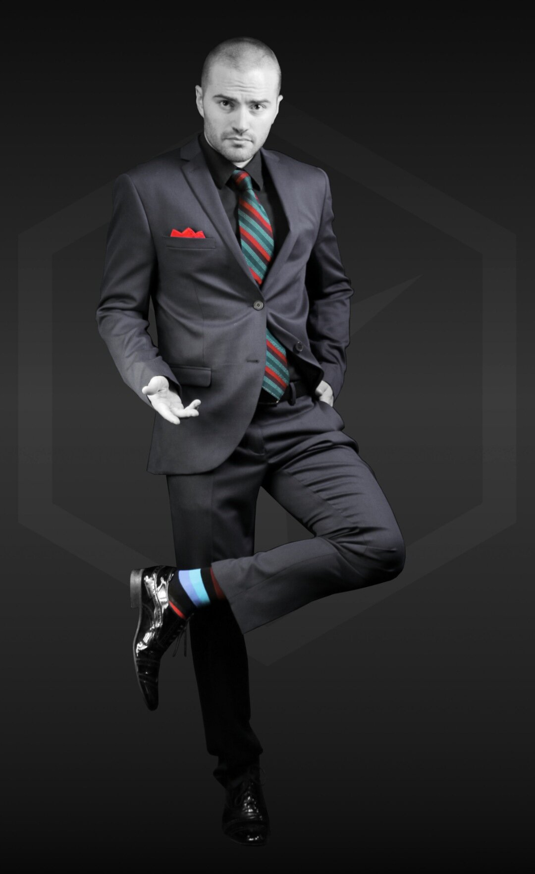
This is how you emphasize with accents. The accents seem larger due to their brightness, which in turn makes the other parts of the outfit look smaller and less “lumpy”. | Socks: Bordeaux
5. Make use of the principle of contrasting and silhouetting. The contrast within your own clothing should accentuate the important regions and de-emphasize the problematic ones.
It’s important to note that actual body weight and composition play a large role in how heavy you might look. Also, how clothing is tailored makes a huge difference. But don’t fret quite yet; the difference that clothing color makes gets bigger the heavier you actually are.
An overweight person can seem to be over 10% lighter in dark clothing than the same person dressed in a bright red shirt and tight, light blue jeans.
Simple Color Combinations You can Wear to Look Slimmer
Here are three outfit combinations that are guaranteed to make you look slimmer. There are many other possible combinations but these are some of the easiest to pull off with what is most likely already in your wardrobe.
Try a pair of dark blue jeans with a gray T-shirt covered by a black jacket. The very dark jacket gives a slimming effect since the silhouette of the brighter T-shirt underneath looks either V-shaped (if the jacket is zipped up) or simply thin (if the jacket is open). Wear a pair of white or brightly colored shoes and colorful socks to pull people’s focus away from your legs. If you are a “bottom-heavy” person, we suggest switching pants and jacket colors.
Go for a dark gray suit that you combine with a black shirt and a colorful tie and pocket square. The bright accents (tie, pocket square, and socks) make your canvas (suit and shirt) seem smaller and less heavy because their brightness draws the most attention.
Middle gray is a great “color” to wear since it has the least contrast to everything surrounding it – on average. Wear an opened, gray button-down shirt over a bright, eye-catching T-shirt. The outline of the gray shirt makes the silhouette of the tee slim. We also suggest accenting your feet (shoes/socks) with an interesting and fitting color or two.

OTHER ARTICLES YOU MIGHT LIKE:


